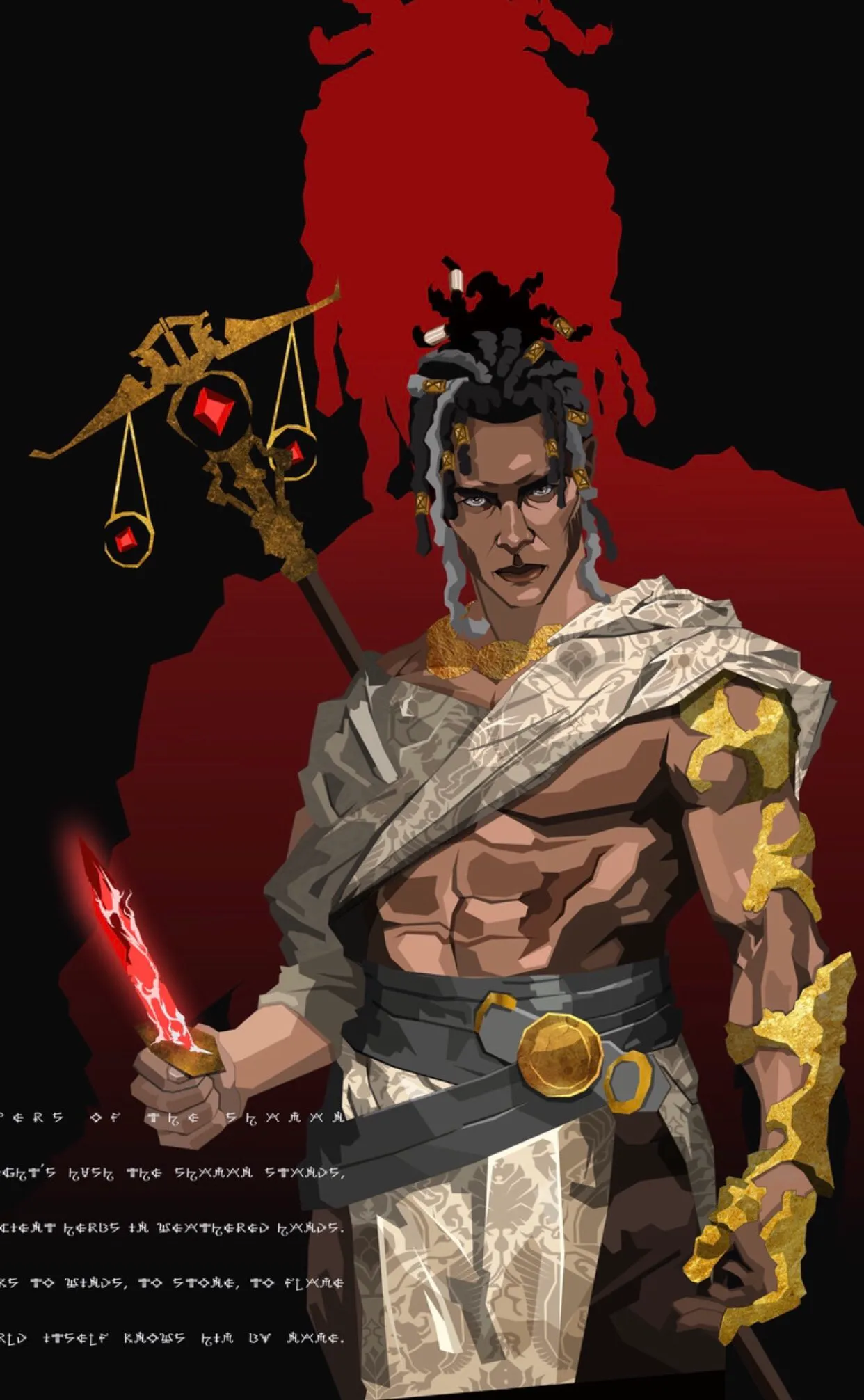
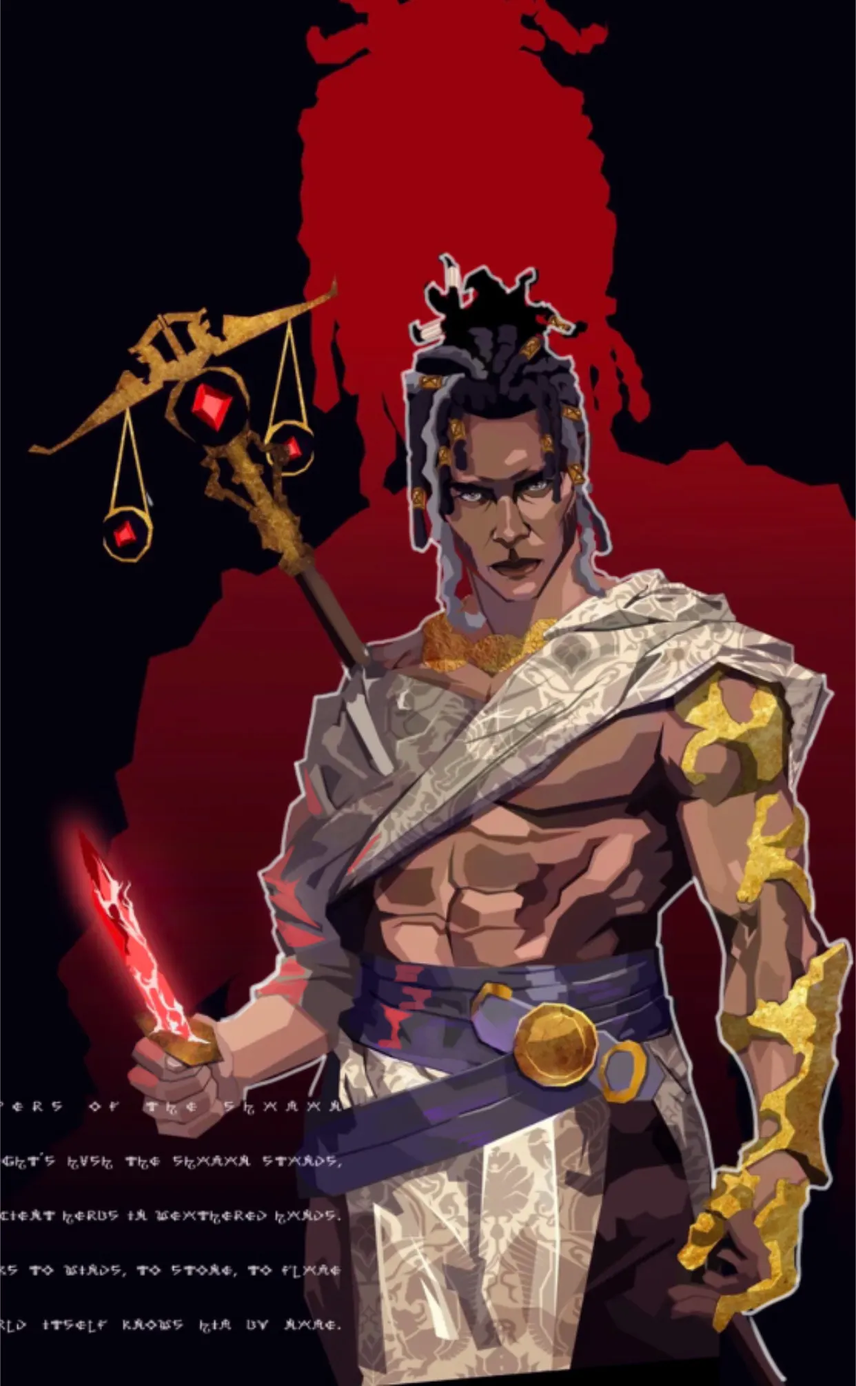
Yo! Great job! I really like your color choices, and very interesting design! :D The only thing I would suggest is adding a bit more vibrancy to the colors. Right now, everything feels like it’s within the same temperature or color range (for example, the skin is quite analogous, with mostly brown hues). Something really nice you could try is introducing a bit more harmony and contrast. You could add some purple tones in certain areas of the skin to create more variation, or even incorporate purple into the belt. Since purple is part of the triadic scheme, you could also use some more saturated hues in specific areas of the belt or elsewhere (while keeping the same value range, of course). Since the knife seems to have some kind of power, it would be ideal for parts of the body to be affected by that red light—it would add a nice contrast as well. You could also use a subtle white outline to help the character stand out more, since it blends a bit with the background right now. Hope this helps!
Participez à la discussion
Inscrivez-vous pour donner votre avis sur cette œuvre.