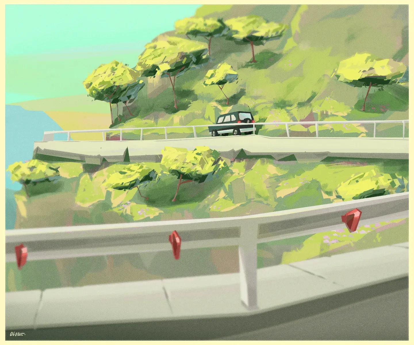
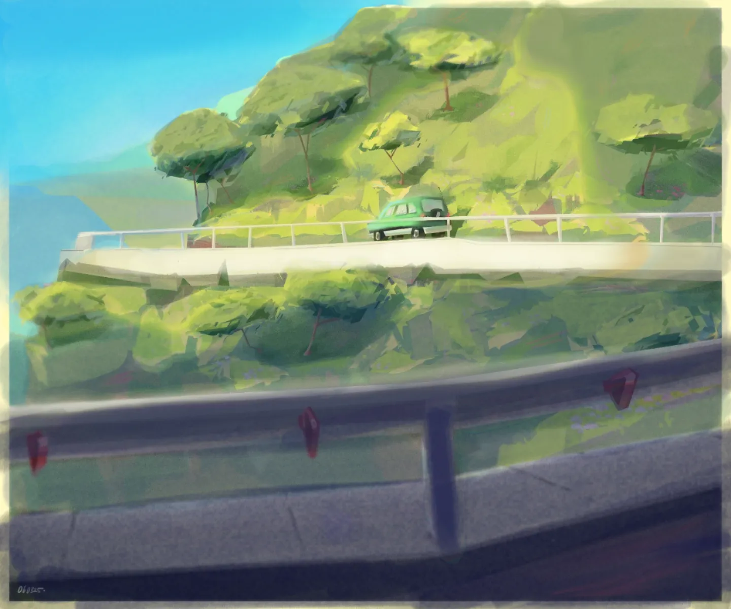


Hey! You've already received a great feedback, but I still wanted to share the version I made before you get the other feedback :p It's basically the same idea: separating your values more clearly to create stronger contrast, just as they explained. Notice that in both examples, we use the lighting to guide the viewer's eye toward the focal point. That's a really important concept to keep in mind. Try to use your lighting intentionally to direct the viewer's attention. Also, aim for strong value relationships around your focal point, such as light against dark or dark against light. Those kinds of contrasts make the focal area much easier to read and naturally draw the eye. Hope this helps!
yeah these feedbacks are really amazing😭, i didn't even think about the contrast at all. i might be focusing too much on the color and leaving value behind. once again thank you for the amazing feedback <3

Réponse à @mopuyo
I reccomend for good value study to look at any leauge of legends splash art on greyscale they are pinnacle of contrast and blocking :3
Réponse à @mopuyo
Glad we could help you! :D Try to turn your painting into values as you go. It's easy to ignore the values and therefore ignore getting better contrast. Or you can do a lil' value thumb just to figure out the lighting of the scene. Those two things are always helpful :)) And also what Comoran said. Do value studies of any LoL splash art! Those are so freaking good to learn value contrast :D