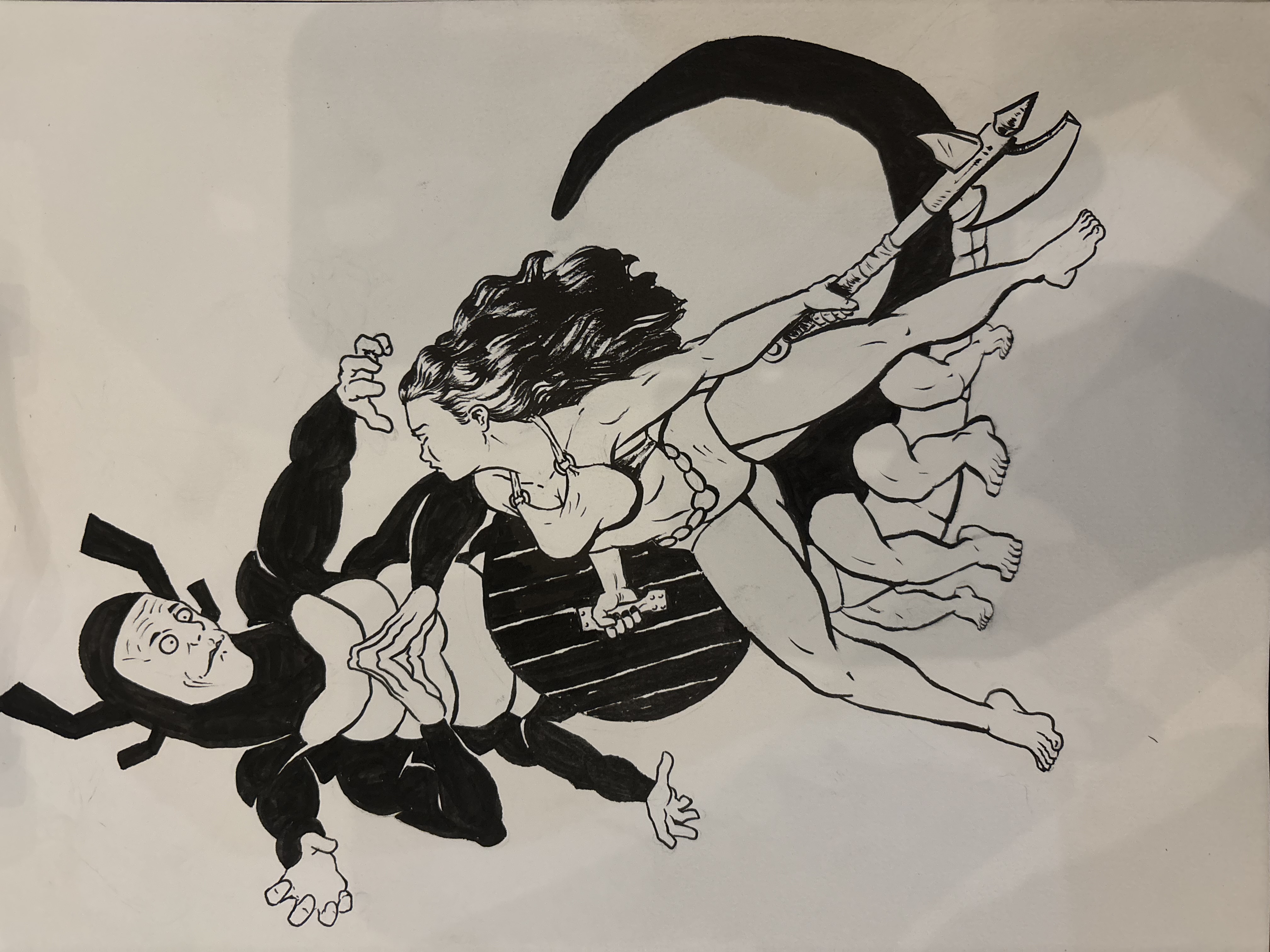
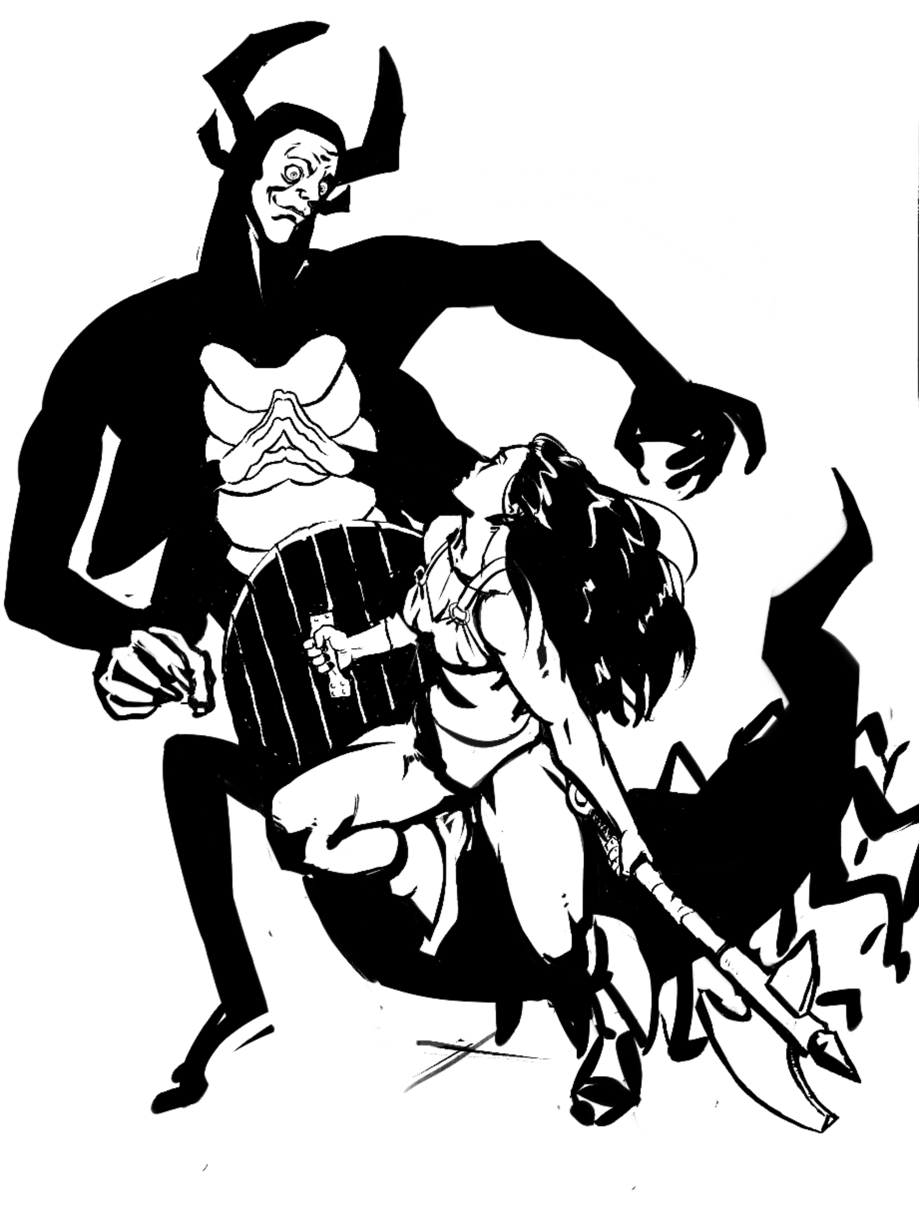
I think the readability is pretty good! As for line weight, I think there are some places that can be improved. I think that there a little too many thin, small lines in a lot of places that come off kind of messy. This would be like the tiny folds of her top, the lines indicated the curve of her muscles, the lines on the creature's face, and the lines on the hilt of her axe. They're a little too distracting. So what I did was remove a majority of all the small details and replaced them with thicker shadows and blocks of black to indicate form instead. Less detail but thicker lines and thicker shadows. Your lines and shadows should be incorporating some level of shape design. Avoid thin lines when you can! I think a lot of things could've been improved by thinking of shape design. Particularly in the case of the creature. I tried to make him a more intimidating presence, but I'm actually not sure what the original intent was. I think we're fighting it, but he doesn't seem very threatening or worth the effort. I think it might be the face clashing with the body. Maybe a baby's face would have sold it a bit more now that I think about it. I did her pose as I don't think it felt very natural and were I to try to recreate in real life, I'm not sure I could. In the future, try out your own poses yourself! And see if they are realistic and doable! And which direction the torso, pelvis, and shoulders are facing and how they would look in 3d space. And finally I gave her boots because I thought they were cute. I have no other explanation I'm sorry. I hope this helps in some small way!
Participez à la discussion
Inscrivez-vous pour donner votre avis sur cette œuvre.