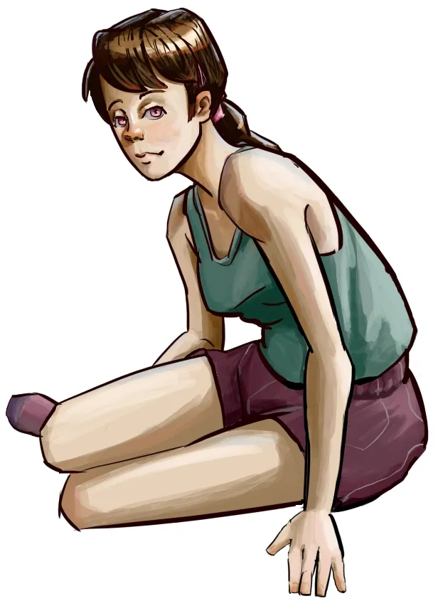
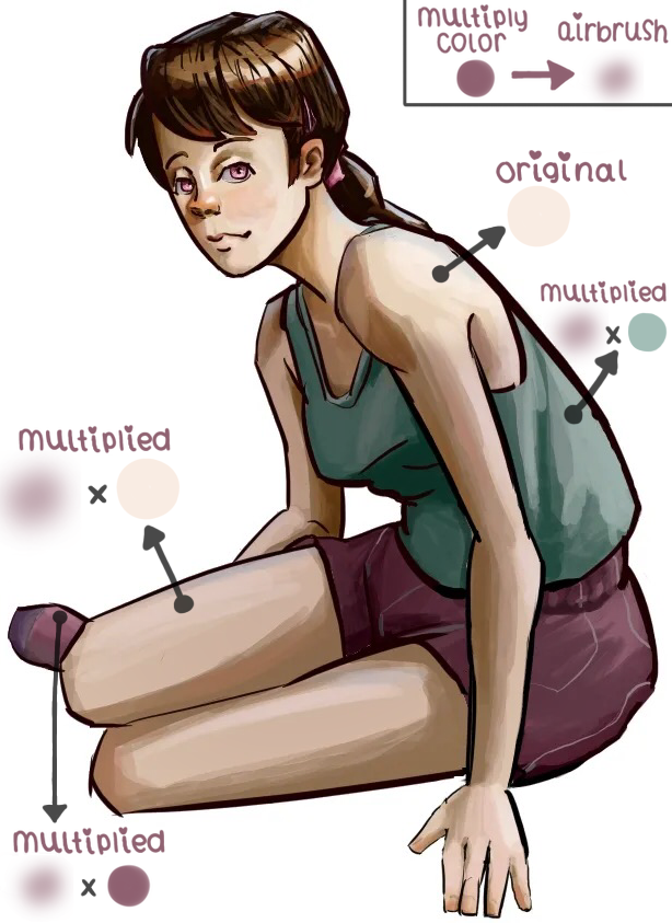


hi! i have a follow-up on the second part of your post! you mentioned decreasing the amount of deeper shadows outside the focal point, and that’s completely fair. my earlier comment referenced the saturation blend mode, but another blend mode that you might find useful for the effect that you want is the multiply blend mode (or really, any blend mode that has a darkening effect). with the multiply blend mode, you can pick any color that’s in your illustration (often, it helps if it’s already a common color that you’ve been using throughout the piece, as that will tend to make your image more cohesive) and then just airbrush in darker values broadly over the entire piece (except for the face and bust area). this broad-strokes approach allows you to darken basically anything you want without adding more rendering detail (and you can use the lasso-selection tool to ensure that only the parts you want darker are affected by the multiply layer). for this draw-over, i’ve made sure to point out the darker varieties of each hue that result from using multiply. i chose the color of the character’s shorts to to multiply over everything except for the face and more prominent shoulder area, and the draw-over that i’ve included is the result; the face looks brighter by comparison even though all i actually did was to darken everything else. in case my explanation of the logistics weren’t clear, here’s a quick review of the steps that i took: (1) i picked a color that’s prominent in the illustration; (2) i selected the “airbrush” as my pen of choice; (3) i created a layer on top of the original artwork and changed that layer’s blending mode to “multiply;” (4) i used the selection tool to select everything except for the character’s face and more prominent shoulder area; and (5) i used a few strokes of the airbrush (at maximum size to minimize the number of strokes required) to multiply the chosen color on top of all the original colors of the illustration. this darkened the illustration everywhere except the face and more prominent shoulder area, making both of those areas look brighter by comparison. please let me know if you have any follow-up questions. i’m also happy to send you a step-by-step video showing what i did to apply the multiply layer, in case my explanation wasn’t clear. i hope this helps! ❤
Thank you, all the steps you laid out are clear and make sense! That is a really interesting way to quickly shift the values of the piece. I guess the closest idea to that in traditional painting is a wash which I would have been intimidated to do without an undo button haha. I guess one follow up question I have is if you have any thoughts about the hue variation in the skin. I have an okay idea where to put more reddish orange into the skin, but a little more trouble figuring out the where different hues should come in on the limbs. Currently the skin tone still looks a little lifeless to me. I'm sure the best way to get used to this would be some studies.
hmmm...it might have to do with the way that you’ve selected your shadow colors for the piece. oftentimes, shadows will feel more lifeless if they are simply the base color with a bit of black/silver value added to them (somewhat reminiscent of older anime-style cel-shading approaches). by contrast, adding a smaller amount of black value but also moving slightly rightward on the color wheel (and allowing this rightward move define more of the shadow color) can have the effect of making shadows more vibrant. for example, a yellow bird might look more vibrant if you give it a shadow whose hue has been shifted slightly to a more orange-tinted yellow with only a slight darkening of its value. another thing that you could try would be adding what's known as sub-surface scattering (also called a terminator region): basically, you add a red outline to the edge of the skin shadows closest to the light. a trick for doing this easily is to make a new layer on top of the shadow layer, outline the shadows with red, gaussian blur the outline, then use the selection tool to quickly delete all of the red outline that falls outside the shadows. (thanks to the selection tool, you don't have to be super precise when you’re first placing down the red outline; anything too far outside the shadows will be deleted automatically, so you can add the red outline pretty quickly). you'll also probably want to decrease the opacity of the red outline layer (sub-surface scattering often makes things look better when its not immediately noticeable). and again, if you'd like a more detailed breakdown or an example of how to do this, let me know! picking shadow colors can definitely be a challenge, and there's no shame in adjusting things a few times until you get them to a point that you like.
Ah, thank you! I was mostly thinking about adjusting the saturation when picking my shadow color and forgot about the factor of the color wheel. I'll absolutely be focusing on that in the future, Thank you!