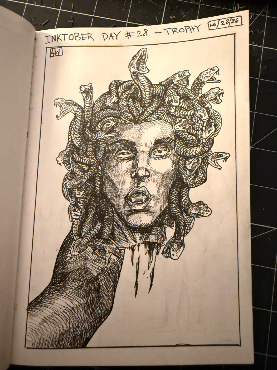
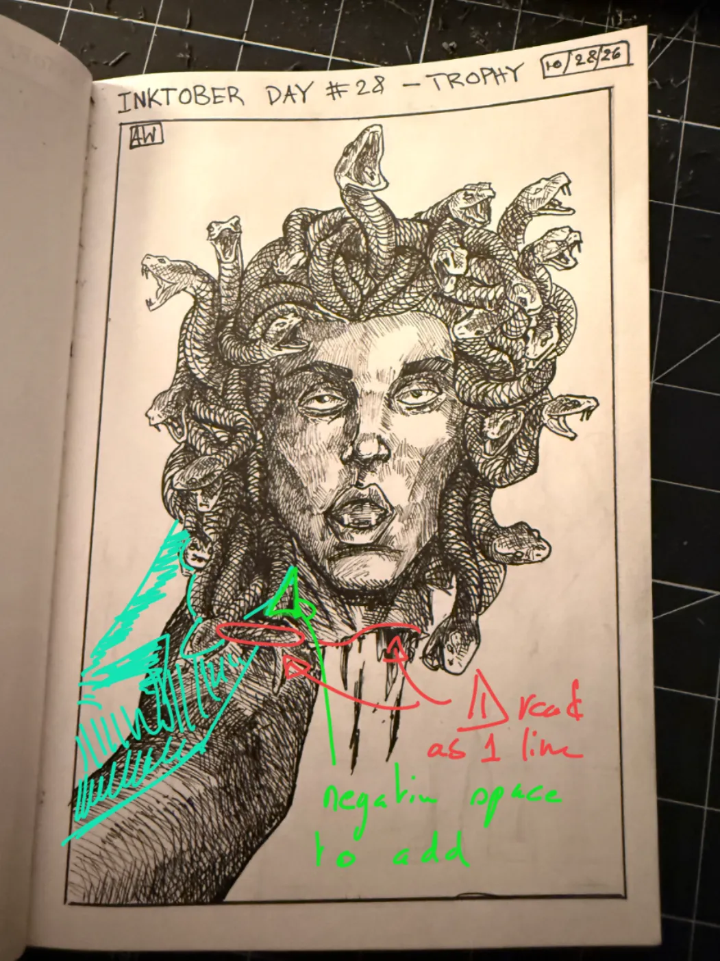
Really cool drawing! the main issue I spotted is the connection between the arm and the head. In red you can see an highlight from the snake prolonging the head cut, this read not clearly. I would put a negative space to make it more readable. As always, I hope it helps!
Pinturas (1)
Comenta 1
Inktober day #28 - Trophy
Notas de autor:
Helloooo! I feel like this is good but a bit muddy. The value isnt very clear. I know i was having a hard time drawing and was very frustrated so that may just have bled through. Any feedback is welcome :)
10