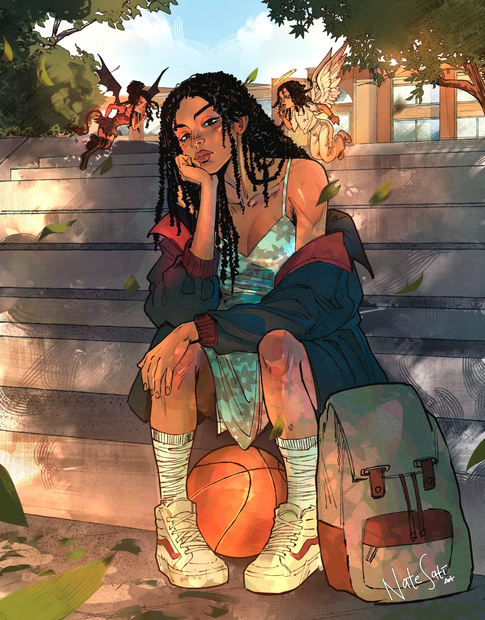
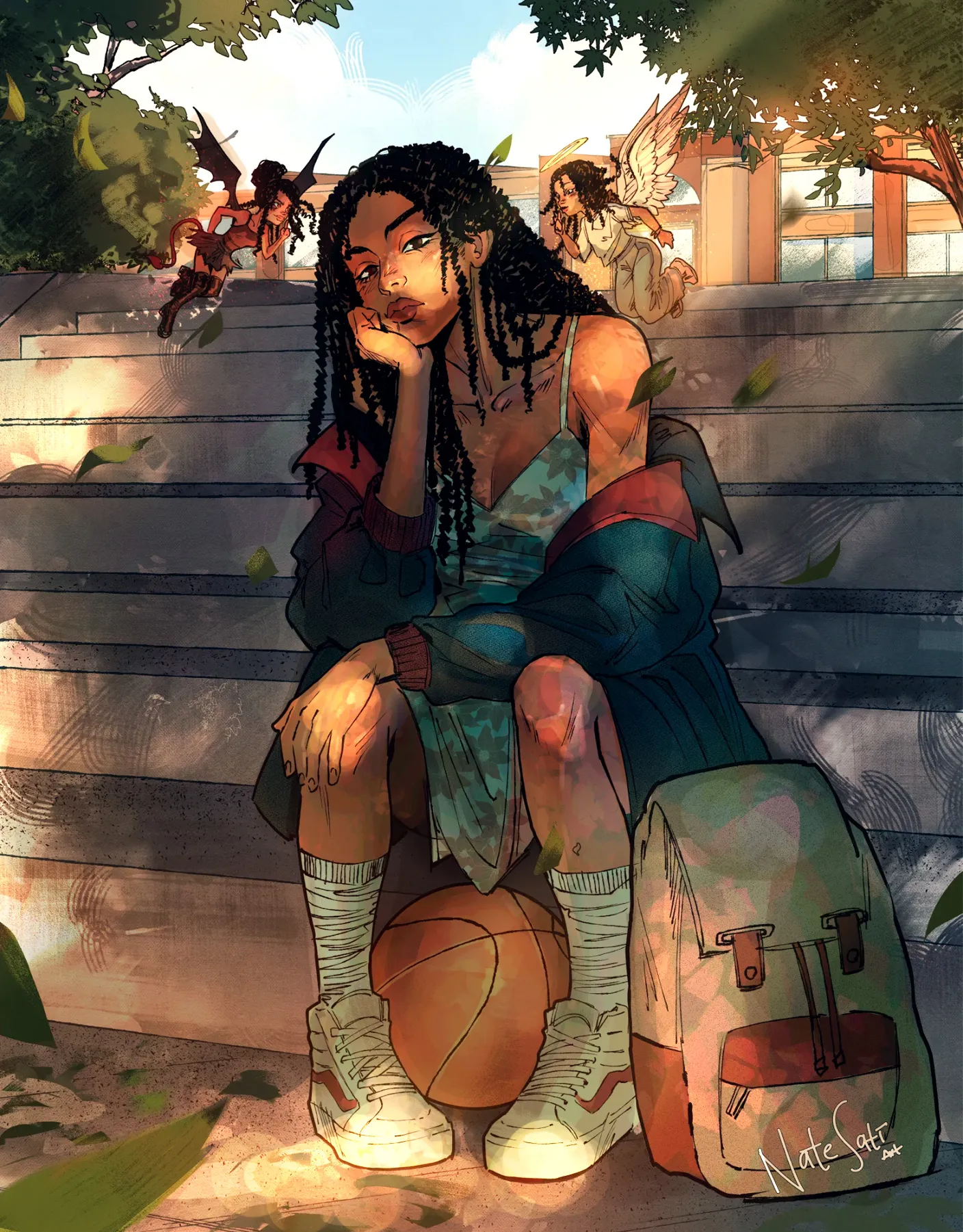
Hey! I don't see much of a problem with the perspective; I think it looks good overall. :) The main issue I see is with the values and lighting. As others mentioned, the shoulder gets a little lost against the background because they both have a similar value. Also, the lighting on the character doesn't feel entirely believable because it isn't following the same lighting as the rest of the scene. Is the light coming from above, from the side, or from below? What I did was shade most of the character and imagine that the light is filtering through the leaves of the trees, creating a more consistent and interesting lighting setup. This also helps both the smaller characters and the main character stand out more. :) Remember, the entire character doesn't always need to be illuminated. Think about which areas you want to emphasize and use the lighting to guide the viewer's eye toward them. Hope this helps!
Pinturas (1)
Bellamy
Notas de autor:
So this was a commission I got the opportunity to work on some promotional art. I noticed my perspective was wonky (especially the stairs) which I have taken note of. Im looking for genral feedback on anything, really. Thanks in advance!
Comenta 2
This is very cool, nice job. The one thing that jumps out at me is the little figures over the girls shoulders. They are too close in value to the background and are kind of hard to see. I completely missed them on my first read of the image. Hope that helps :)