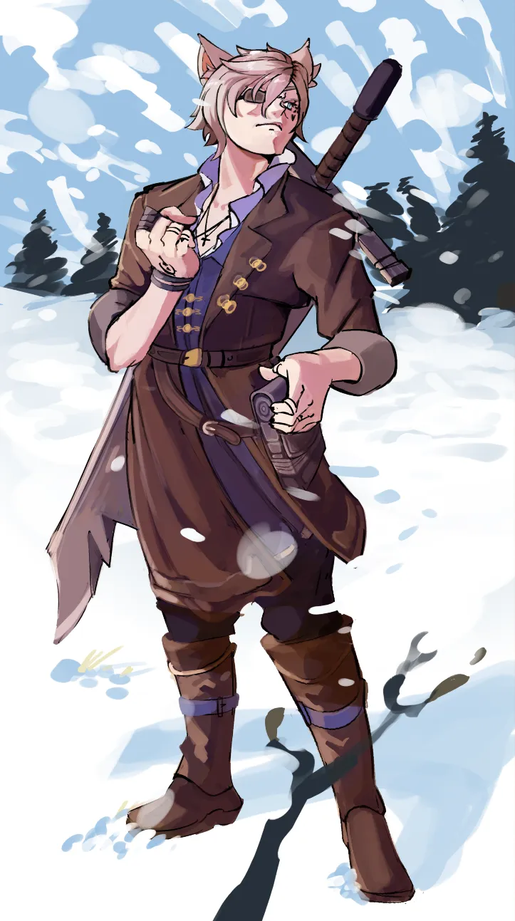
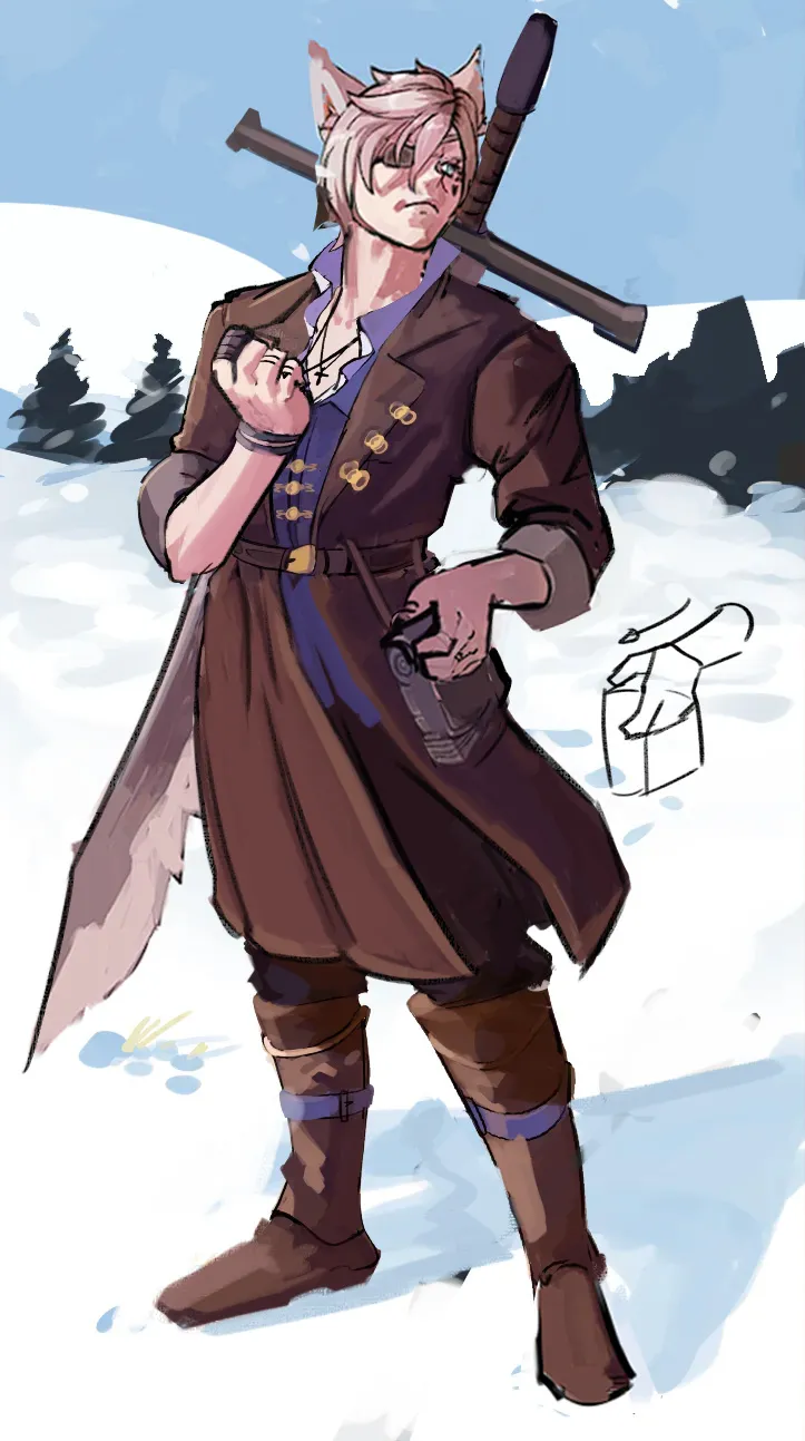
Hey there! I really like the character design so far! That said, here are a few changes that could help improve him. First of all, I would simplify the background by painting a clean sky so that the character's silhouette becomes more readable. Alternatively, you could add a simple cloud shape behind the pine trees to help the silhouette stand out even more. As for the character, the head felt a bit too oval or compressed, so I elongated it slightly. I also adjusted the position of the sword, since the handle wasn't following the same axis as the blade; they were pointing in different directions. I corrected the edge of the sword as well. Because of the shadows you painted along the serrations, it gave the impression that the blade had depth, which made it read a bit strangely. The thumb resting on the small side bag felt broken; it wasn't following the same direction as the rest of the hand and appeared to be pointing outward or backward, which created that impression. The lower part of the coat (or garment) wasn't too far off. I only adjusted the folds slightly, as well as the folds on the character's left arm. Typically, you'll see spiral folds around the arm and compressed folds where the forearm meets the upper arm, since the position of the arm causes the fabric to bunch up in that area. Also, consider maintaining the left side of the character in shadow. The lighting becomes much more interesting that way and creates stronger contrast throughout the piece.
Pinturas (0)
Commission for a friend
Notas de autor:
Im pretty happy with this piece, but I still feel like theres more I can do to make this one really stand out, particularly with the clothes maybe? My form? My perspective? Im really not sure. Some things I DO notice is the hair clumps arent the greatest, and my folds arent too great either, still studying. Open to any and all critiques! I take heavy inspiration from Yoh Yoshinari as well!