


Super great work! I tweaked the face structure slightly, I believe I hopefully found the correct reference image that's been used in your original piece. Making it slightly easier to discern what feels wrong with the choice of values. Your values aren't necessarily wrong, there just aren't enough of them. I often see this happen when portraits are drawn on white backgrounds, but remember the background is a part of the value structure of the whole portrait. And using that background value, we can push and pull things closer and farther away in terms of depth. I also just wanted to darken the whole image and go darker with the shadows, expanding the range of values available to us. And then using soft brushes to really blend those shapes together, so we can really get a feel for that form that's going on based on what's a hard and a soft edge. Hope that helps! Great work keep going!
Paintovers (2)
Comments 3

Hi! I think you did a great job already finding the plains of the face and values too The reference is not an easy one. I do admit I'm not the best when it comes to values. And i did cheat a little because i was able to find your reference. But i have tried my best to keep myself to your artistic choices. I did paint in his left eye. And i have shrunk is head I have simplified the values a bit in the shadow area on his cheeks and i did that in order to have more readable shapes. There is a lot going on and it helps the viewer understand what is going on. Like the lips which i gave more definition too. this goes hand in hand with trying to be a little minimalistic with brushstrokes. I strongly recommend watching Marco Bucci's series: "10 Minutes to better painting" on youtube! I painted in just a few places where you can see his skin through the hair. It helpes to sell the hair, as hair. And i have softened it in a lot of places. I suspect you used a lasso tool. There is nothing wrong with the lasso tool. Just keep in mind it can look very "Digital" with very sharp edges. hope that helps!
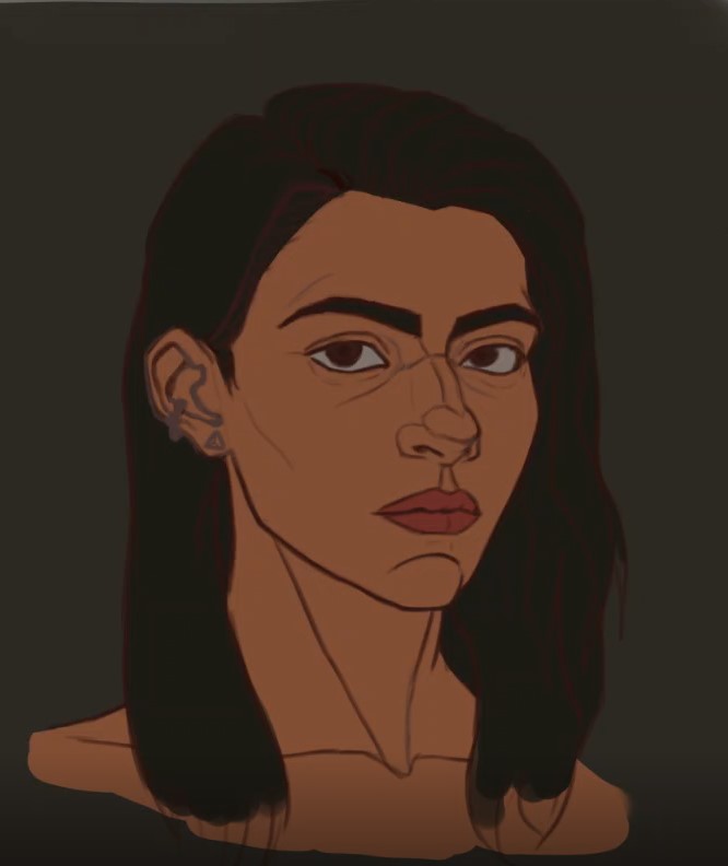
This is a good effort for a first attempt. I don't have access to a pen right now, but I will try to provide guidance and help through explanations. To make the rendering process easier and less complex, I suggest analyzing your reference first. Try to separate the light and shadow areas based on two values. Once the shadow areas are defined, you can focus on developing them further by incorporating various shadow elements—such as core shadows, bounce light, ambient occlusion, and cast shadows. Afterward, you can move on to the light areas, defining or distinguishing the halftones and highlights. Following this, you can soften the edges where the shadows transition gradually—using a smudge tool or a brush, while keeping sharp, hard edges where the surface plane changes. Finally, you can add details and apply any necessary finishing touches. I hope this explanation is clear and helpful, enabling you to approach your future rendering work with greater ease, confidence, and awareness.
painting practice

Artist's notes:
i'm working on my painting skill with values, i don't know if this is ok. I'd be happy to get some critiques. Thank you.
21