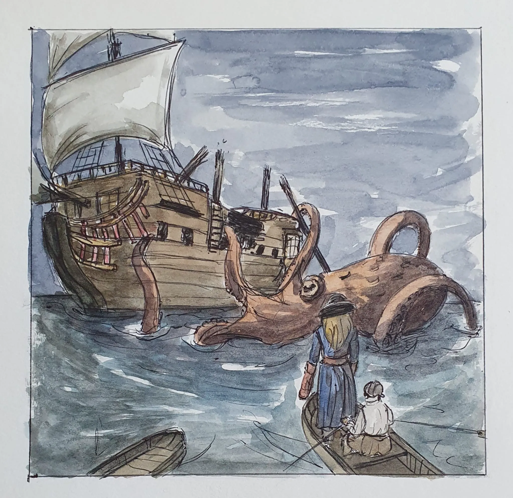
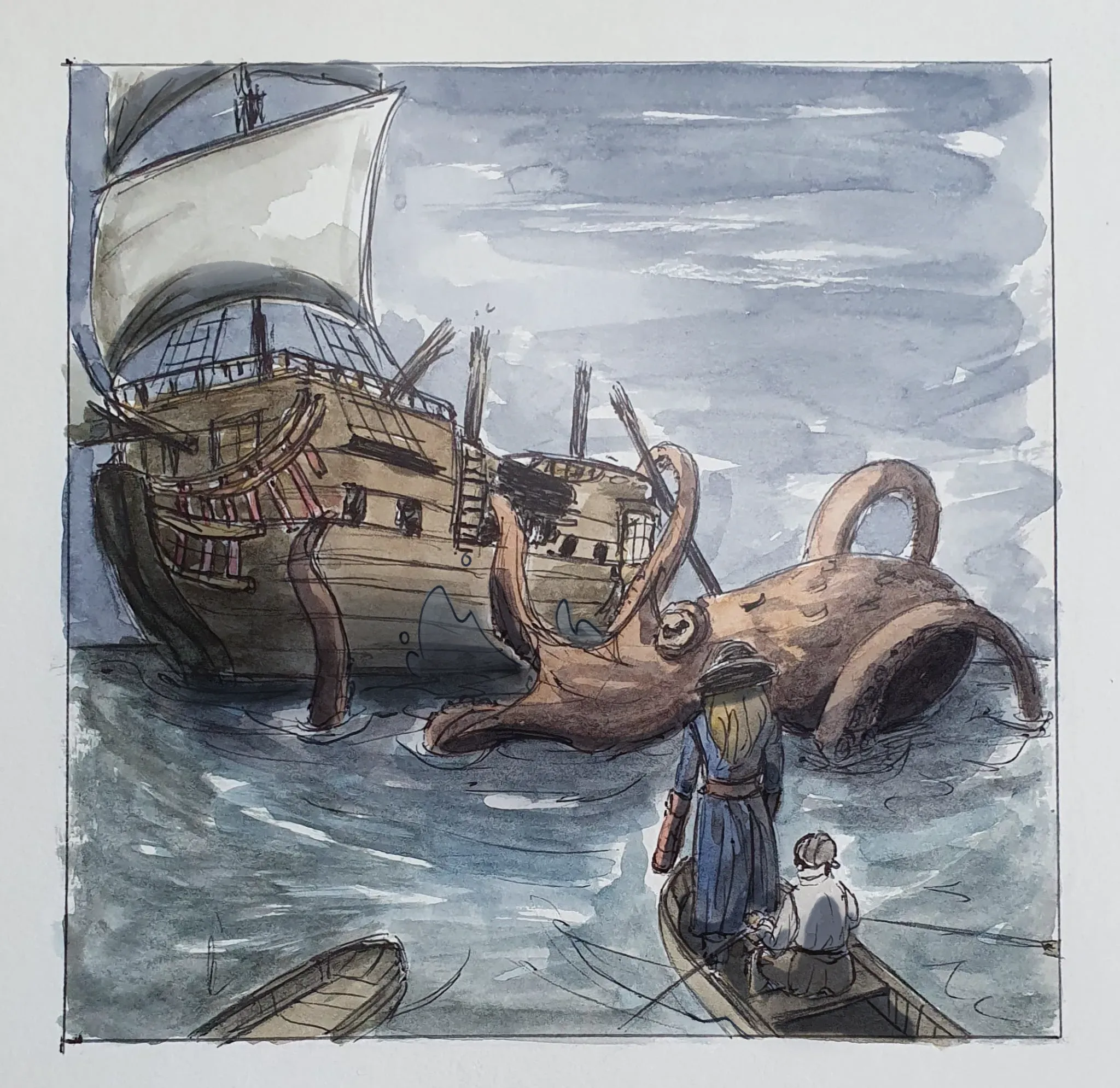

I love how you did you overall theming, the desaturated colors really add to the overall piece!! My main points are the values and movement of the waves. The best way to check if your values are good is by using a grayscale filter over it, if it all blends together, then the values aren't super clear :] With how big the kraken and ship is, the waves would be more aggressive and wavy. My doodle isn't the best example since I'm not the greatest at drawing water or waves, but when in doubt, references always help!
Paintovers (1)
Octopus attack
Artist's notes:
Hello, how could I improve on this? The ship could be better i think. Maybe the composition and perspectief and the light maybe. It should look like the have to abandon the ship, while the octopus is destroying the ship.