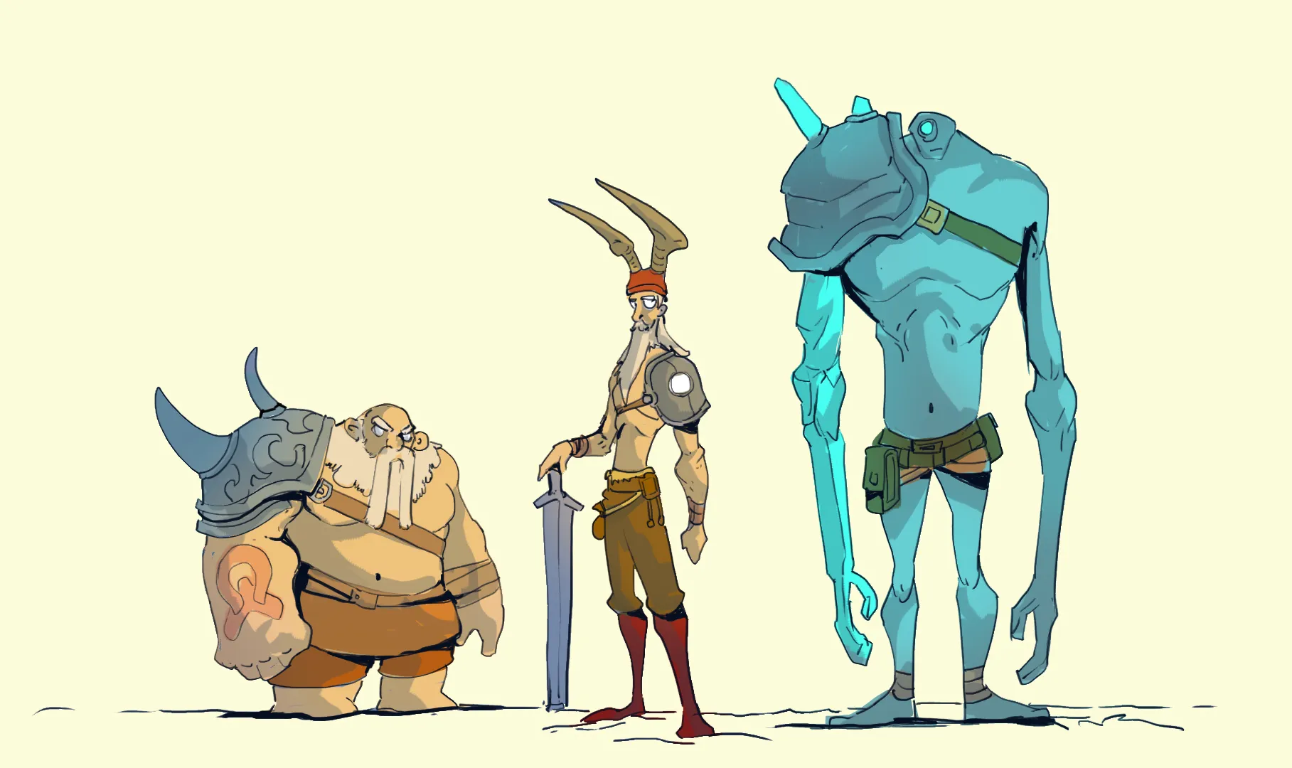
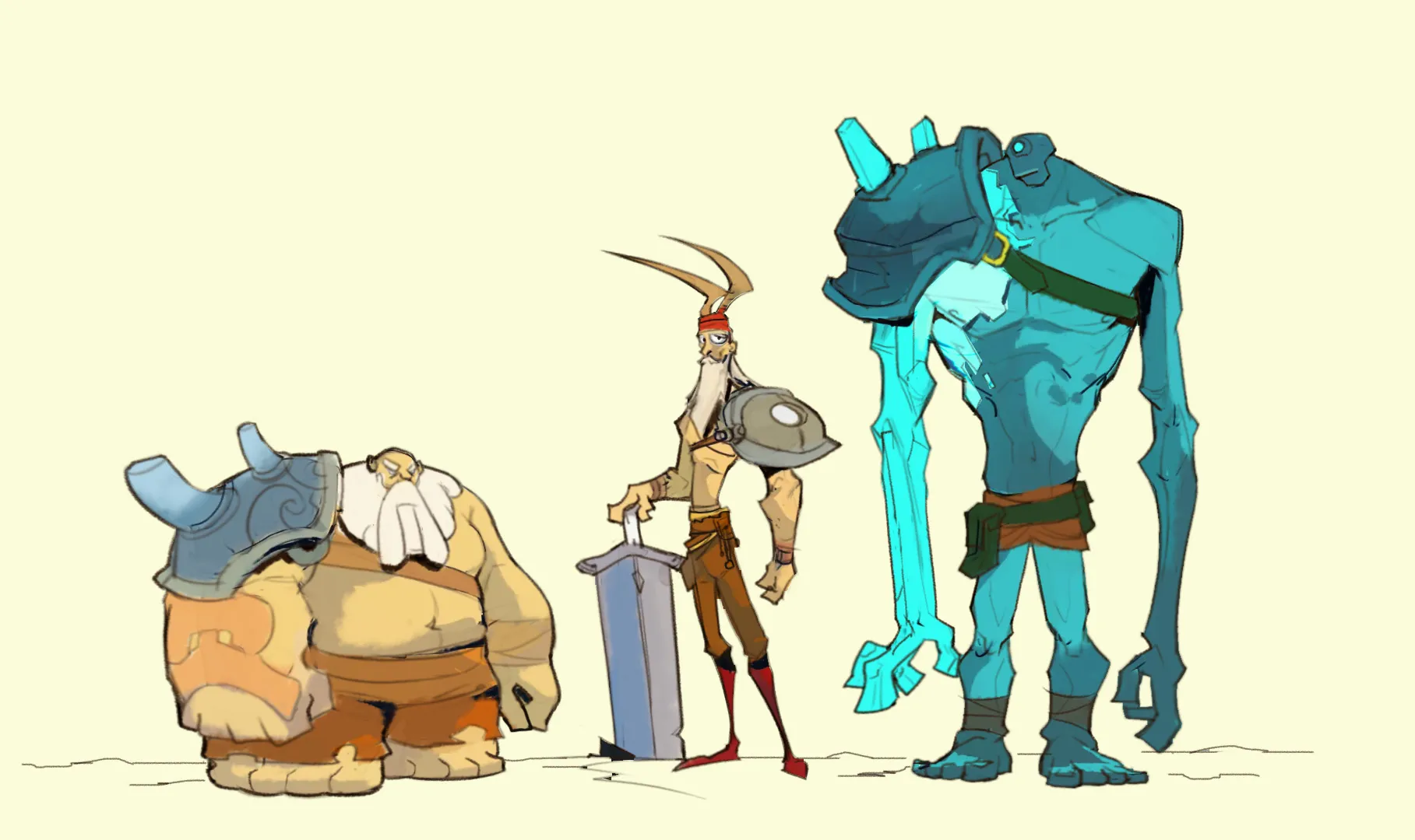
I can't do a paint over but I would exaggerate your shapes more.
Paintovers (1)
character design practice
Artist's notes:
looking for some feedback on the use of shapes
Comments 2

Hey! I honestly think this is your best design lineup yet. The character variety is awesome, and you have a really fun, appealing style right out of the gate. I did a quick paintover to share one main tip: don't be afraid to make your shape language even **bolder**. Because your foundation is already so solid, you can really afford to exaggerate the proportions to make their individual roles instantly readable. For example, I squashed and widened the guy on the left to lean heavily into those heavy, immovable blocky shapes, and make his head smaller, stretched the middle character out to be sharper and much more angular. Pushing those primary shapes heavily. I like making the tank a literal inverted triangle and give the warrior extremely thin frame, just gives the whole lineup that extra punch of personality. Of course, you absolutely don't have to do exactly what I did here. There are a million different ways to make character designs stand out, so I'm really just tossing out some visual ideas for you to play around with. Really amazing work on these, you should be super proud of this set!