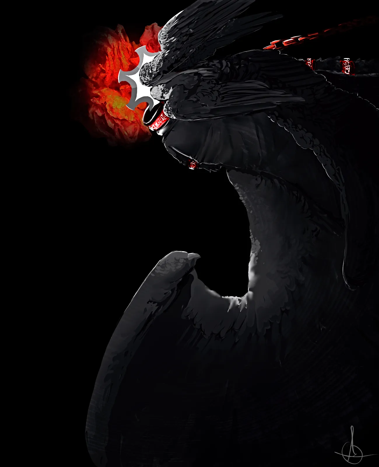

I could be wrong about this, my firs thoughts are that the big shapes are fighting for attention. The top portion draws the eyes in immediately with the red circular shape that stands out along with the wings and highlights pointing in a spiral shape towards the red sploch but its competing with the highlight on the wing on the bottom half of the image. I wouldn't say that it's a rendering issue so much as a compositional one. Great effort though, its pretty sick.
Seraphlaser
Artist's notes:
Not sure how to make the rendering look better ⁰_⁰,