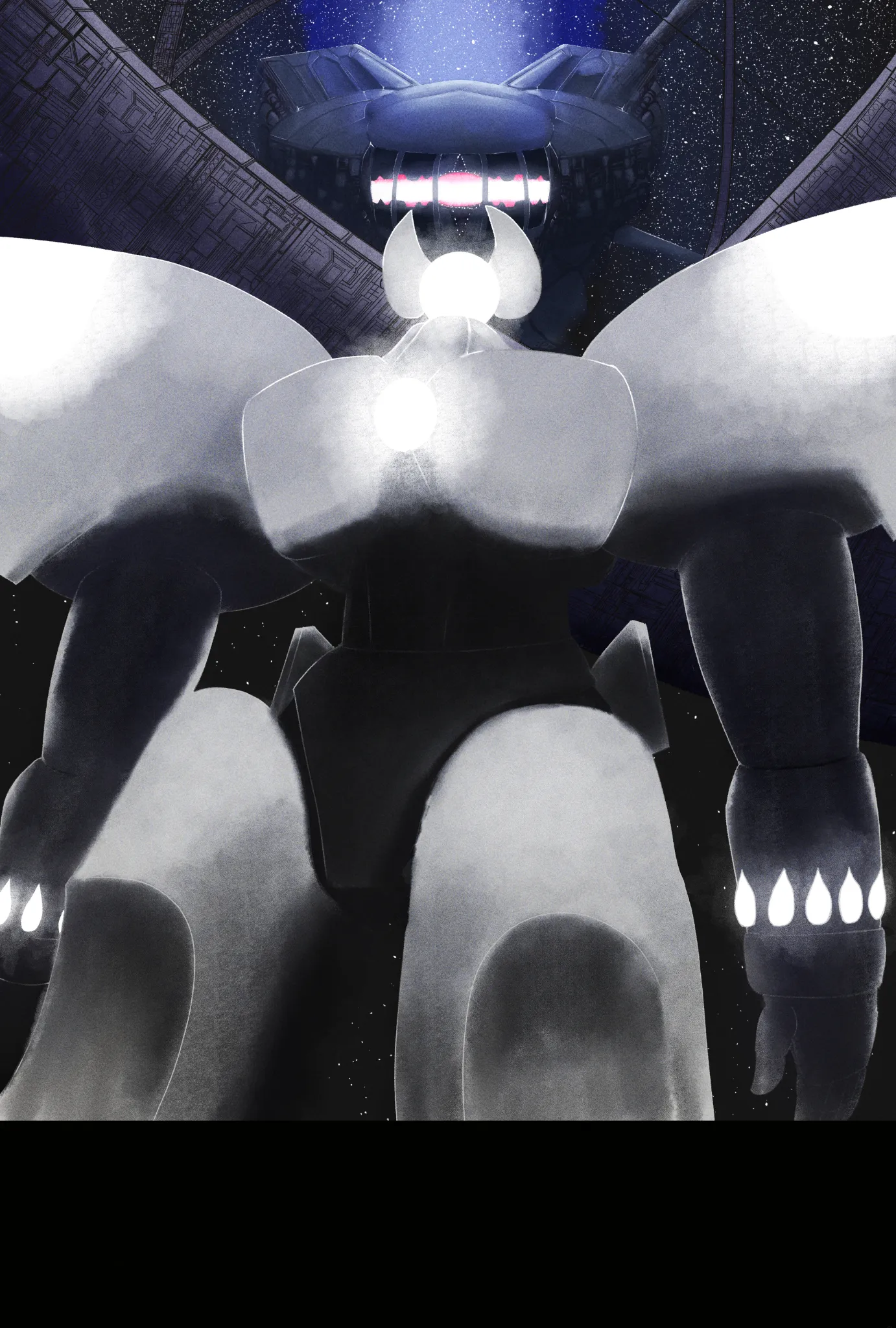
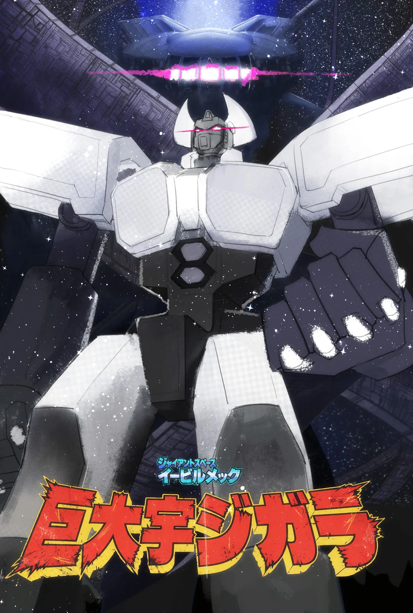

Hey there! I actually really love your vision, the soft lighting gives it this incredibly cool, ethereal vibe that makes the mecha feel totally god-like and imposing. I do see what your friend means about the shadows, though. Because metal is a hard, rigid surface, using purely soft gradients can sometimes make the armor look a bit organic or doughy. I did a quick paintover to show how mixing your awesome glowing lights with just a little bit of hard-edge definition can really help it read as a giant machine: Mechanical Joints: Honestly, my own mecha drawing skills are pretty bad, it is a tough subject! But one thing that always helps is cutting in some functional joints. Giving the neck, shoulders, and hips some visible mechanical connections grounds the design and shows the viewer exactly how this massive thing moves. Defining the Armor: Squaring off some of the plating and adding some sharp, distinct shadow lines gives the shapes that heavy, manufactured feel without losing your dramatic lighting setup. Retro Poster Vibes: Since you mentioned being inspired by legends like Ohrai and Takani, this composition is absolutely begging for some old-school 80s anime movie titles! I threw some huge, dramatic typography onto the mockup just to show how perfectly it fits the mood you created. (Full disclaimer: I am not Japanese, so those are just random characters thrown in for the visual showcase!) Your sense of scale and atmosphere is already fantastic. Keep experimenting with mixing those soft, god-like glows with some hard metal edges!
Paintovers (1)
Starry Sky
Artist's notes:
My friend is saying the shadows are a little off with the mecha in the middle, and I am kind of confused with it. He also said it was blobs, or something like that. Also any other advice, would be helpful. (Poster inspired off of Okiwara, Ohrai, and Takani's style)