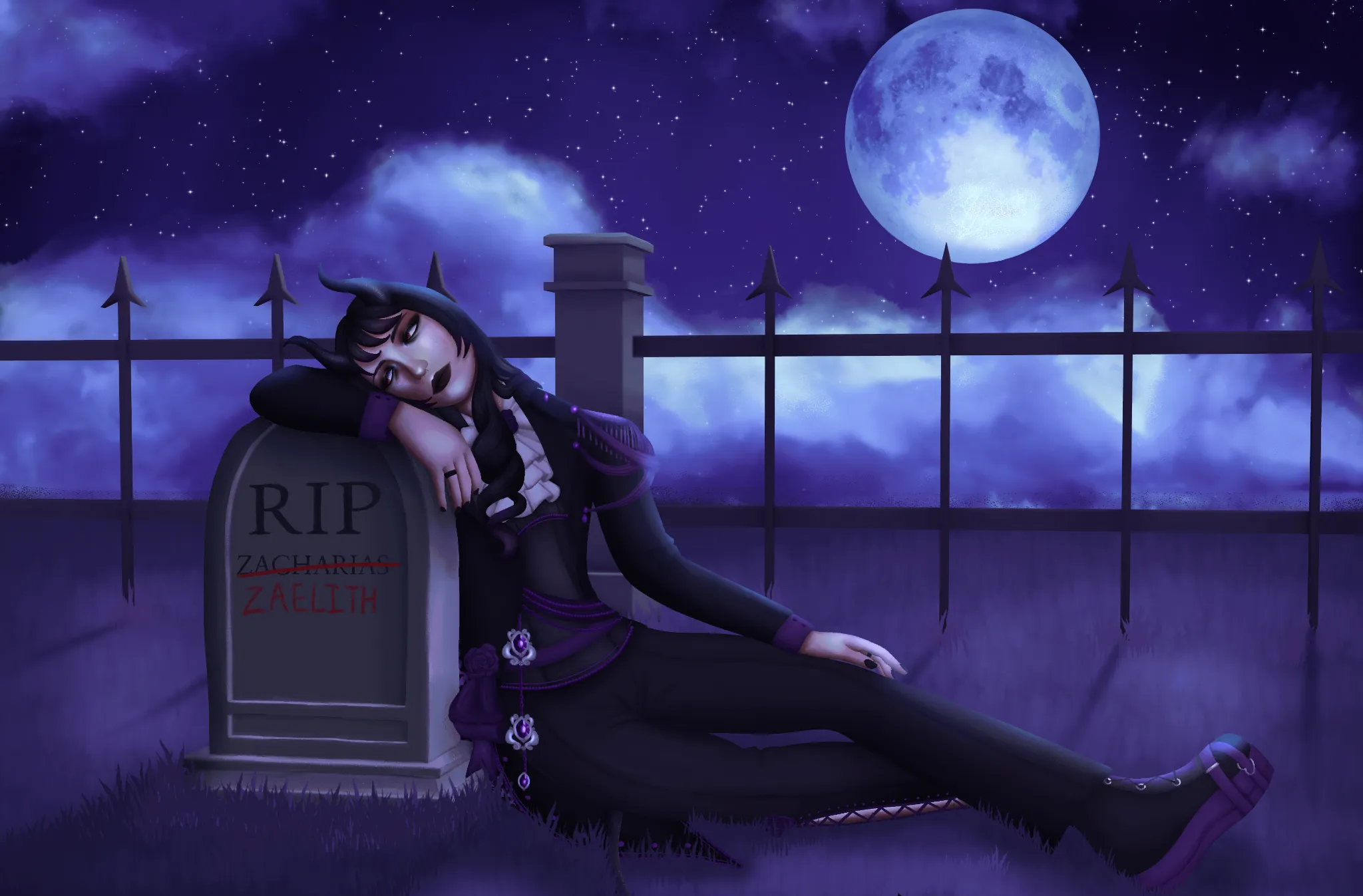
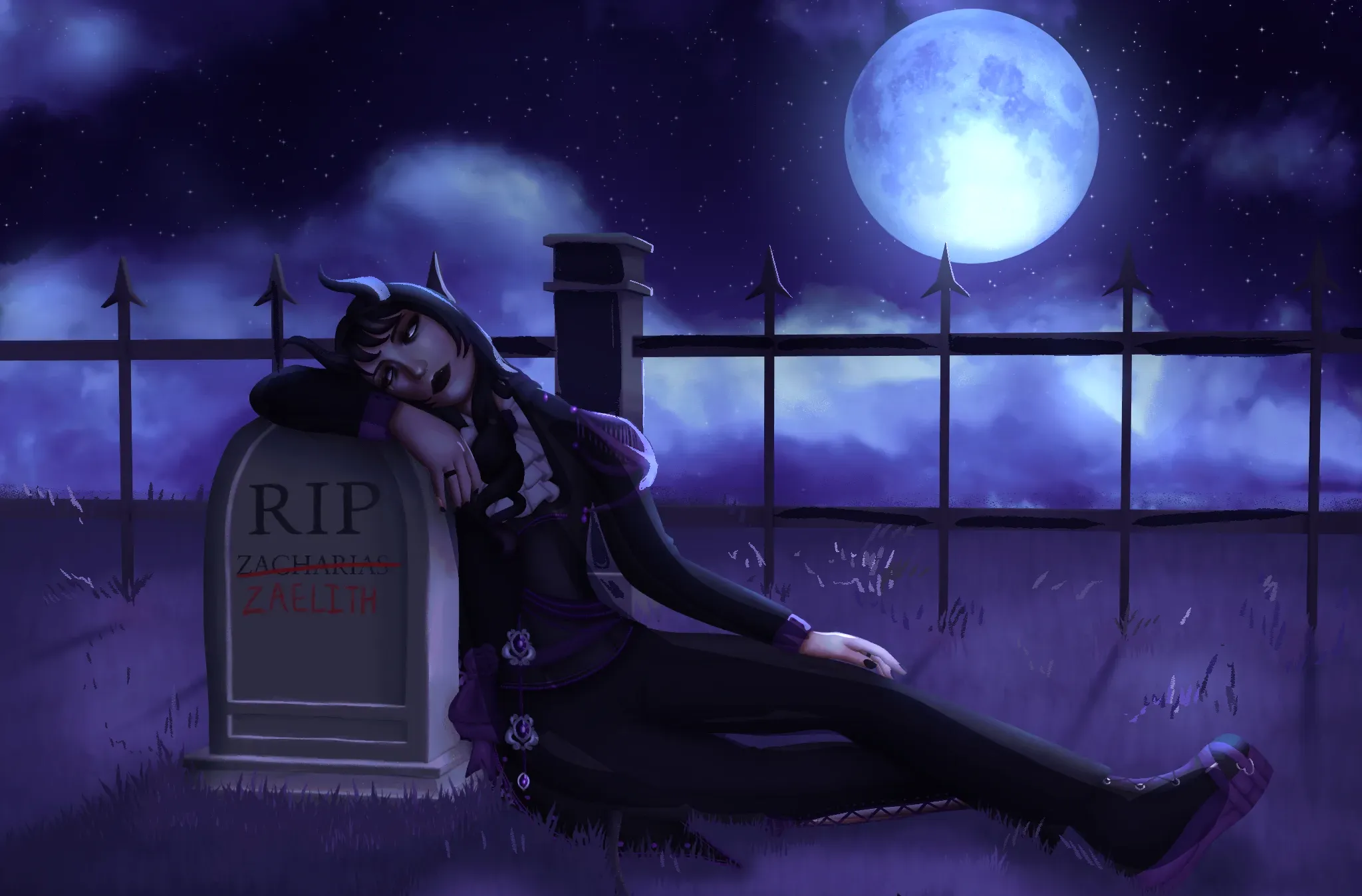


What I would do is focus on contrasting values and sharper lighting. The way the lighting was didn't really differentiate between the forms much (i.e. the horns to the hair and the details on the sleeves.) I also heightened the contrast for the background: making the shadows darker and the highlights lighter. I would suggest looking into your grass brush's settings and seeing if is has a color jitter setting to add a little more variation in the grass. Best of luck to you! You're doing so great!
Paintovers (1)
Oc Artwork
Artist's notes:
I feel like the rendering is off in some area, please help