Want to store your feedback?
Sign up to store all your feedback in one place on your account. Your feedback will be private instead of public.
Paintovers
Paintover Notes
Choose a paintover
Pick a user avatar to see their paintover notes and discuss them.
Also need help with rendering?
Improve your values and blending, a 3 min read
Beginner's Guide to Storytelling Through Comics: Easy Steps for Your First Comic
Master comic storytelling by blocking shapes, simplifying forms into mannequins, imitating professional styles, then creating your own narrative-driven panels.
Rendering
Would you like to help someone who's still waiting?
Perspective and Form
No responses yet
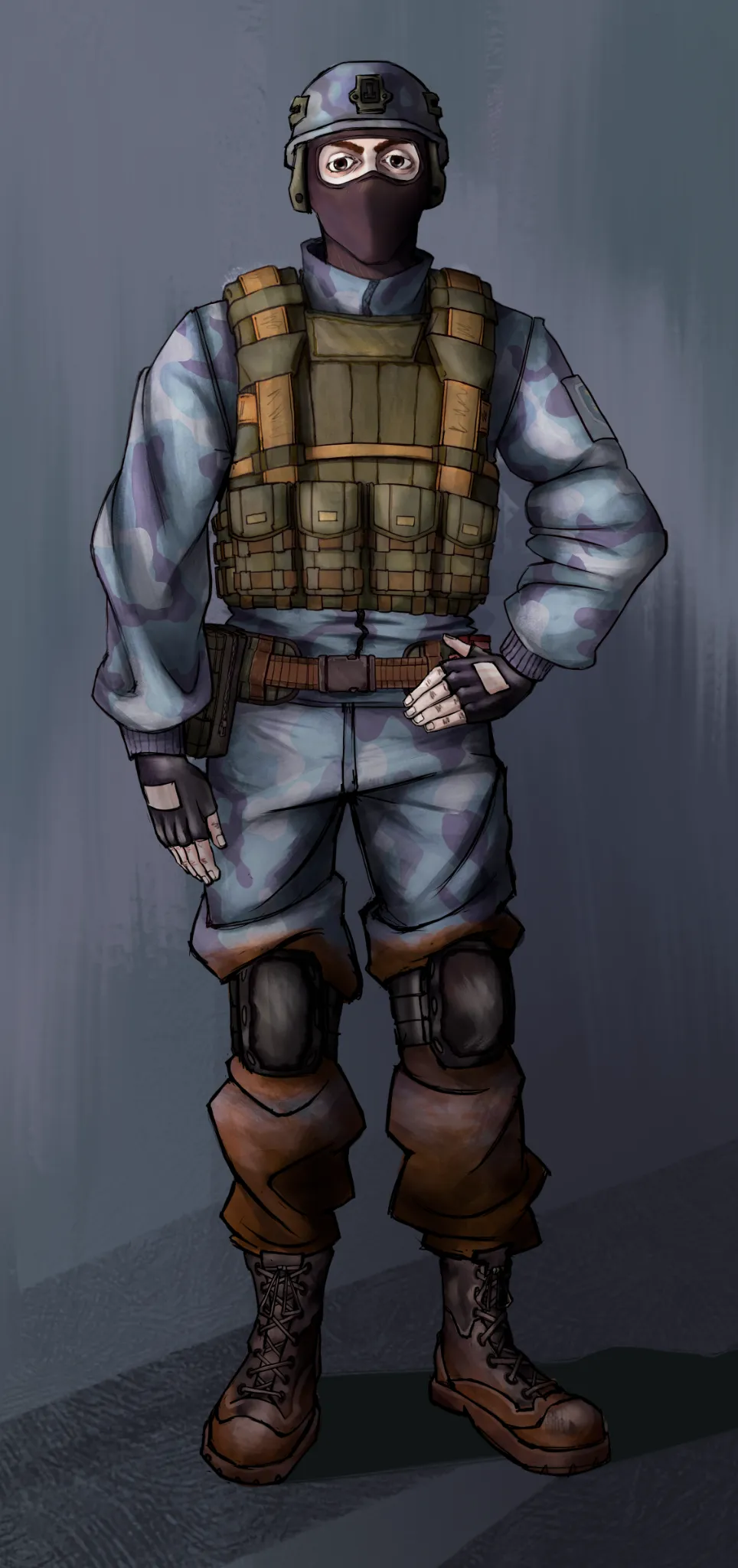
CragDyna
I want to get better at communicating shadows and perspective. That's something I've always struggled with. I'm sure there are some things I could've done better, but I need a seasoned eye to tell me what specifically.
1 hour ago
View
Rendering
No responses yet
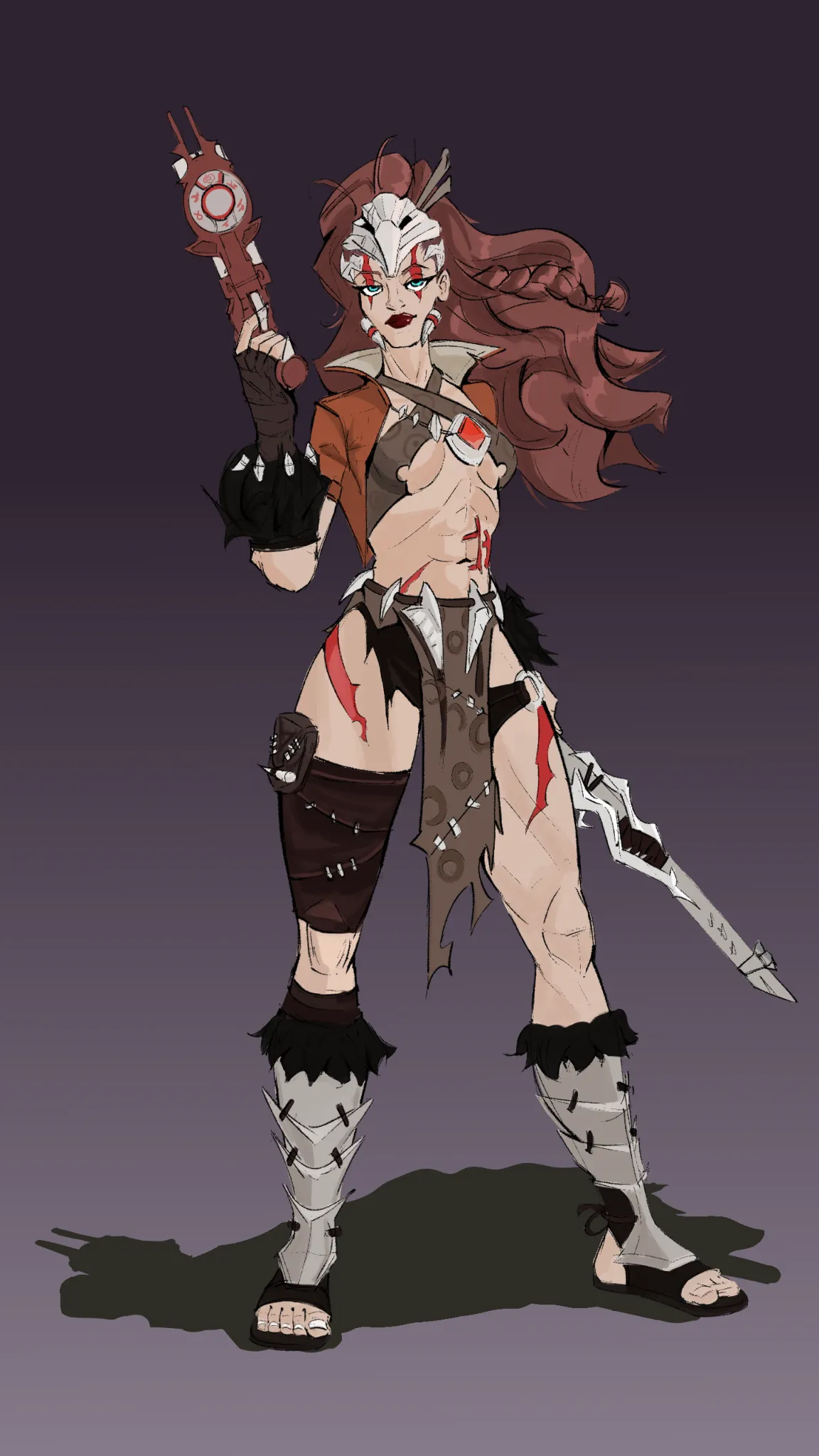
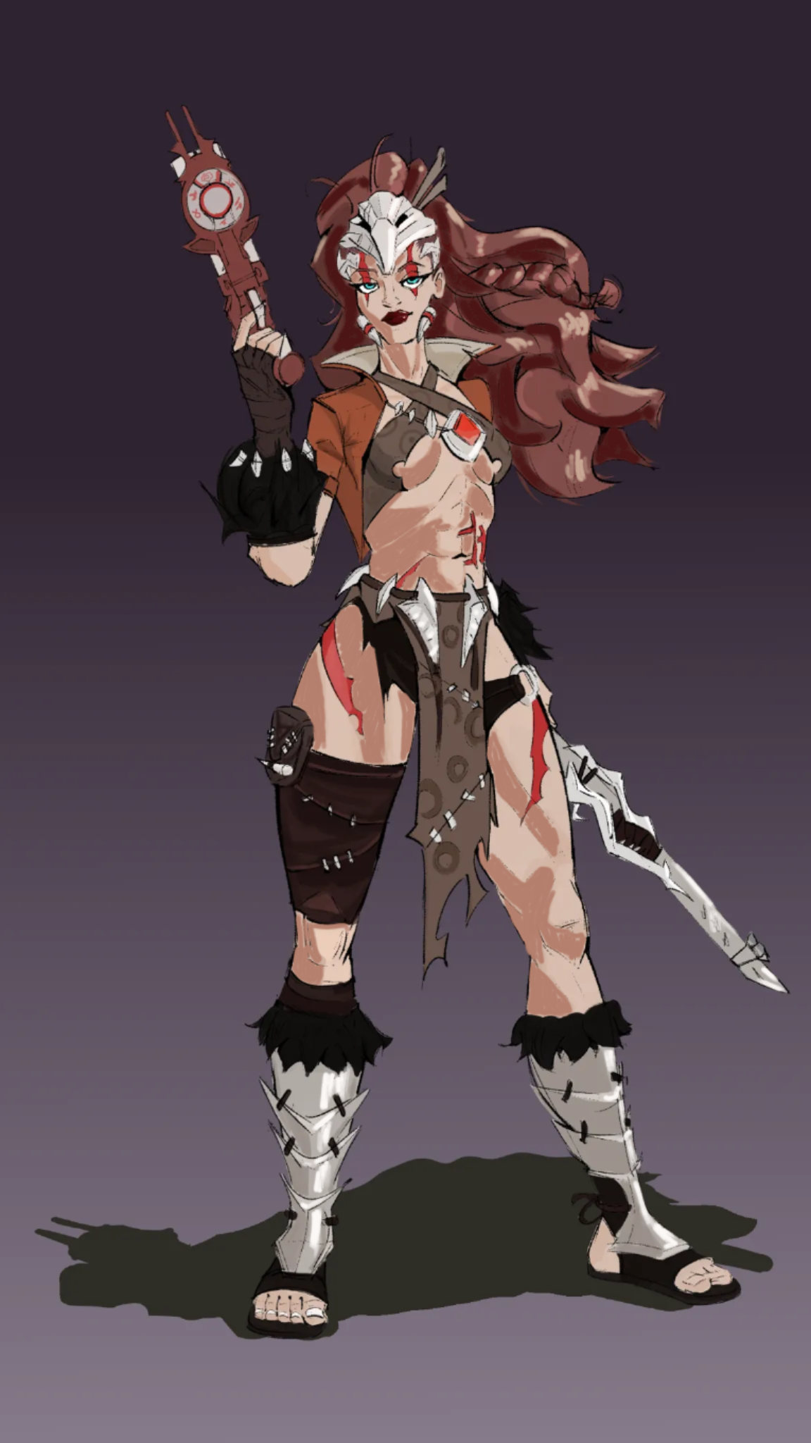
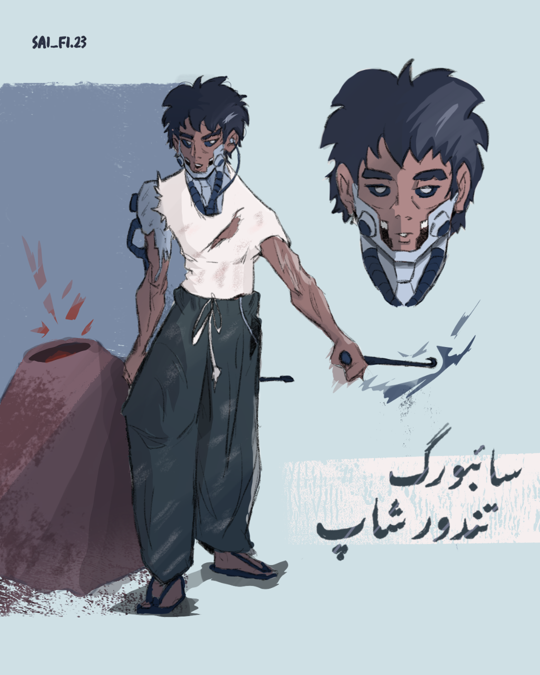
A character i drew, want to get some feedback
This is a commission i drew recently, and i think that aside from the boots, my texturing and render is kinda week.
2 hours ago
View
Figure
No responses yet
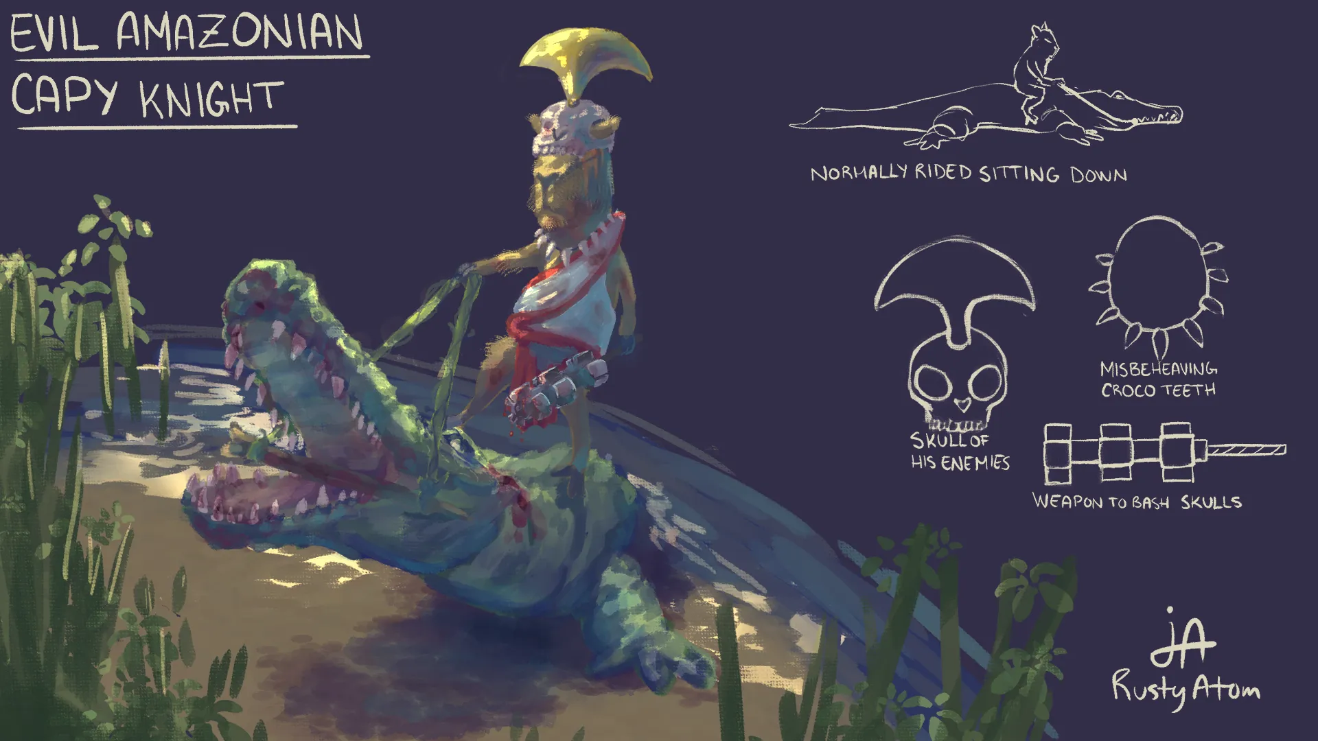
Bread maker Saleh
How can I improve the pose overall and make it feel more dynamic, I feel like the arm holding the rod can be executed better, other suggestions are appreciated as well.
2 hours ago
View
Perspective and Form
No responses yet
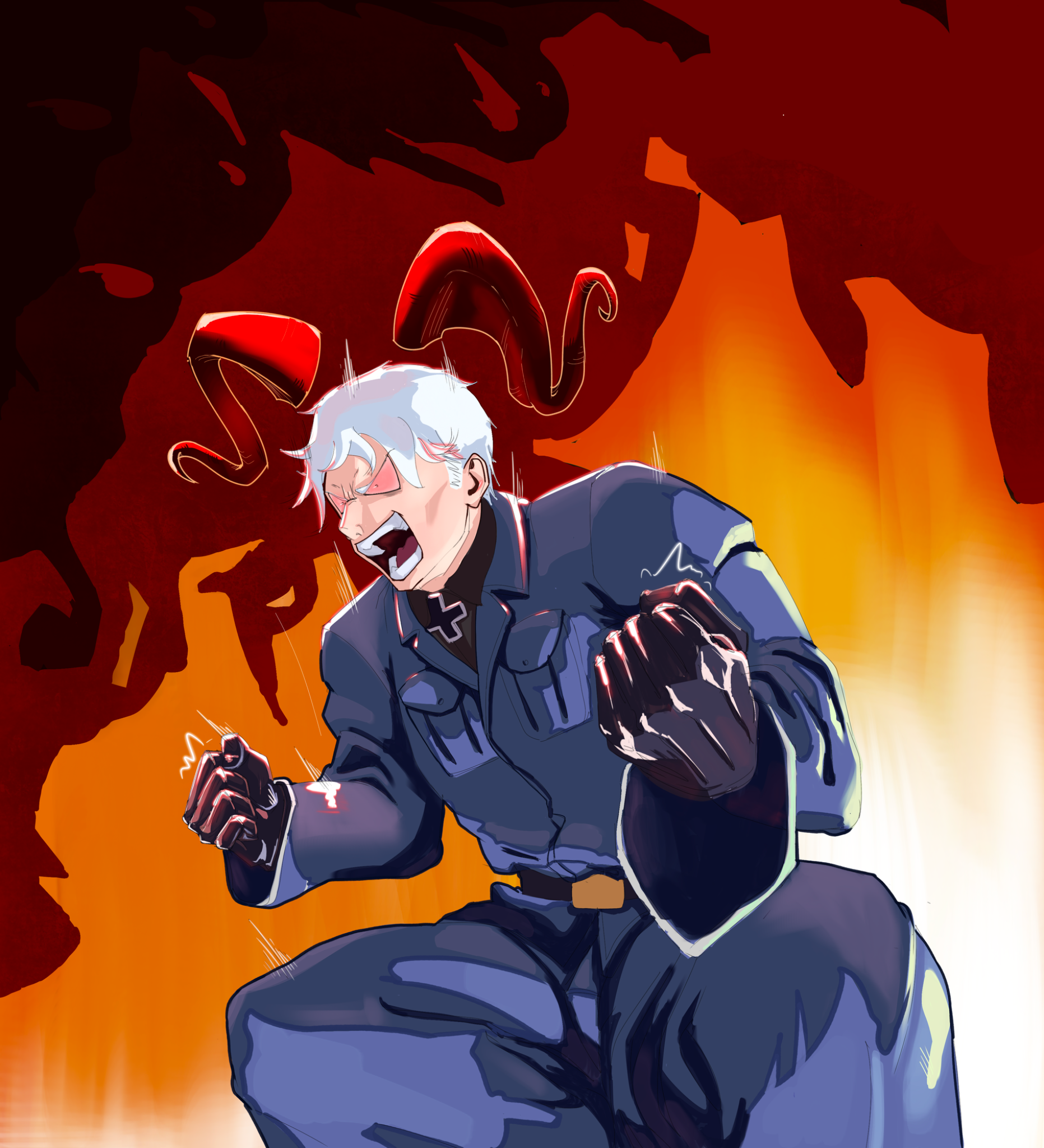
Evil capy knight
So, did this for this year's Chroma Corps assignment yesterday, and as proud as I am of this piece, I really did not receive the feedback I thought I would. I know my weak point is presentation, but I have also always struggled with both perspective and colors. I feel like the alligator and capy could've been in a more dynamic angle on more intense perspective, but I have no idea how to get it done.... Any help and ressources would be so much appreciated 👏
3 hours ago
View
Rendering
No responses yet
Lighting/Coloring Improvements
Anything I could do to improve this? Thanks!
4 hours ago
View
Rendering
No responses yet
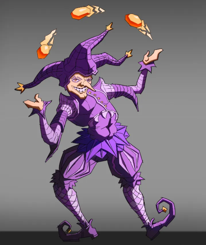
Character design, jester
This is practically my first piece of art without references. I drew it until I ran out of ideas on how to improve it. I would be glad to receive any advice.
4 hours ago
View
July Before & After Art Challenge
No responses yet
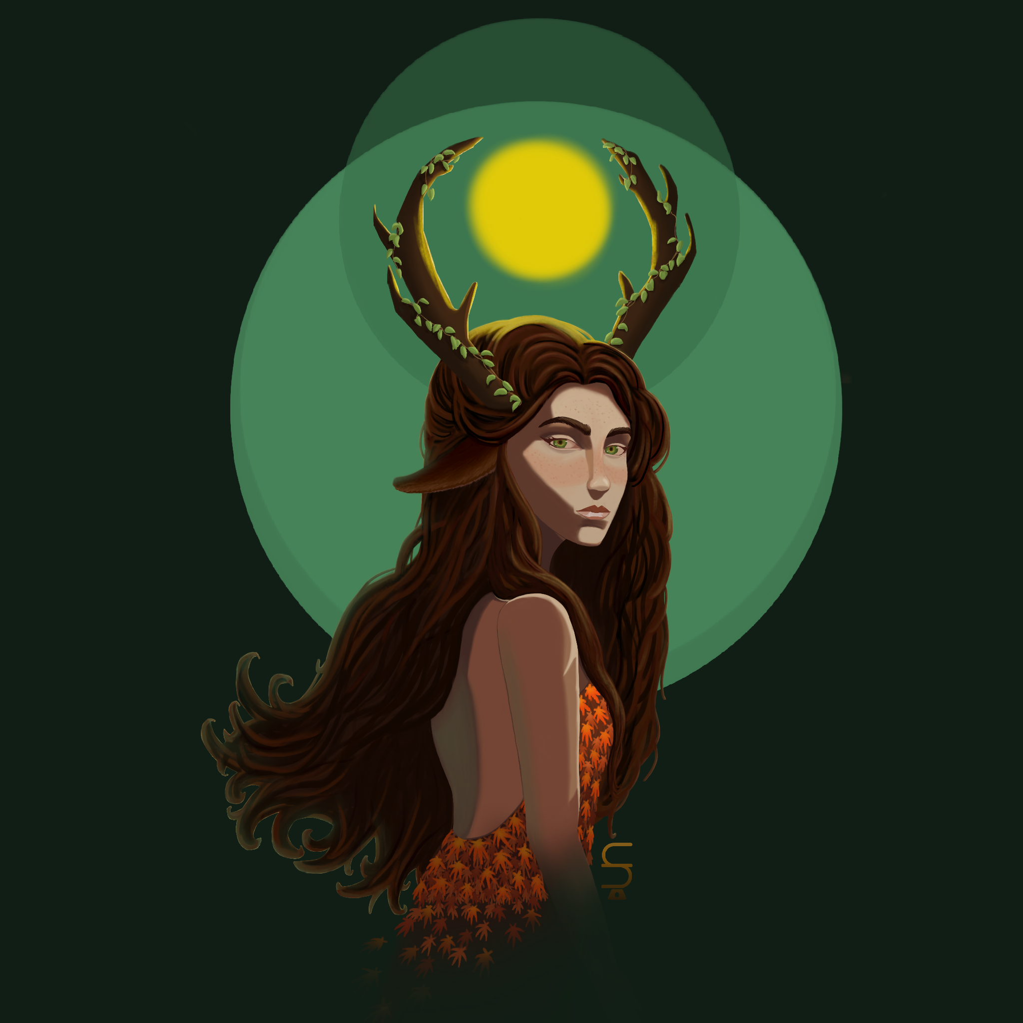
Profile illustration
Rework Thanks so much for your feedback, Fosco ! My drawing has really improved !
4 hours ago
View
Environment
No responses yet
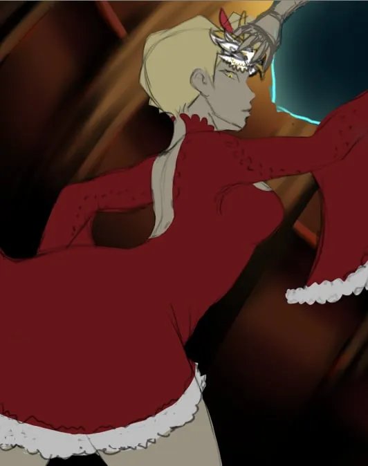
help me with the background
i really dont like the background it was supposed to be inside of a fancy mansion but it looks like a cabin i really dont know what to add. before i render i wanted to fix the environment first so it doesn't turn out bad
5 hours ago
View
Figure
No responses yet
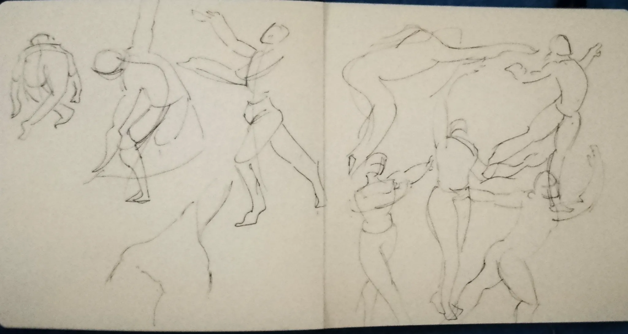
Figure drawing practice
Hello, I'm a beginner and I was practicing figure drawing. I'd like to know if I need to have certain criteria or what I should consider.
5 hours ago
View