Want to store your feedback?
Sign up to store all your feedback in one place on your account. Your feedback will be private instead of public.
Paintovers
Paintover Notes
Choose a paintover
Pick a user avatar to see their paintover notes and discuss them.
Also struggling with rendering?
Improve your shading and light control, a 3 min read
Beginner's Guide to Storytelling Through Comics: Easy Steps for Your First Comic
Master comic storytelling by blocking shapes, simplifying forms into mannequins, imitating professional styles, then creating your own narrative-driven panels.
Rendering
Would you like to help someone who's still waiting?
Portraits
No responses yet
Kazmo kramer
General
1 hour ago
View
Portraits
No responses yet
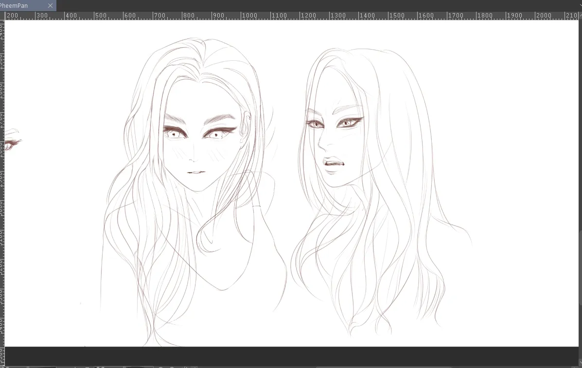
PheemPan
I'm really struggling with the features and the head. It felt like something is off here especially the 3/4th head.
3 hours ago
View
Figure
No responses yet
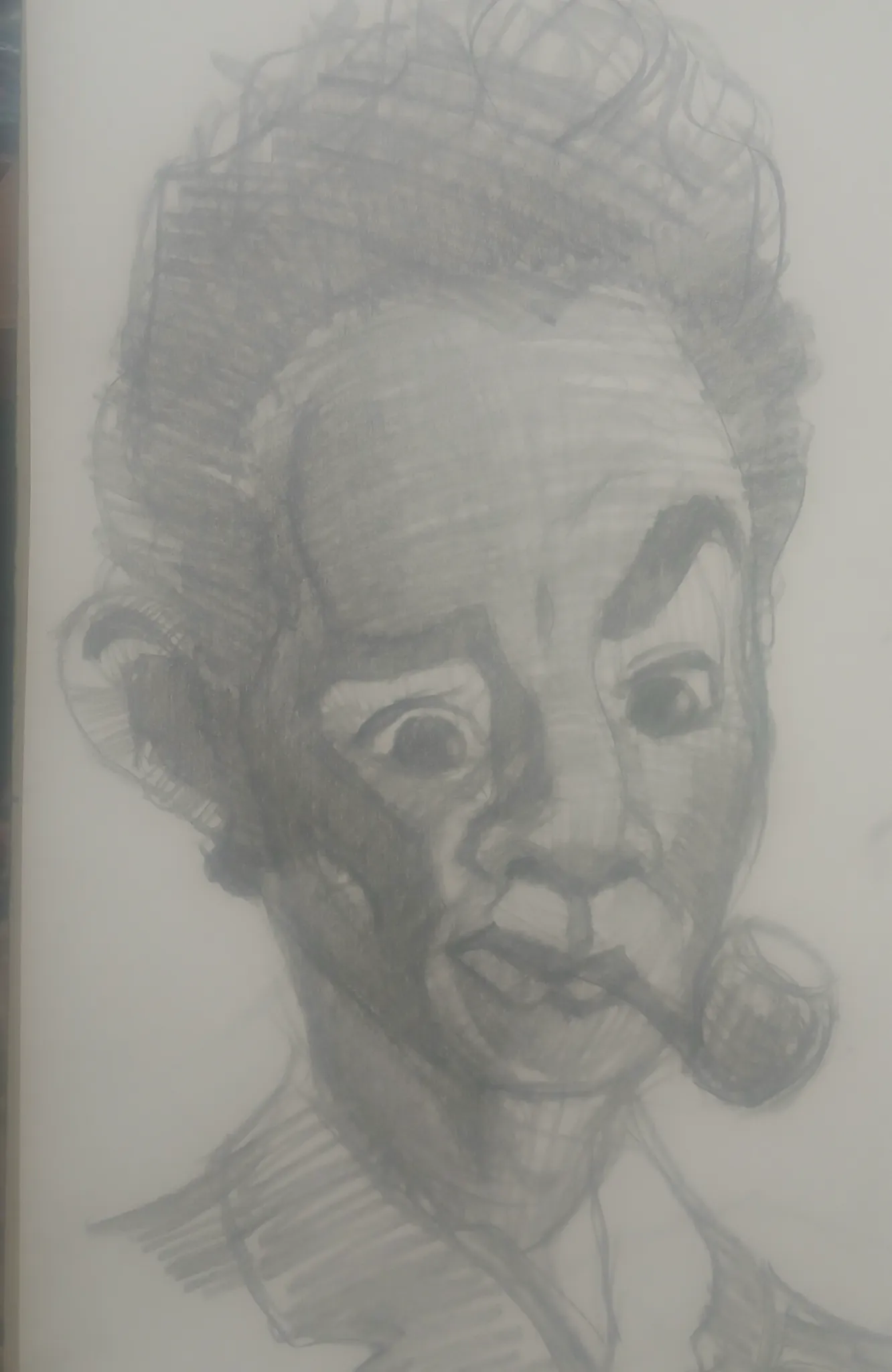
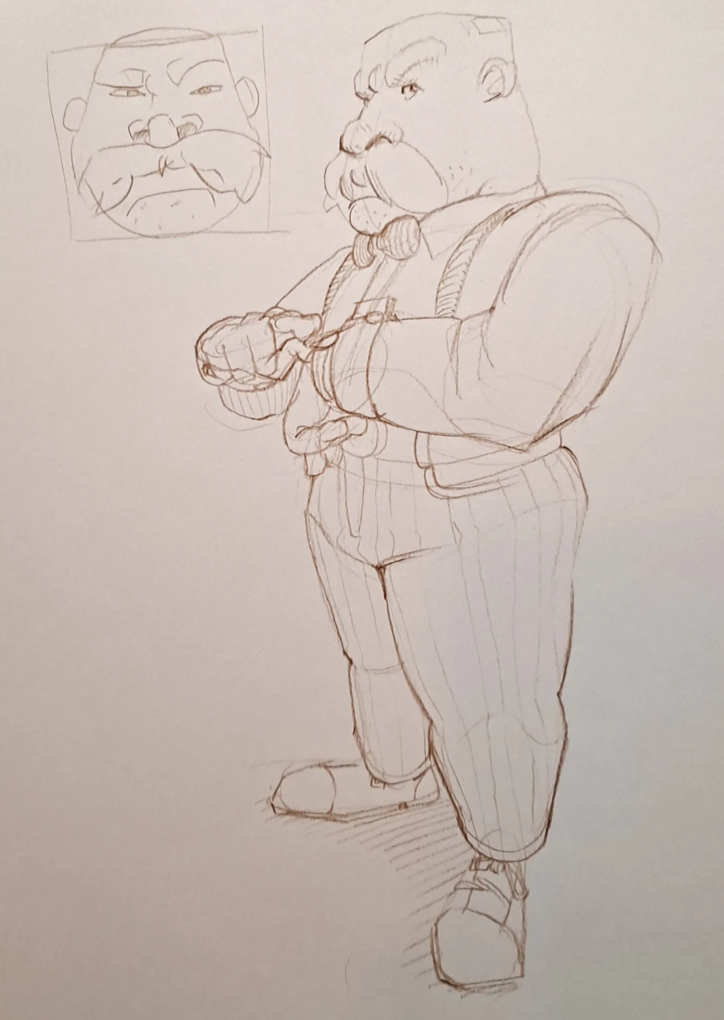
Fancy Dwarf Guy
This started out as a practice in unique head shapes and turning them in space, but it turned into a dwarf guy in a bow tie. Is the perspective working out? Any other thoughts? Thanks
9 hours ago
View
July Before & After Art Challenge
No responses yet
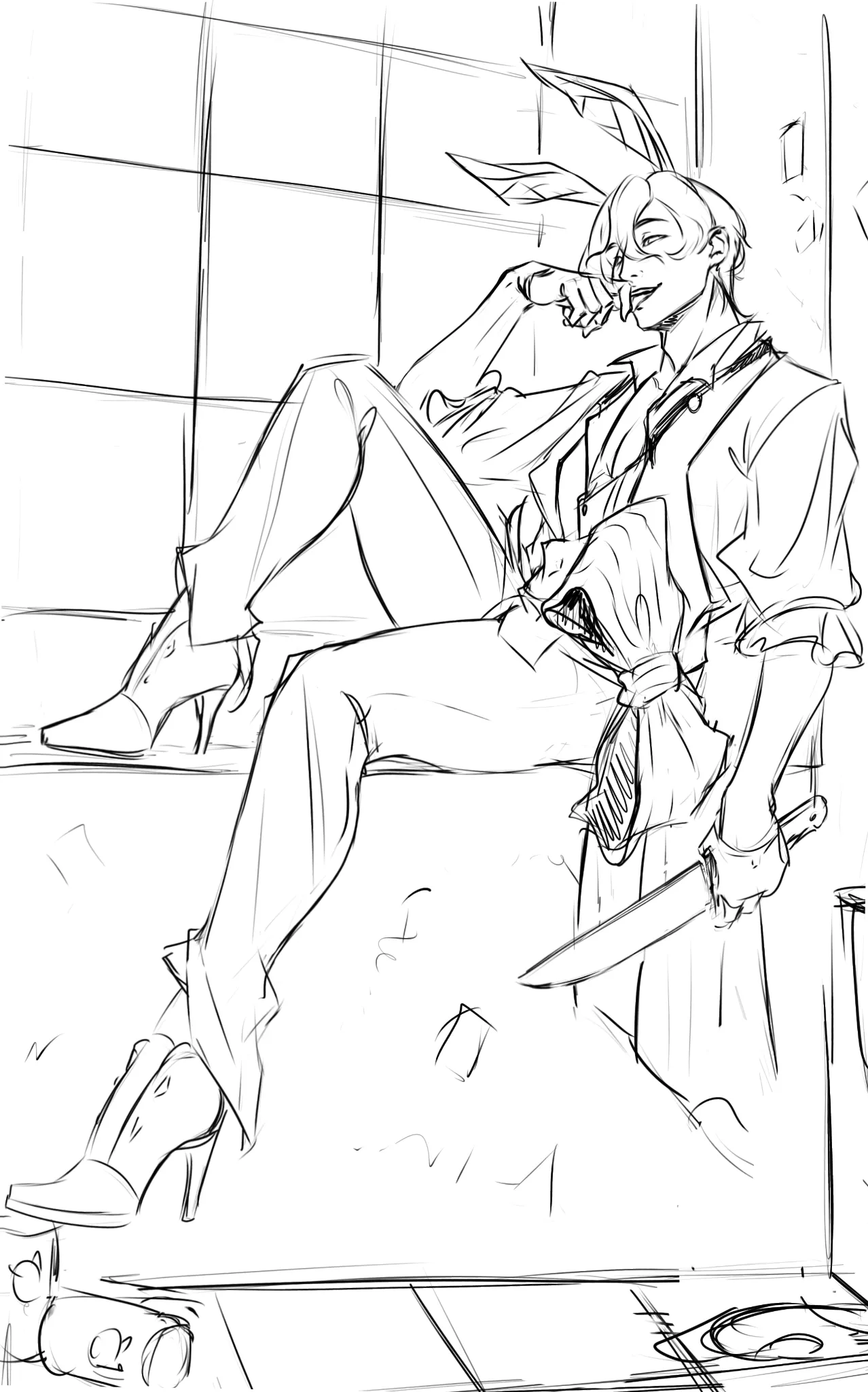
Redraw of an old piece - yandere bunny Belphie
Decided to go with version B based on feedback. Changed the angle a bit. Rough sketch before rendering. Could use help with anatomy >.<
11 hours ago
View
Perspective and Form
No responses yet
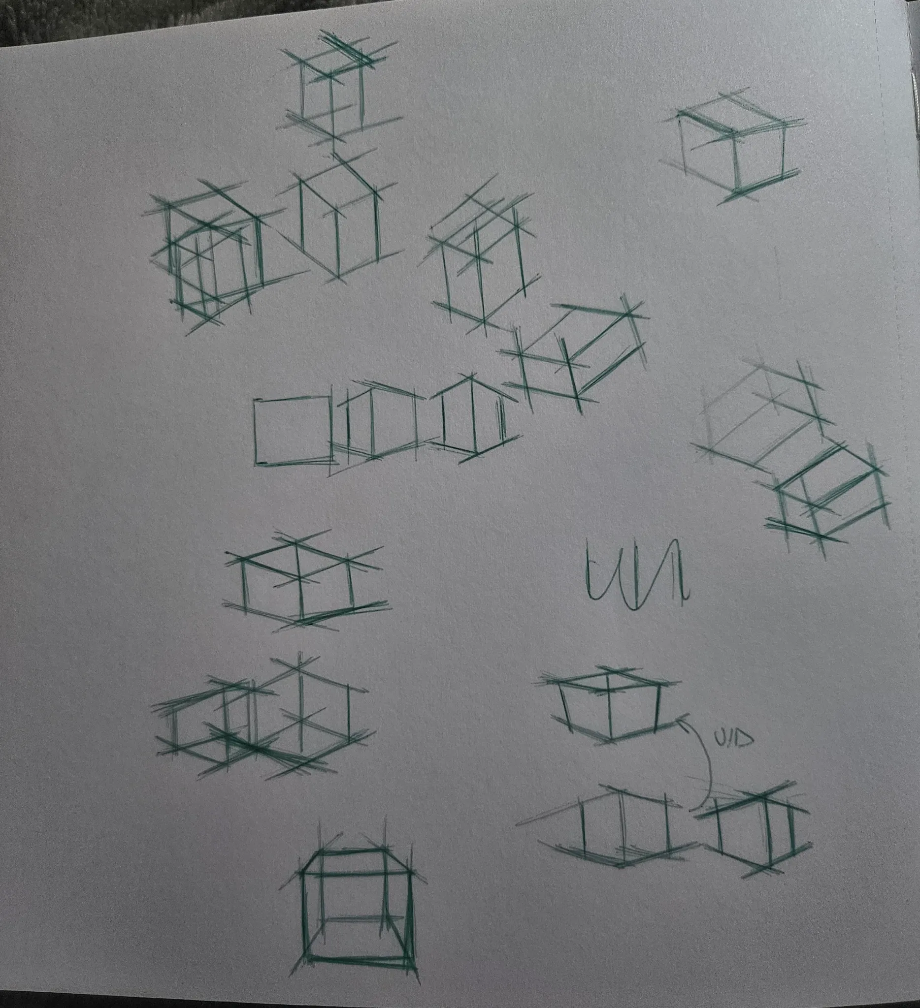
Boxes rotation 3 dimension
I'm doing box rotation exercised and it's been a struggle i cam see i am mpving and some ho rotating the box but i can figure out the logic behing it (like if i want to rotate in in the x or y or z axist what actually i need to change abt my lines and stuff) and i dont know if im doing it properly
14 hours ago
View
Figure
No responses yet
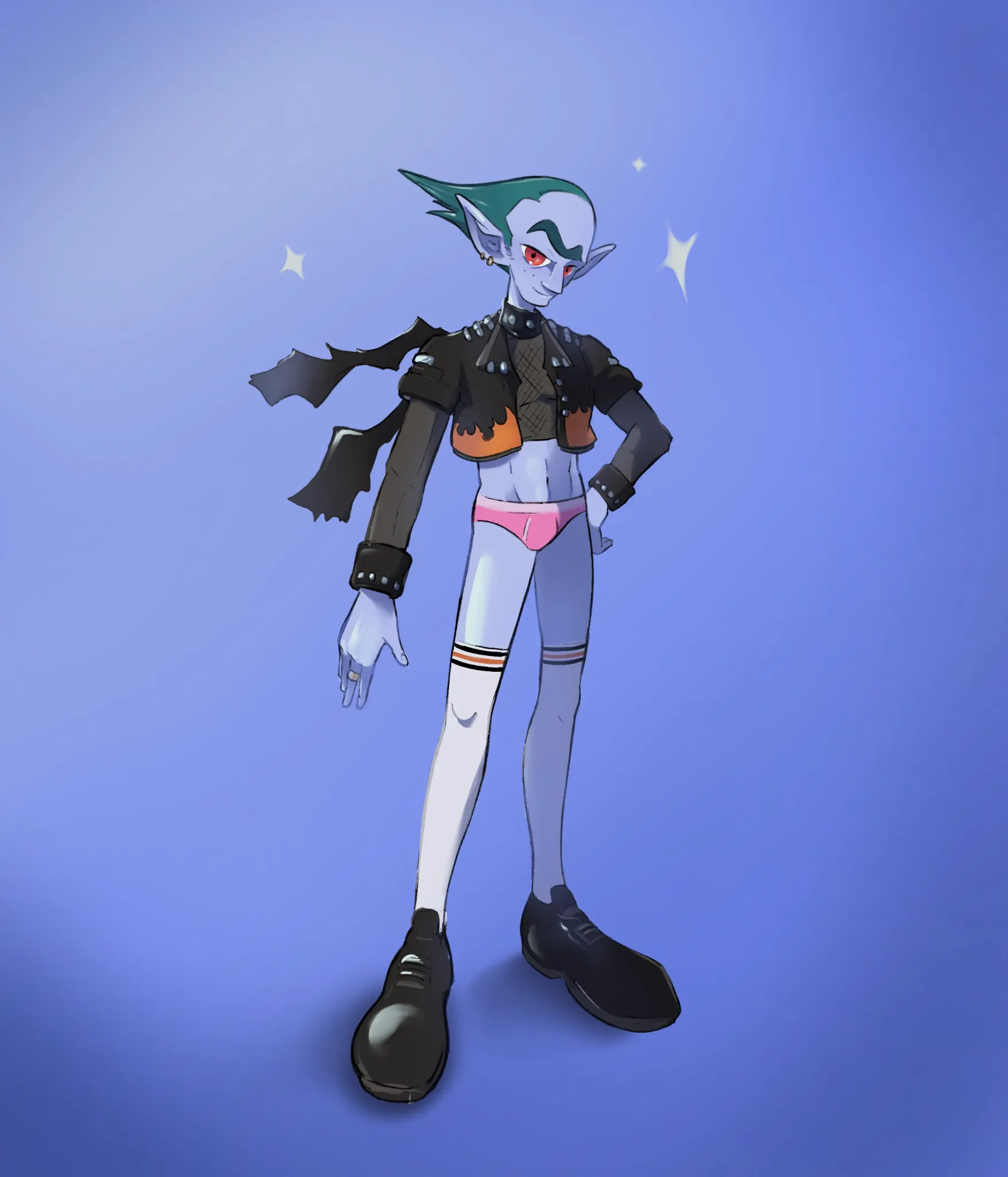
My OC protagonist
Need some feedback about character design and silhouete as well as rendering
16 hours ago
View
Perspective and Form
No responses yet
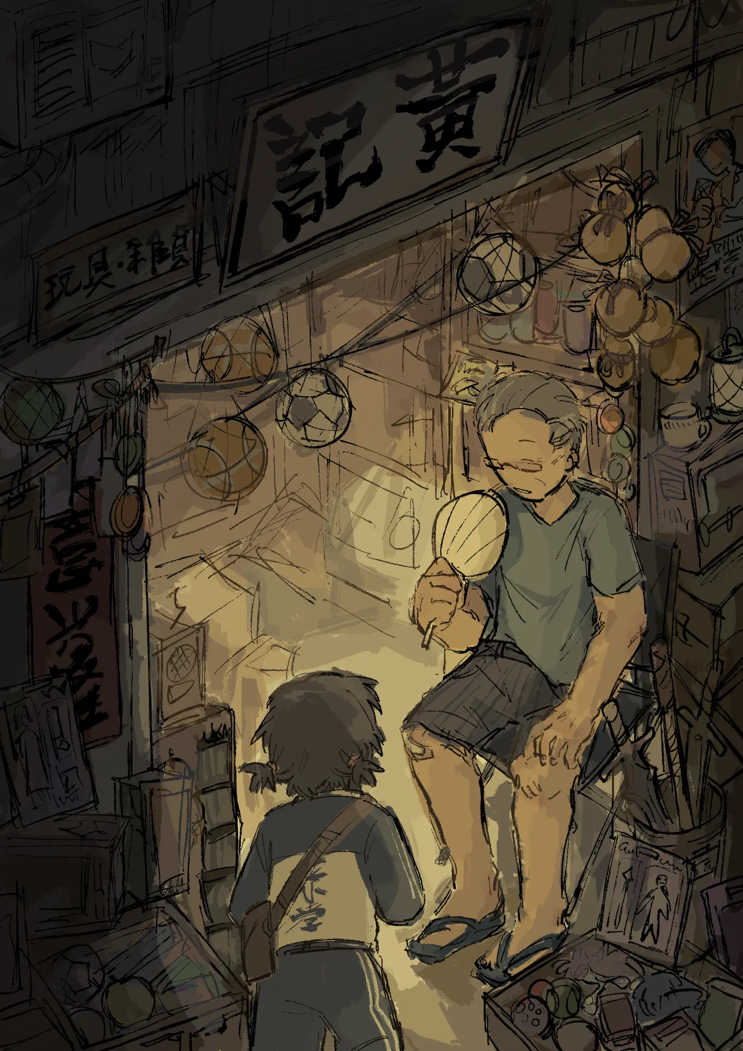
nostalgia
A bit of an older piece. Perspective is kind of off in this one i think (especially for the placement of the characters, and also the contrast and readability of the composition
17 hours ago
View
Perspective and Form
No responses yet
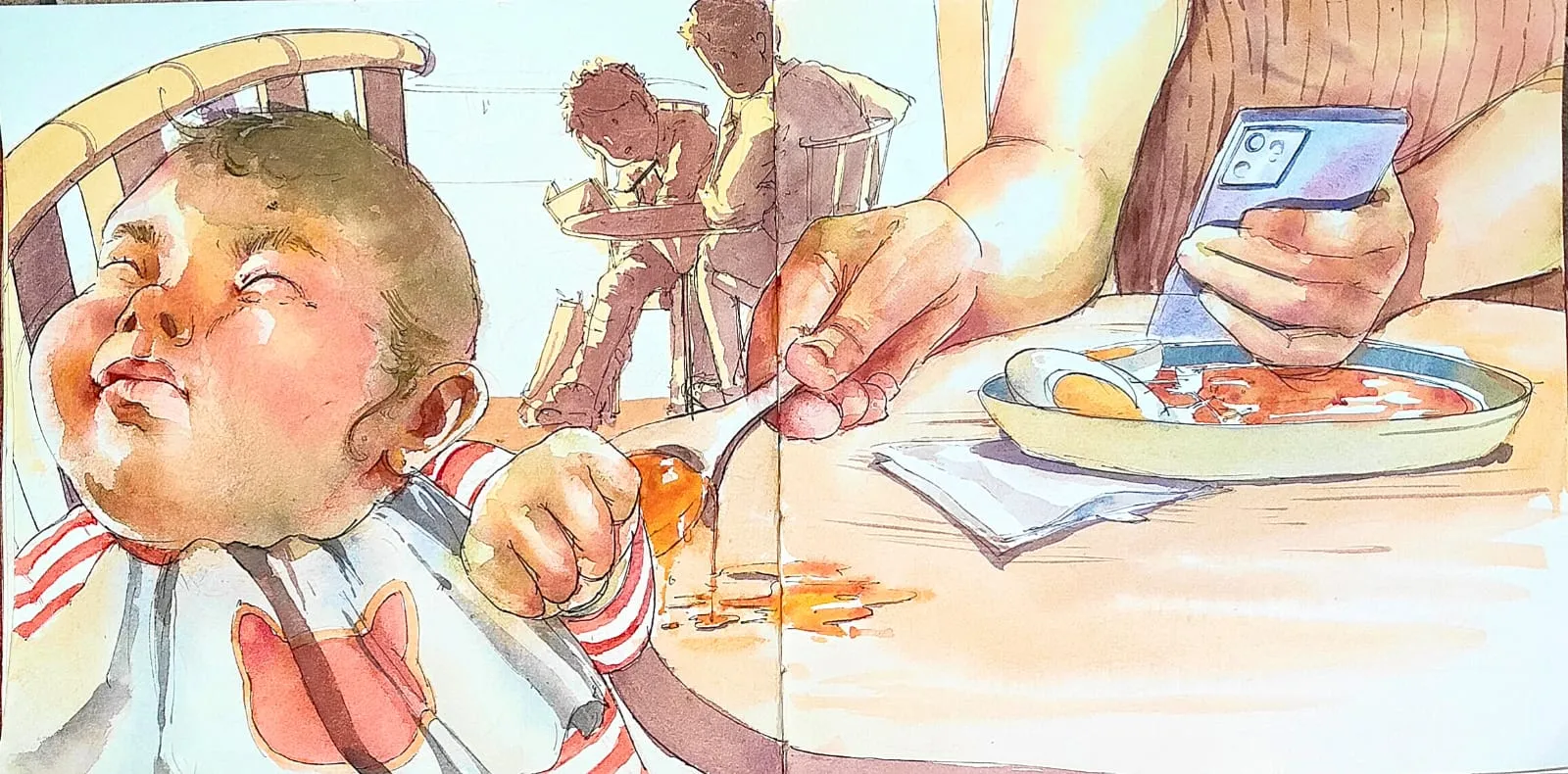
child protest
it was the quick one and i struggled with forms and frame
18 hours ago
View
Portraits
No responses yet
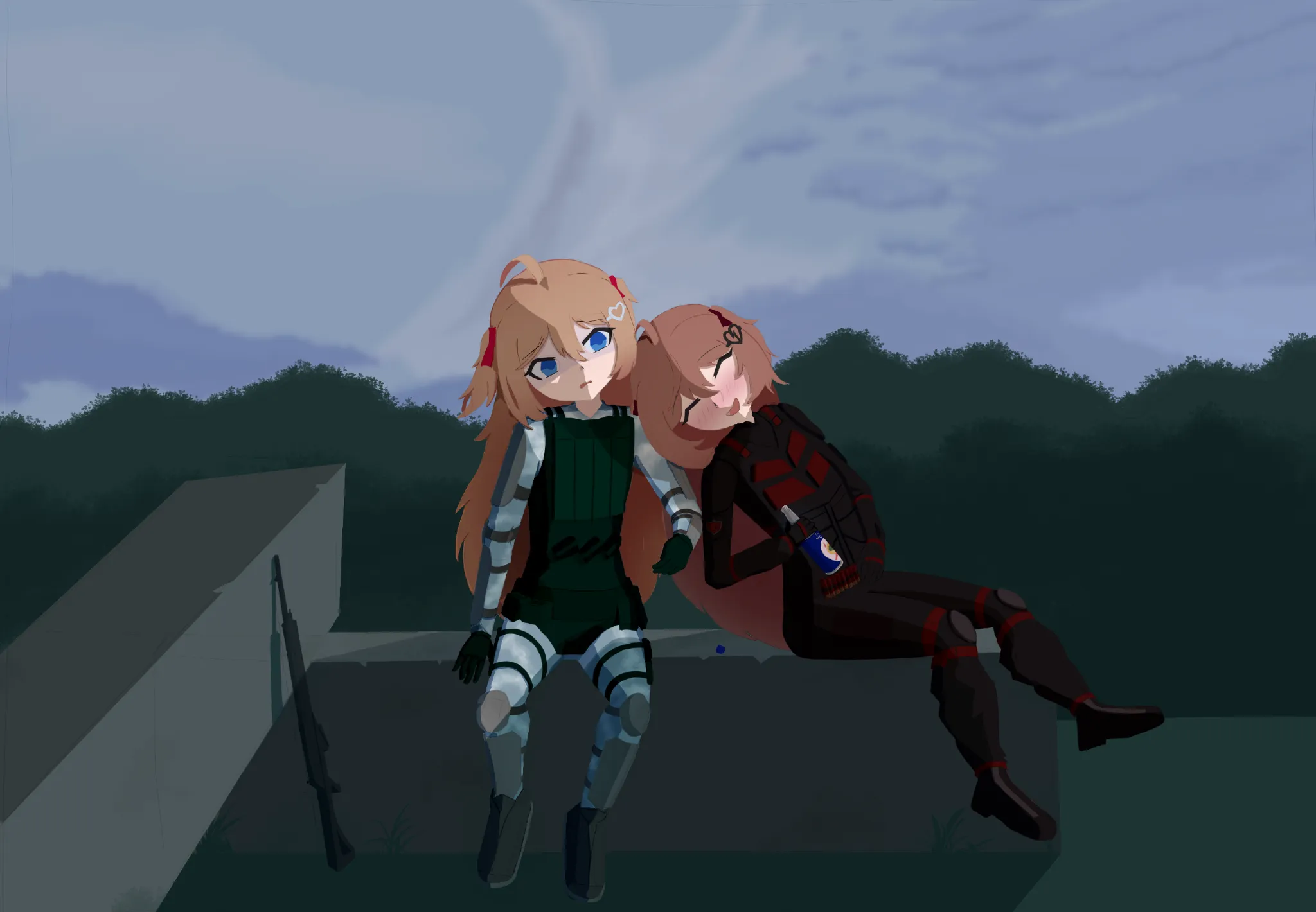
Stalker (game) themed fan art
Would like to know what I can improve on. Struggling a lot on composition, but wouldn't mind overall feedback
20 hours ago
View