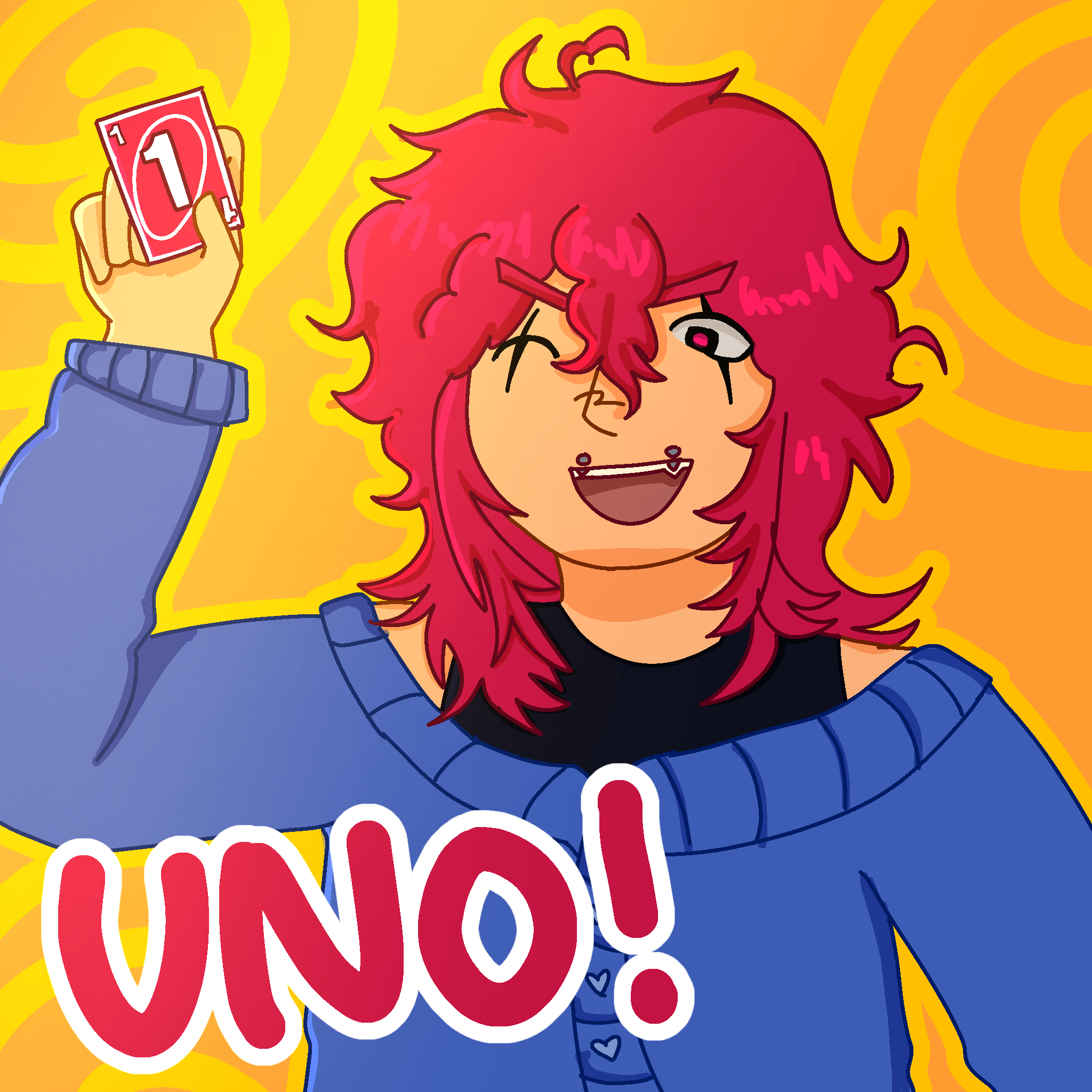
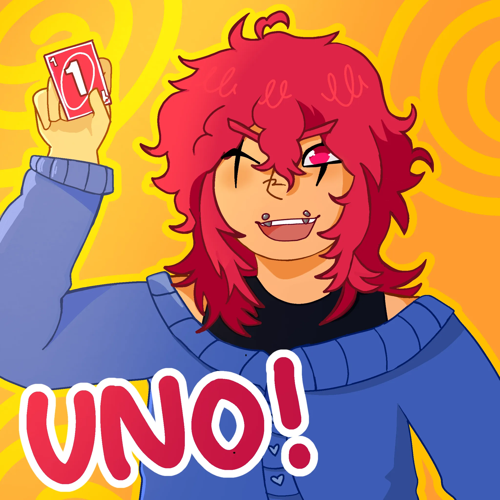

I think the biggest things I noticed with your work that could use improvement is your linework and your shading. Your lines and shading consistently seem to overlap/pass over where theyre meant to stop, especially on the collar of the shirt and on the hair. I noticed a couple spots where the linework itself goes past where its meant to stop. And some of the shading/coloring goes outside of the lines. Overall your anatomy isnt bad for the style your using- I would just mess with the angle of the eyes a little bit and make the mouth wider/shorter. Id recommend for your style sticking with the hard cell shading youve been using, having the slight gradients definitely boosts that, but dont be afraid to block out larger sections that would be shaded, especially with hair. It gives it great depth and helps separate the top/bangs versus the lower and back parts. I thought itd be a nice touch to add the swoopy curly bit as a highlight to mimic the pattern on the nose and keep the highlight pattern you used before. Another thing i wanted to mention was just to keep in mind where your lightsource is on your piece so you can add shading in the right spots. Theres only a couple spots i noticed where you had shading that wasnt necessary on the hair. overall really nice piece!!! wonderful work- youve got such strong foundations
Paintovers (1)
Artfight attack, how could i improve?
Artist's notes:
I purposely chose my favorite piece of art ive made to see what exactly needs changed without it being stuff i just forgot Im mainly struggling with shading and anatomy and stuff. It doesnt need to be perfect anatomy since i have more of a cartoony style