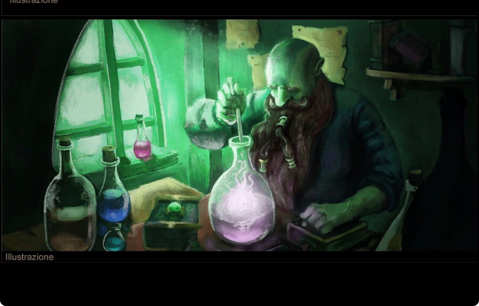
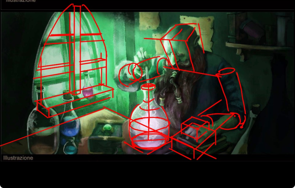


Second is the construction, your perspective is a bit inconsistent between the window and the table, which makes the image look flatter. We don’t want that, it would be a shame on such a nice piece!
Paintovers (0)
Scientist/merchant
Artist's notes:
Hello everyone, I wanted to ask you for a hand on the color or something else that you see that is wrong, thank you very much and have a good day
Comments 2
Really cool piece! It looks great already. I will leave you two feedbacks, one regarding construction/perspective and the other regarding the light/color. First, the colors. The ones you picked work well, i think i would mostly advise you to make the light/shadow contrast more harsh using the colors you have. That way the piece is easier to read, and will look more engaging as well :)