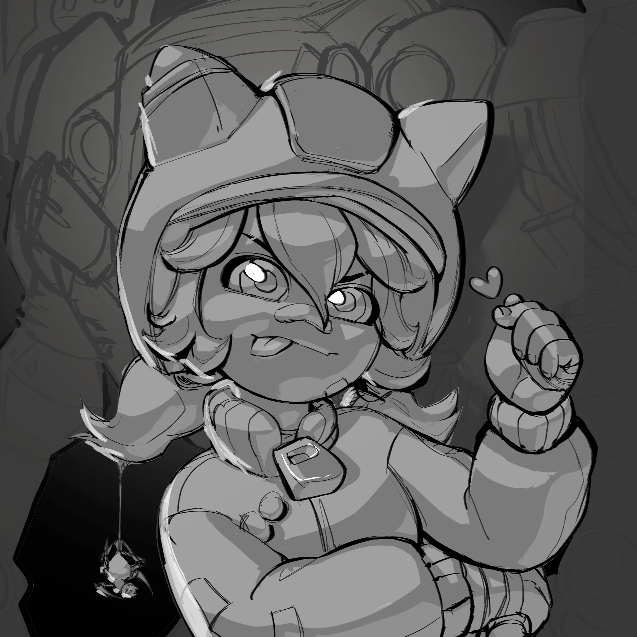
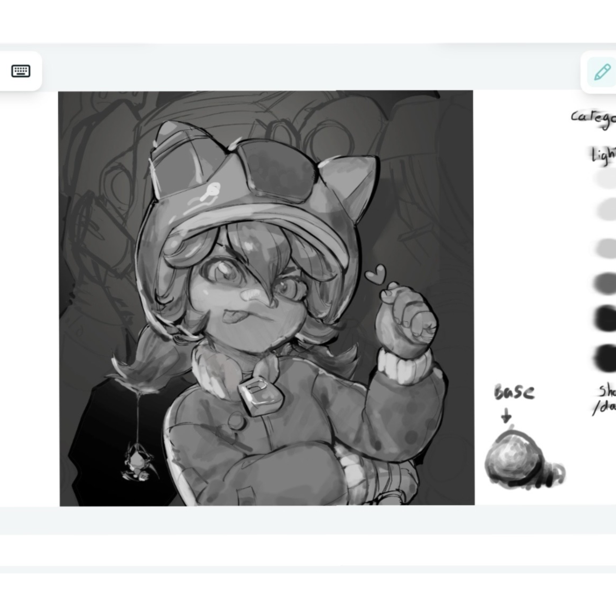
Hey there ! Your drawing is adorable and i can feel like its almost perfect! First of all, all objects the in the foreground all have the same base colour in your drawing, even though the drawing is in greyscale, you should know that different colors have different values. The second thing id like to point out is the reflection on the character which we dont really know where it comes from, while correcting, i placed a bit more on the back. Your shadows arent deep enough which doesnt make the drawing look “believable” or have a sense of deepness (even though your art is stylized, i feel like it can elevate it by doing so) and it makes it look like that light is bouncing off of everywhere. Also keep in mind that you should have a light value category and a shadow value category which shouldn’t interfere with eachother when drawing in general. I have also changed slightly the proportions of the face to make it more balanced. I know its frustrating to have to separate the background from the subject but it shouldnt be something that you have to be bothered about at this stage (to the point of requestionning the values you are using to render your character). Pardon me if the values i used isnt accurate to your character, dont forget that drawing is also sculpting. (I had to screenshot my correction since the website distorted my layer) Your piece is lovely and so is the character!
Paintovers (0)
Peni Parker (MR skin)
Artist's notes:
Values bother me. In this artwork I tried a new style and now i am struggling with values. I tried to make the character stand out form the background, but values looked like an eyesore, so I played around with the curves, but now it looks dull :( Maybe its alright and i am just tired, but nonetheless advice is appreciated!