Want to store your feedback?
Sign up to store all your feedback in one place on your account. Your feedback will be private instead of public.


Choose a paintover
Pick a user avatar to see their paintover notes and discuss them.
Improve your features and structure, a 3 min read
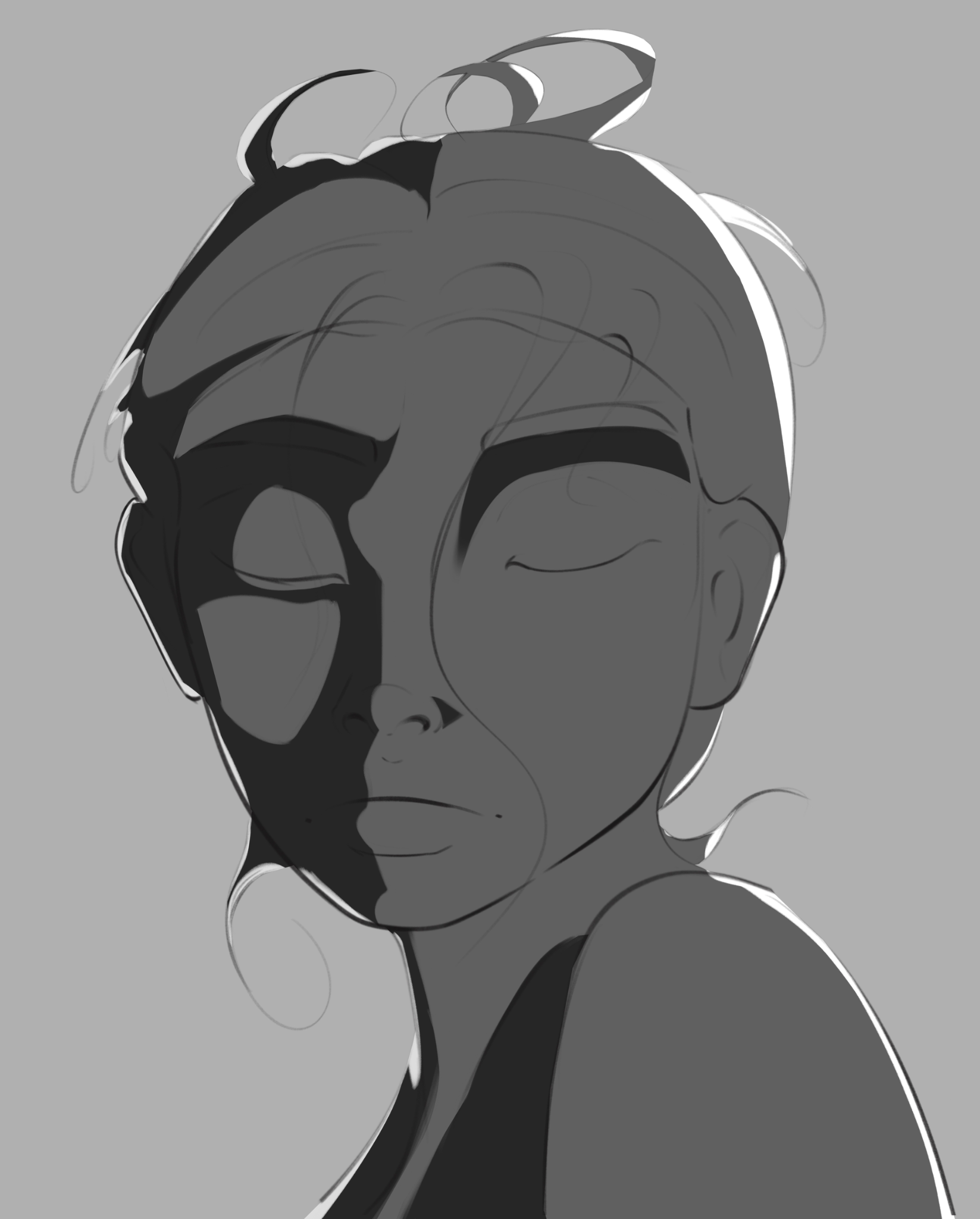
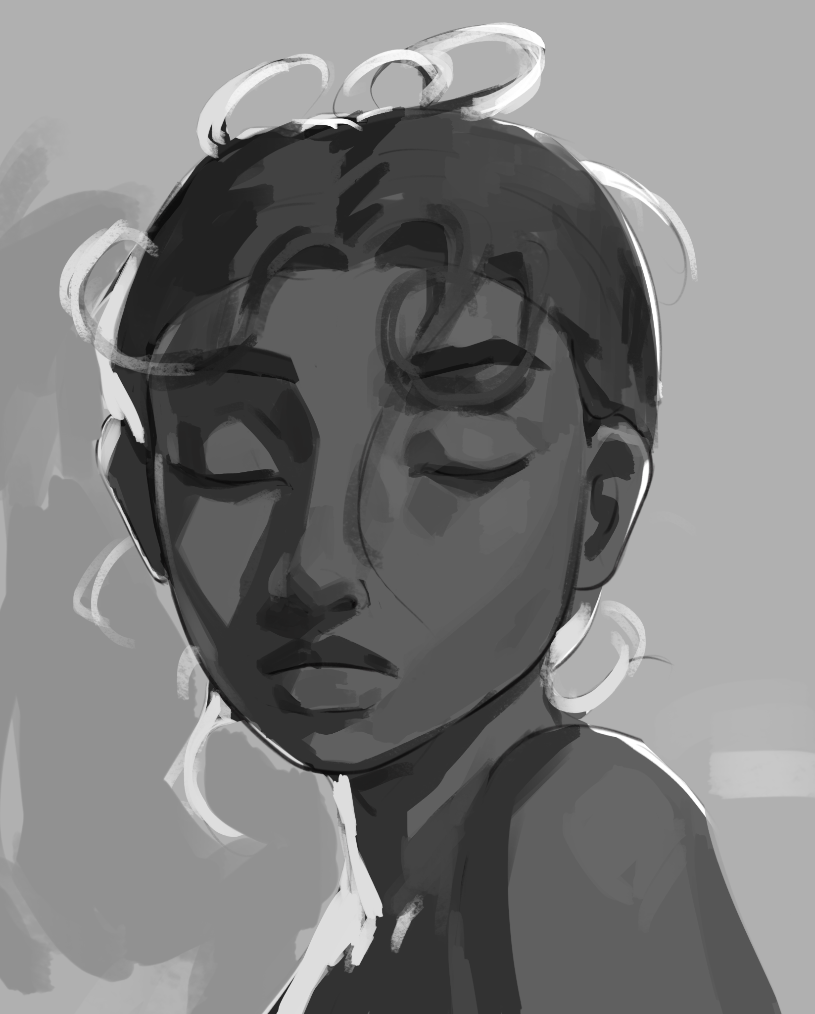
Master shadow mapping through four progressive exercises—from simplified Loomis and Asaro heads to analyzing real paintings and experimenting with different light sources.
Portraits


Flash photography- Lighting/color help
Hiya (  ̄▽ ̄)/~~ This is based on a pinterest reference image, in which flash photography is used. I tried to translate it into my drawing, and I believe I did so on the background as its basically just a 1:1, but I struggled a LOT on the character herself. Im not sure how to make it bright white while still showing the difference in texture from the (short) fur, cloth, and sword, and also keeping the lineart. The character looks way too 2d on a 3d background, Im really not sure how to work it any further? All permissions for feedback and/or draw overs! ALSO anything anatomy related in feedback is also welcome!

wendy
Hello! This is a fanart for wendy of gravity falls... something is off, but i dunno what. Please help, thank youu!

Trunchbull
I have this project of putting Matilda's (from Roald Dhal) characters in an anthropomorphic animal world. Here is TrunchBull. I think my shapes could be improved but I'm not really sure how. I would love to have your take on this !

color practice
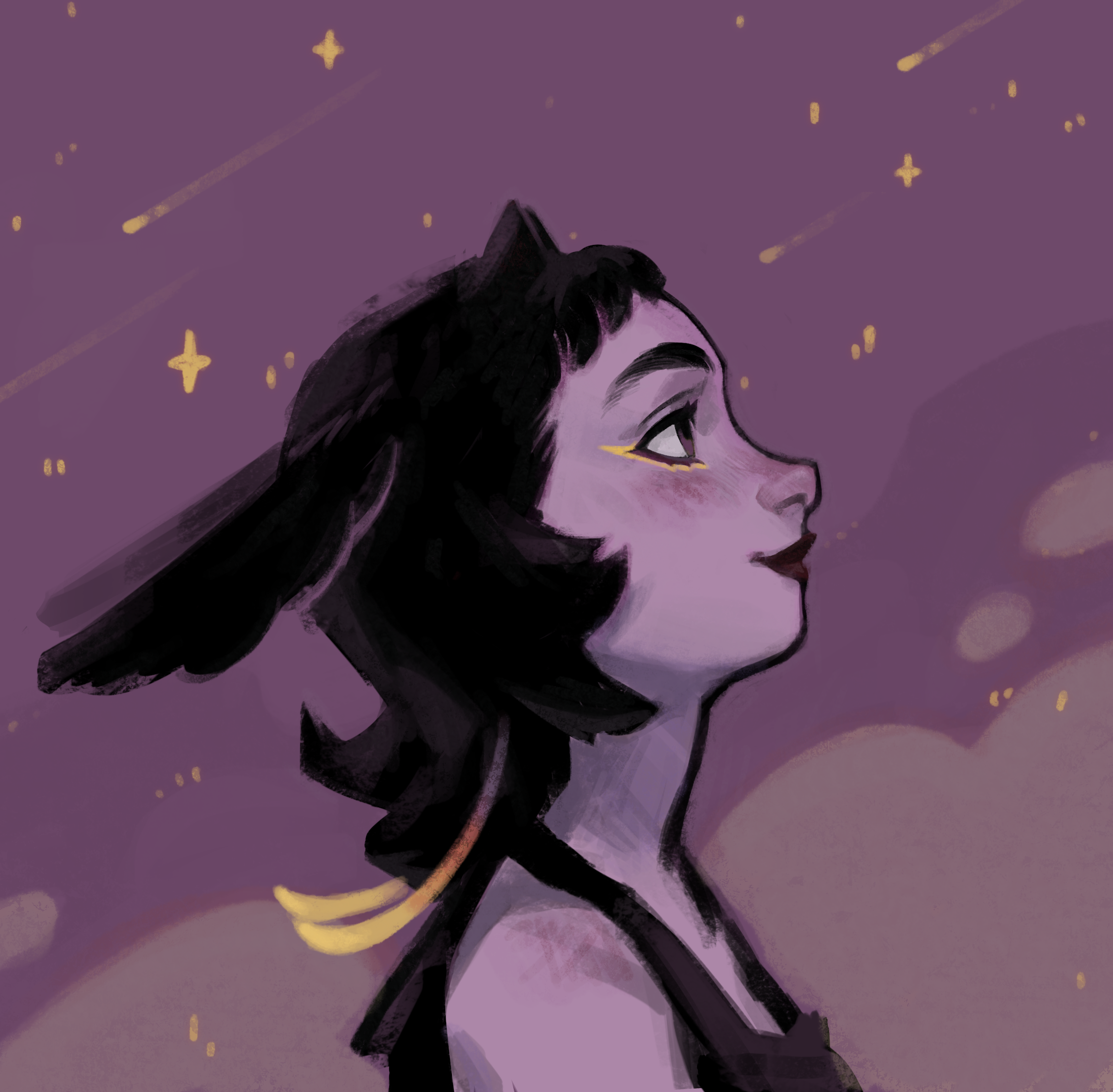
thats an imaginary portrait practice. i m trying to get out of my comfort zone which is grayscale first>hues later and try to paint directly with color. but she looks lifeless.i want to keep the overall saturation but cant find how to balance it .is it the colors?the planes?wrong anatomy?all of the above? thanks!

referenced painting study
I'm having a hard time grouping my value zones in a clear and concise way, I can't seem to include reflected light and hue changes (particularly in the cobblestone path here, and some foliage details) without complicating and overworking the values.

Undecided
So, I was too deep in to go back to perspective Im just cheat and render it out. Sorry Fosco - When I start the next one im gonna really lean into the horizon line and vanish points. Try get some feedback on it early when its still sketch phase.

24-26
Still a looooong way to go but nice to see the distance covered so far :)

OPTIC BLAST!
Cyclops from x-men! uuuhhh i started with the silhouette first (kind of a sloppy move on my part). Actually, this whole drawing is pretty much based on my intuition, so yeah, the proportions and everything under the visor are gonna be pretty inconsistent, especially considering the angle. Didn't do too bad on the hair and line variation, tho. Oh yea, and there's a face from imagination on the bottom right. Also, have y'all read the remastered x-men manga yet. Im enjoying it so far. Thanks for the feedback!

Don quijote polish
I got some feedback in a Discord server, but it’s not here. Since im treating this website as a kind of journal, ill upload. I worked on the material separation, render of the face and tried to make the metal armor more beliavable. I think it’s a good improvement. Still, it could allways be better.