Want to store your feedback?
Sign up to store all your feedback in one place on your account. Your feedback will be private instead of public.


Choose a paintover
Pick a user avatar to see their paintover notes and discuss them.
Improve your likeness and facial proportions, a 3 min read
Build expressive portraits using the Loomis head method, Reilly rhythms, and shadow mapping to establish structure, flow, and clear lighting before adding final details.
Portraits


Undecided
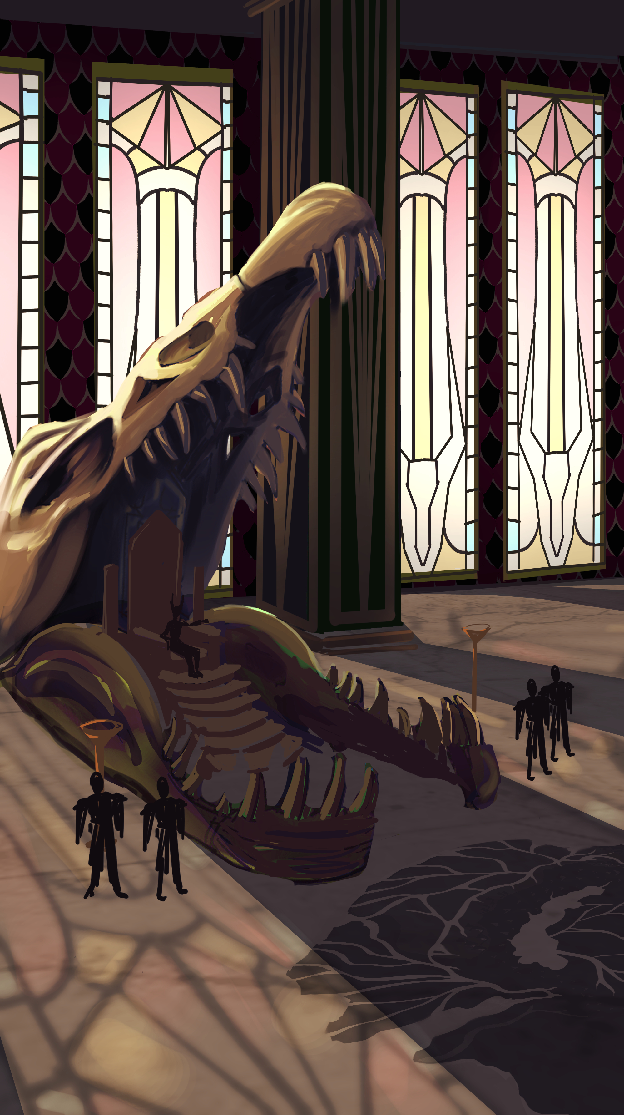
So, I was too deep in to go back to perspective Im just cheat and render it out. Sorry Fosco - When I start the next one im gonna really lean into the horizon line and vanish points. Try get some feedback on it early when its still sketch phase.

24-26
Still a looooong way to go but nice to see the distance covered so far :)

OPTIC BLAST!
Cyclops from x-men! uuuhhh i started with the silhouette first (kind of a sloppy move on my part). Actually, this whole drawing is pretty much based on my intuition, so yeah, the proportions and everything under the visor are gonna be pretty inconsistent, especially considering the angle. Didn't do too bad on the hair and line variation, tho. Oh yea, and there's a face from imagination on the bottom right. Also, have y'all read the remastered x-men manga yet. Im enjoying it so far. Thanks for the feedback!

Don quijote polish
I got some feedback in a Discord server, but it’s not here. Since im treating this website as a kind of journal, ill upload. I worked on the material separation, render of the face and tried to make the metal armor more beliavable. I think it’s a good improvement. Still, it could allways be better.

Sleepy Hoarder
1. Definitely struggled with the back feet being hidden but still managing to draw convincible forms. 2. Even with the perspective grid I think I did a poor job of nailing that yawning snout - referred to yawning lions for reference. The other entries are fantastic!

please show me what i can improve
im very open minded and really want some criticism on basically anything :)

concept art For Rushinda
Struggling with the kimono for the adult version for her as I want it to be more combat but also be something you can wear to fancy events. Also want it fit her character more be something unique & memorable.

my first ych i opened, but it feels a little flat?
i feel like there’s not a lot of contrast, idkkk

Need help with the form/proportions of the Upper torso.
How do I improve the form or proportions of the torso? I feel like something is off about the upper torso's that I'm drawing, I'm mainly just drawing a roundish sort of square for the base of the torso, and adding the chest over it, and just indicating the ribs.