Maybe push the depth a bit exagerate how huge he is also maybe try to push the silhoutee i am a horrible speller :) Super cool design!! Epic
Paintovers (0)
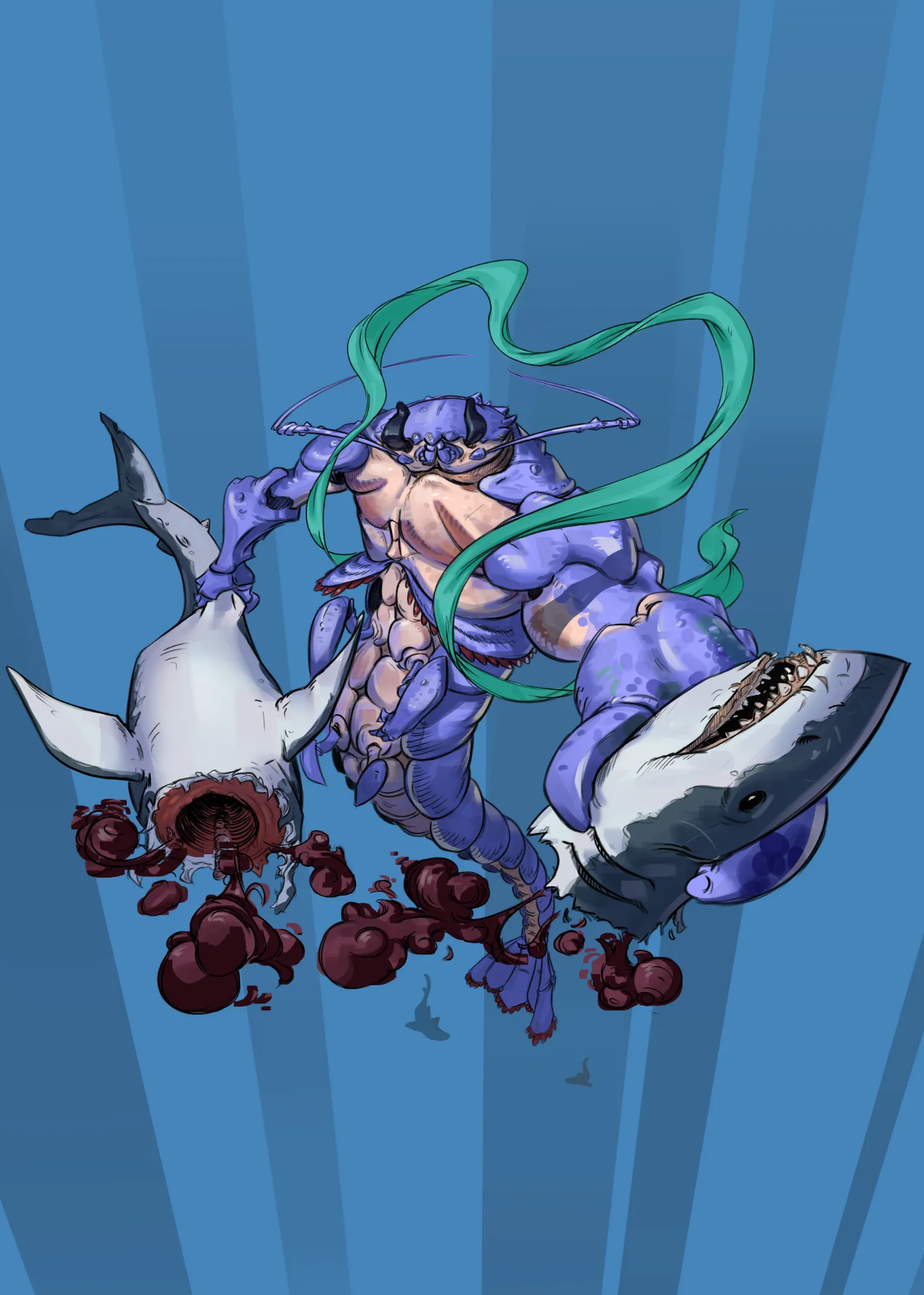
crustacean mermaid
Artist's notes:
i really like this crustacaen design, but i do struggle a bit with a decent pose and composition to really sell the design, perhaps i tried to do to much at once? any feedback would be much appreciated
Comments 3
William4 months ago
I would say that some more defined highlights would make it pop. I do see some sort of highlights but they are dim.
Thank you for the feedback, i'll make sure to make better use of highlights.

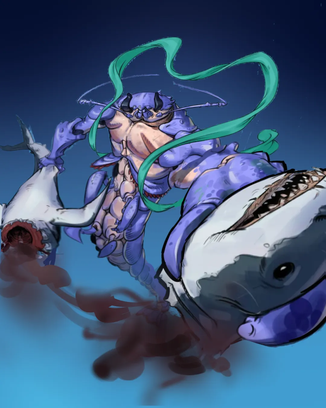
Hello! Let me just say, your artwork is so freaking awesome!! Firstly, I would say crop your artwork to make your characters take up more of the frame. It makes it much easier to appreciate your wonderful linework! I would push your foreshortening a lot more -- not only does that make it feel more dynamic, but it also improves your composition by making the size less equal. Before, it felt a little too evenly balanced, if that makes sense? To push this further, I would use heavier lineweight for the things in the very front (his hand, the shark's head) and make things in the far background lower contrast (the shark's tail, his tail). In terms of the background, something I'd say you should think about is contrast. The biggest problem with the background's color was that it was too similar in value to the character, which makes everything kind of blend together. I just did a simple gradient background to give you an idea. Don't think of the background as a separate thing; use it to frame your character and make them stand out more! I felt like the blood was a great opportunity to frame the character and make it feel more dynamic. By using the blood to show the character's motion (that arc shape), it makes it much more clear that he's actually rrripping its head off. The blood also originally had very high contrast, which distracted from the actual character. Higher contrast attracts the eye more, so try to be more intentional with where you use it! I kept some of that darkness around the blood coming out of the shark's head to try and push the depth a little more. I really love your art a lot!!! I hope this helps (ᵔ⩊ᵔ)ノ (Artwod rejected it for gore, so I greyed it out a little.)
Thank you very much! This was very helpful, i am going to keep this in mind for future work.