Want to store your feedback?
Sign up to store all your feedback in one place on your account. Your feedback will be private instead of public.
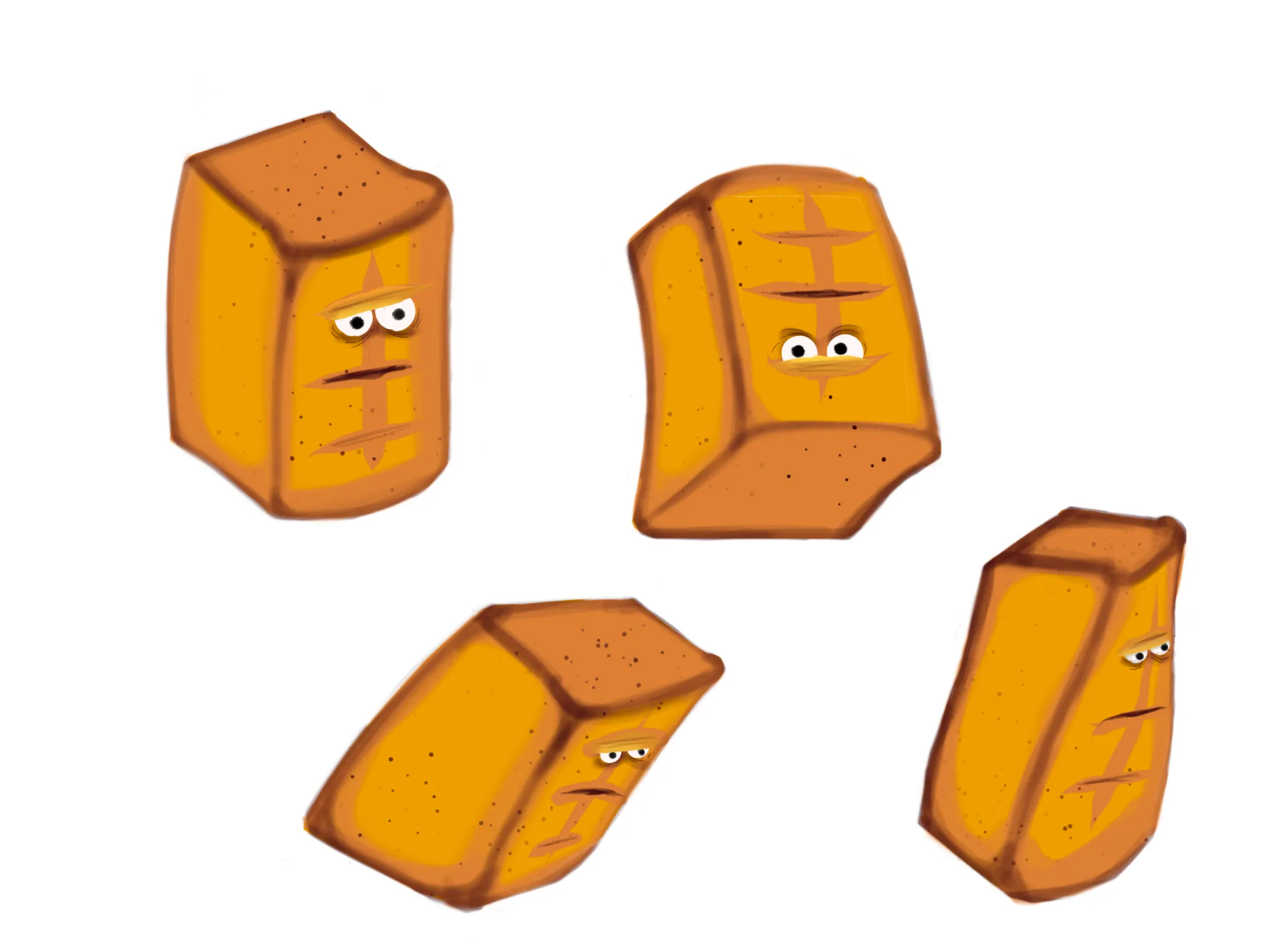
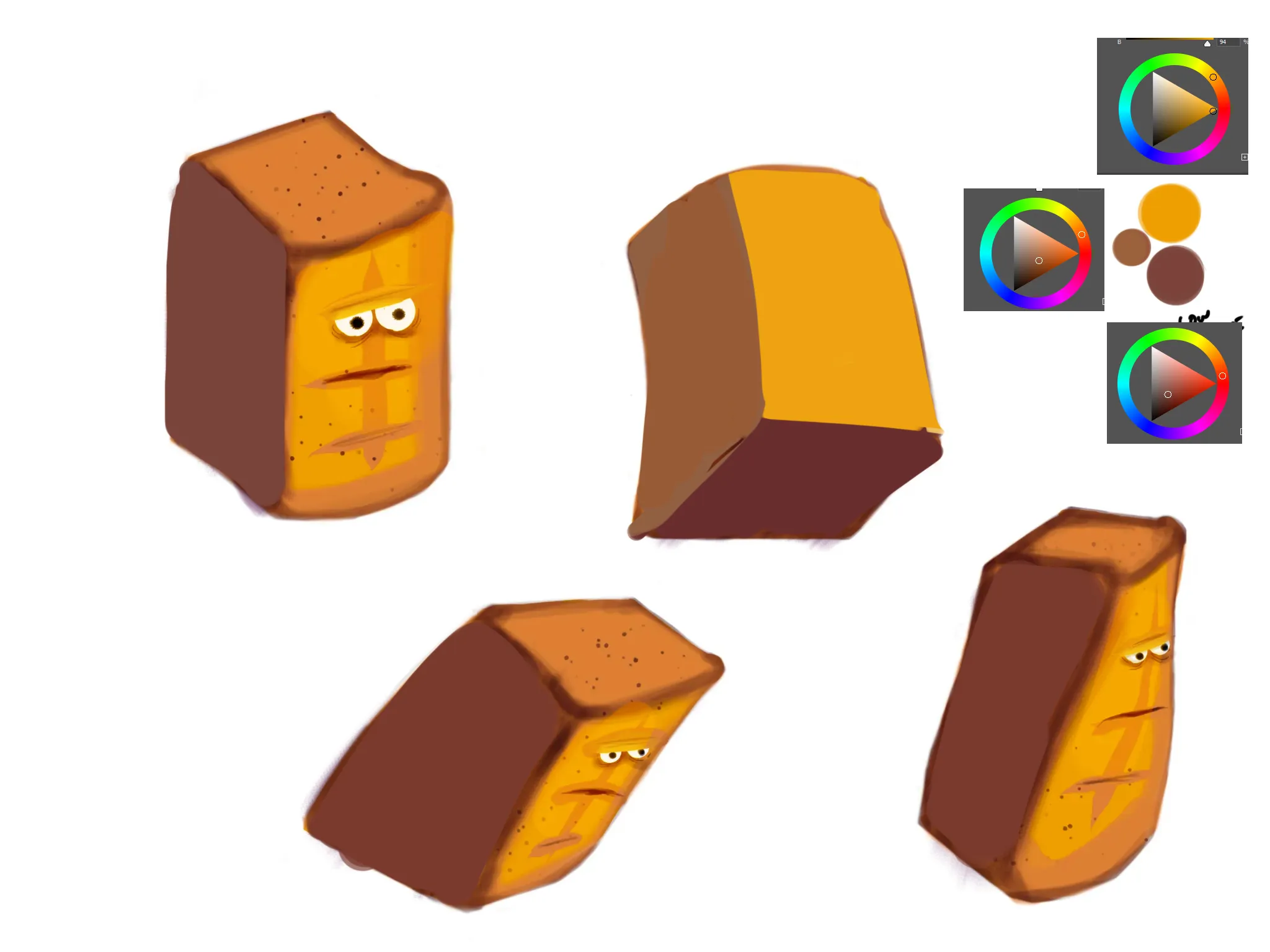
Paintovers
Paintover Notes
Choose a paintover
Pick a user avatar to see their paintover notes and discuss them.
Also need help with your art?
Improve your fundamentals, a 3 min read
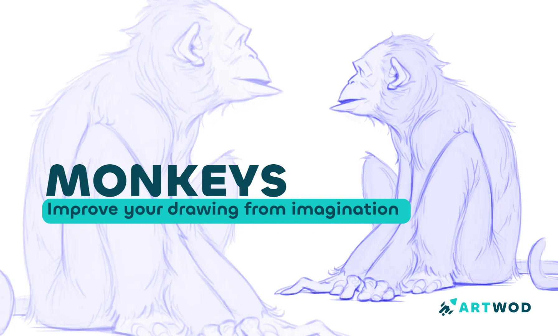
How to Draw Monkeys for Beginners: 15 Minute Guide
Master monkey drawing by progressing from simple shapes and photo tracing to imaginative sketches with anatomical structure and details.
Animals
Would you like to help someone who's still waiting?
June 30 Sketchbook Pages Challenge
No responses yet
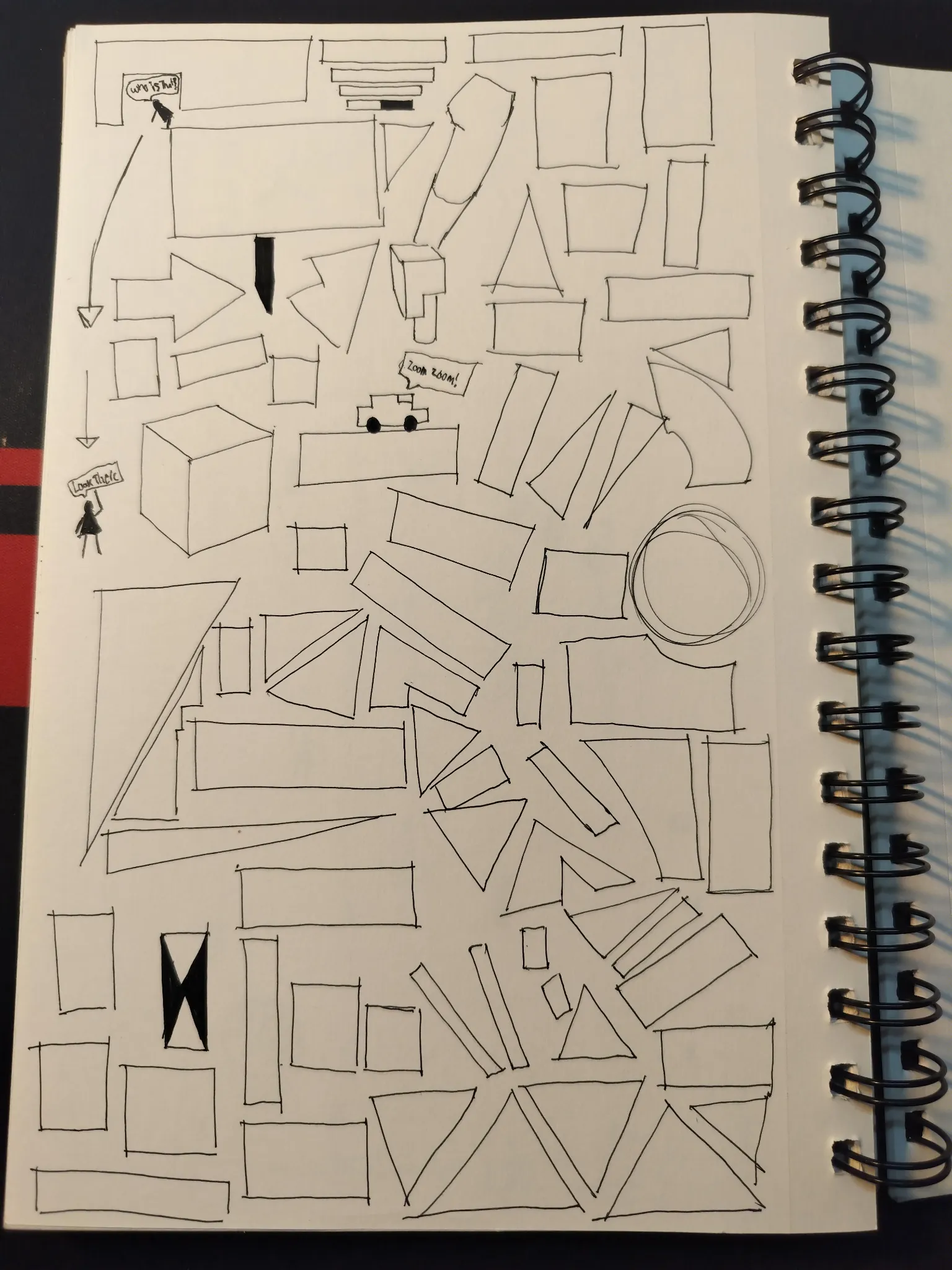
June Sketch Day 26
My sketchbook almost full. Might want to buy new one. Still with the same practice. I kinda get the hang of it.
20 minutes ago
View
Environment
No responses yet
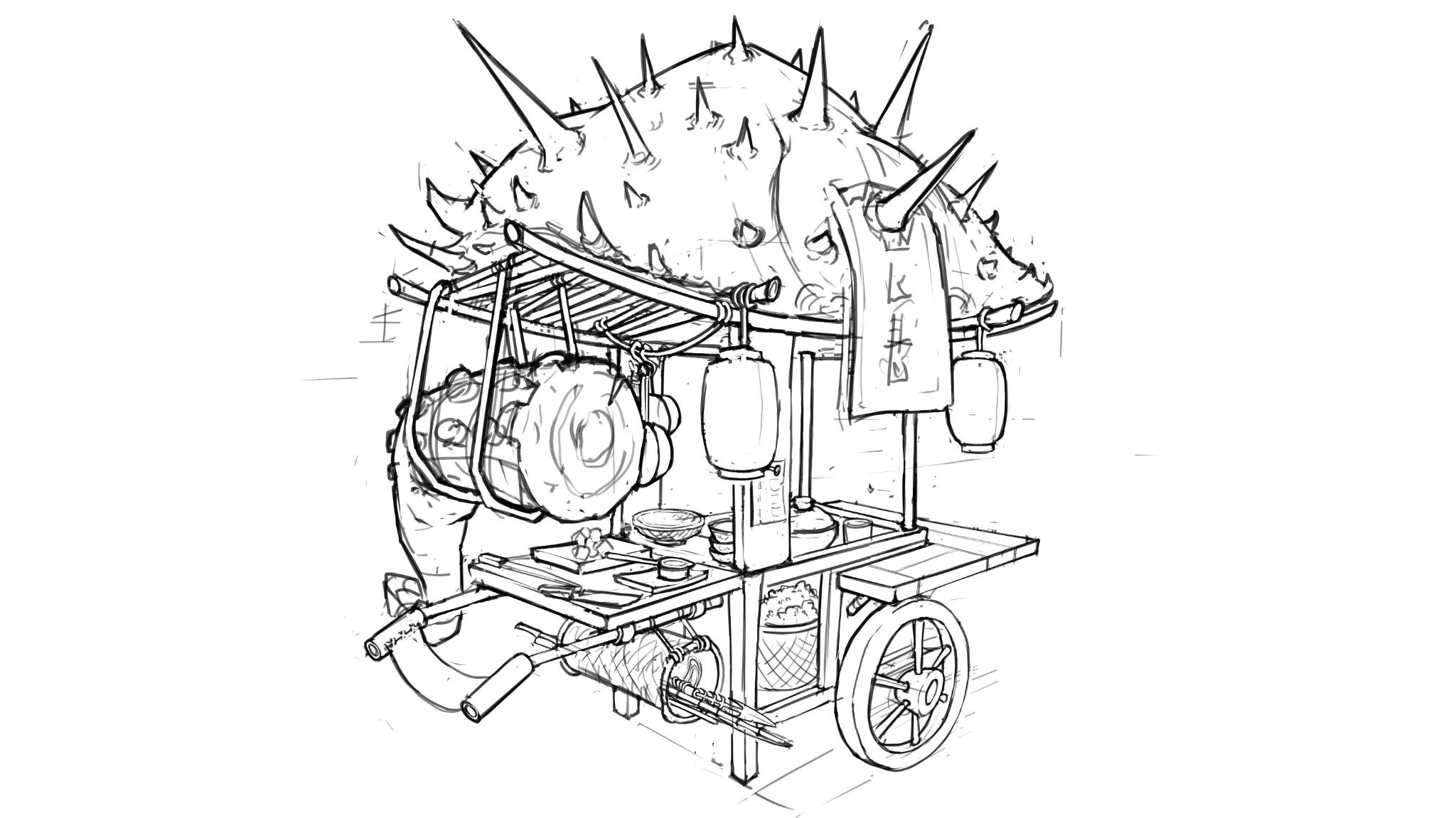
Japanese Food kart
Hi! I'm looking for some advice on design. The idea for the prop is a medieval Japanese food kart, its a fantasy world where we have giant sea animals and an old fisherman/chef that loves the sea brings us exquisite food from these giant beasts. Its a sketch so I know perspective needs some tweaks. I'm mainly looking for advice on shape design, and how can I make the design more interesting or professional. Thanks in advance :)
1 hour ago
View
June 30 Sketchbook Pages Challenge
No responses yet
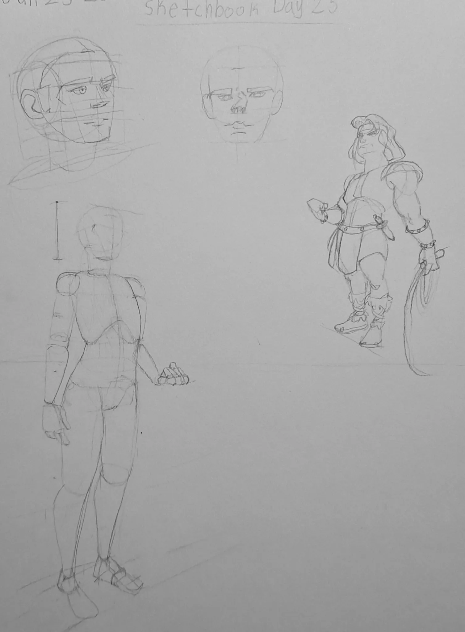
June 30 Sketchbook Pages Challenge Day 25
A smaller sketchbook day. I'm pretty happy with the improvement of my line quality, and I am still working on refining the mannequin in perspective.
1 hour ago
View
Anatomy
No responses yet
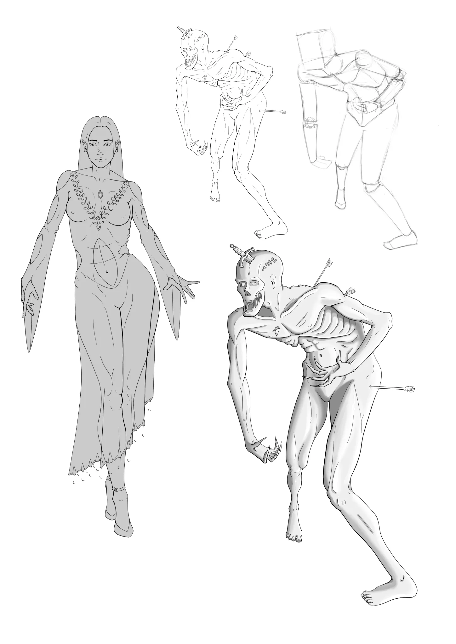
Sorceress
Hi! Based on "The Ultimate Course to Draw Anything from Imagination," what level am I at, and what should I practice?
2 hours ago
View
June 30 Sketchbook Pages Challenge
No responses yet
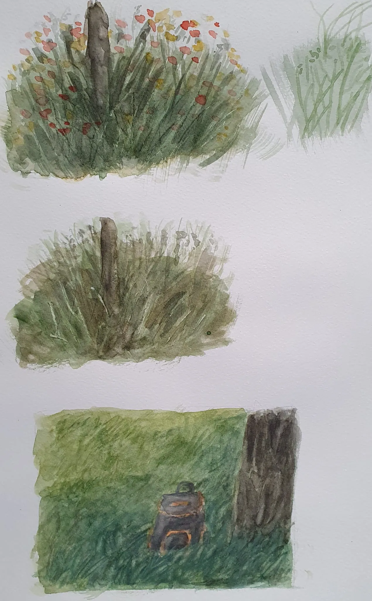
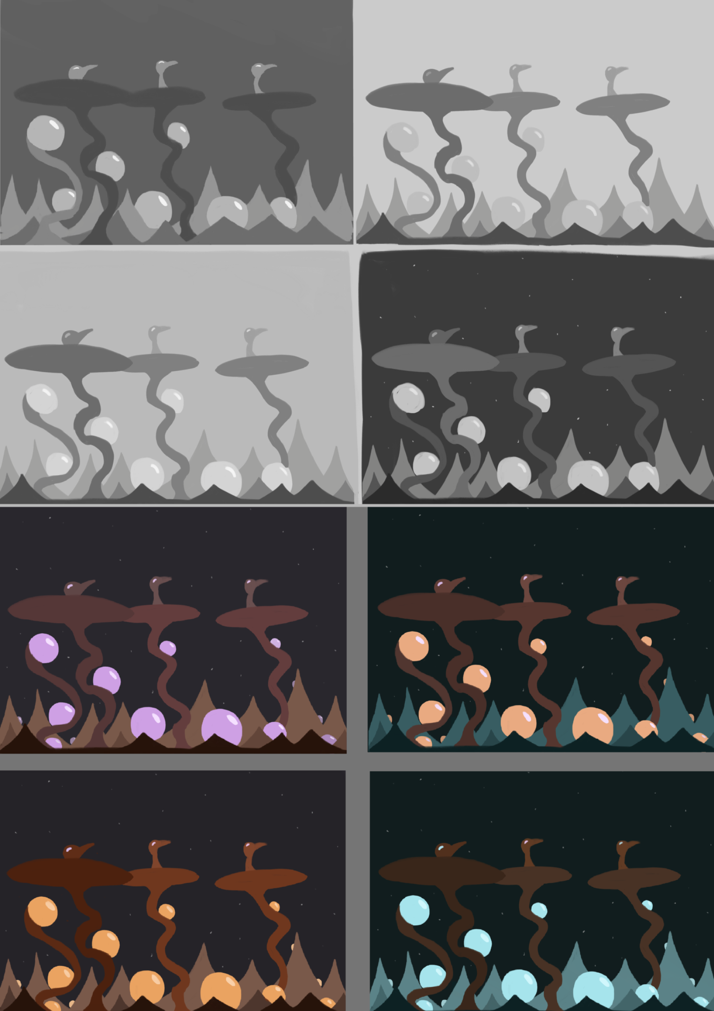
Watercolor grass study
Hi, yesterday I made some landscapes, but the foreground elements felt to simpel. I made an study of that issue. The first 2 are from yt tutorial., and aplied to my painting issue the 3rd time. A bit better but not good enough yet. Still struggling
3 hours ago
View
April One Piece Art Challenge
No responses yet
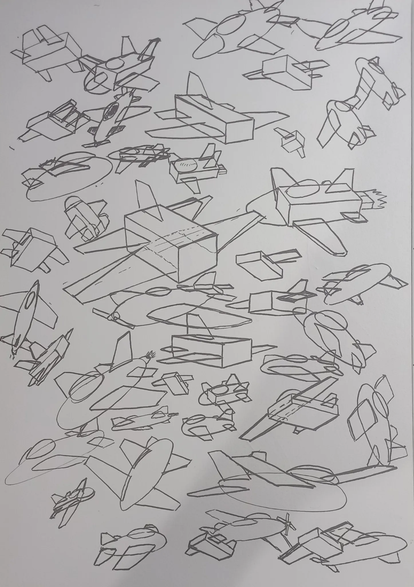
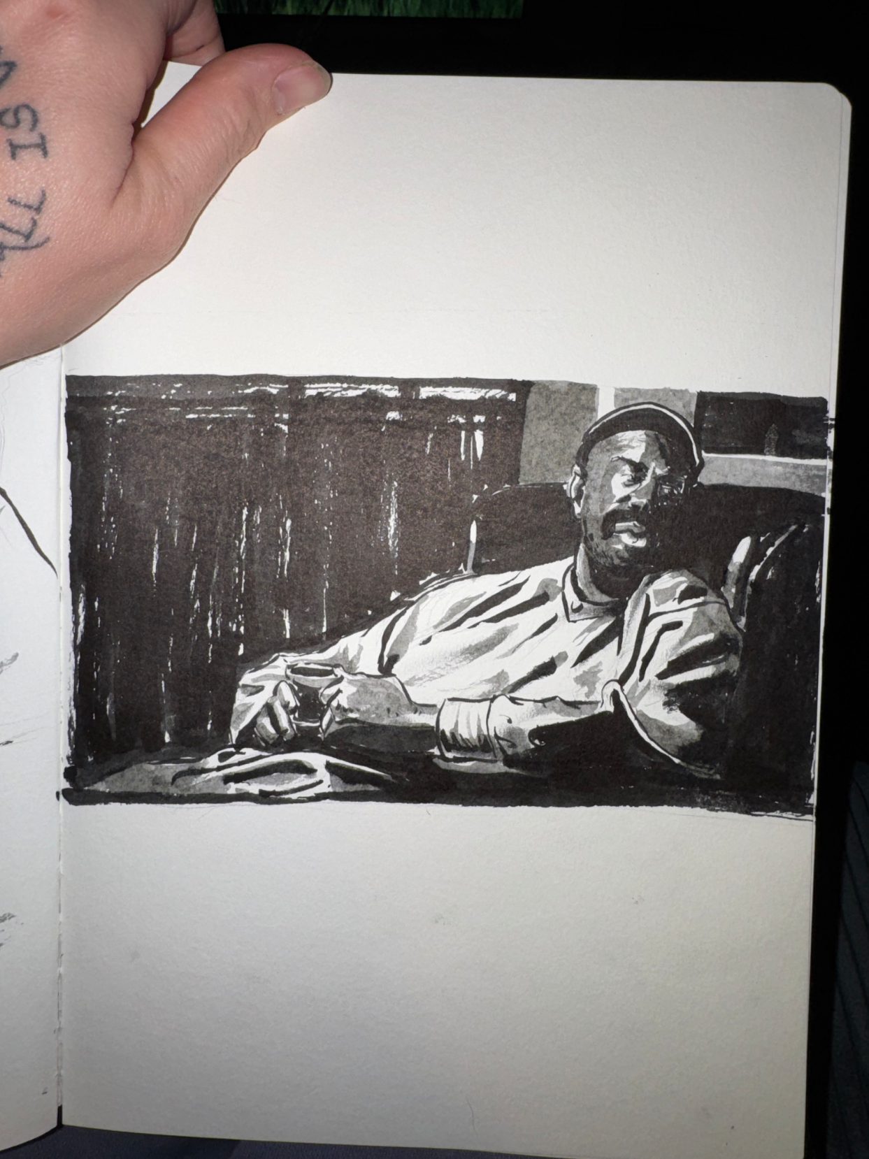
Brush Pen Study
Trying to focus on shapes and values, pushing darks and being bold
5 hours ago
View
June 30 Sketchbook Pages Challenge
No responses yet
Day 26
Today i test a new concept art
5 hours ago
View
June 30 Sketchbook Pages Challenge
No responses yet
Day 13
chill day
5 hours ago
View
Anatomy
No responses yet
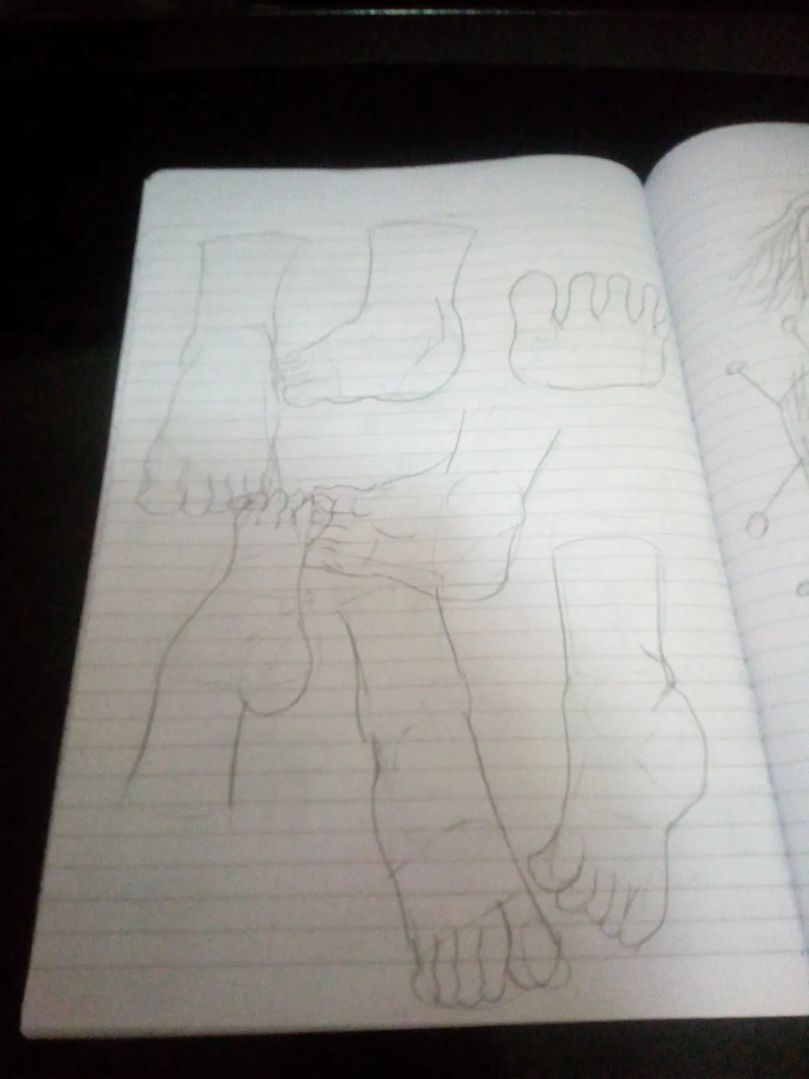
Feet practice
I practiced drawing feet and the references I got from Pinterest what are things that are off here mistakes I can fix and improvements and tips and things to improve
7 hours ago
View