Want to store your feedback?
Sign up to store all your feedback in one place on your account. Your feedback will be private instead of public.
Also struggling with figure drawing?
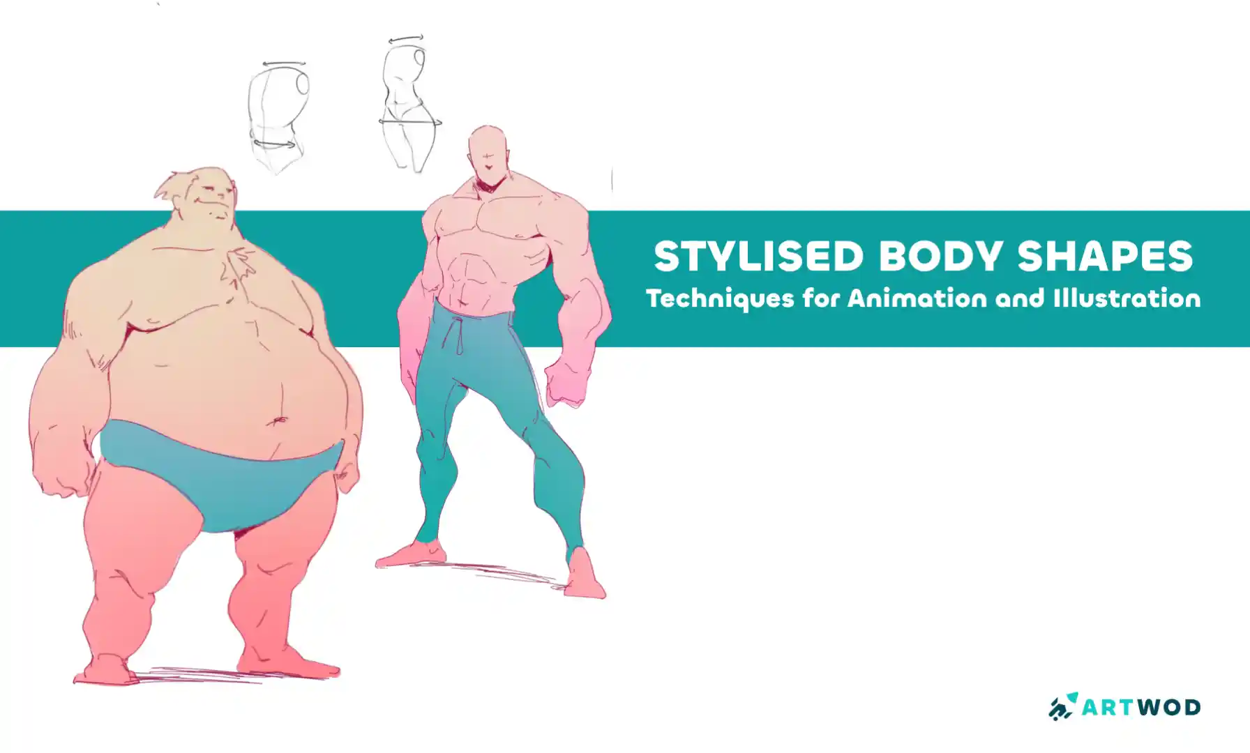
Improve your figure proportions and anatomy skills, a 3 min read
Stylised Body Shapes: Simplify and Exaggerate Figures for Animation and Illustration
Break down stylized characters into basic shapes, experiment with silhouettes, and layer anatomy to create expressive, believable designs with personality.
Figure
Would you like to help someone who's still waiting?
Portraits
No responses yet
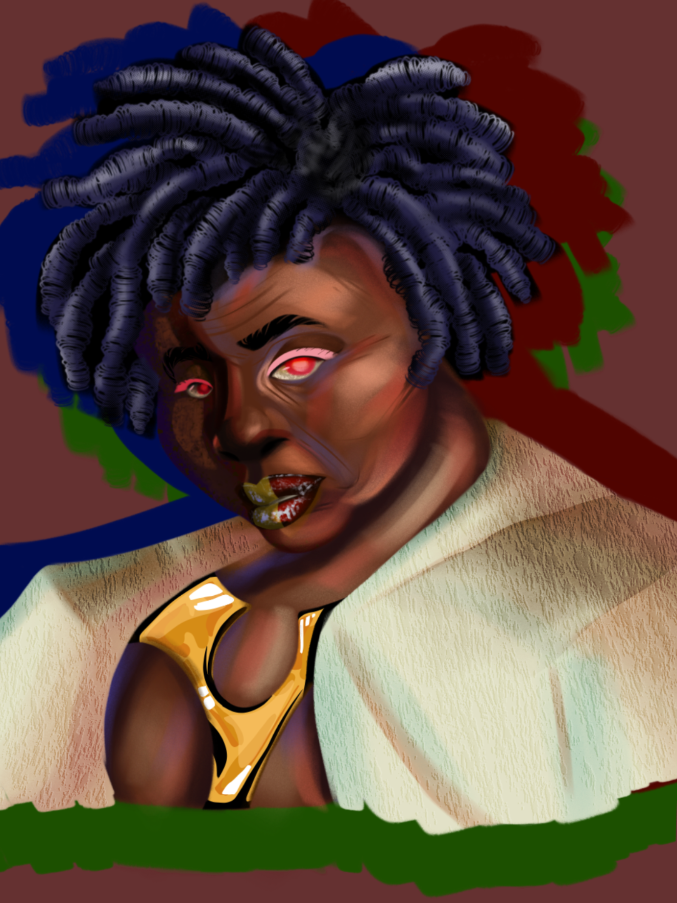
Cyberpunk OC
I just don’t like how my colors turn out, they feel muted, or like they don’t match very well. I’m not aiming for realism, but like cartoon art theory has eluded me forever.
1 hour ago
View
Perspective and Form
No responses yet
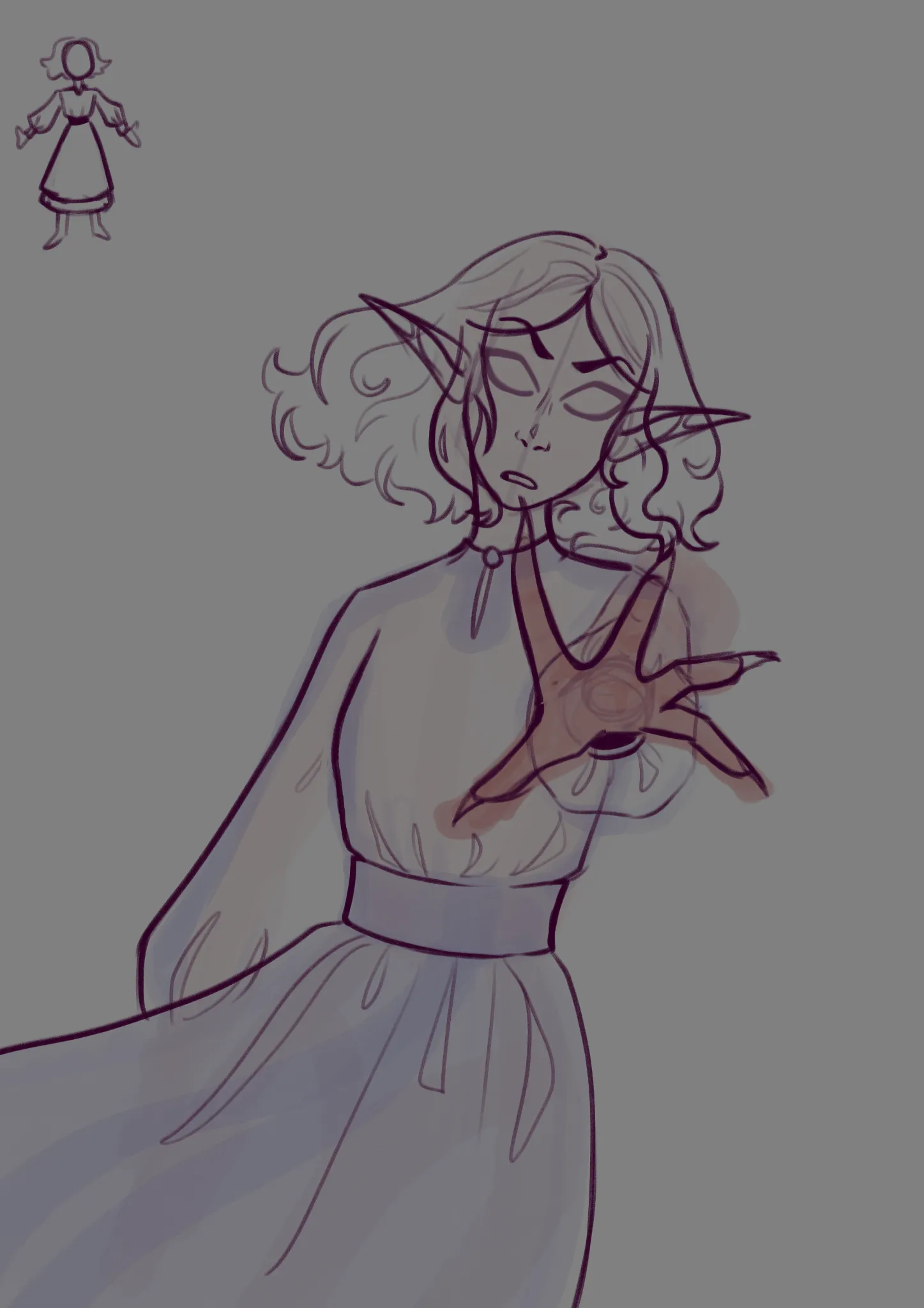
The fire
I'm having a struggle with the hand perspective, especially with the sleeve and how it would form around it Not sure about the creases and fold in general either the dress shape is in the top left corner
2 hours ago
View
Rendering
No responses yet
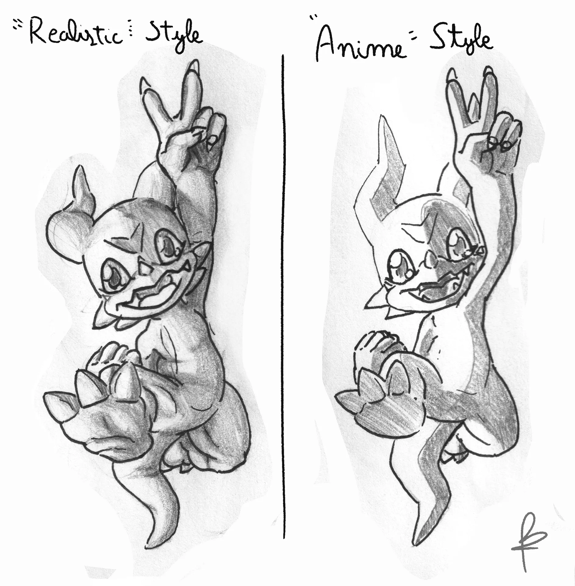
Jud looking at differences
I drew these two so I can see how I understand stylisation and more "anime" styles, more specifically with shading, the "Realistic" is more what I would normally do by instinct, the "Anime" style is my second attempt to try to make the style more simple and not using so many lines. I mainly struggle in not knowing how to simplify details, how can work on this skill? Also I understand how light works but I tend to also struggle with very complex shapes such as clothing and characters
2 hours ago
View
Figure
No responses yet
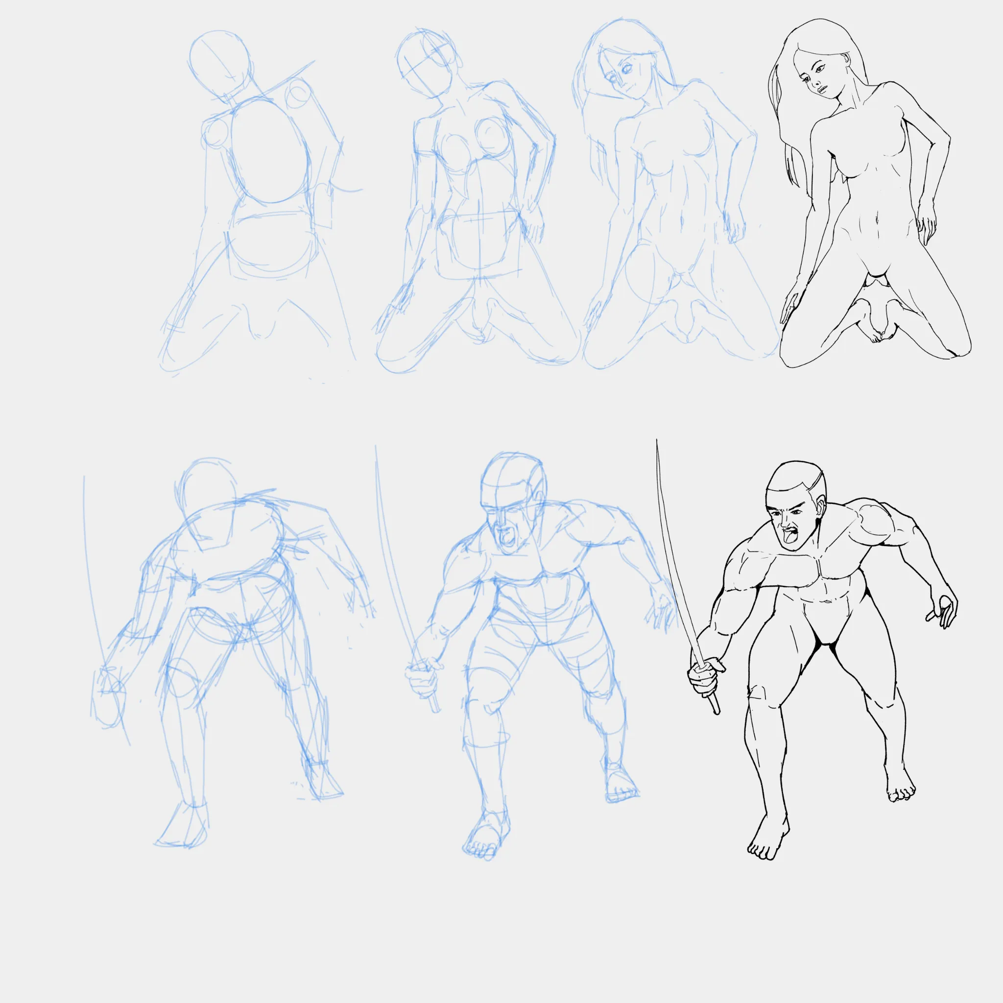
What to do to keep improving my figure drawing?
Hi guys, I'm very proud of how my figure drawing has been improving, maybe it's time to start focusing on hands and feet finally, but if you'd like to give me some feedback with the face and the body to improve, I'm all ears. My process is firstly going with a rough sketch considering very superficially the form, then I draw the form on top, I make several iterations for this process, and finally I add line art.
3 hours ago
View
Rendering
No responses yet
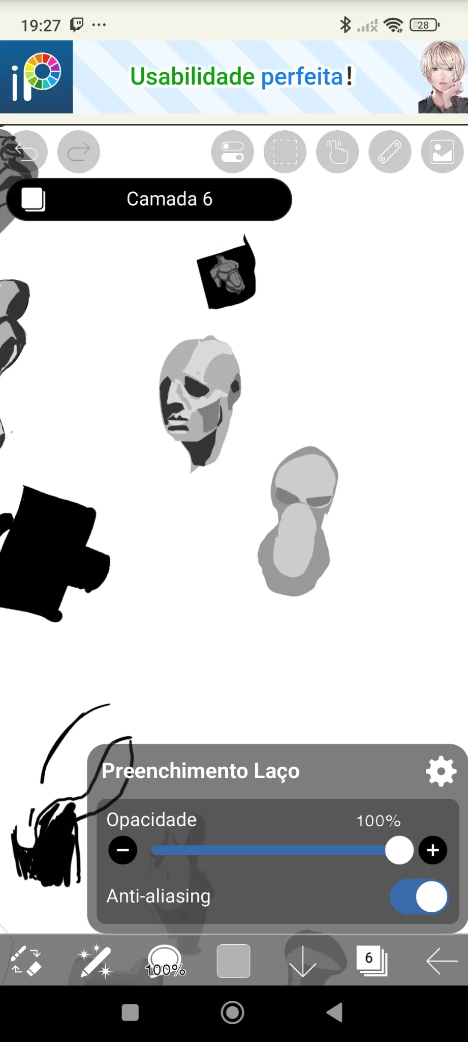
Estudo
Preciso saber se está bom os valores e as formas e onde melhorar
5 hours ago
View
Environment
No responses yet
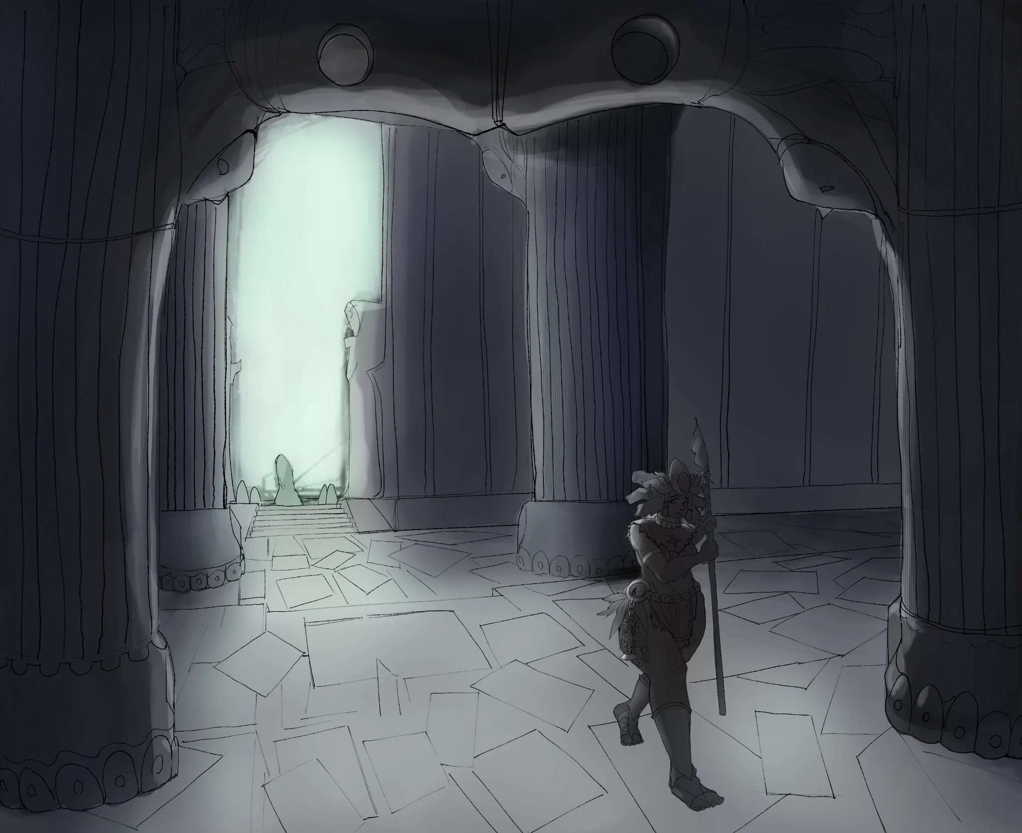
Whats in the Dark
As much as I like this one, I feel like the there's so much I could do to improve on. I Feel as though the texture work, and the steps both entering the room, and behind the character, could be done better. How do I make my backgrounds more interesting?
5 hours ago
View
Environment
No responses yet
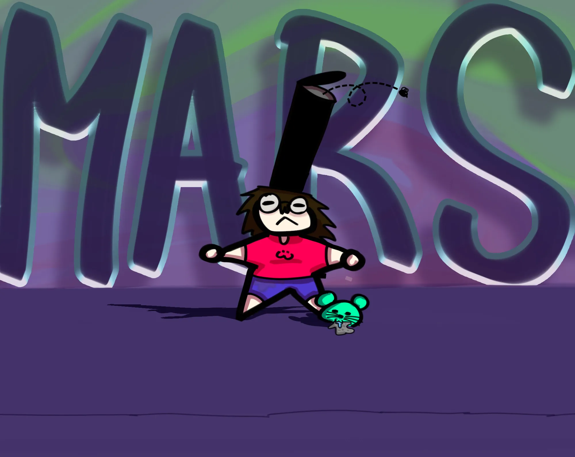
My Professional Persona lol
I feel like the background and flooring are so lackluster and kind of blend in with the character and the rat... I want to keep my name in the background big like that, but I still want the character and the rat to be the main focus while still making the background look good. Any ideas on a better color, design, or something else I can do for the background? Thxx
5 hours ago
View
July Before & After Art Challenge
No responses yet
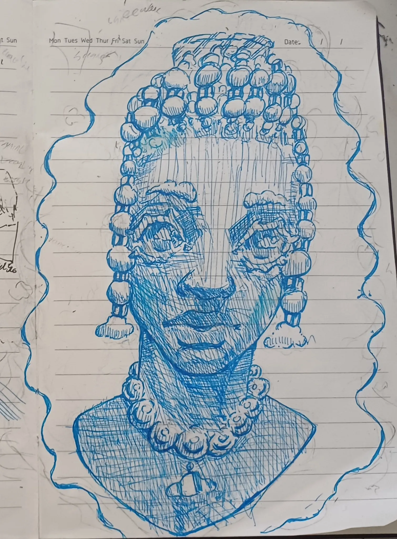
Azure before ad after
after
6 hours ago
View
Rendering
No responses yet
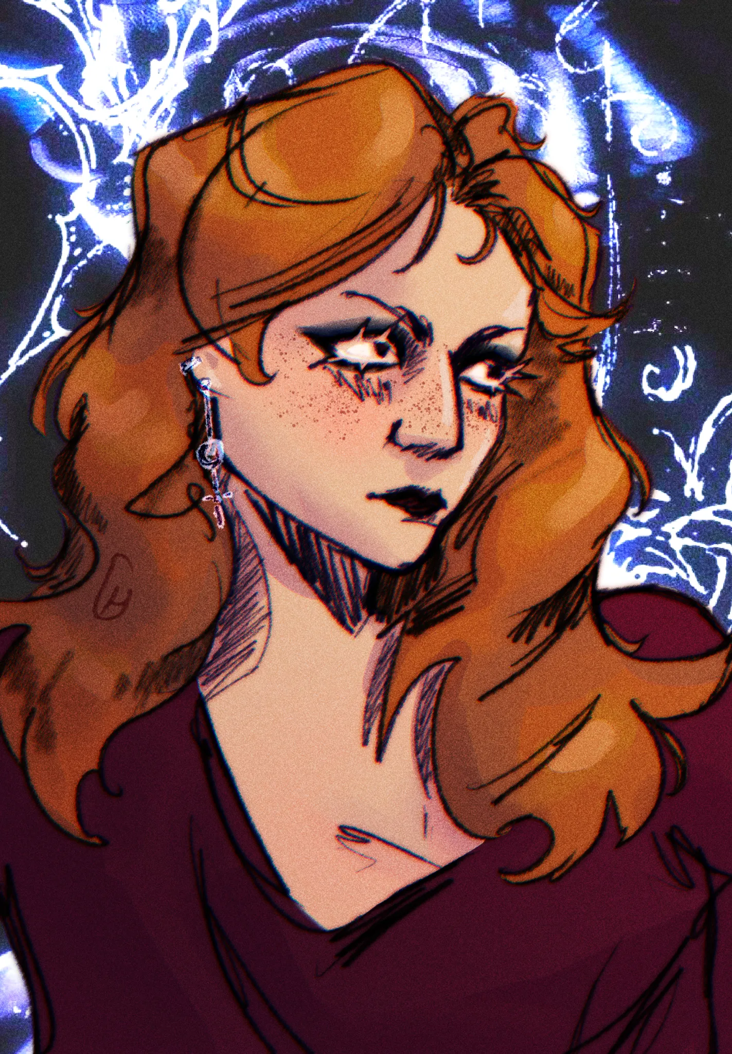
Character 3/4 Sketch
Depth & rendering. This is a more stylized piece so I didn't do anything too high level, but feel that it kind of looks flat.
6 hours ago
View