Want to store your feedback?
Sign up to store all your feedback in one place on your account. Your feedback will be private instead of public.
Also need help with rendering?
Improve your values and blending, a 3 min read
Easy Art Pen & Ink Rendering Techniques
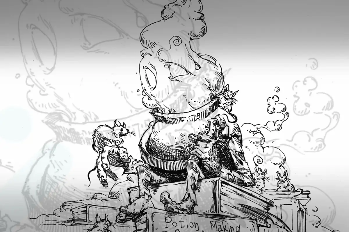
Master pen and ink rendering through four progressive exercises: build value scales, shade basic forms, study organic objects, and create imaginary inventions using texture and light.
Rendering
Would you like to help someone who's still waiting?
Rendering
No responses yet
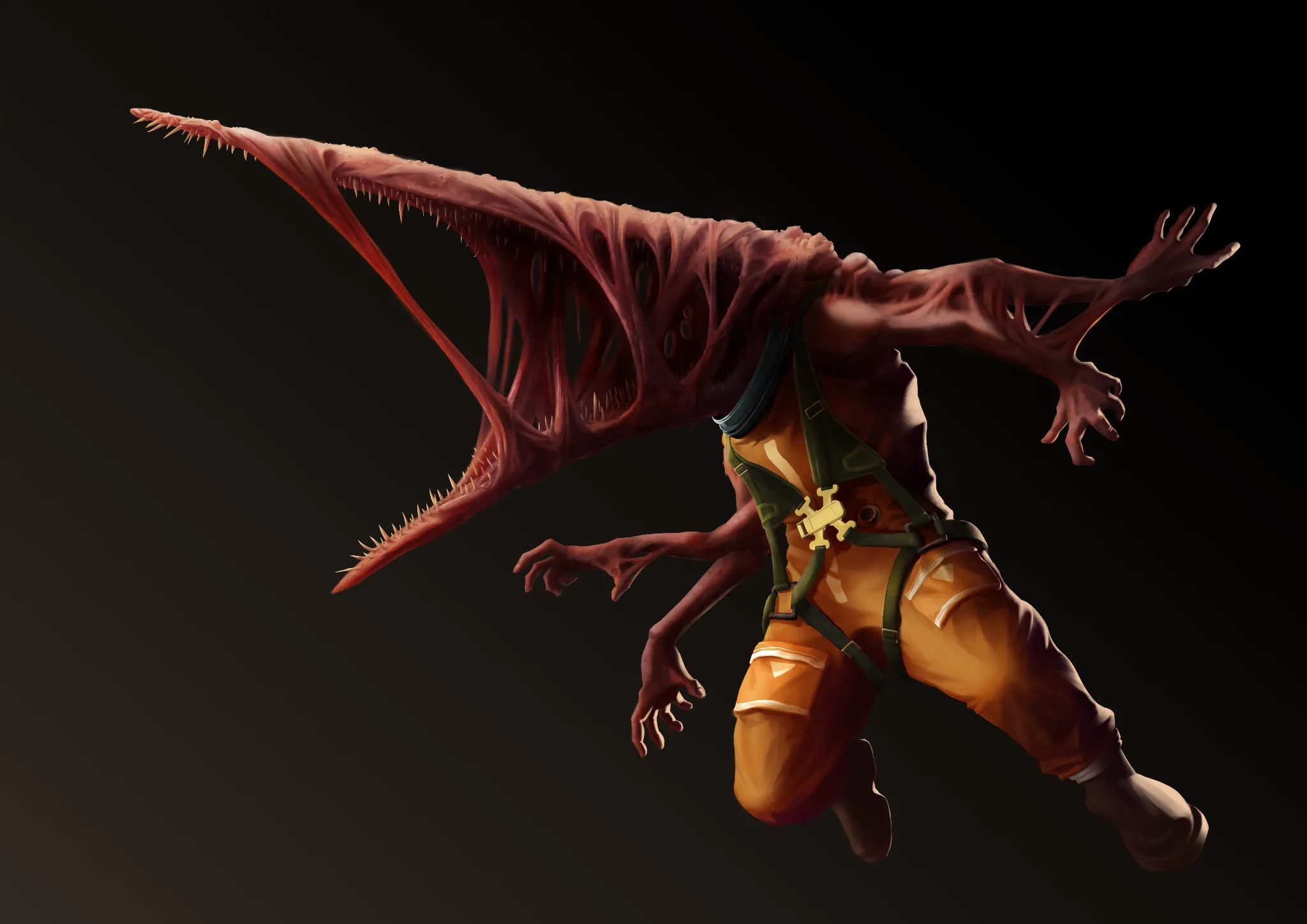
Cosmic parasite
Hi, how can I improve rendering of materials here? I want to achieve more visible contrast between "fleshy" stuff and the rest. Also, if you have any general feedback this would also be greatly appreciated:]
56 minutes ago
View
Portraits
No responses yet
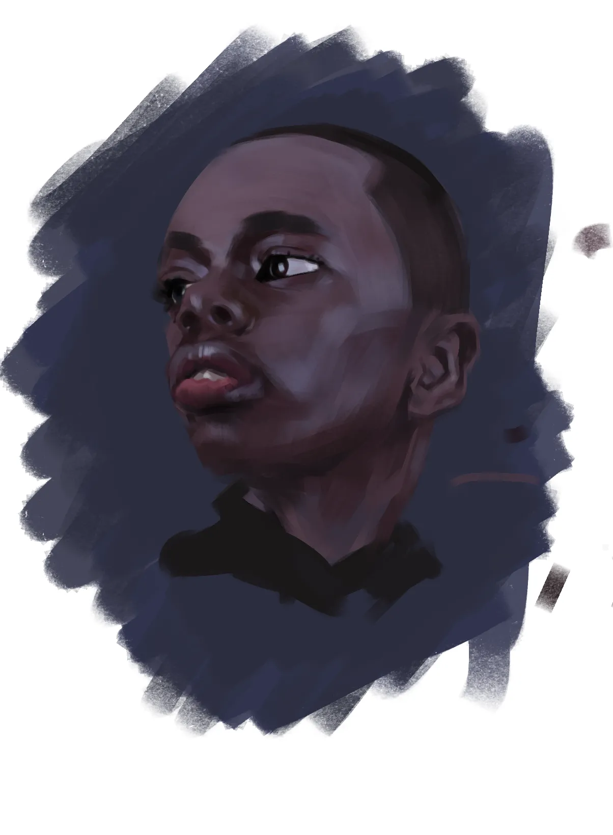
guy
colours are hard
1 hour ago
View
Perspective and Form
No responses yet
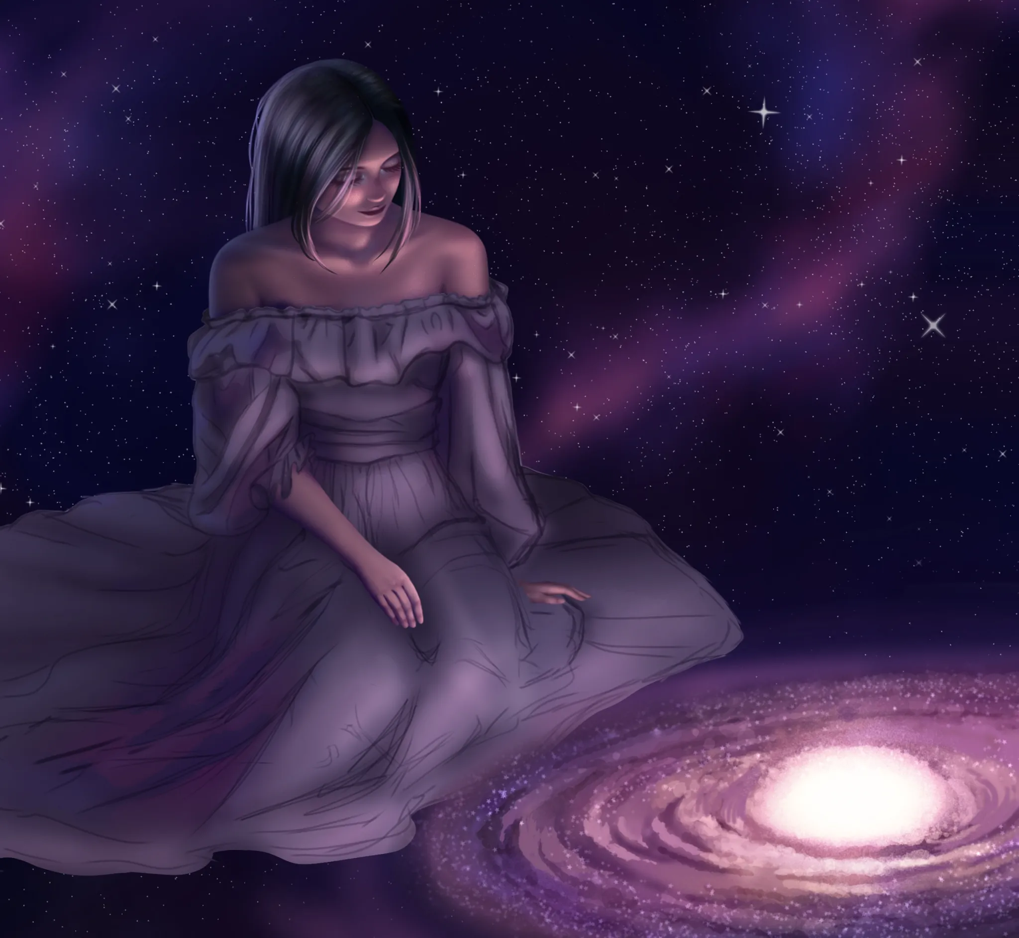
Spaced out
It's not finished yet I'm still working on the dress but I need help with the perspective of the entire image it feels off. I could use some tips on lighting as well🙏
1 hour ago
View
Anatomy
No responses yet
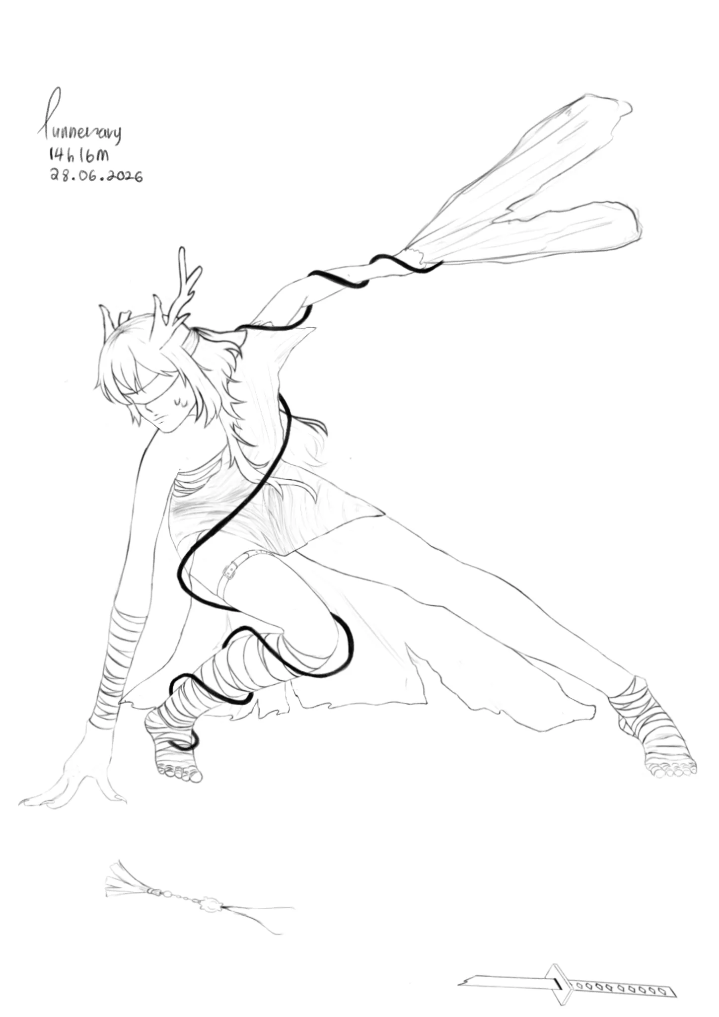
oc/miha anatomy
i just started anatomy in January.. and i genuinely cant figure out how to make the stance more natural.. she's supposed to be flat.. i mean the bandages should kept her flat but she still look so awkward.. i also have some problems with her head/face angle but cant figure out why .. maybe the horn placement or something.. her left hand is also weird... or it just my perfectionism...
3 hours ago
View
Rendering
No responses yet
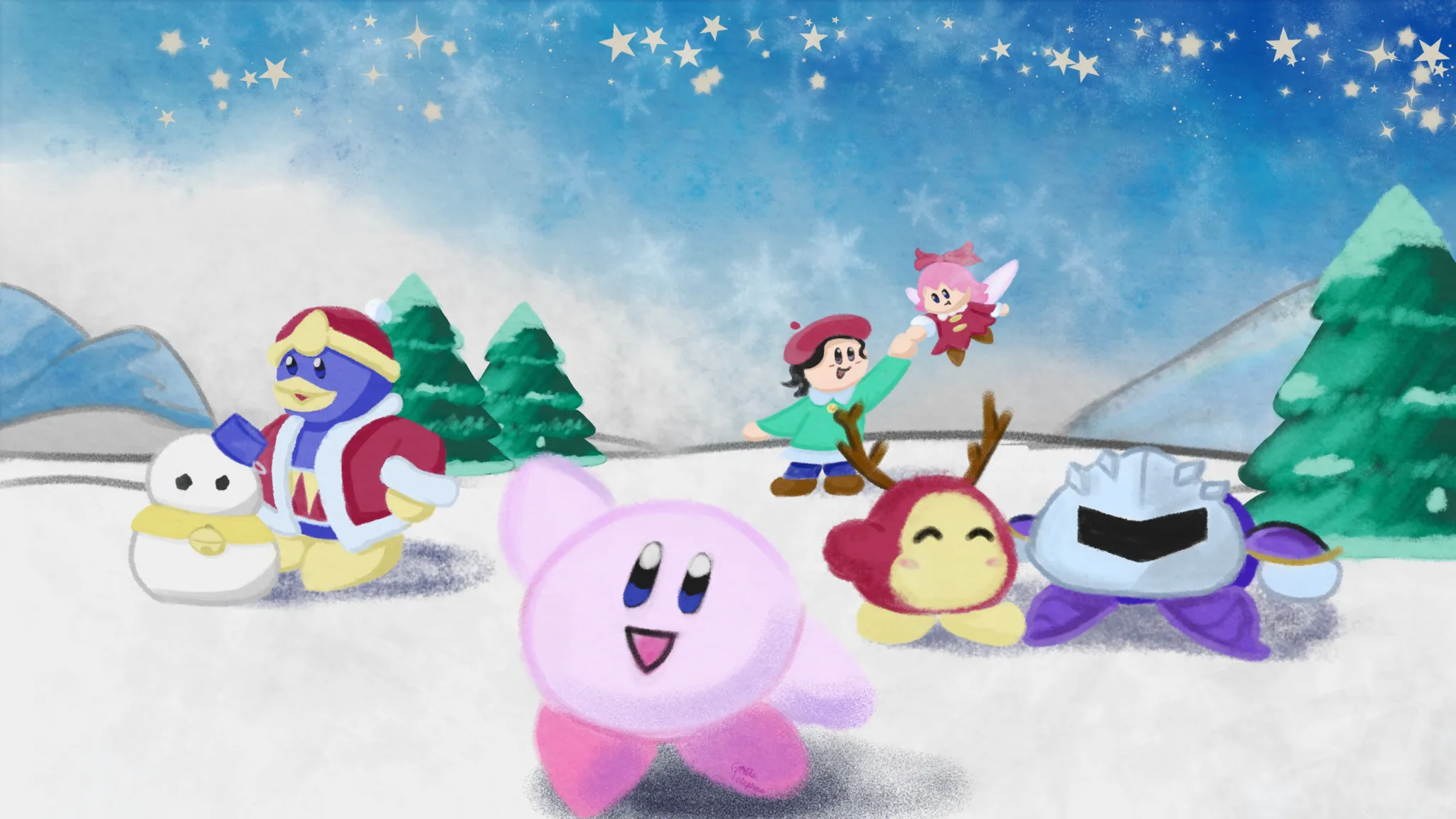
Kirby during the winter
I feel like the colors are off, and everyone looks like they are floating in the air instead of composited in. I've been trying to go for a chalk/watercolor style, but I think there is maybe a texture layer I should be adding in. This is my first time using this website, so if there is something else I should do in the future, please let me know!
5 hours ago
View
Portraits
No responses yet
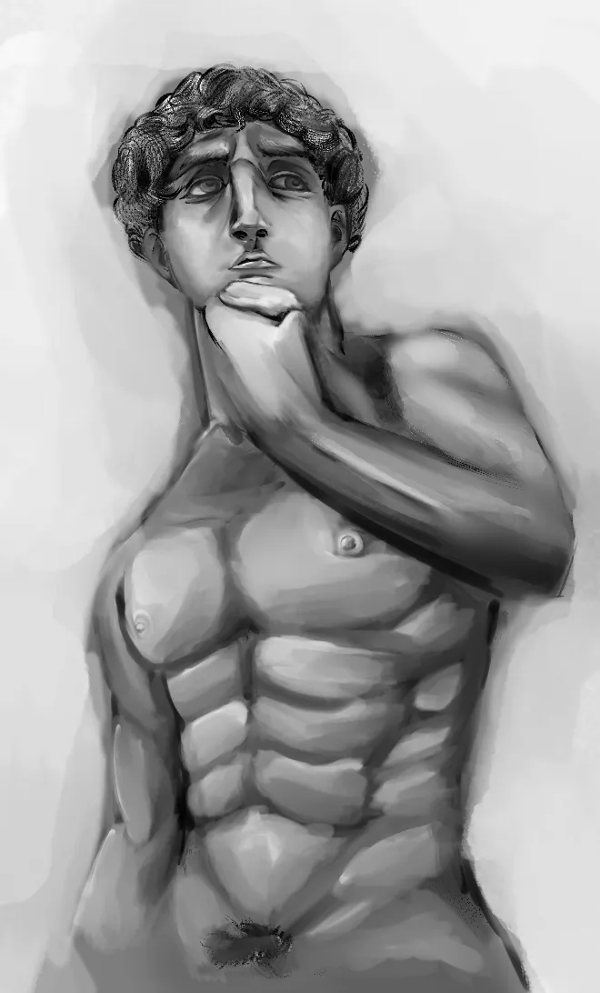
michaelangelo statue study
I don't know how to make my proportions while doing an art study of this statue, any tips?
5 hours ago
View
Perspective and Form
No responses yet
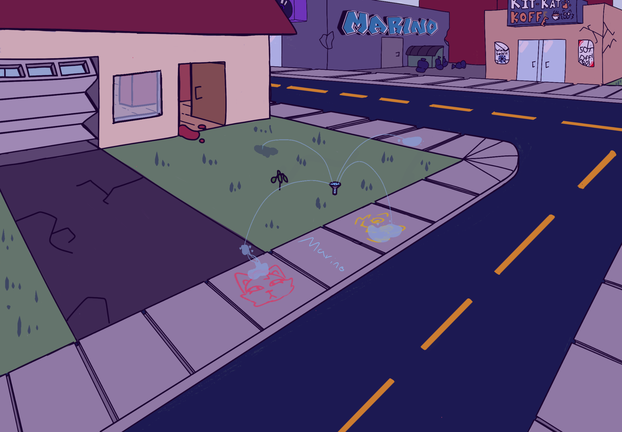
Careless Street
Hello, I’m a 14 year old beginner artist who started art and Artwod 7 months ago and I drew this picture on my iPad. I’m wondering if anything needs to be changed. To me, I feel like there’s something wrong but I just can’t seem to figure it out and I was wondering if anyone could help me, thanks :)
6 hours ago
View
Portraits
No responses yet
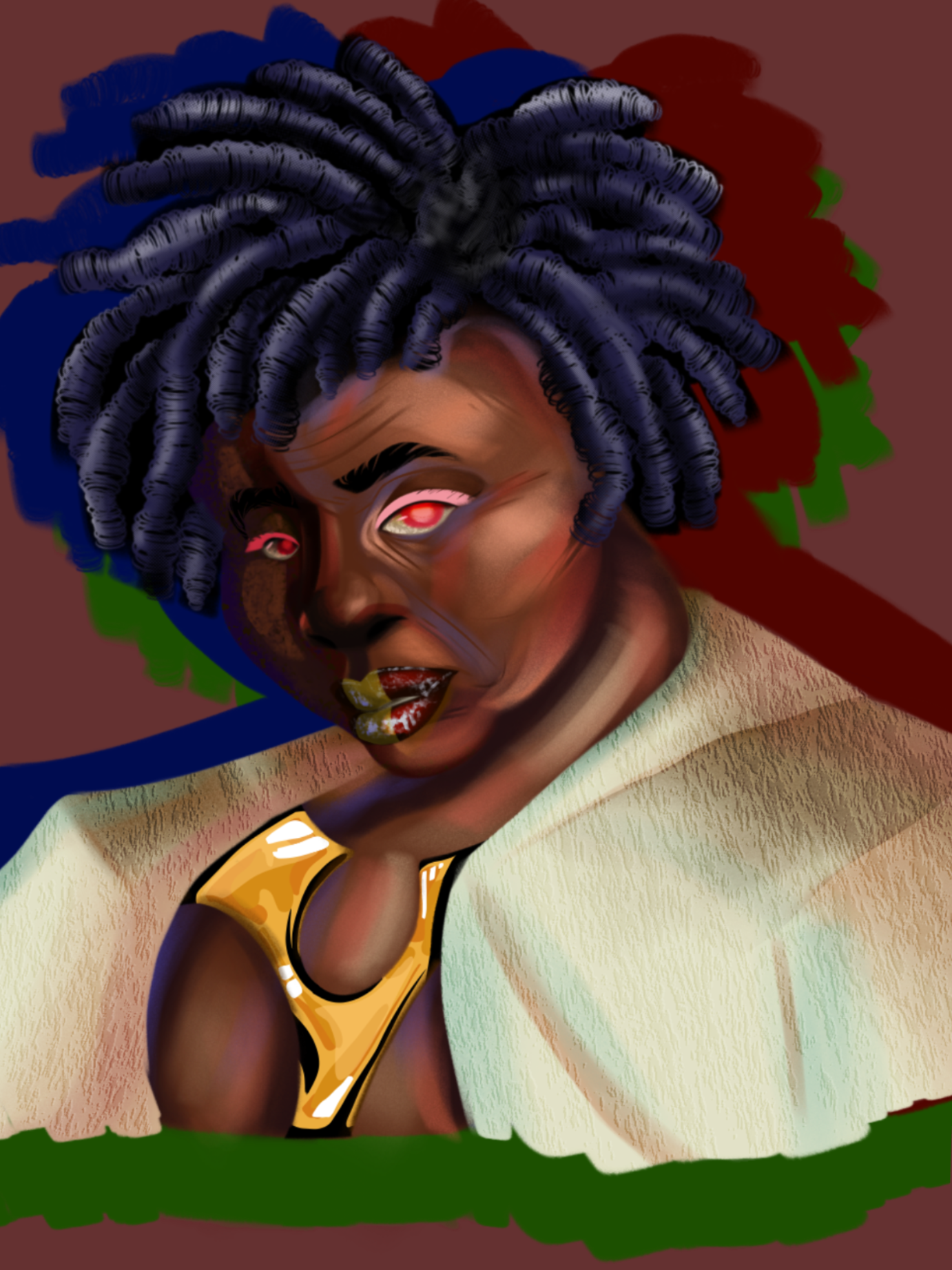
Cyberpunk OC
I just don’t like how my colors turn out, they feel muted, or like they don’t match very well. I’m not aiming for realism, but like cartoon art theory has eluded me forever.
7 hours ago
View
Perspective and Form
No responses yet
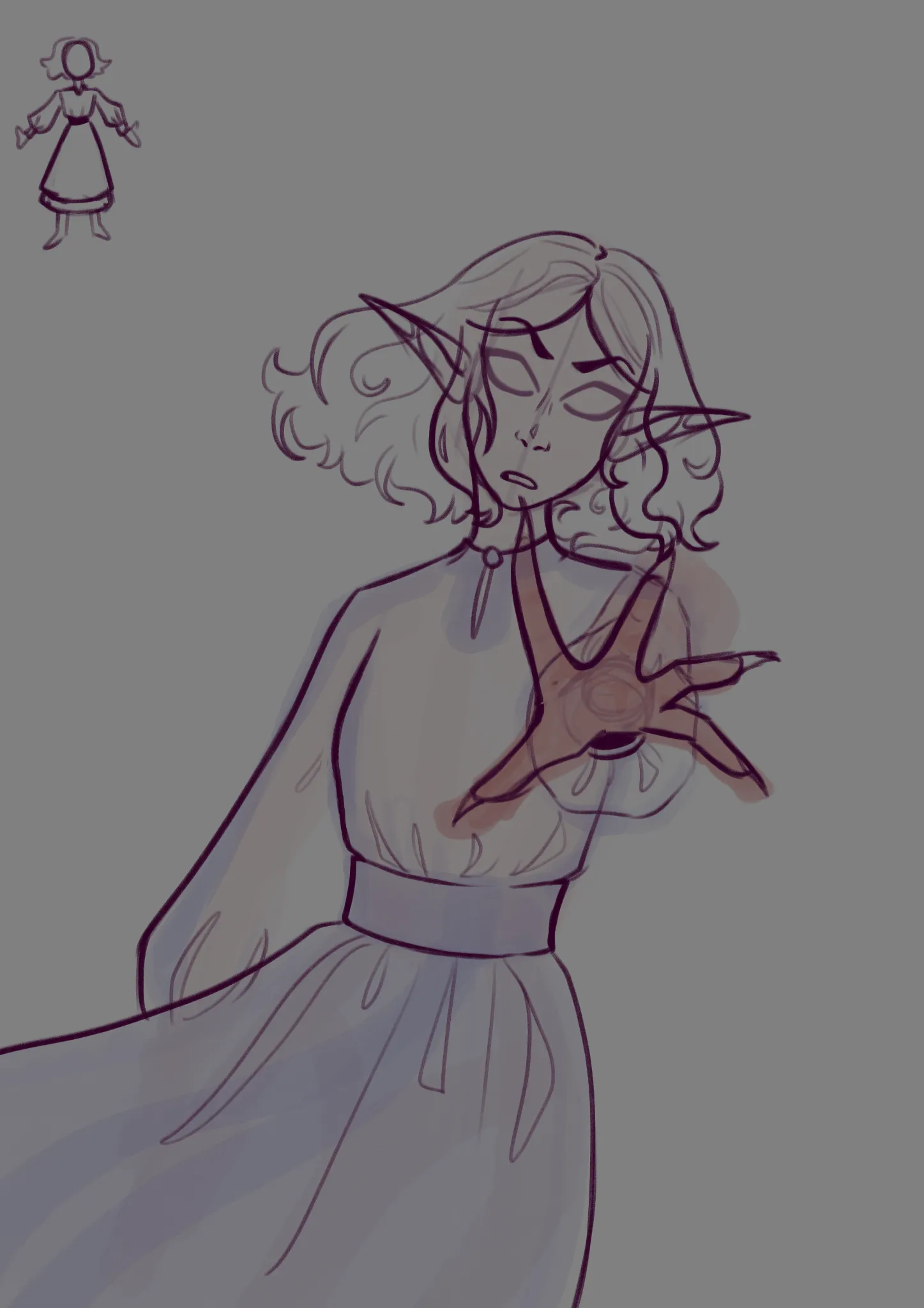
The fire
I'm having a struggle with the hand perspective, especially with the sleeve and how it would form around it Not sure about the creases and fold in general either the dress shape is in the top left corner
9 hours ago
View