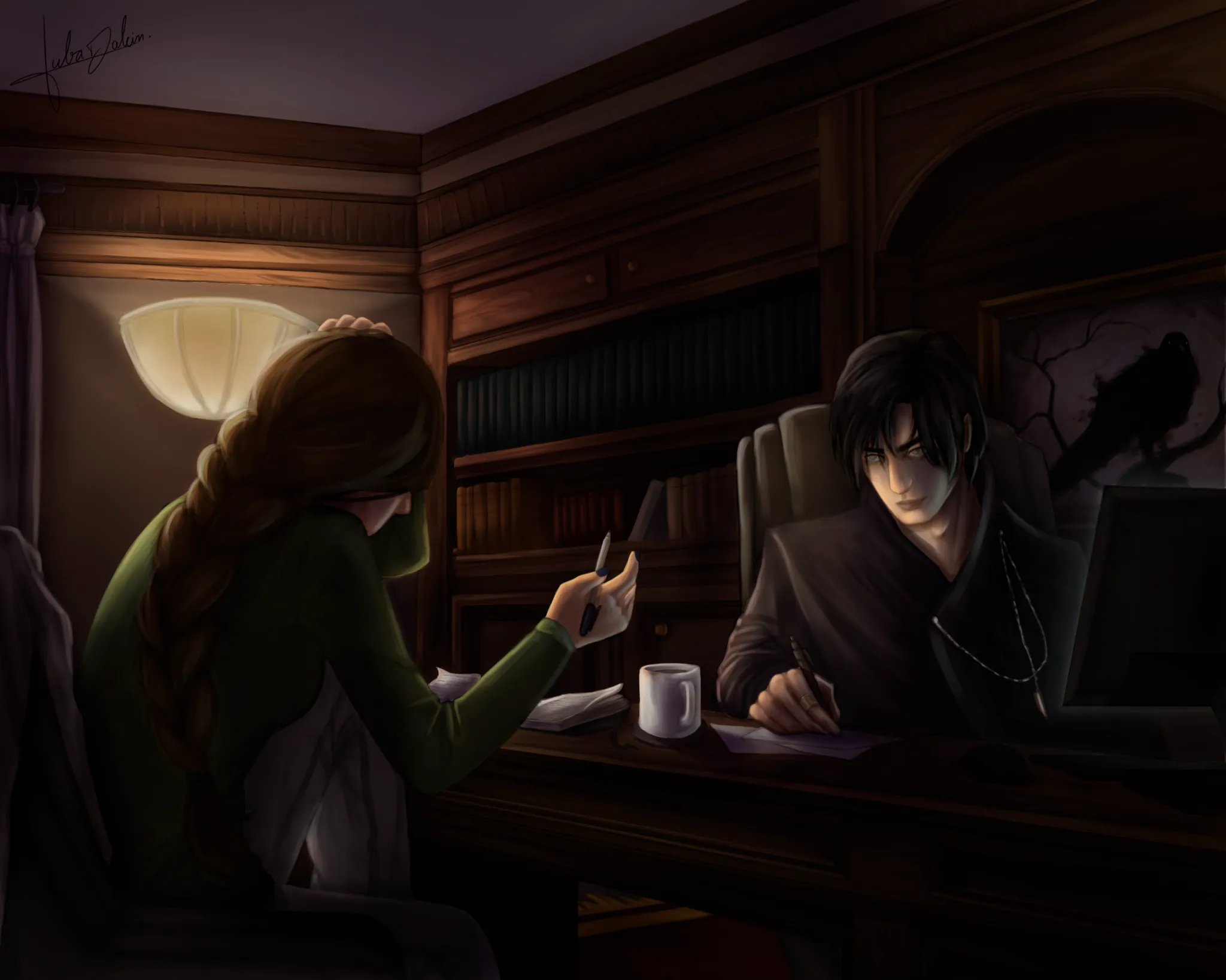
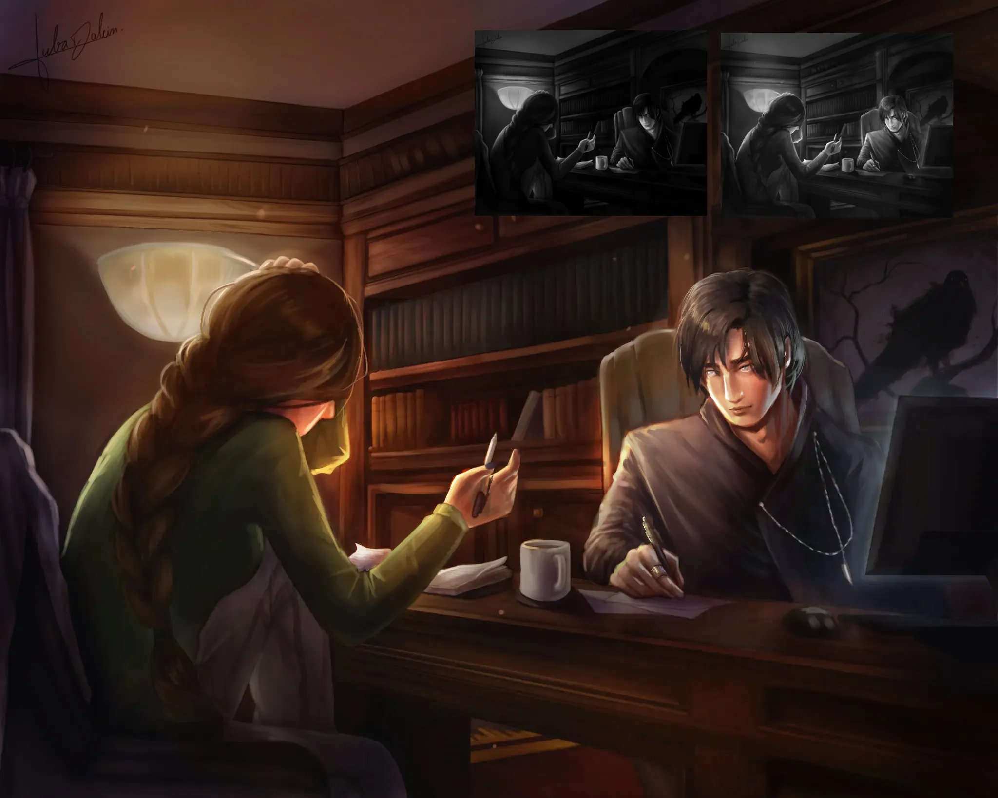

I added more warm colours into the whole piece since this piece is supposed to be comfortable so I think that's appropriate. Your values are mainly missing the middle values, which makes the overall painting feel too dark. I brought back the midtones and make the face brighter overall so that the whole face becomes the focal point. I soften the expression a little too because it felt like the stare he is giving is too intense. Check your values using grayscale, makes it easier to check the clarity of your silhouettes and forms.
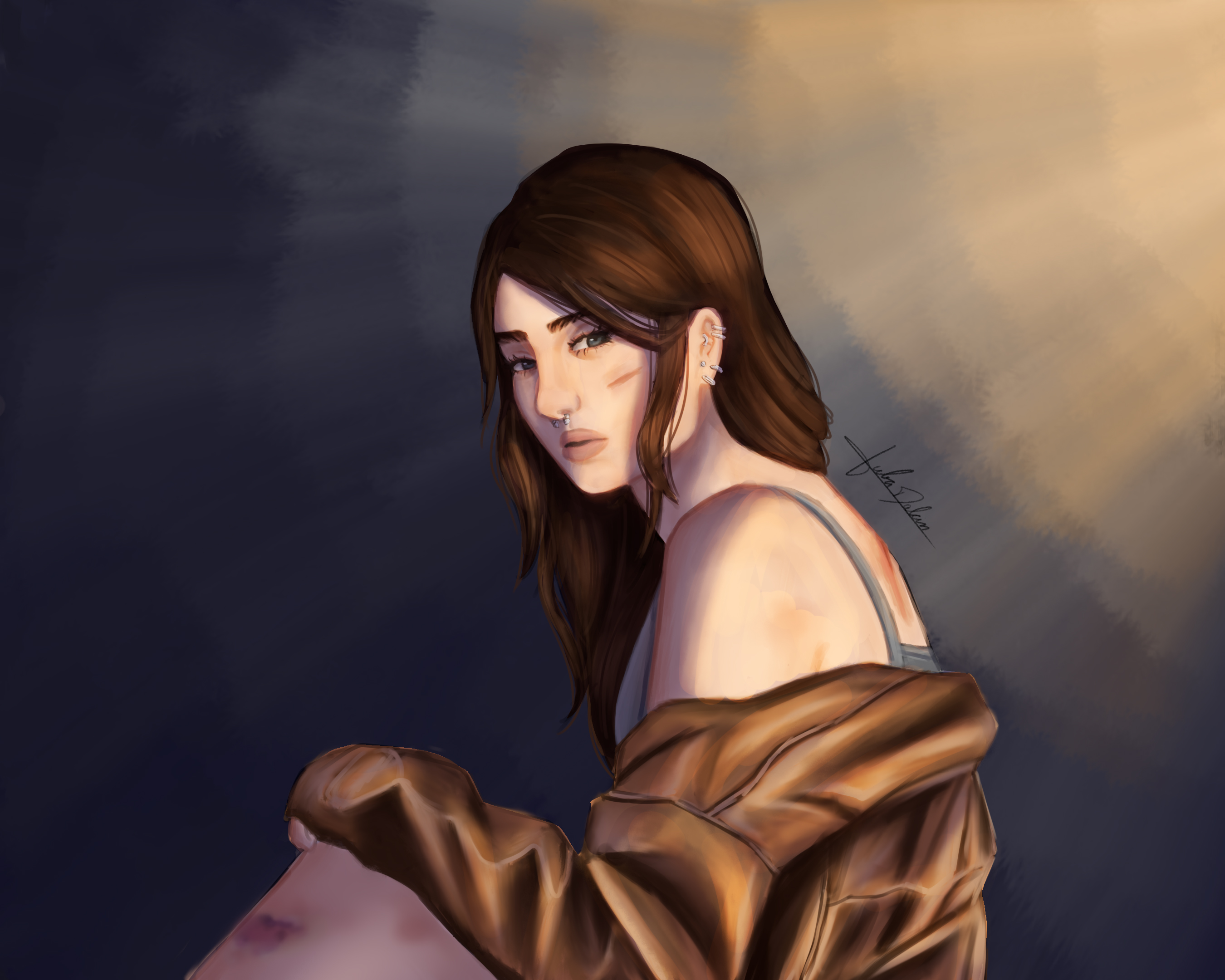
Thank u so muchh