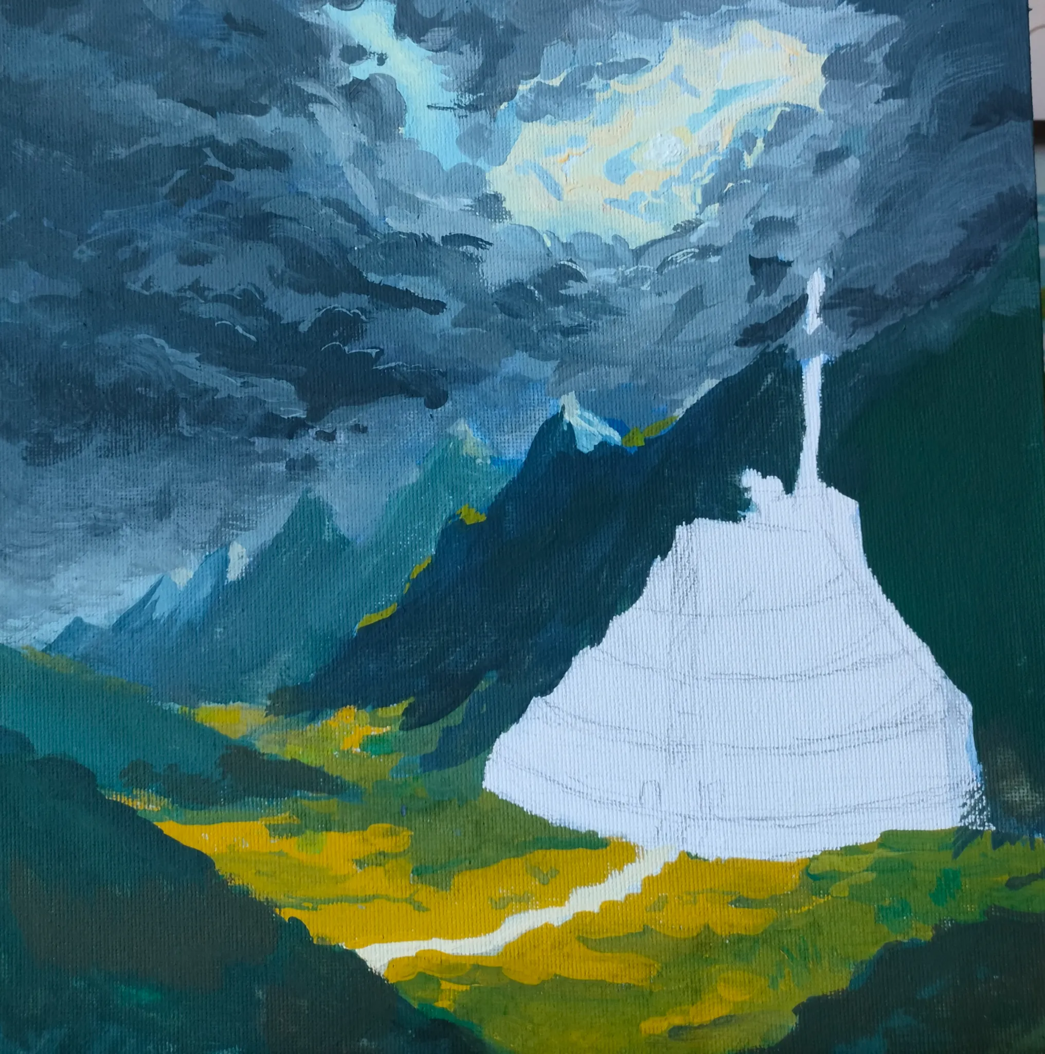
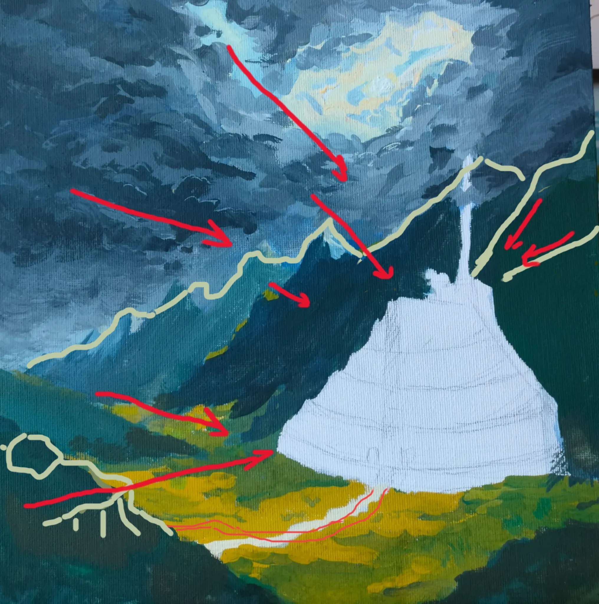
The composition is already very strong. It is clear that the large building is going to be the focal point so the rest of the composition should support and guide the eye toward it. I want to apologize for the markings on the picture - I only have a mouse to work with and it is pretty terrible. What I, personally, would change: 1. The sky is very impressive but I would simplify it a little into large masses that tilt towards the main focus, which is the building. The clouds are very detailed and important right now. Also, the light opening is very bright and is becoming too dominant to the eye. I see the light streaming down and lighting the objects below which is beautiful but mute is down a little bit so it doesn't steal the show (unless it is supposed to). 2. The mountain peaks are too similar and look cloned. Vary the skyline with a broken pattern so it creates an interesting line. I traced an example, make your own. You can use mountain slopes to point towards your main object too. 3. The path to the building has too many wavy unnatural twists. I'd make it more flowing and merging into one of the valleys to avoid a rigid, almost straight angle it creates now with the mountain in the lower left corner. 4. The valley is beautiful. Just make the colors less saturated and fade in the distance like you did with the mountains. Right now the intensity of the color is the same both in the foreground and in the distance. 5. Since the mountains on the right and lower left are the closest, I would make them most detailed. Right now they are more blocky shapes while the mountains in the distance are more detailed. It should be the other way around. All in all it looks very impressive. Looking forward to see the completed temple!
Paintovers (1)
Minas tirith
Artist's notes:
Struggling with the light in the skyand perspective on the mountains. I don't know what amount of detail to add to the mountains that are close by and the foreground