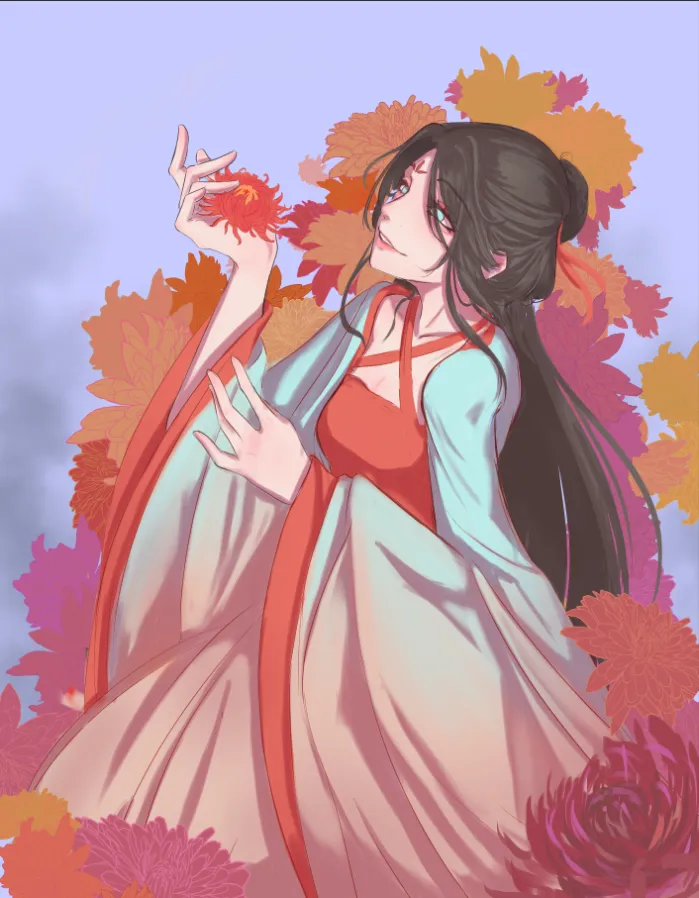
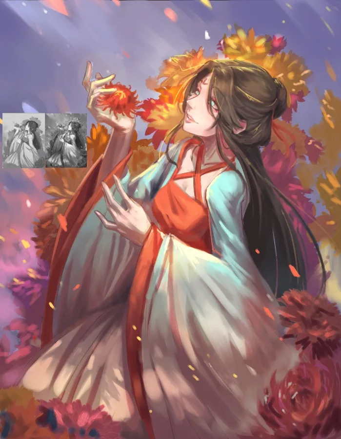
I think this piece definitely has a lot of potential. I do recommend checking your values often and use references when you render. For the composition, I tried adding more atmospheric layers like a mist effect, petals in the air, and light shining down to just make it feel more spacious without changing the positions of anything. For shading, checking your values can help, I used more value range and for the focal point, which is the face, I use the lightest values and with more contrast too. Your values also helps with your composition, if you are unsure you can try thumbnailling in grayscale to figure it out. Colour, again, values! If you can manage your values well, you can definitely add any colours and it would still be coherent. However, if you aren't too sure about it just go with more analogous hue shading, or mix the colours you already have in the piece and work from there. I'd love to see how you would continue with this piece though, cause it'd definitely be more interesting with some embroidery or metallic accessories!
Thank you so much! And your paint over is beautiful ❤️! I'm going to keep that in mind going forward and pay extra attention to my values. I'll def post the finished piece when I get finished eventually!

That is one beautiful paintover