Want to store your feedback?
Sign up to store all your feedback in one place on your account. Your feedback will be private instead of public.


Choose a paintover
Pick a user avatar to see their paintover notes and discuss them.
Improve your proportions and landmarks, a 3 min read
Master figure drawing by manipulating simple forms, studying anatomy compartmentally, simplifying concepts, gradually increasing complexity, and practicing abstract shape exercises consistently.
Anatomy


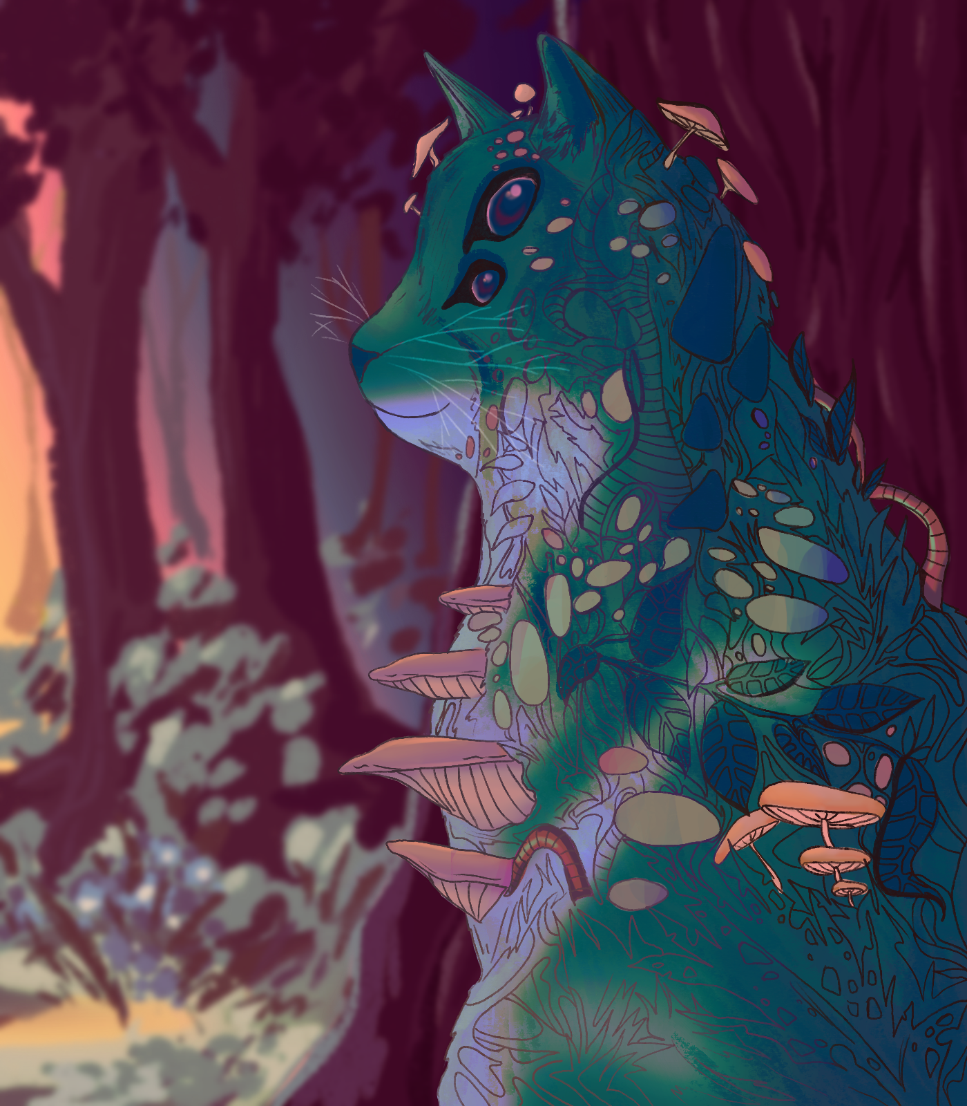
Raccon Mage
thank you for your feedback and recomendations, i created a new background based on your recomendation @ overinker.i see what @ kidmoe meant about relationship and quite like his redraw of my origional illustration. any ideas or feedback on the new concept would be gratly appreciated,

PNGTuber Revamp
def looks a little bit better. maybe i should ajust the eyes more? i think the hair is giving the illusion that they're uneven

City Bakeneko
I wonder if my approach to things is a bit too loose. I like the general look but I might be too tied to my idiosyncrasies.

An Old Friend (or Foe?)
This is my first time using the feedback tool, so forgive me if I make any mistakes while using this. I drew this pic as a last-minute submission to actually complete SOMETHING. It's not pretty or neat or anywhere near completion, but the point of it to actually have something to show that I'm genuinely drawing and being more proactive on Artwod and using my skills. That having been said, my biggest hurdle right now is the sense of perspective with the umbrella. It's transparent in the original reference I have but I can't make heads or tails with it's "spokes" or whatever they're called. It's been a LONG time since I last made any sort of illustration digitally, so any advice, umbrella related or not, is highly appreciated. Thanks for the taking the time to read this and constructively critique my drawing!

Smaugust 2026: crossover silliness edition
Calling it finished, but I would love to hear what could be fixed/improved on next time I jump into a fully rendered piece. Thanks!

improve blending with the enviroment
I feel like the dragon is not well blent with the enviroment, what should i do? what else do you see wrong in the drawing?

Meeting an wyvern art
I was thinking about some one meeting an wyvern in an soort cave or pit with an waterfall in background. How could I make this idea look better. Maybe the colour are to same, to much brown? Does it need different values? It looked more clear in my value sketch.

The Joker
I drew the Joker but I don't know what's wrong with it. Thanks for any help I'm an aspiring comic artist!

Street Fighter 6 - C. Viper Fanart
There are many aspects of this one that leave much to be desired. The main thing however I'd say is the lighting, especially on the dress (the brightest spots are a mess). I tried to go for a kind of desaturated orange-ish main light here with simplistic , messy/brushy rendering. If I were to point out a second thing, that'd be the stiffness of the pose, making it somewhat boring.