
Paintover
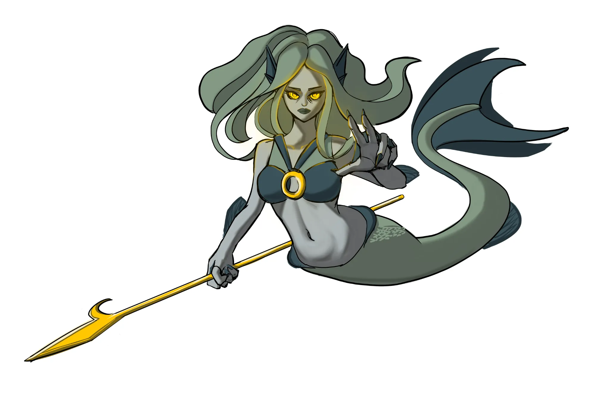
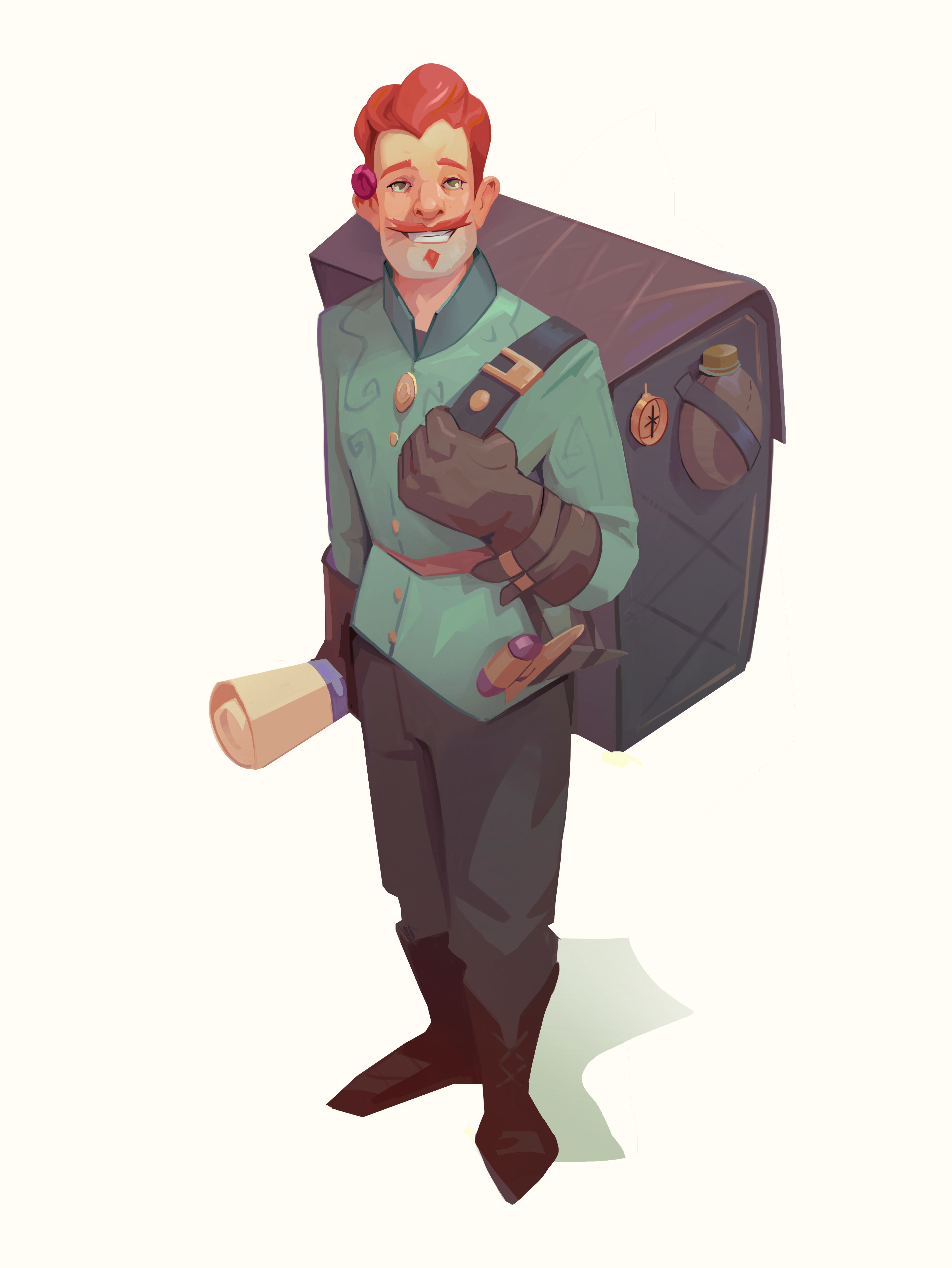
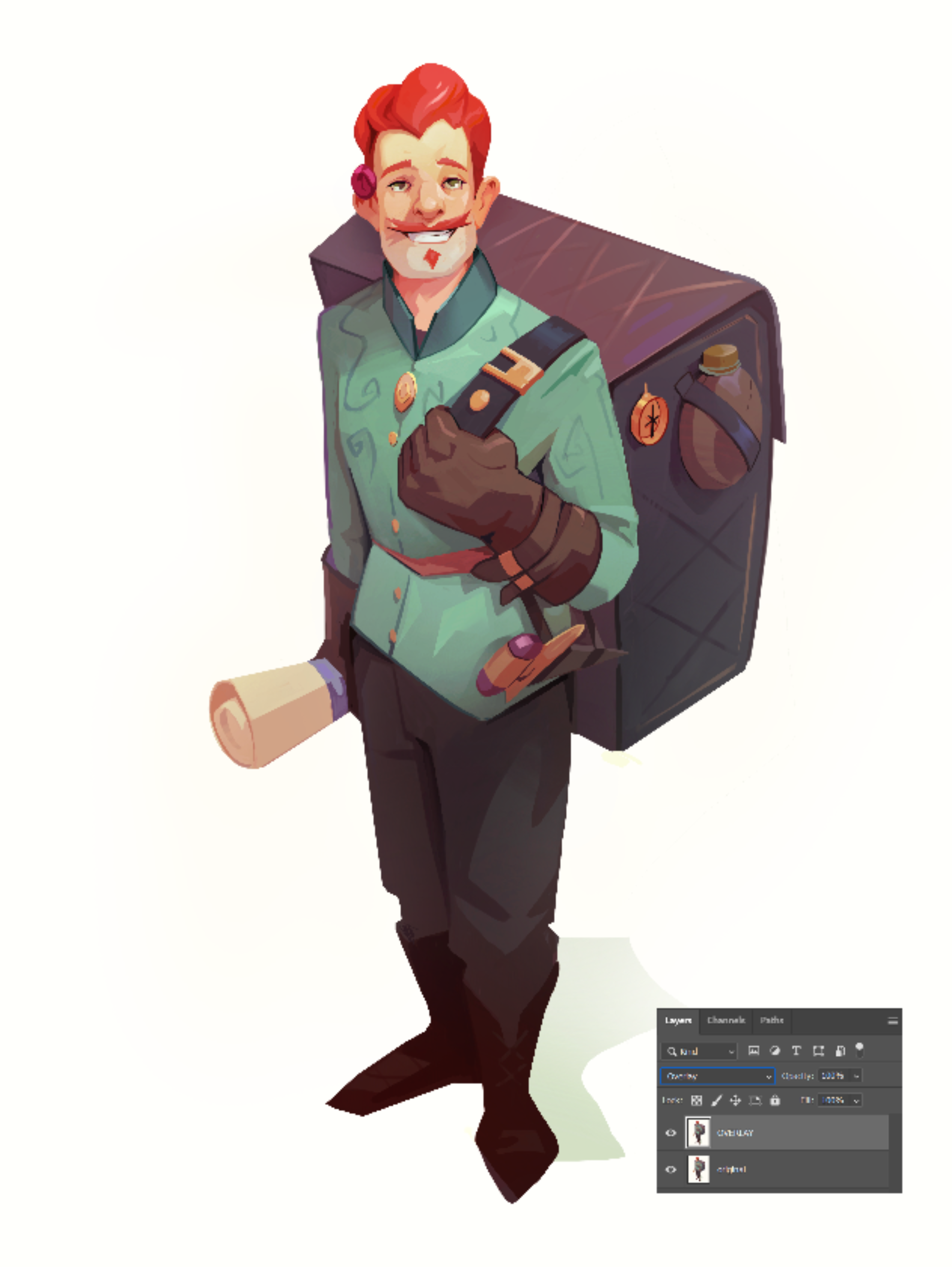
Your colors are nice, but they are quite mid toned, which is giving the piece a bit of a dusty/hazy vibe. A couple of little tricks I use when checking my colours: - Check your image in greyscale to check the tones. It's easier to see contrast/tone issues without colour - Duplicate the image and set the upper layer to overlay. This will retain your colour pallet, but will push the tonal/saturation values - you can then mask his back or it will at least shock your eyes to give you a new perspective on the piece :) Nice work, keep it up!
Mar 10, 11:44 PM