Want to store your feedback?
Sign up to store all your feedback in one place on your account. Your feedback will be private instead of public.
Paintovers
Paintover Notes
Choose a paintover
Pick a user avatar to see their paintover notes and discuss them.
Also struggling with your art?
Improve your skills, a 3 min read
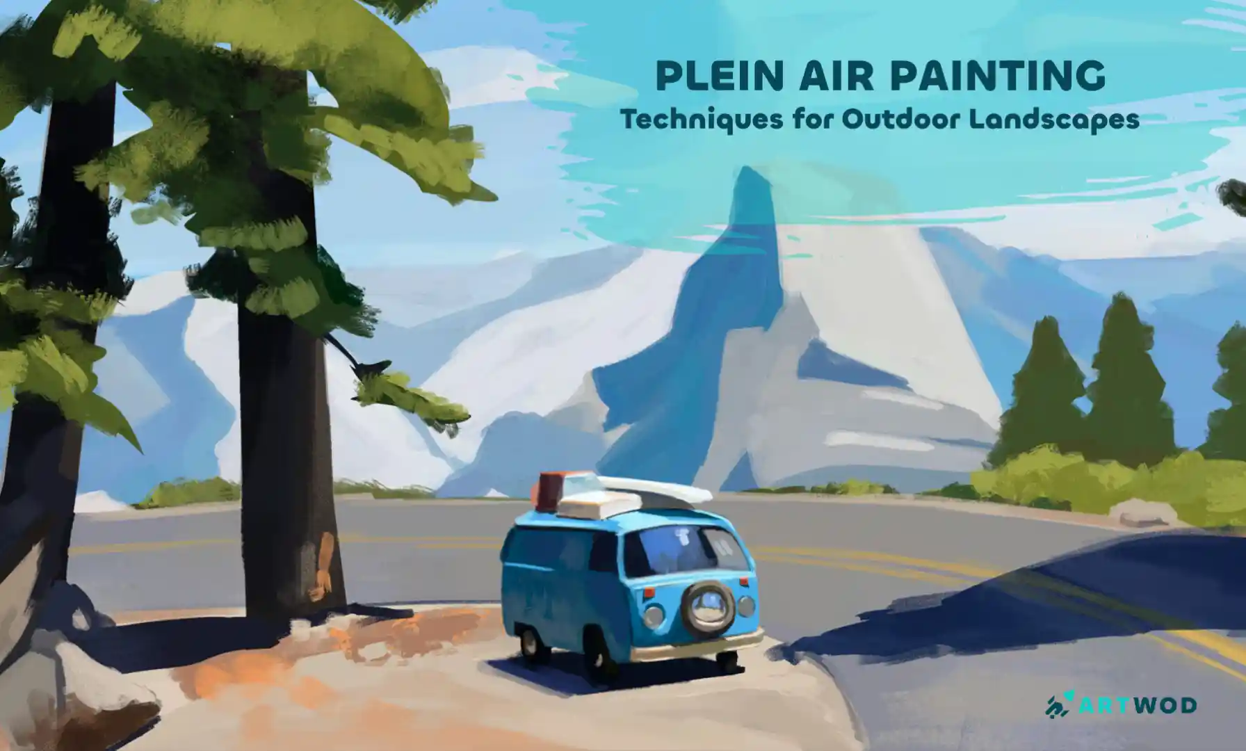
Plein Air Painting: Outdoor Techniques for Landscapes and Nature Scenes
Master plein air painting by analyzing compositions, sketching real environments, building value structures, and layering color to create immersive landscapes.
Environment
Would you like to help someone who's still waiting?
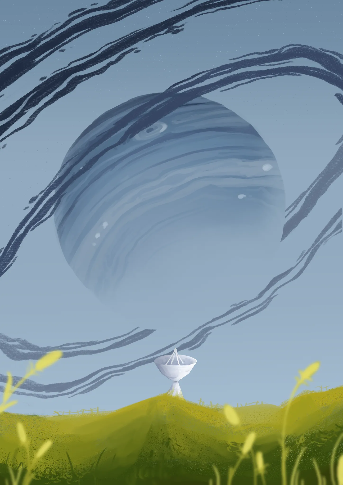
Environment
No responses yet
Gas Giant
Having a hard time with getting the fore/mid grounds looking right. Cannot draw grass for the life of me, and the telescope looks off, I'd appreciate any help!
13 minutes ago
View
Portraits
No responses yet
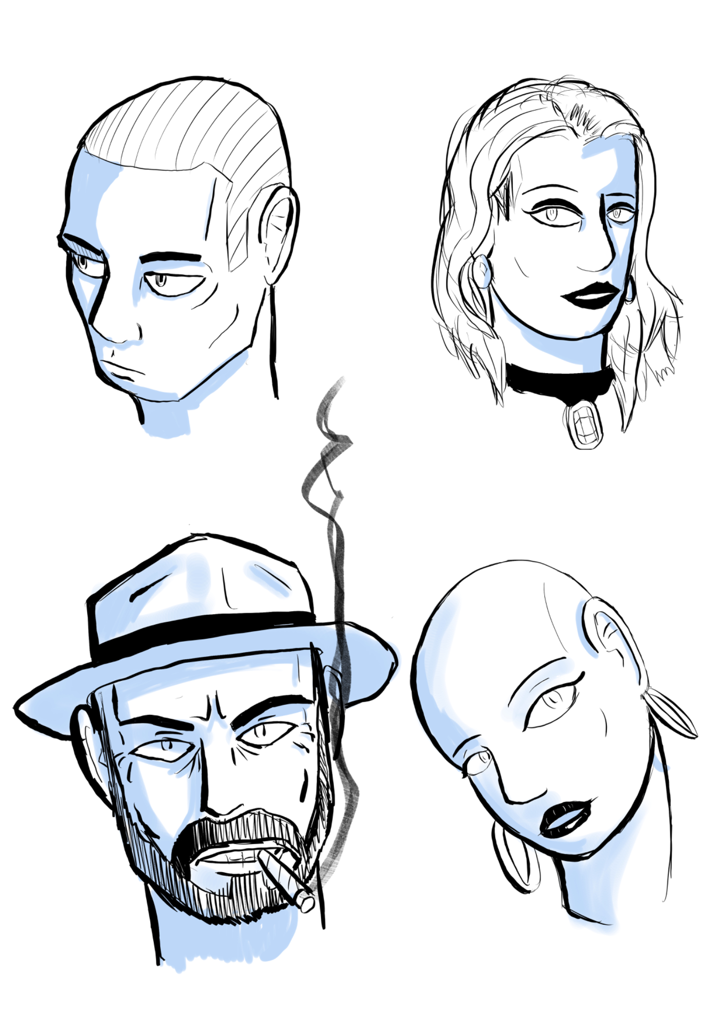
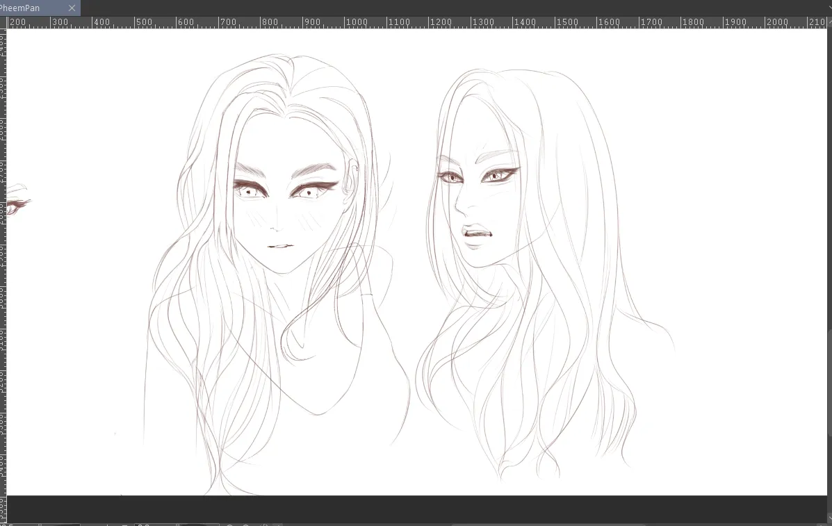
Portraits
Hi Any help with the portions or lighting would be great , specifically the female ones ( the ones on the right ) Thanks
16 minutes ago
View
Animals
No responses yet
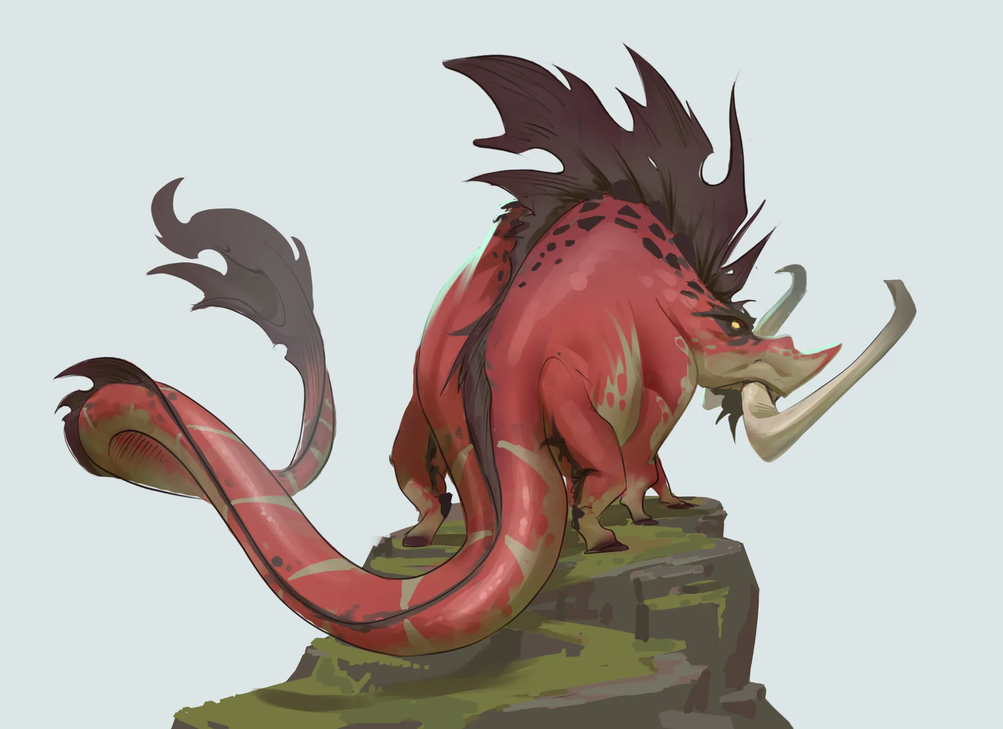
Boar Creature
I love to get some feedback on this creature design. I'm unsure about the proportions and the coloring.
53 minutes ago
View
Portraits
No responses yet
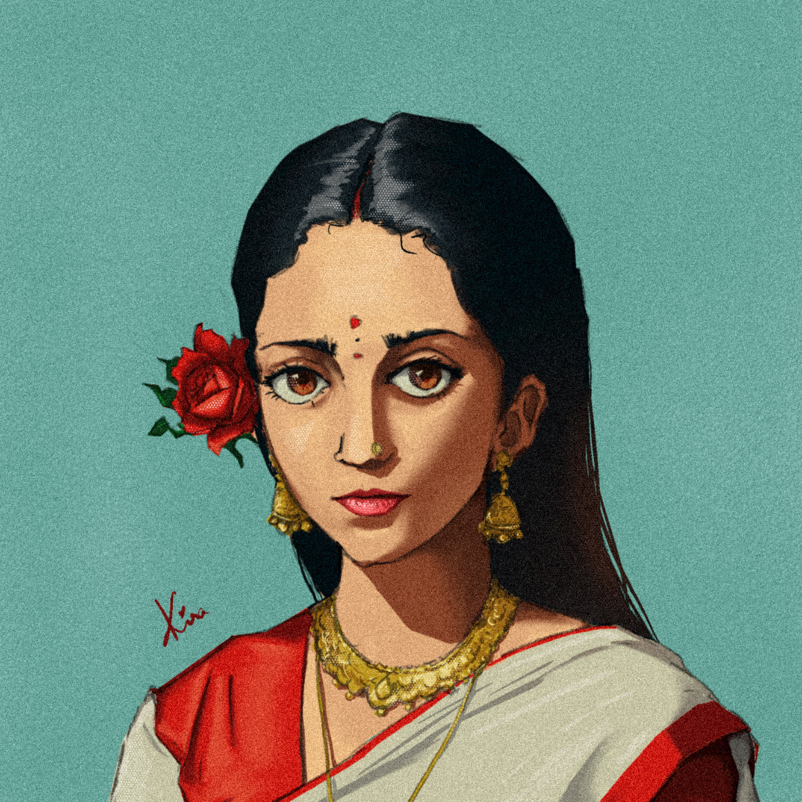
Portrait of a lady with a rose ?
I think there is something wrong with the face proportion and rendering …also cloth anatomy and hair
3 hours ago
View
Perspective and Form
No responses yet
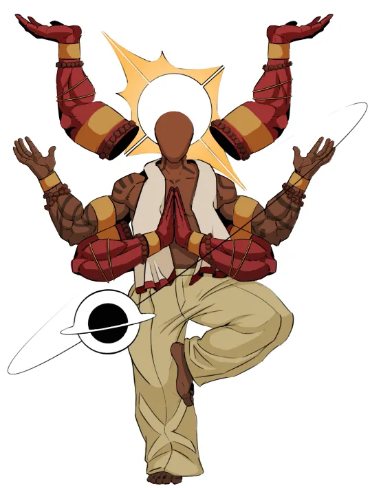
my character design. trying to build my own character in different cultures
is the pose and correct
4 hours ago
View
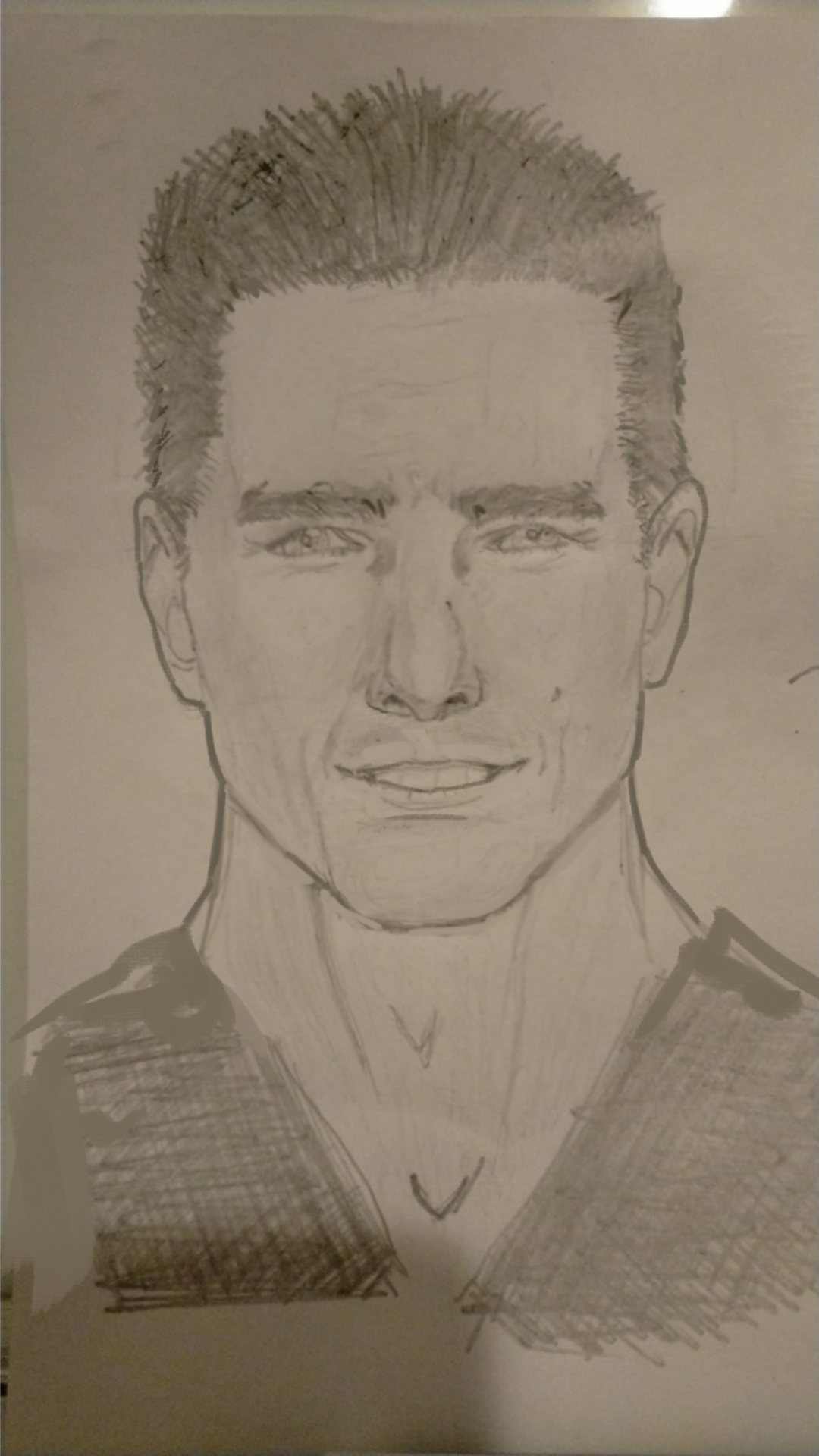
Portraits
No responses yet
Kazmo kramer
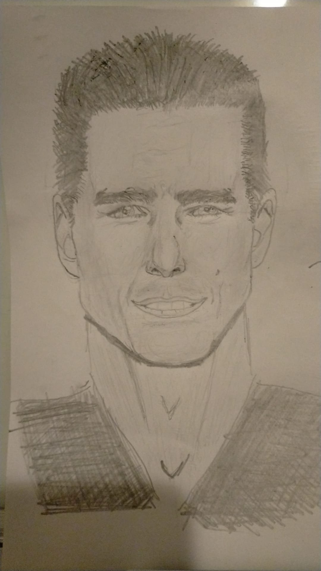
General
6 hours ago
View
Portraits
No responses yet
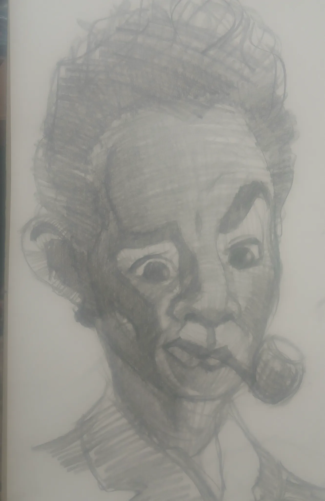
PheemPan
I'm really struggling with the features and the head. It felt like something is off here especially the 3/4th head.
8 hours ago
View
Figure
No responses yet
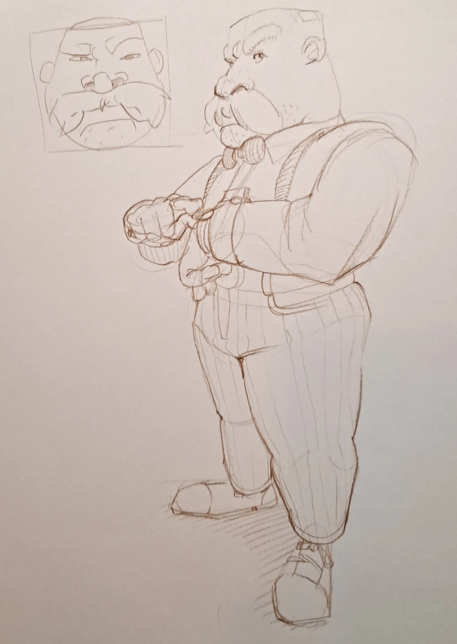
Fancy Dwarf Guy
This started out as a practice in unique head shapes and turning them in space, but it turned into a dwarf guy in a bow tie. Is the perspective working out? Any other thoughts? Thanks
13 hours ago
View
July Before & After Art Challenge
No responses yet
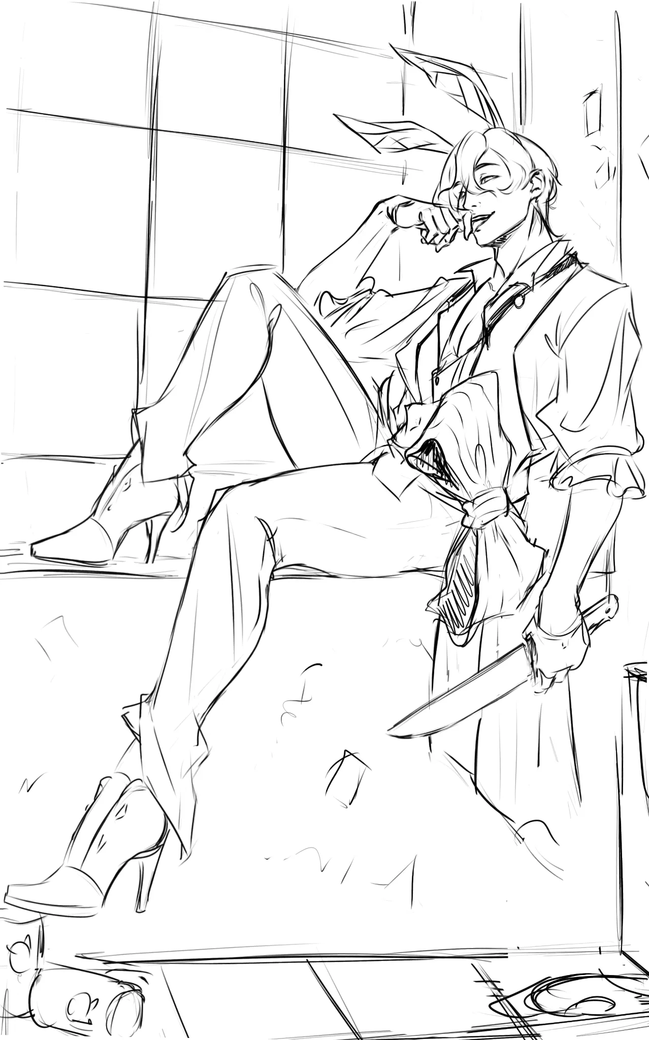
Redraw of an old piece - yandere bunny Belphie
Decided to go with version B based on feedback. Changed the angle a bit. Rough sketch before rendering. Could use help with anatomy >.<
15 hours ago
View