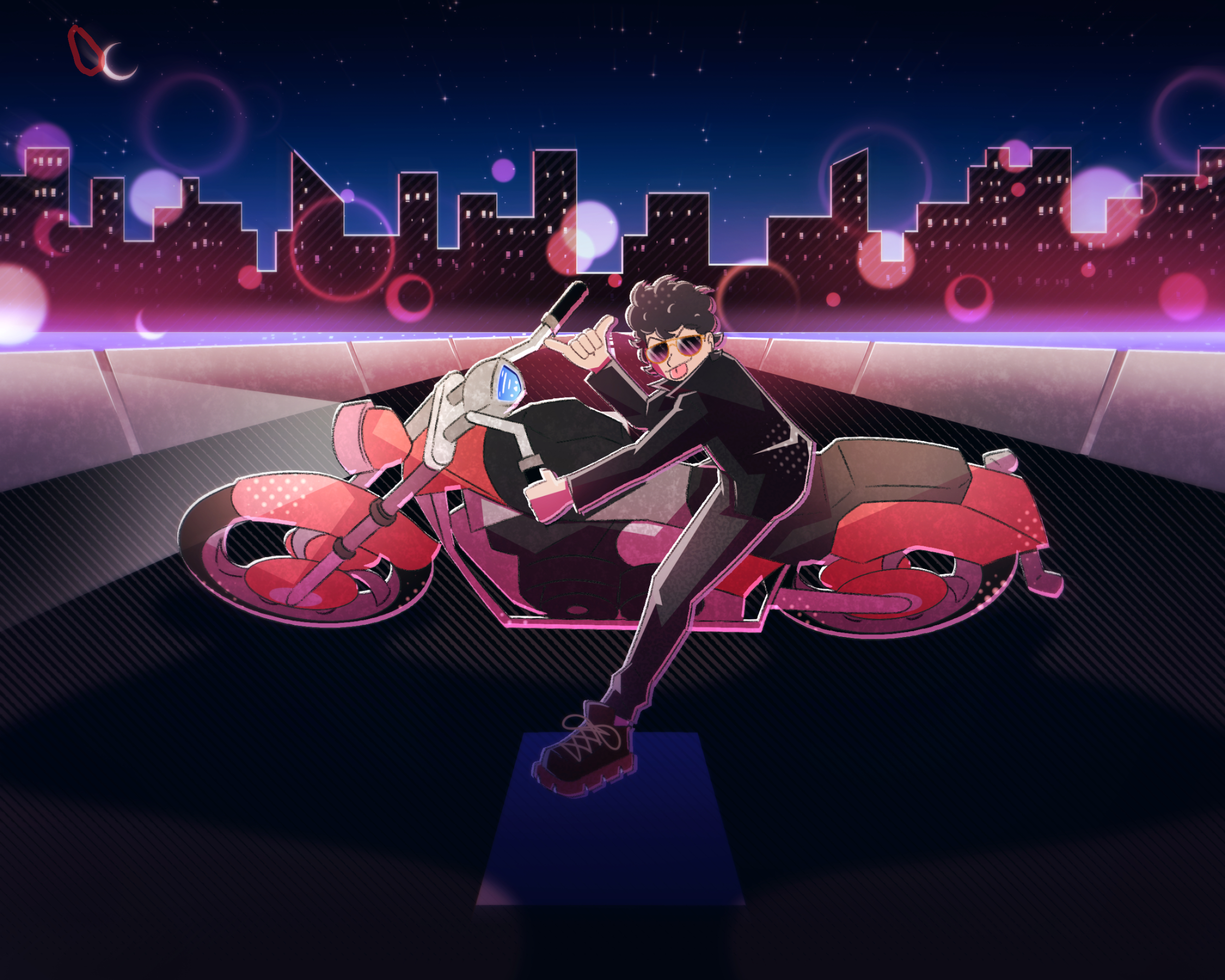
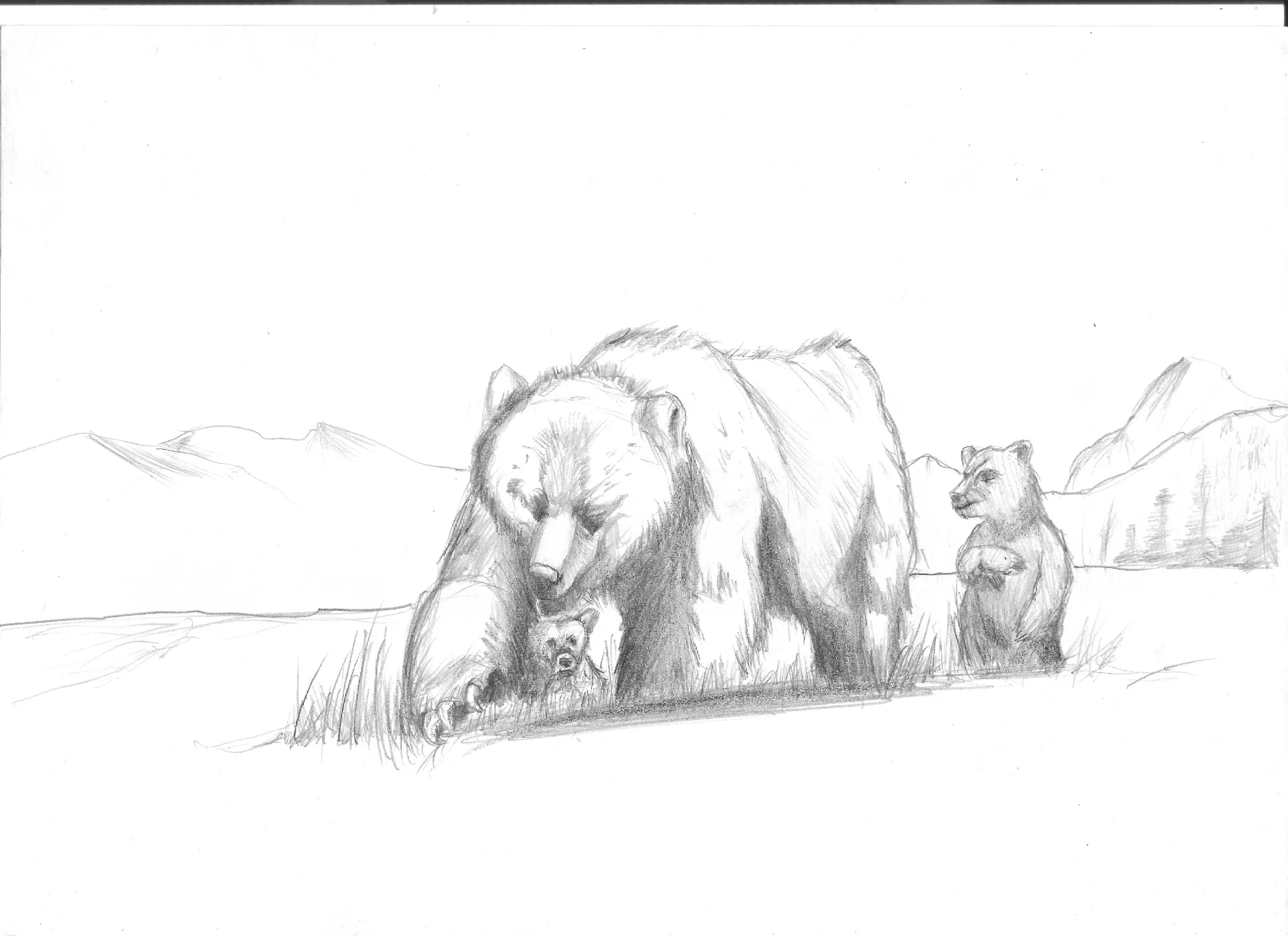
Your color palette works well overall, the pink/magenta against the dark blue creates nice contrast and mood. The issue isn't the colors themselves but how they interact: the bokeh circles and the motorcycle compete for attention because they share similar pink tones and saturation levels. On rendering: You're right that it feels a bit heavy in places. The hatching/texture is applied uniformly across many surfaces. Try being more selective. use that rendering style to emphasize form and shadow, not on every element. Also, while I understood that it must be water, I would push down the buildings to not have this small strip filled by water. Either that or make it bigger. I highlighted a blending white from the moon that looks like a leftover. I hope this helps !
Want to store your feedback?
Sign up to store all your feedback in one place on your account. Your feedback will be private instead of public.

Feedback Thread
Paintover
Feb 5, 2:45 PM
Also struggling with your art?
Improve your skills, a 3 min read
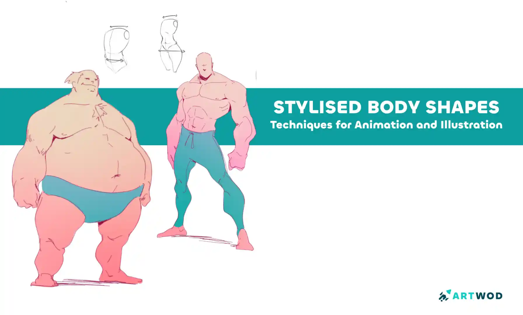
Stylised Body Shapes: Simplify and Exaggerate Figures for Animation and Illustration
Break down stylized characters into basic shapes, experiment with silhouettes, and layer anatomy to create expressive, believable designs with personality.
Figure
Would you like to help someone who's still waiting?
June 30 Sketchbook Pages Challenge
No responses yet
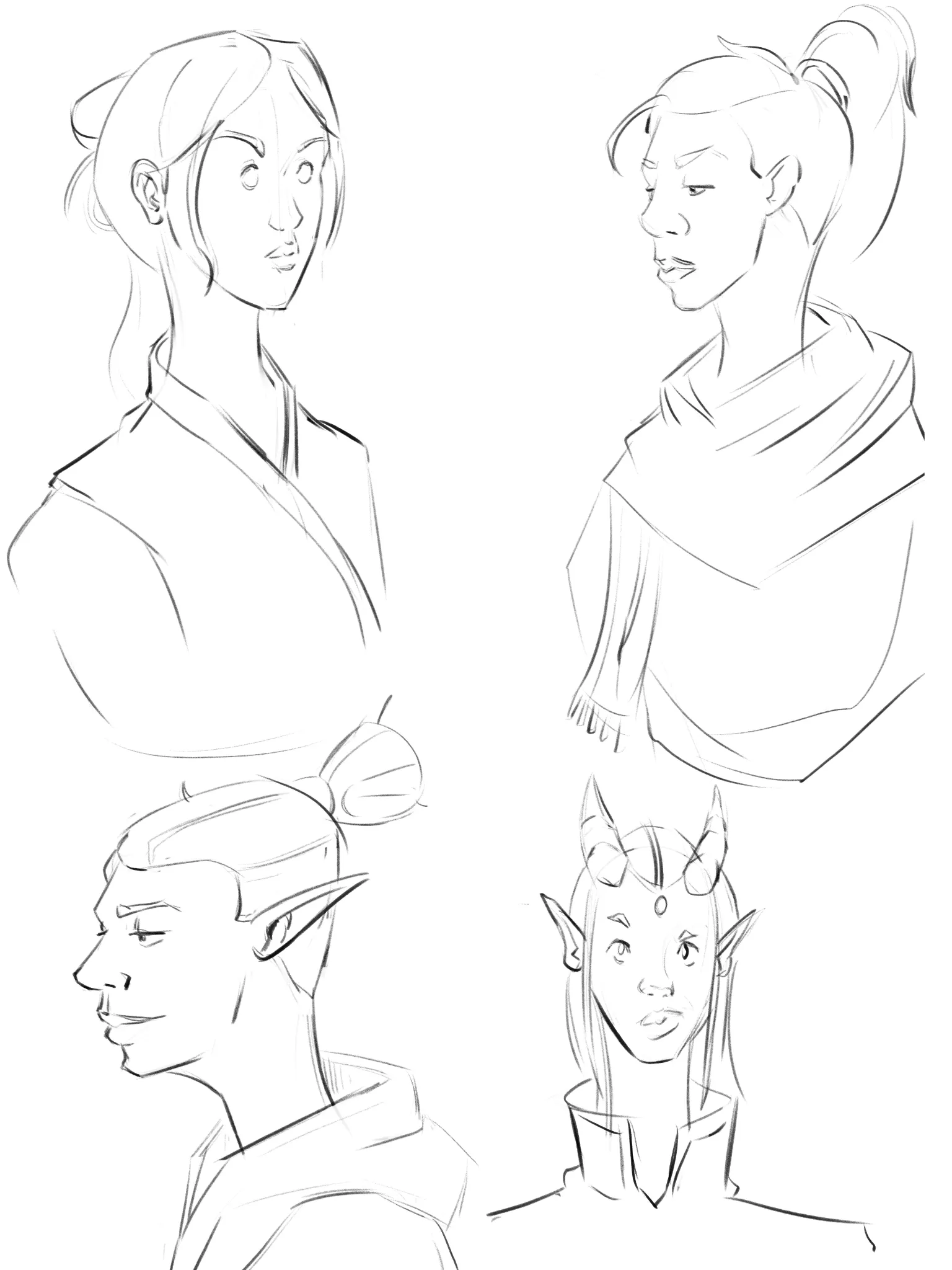
Page
coming up with more interesting shapes
4 minutes ago
View
June 30 Sketchbook Pages Challenge
No responses yet
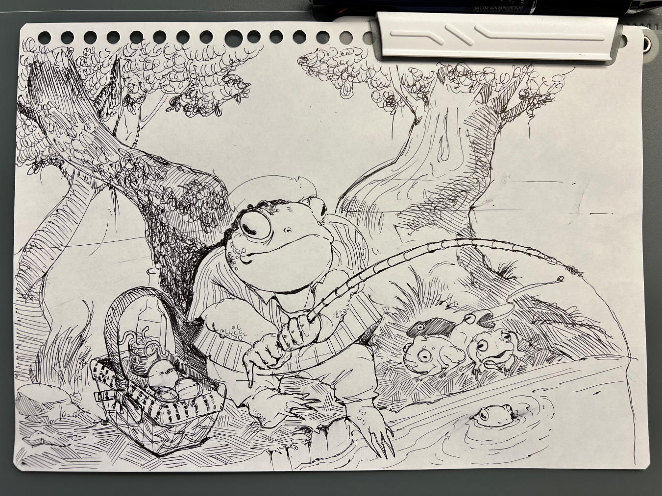
Daily sketch page, day 2
Trying to incorporate stuff I learned from portrait road. Drew my OC this time. Struggling with keeping face looking the same in all angles (and fail :x)
18 minutes ago
View
June 30 Sketchbook Pages Challenge
No responses yet
Sketchbook pages 01
Hey everyone! this is my first post here - I’m super excited to share some of my art with you all! I really want to improve my compositional/perspective skills during this month’s challenge. But my main goal is just to have fun and make cool drawings :D - I appreciate any feedback you can give me for my first entry for the challenge :D
50 minutes ago
View
Rendering
No responses yet
David
One thing I constantly struggle with is rendering it always feels as if I’m missing a step or theirs a gap between my knowledge. Feel free to critique my lighting, shading, and etc.
56 minutes ago
View
June 30 Sketchbook Pages Challenge
No responses yet
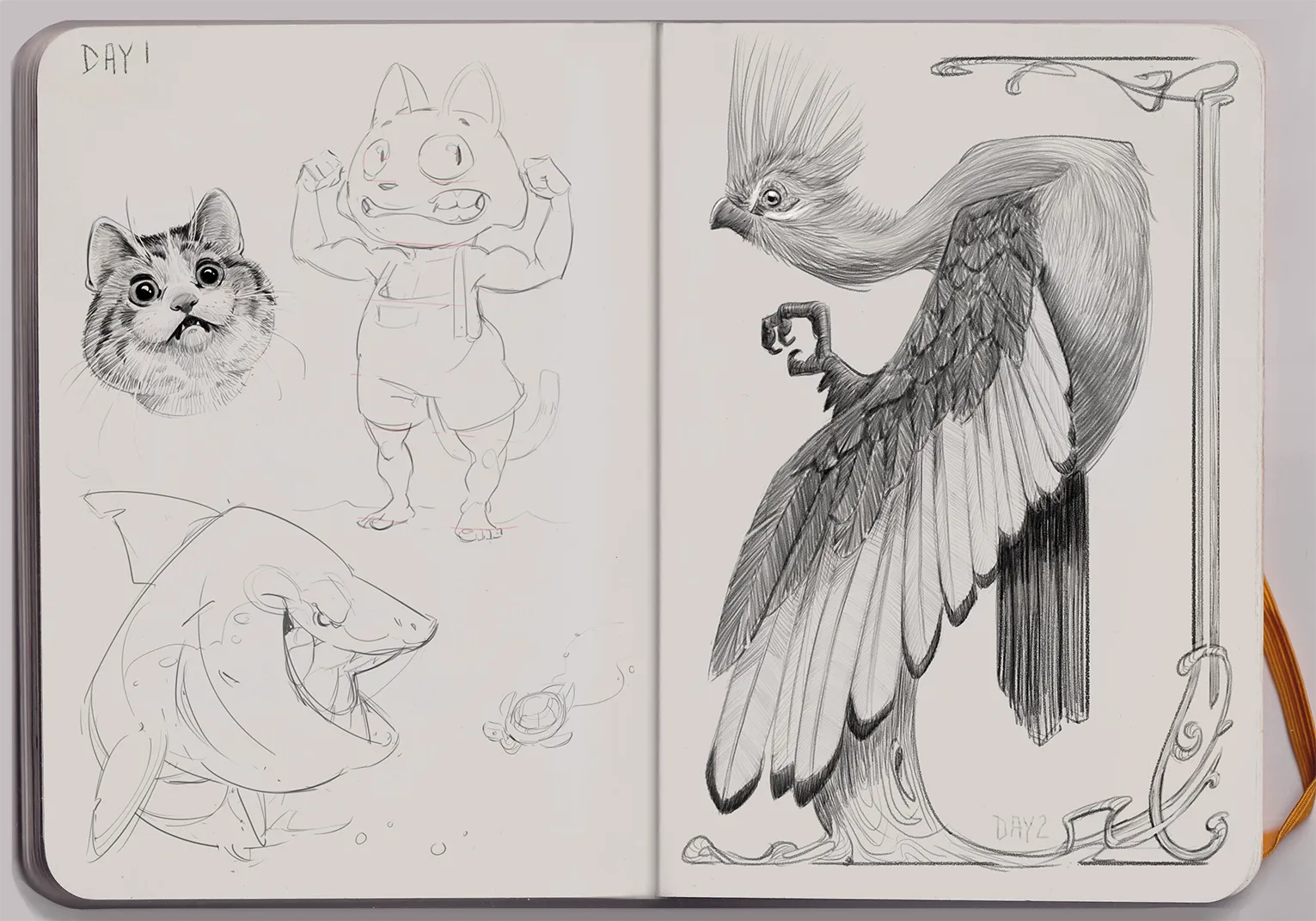
Day 2 Jacqueline's Sketchbook
A Knysna Turaco bird in Art Nouveau style
1 hour ago
View
May Mermay Art Challenge
No responses yet
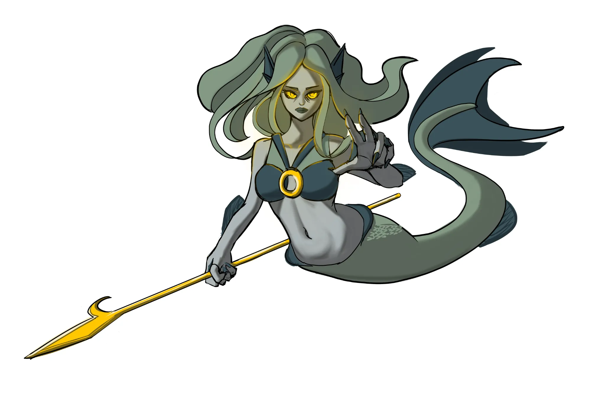
Mermaid
Made improvment of the hands.
3 hours ago
View
Rendering
No responses yet
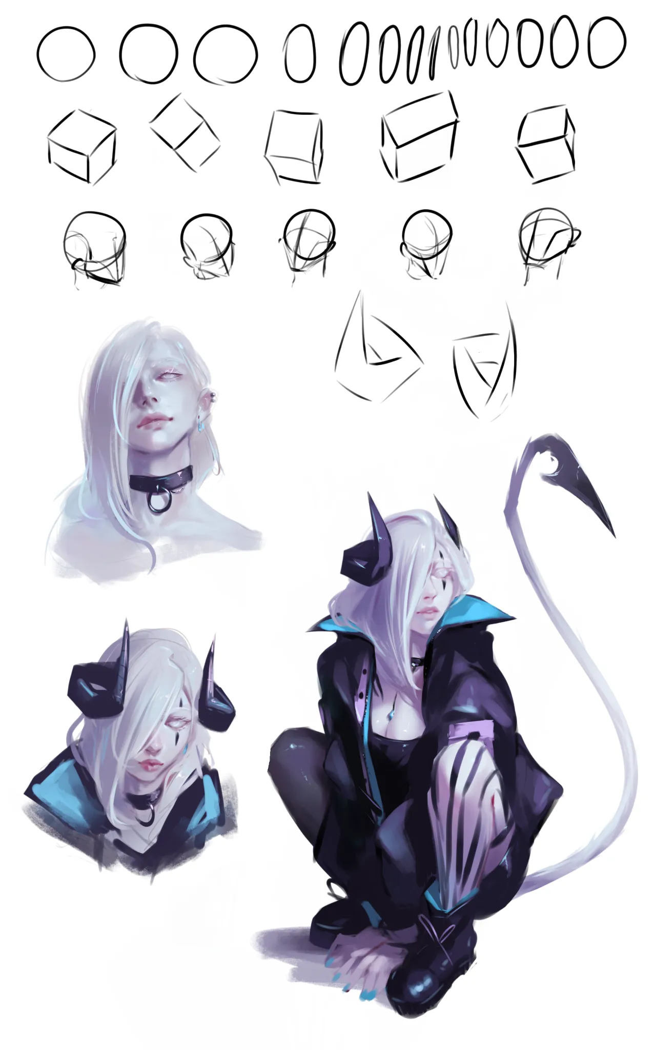
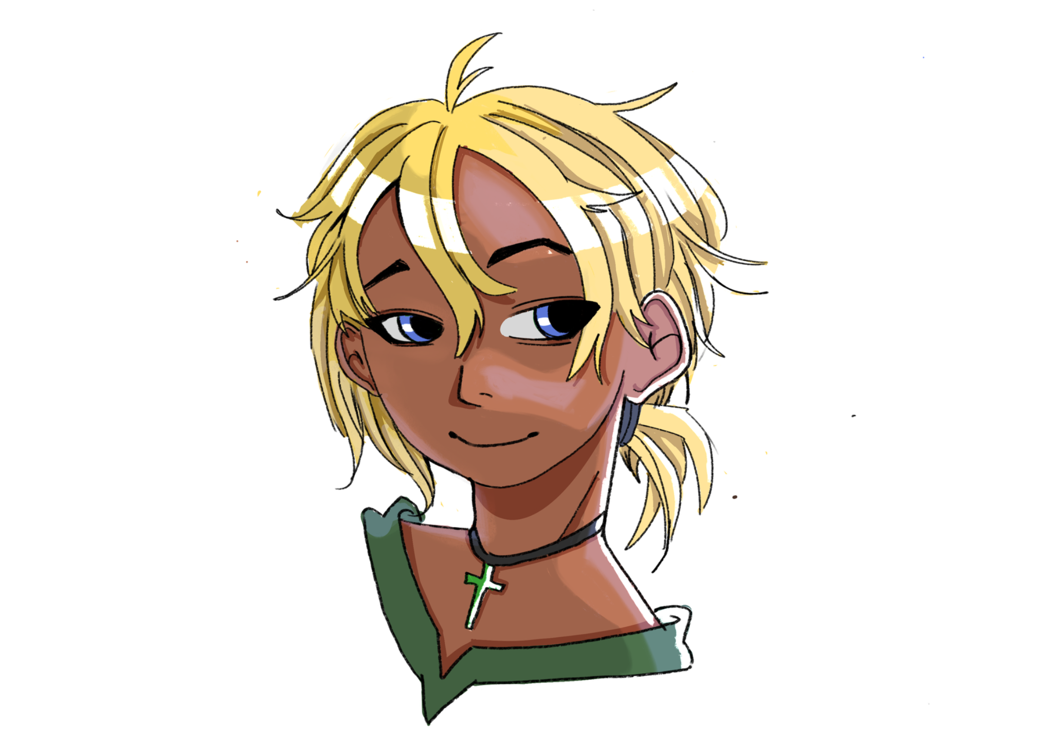
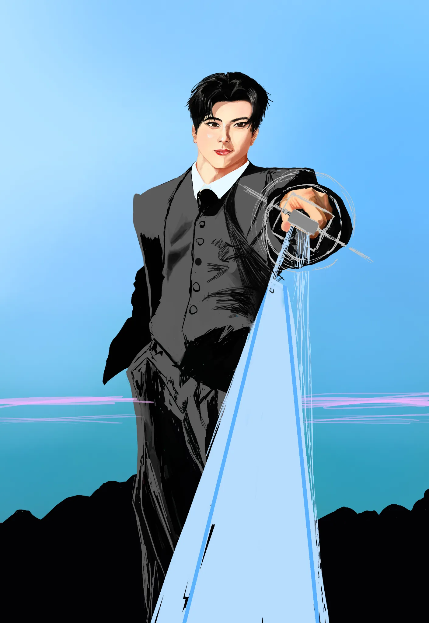
WIP Jay Enhypen
I am struggling with capturing his face from my refrence, I made a mistake with choosing my reference a bit, I chose the refrence pose where the face wasn't fully visible and used other refrence for his face so I had to adjust the face angle and how he is looking at the viewer which led to facial structure changes, I can't add my reference in this site because it doesn't support more images. I want you to help me with how do I make look more like Jay.
4 hours ago
View
Challenge of the Month
No responses yet
Page 2 (day 2)
Page 2 (day 2) Trying to be consistent with the challenge. In this drawing, can someone teach me how to make simple backgrounds? ( Other adivces is good too!)
4 hours ago
View
June 30 Sketchbook Pages Challenge
No responses yet
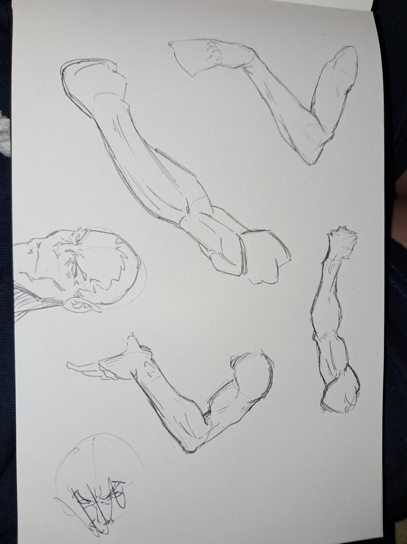
2 sketchbook page
Some arm studys. I wanted to practice the anatomy for the ice arm of the eleven archer character
4 hours ago
View