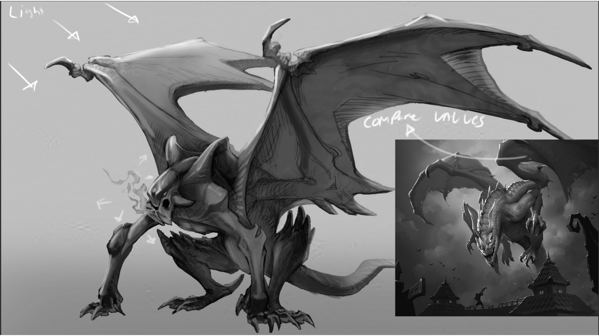
So when it comes to rendering specially when you are starting out I recommend finding a similar reference of quality to compare too. Because you have a dragon I pulled up a reference that firs my personal style which is sticking closer to hearthstone, the image attached is the loathsome dragon card art from hearthstone. This might not be your preference and thats ok this is just an example! all I did to make the image black and white btw was put a solid black layer on top and set it to color mode, from here you can use layer modes on top to add light and shadow, then you can remove the black layer and voila, new values and you can tweak it a bit pretty easily! here's what to take note of in terms of polish and values. Notice the value grouping, the shadow areas are pretty consistent on the dragon. notice how the rim light is used and you can easily tell the light source is coming from the top left. There is also another small light source that is being used to light the dragon itself to identify the face as the focal point. you will also notice that it is shaded pretty dang simply, you can make out all the areas of where light separates and shadow starts this is what you want in your image! I think if you focus on that and shade some spheres and cylinders and cubes as a warm up, then jump into shading this piece, i think you'll nail it! heres some videos explaining! https://www.youtube.com/watch?v=HQs5jnltSWY https://www.youtube.com/watch?v=oEwdvgu7gUQ They are both on the Artwod Youtube channel! they are "If you struggle with painting, please watch this" and "You will NEVER be confused by Values again after watching this video"
Want to store your feedback?
Sign up to store all your feedback in one place on your account. Your feedback will be private instead of public.
Feedback Thread
Paintover
Jan 31, 7:48 PM
Also struggling with your art?
Improve your skills, a 3 min read
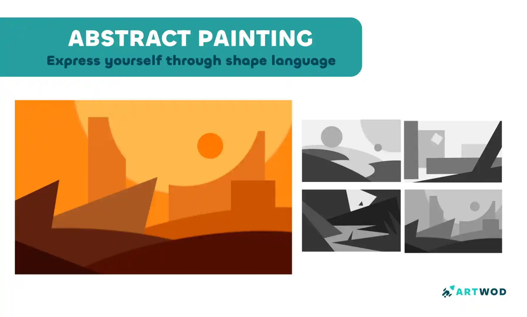
Abstract Painting Techniques: Unlocking Creativity with Color and Form
Master shape language and value composition through a six-step exercise combining rectangles, triangles, and circles to build stronger design instincts.
Environment
Would you like to help someone who's still waiting?
June 30 Sketchbook Pages Challenge
No responses yet
Page
coming up with more interesting shapes
3 minutes ago
View
June 30 Sketchbook Pages Challenge
No responses yet
Daily sketch page, day 2
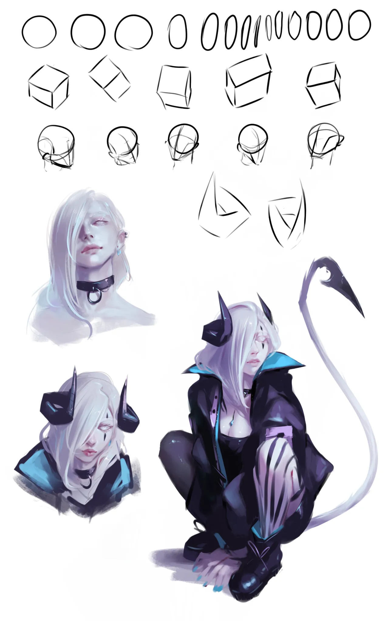
Trying to incorporate stuff I learned from portrait road. Drew my OC this time. Struggling with keeping face looking the same in all angles (and fail :x)
18 minutes ago
View
June 30 Sketchbook Pages Challenge
No responses yet
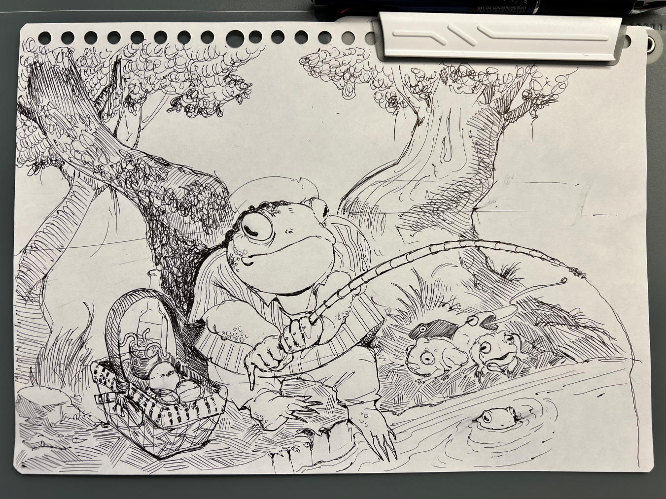
Sketchbook pages 01
Hey everyone! this is my first post here - I’m super excited to share some of my art with you all! I really want to improve my compositional/perspective skills during this month’s challenge. But my main goal is just to have fun and make cool drawings :D - I appreciate any feedback you can give me for my first entry for the challenge :D
50 minutes ago
View
Rendering
No responses yet
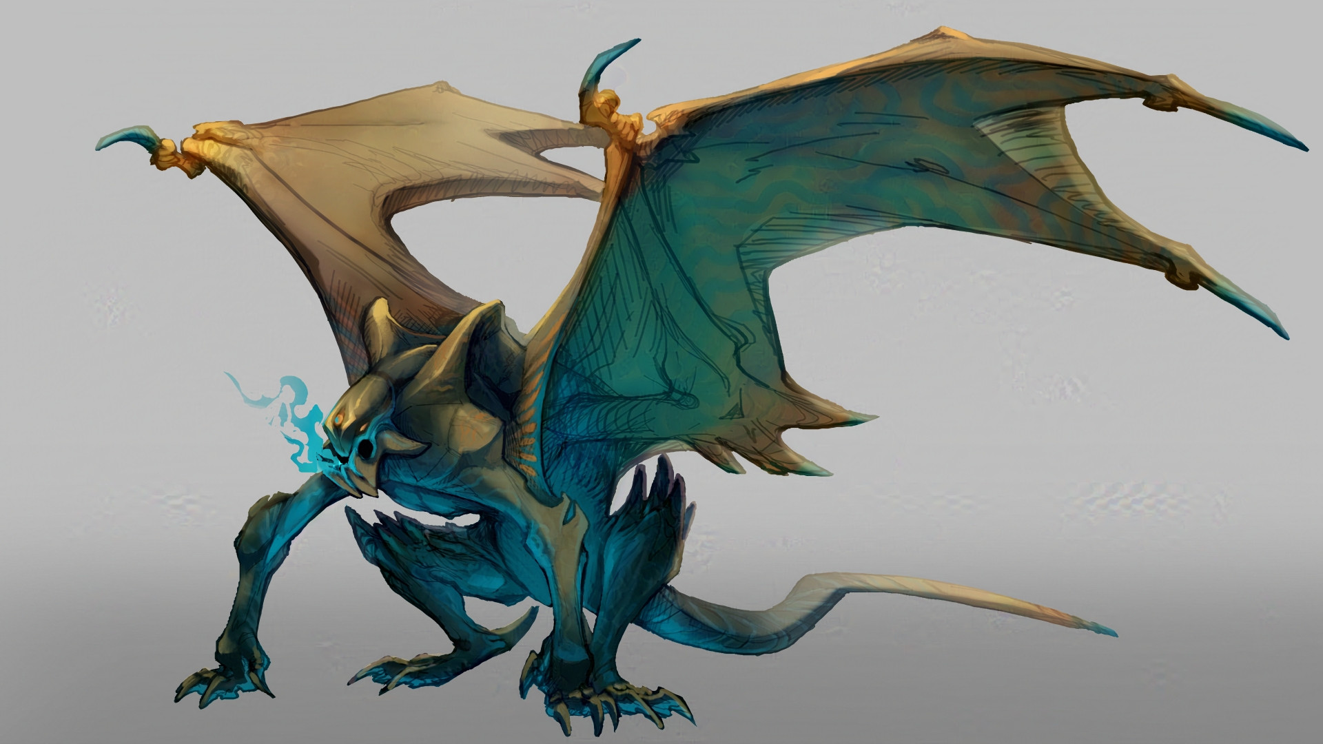
David
One thing I constantly struggle with is rendering it always feels as if I’m missing a step or theirs a gap between my knowledge. Feel free to critique my lighting, shading, and etc.
55 minutes ago
View
June 30 Sketchbook Pages Challenge
No responses yet
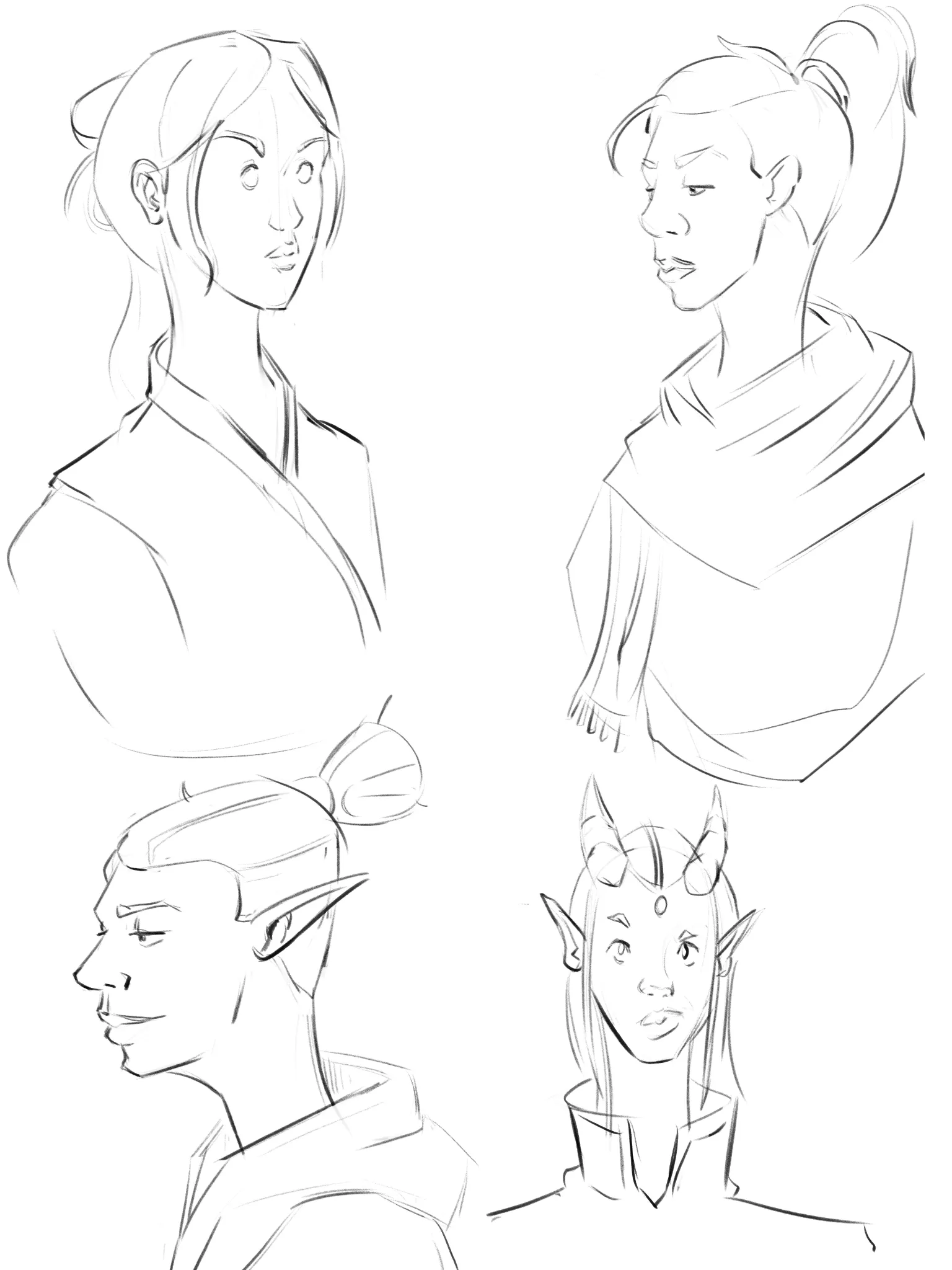
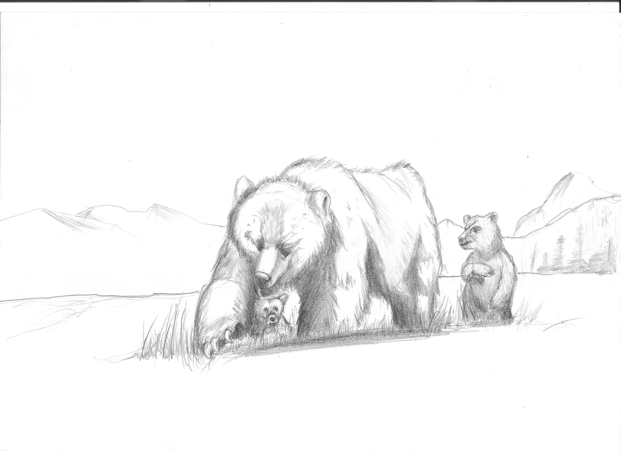
Day 2 Jacqueline's Sketchbook
A Knysna Turaco bird in Art Nouveau style
1 hour ago
View
May Mermay Art Challenge
No responses yet
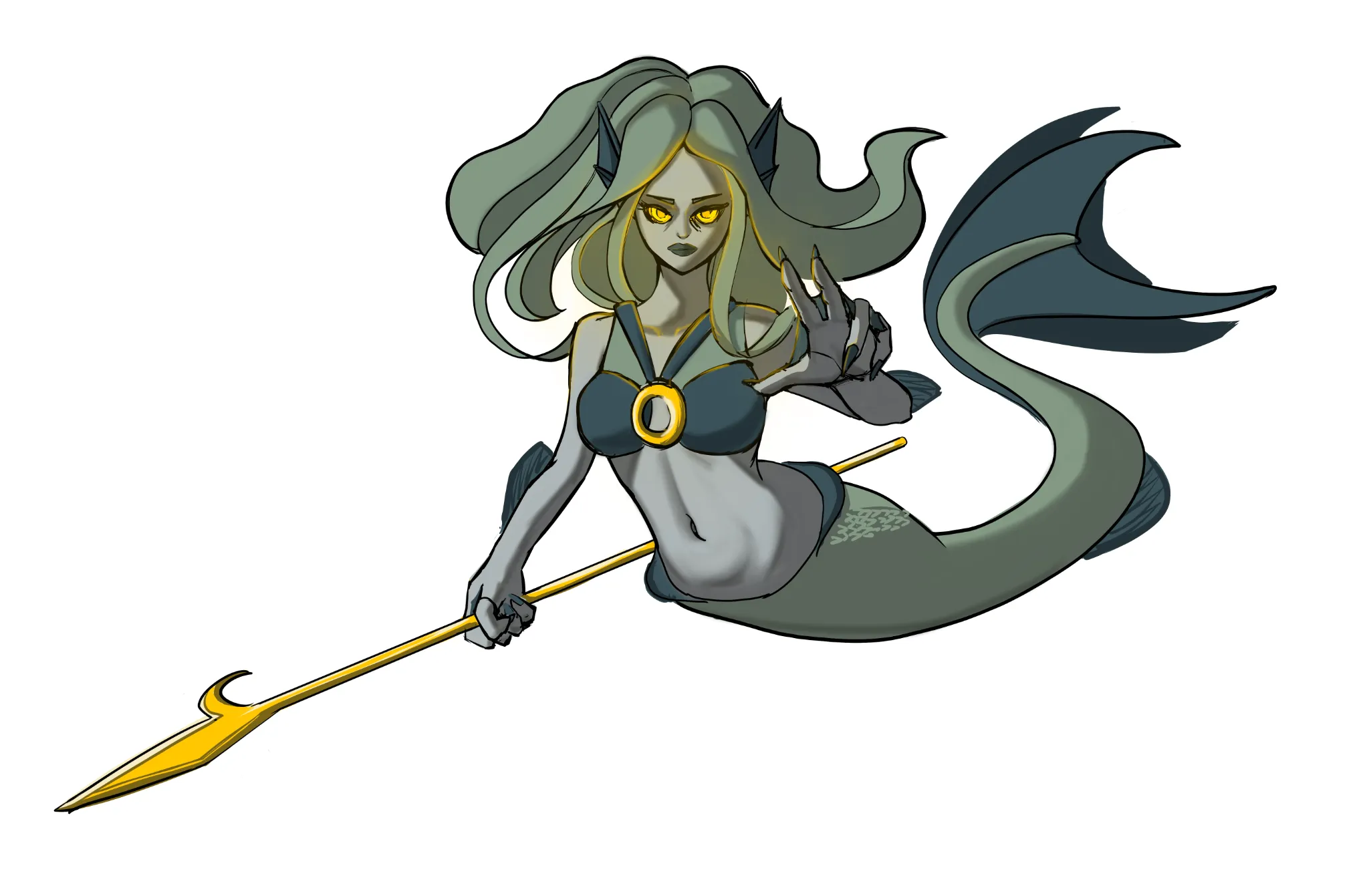
Mermaid
Made improvment of the hands.
3 hours ago
View

Rendering
No responses yet
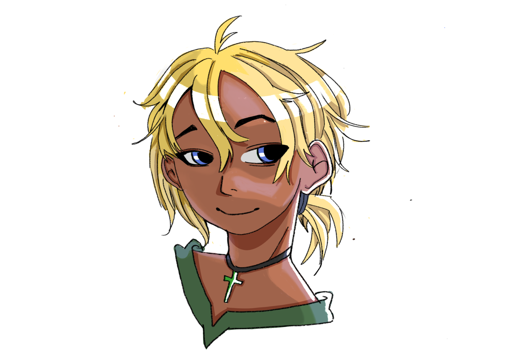
WIP Jay Enhypen
I am struggling with capturing his face from my refrence, I made a mistake with choosing my reference a bit, I chose the refrence pose where the face wasn't fully visible and used other refrence for his face so I had to adjust the face angle and how he is looking at the viewer which led to facial structure changes, I can't add my reference in this site because it doesn't support more images. I want you to help me with how do I make look more like Jay.
4 hours ago
View
Challenge of the Month
No responses yet
Page 2 (day 2)
Page 2 (day 2) Trying to be consistent with the challenge. In this drawing, can someone teach me how to make simple backgrounds? ( Other adivces is good too!)
4 hours ago
View
June 30 Sketchbook Pages Challenge
No responses yet
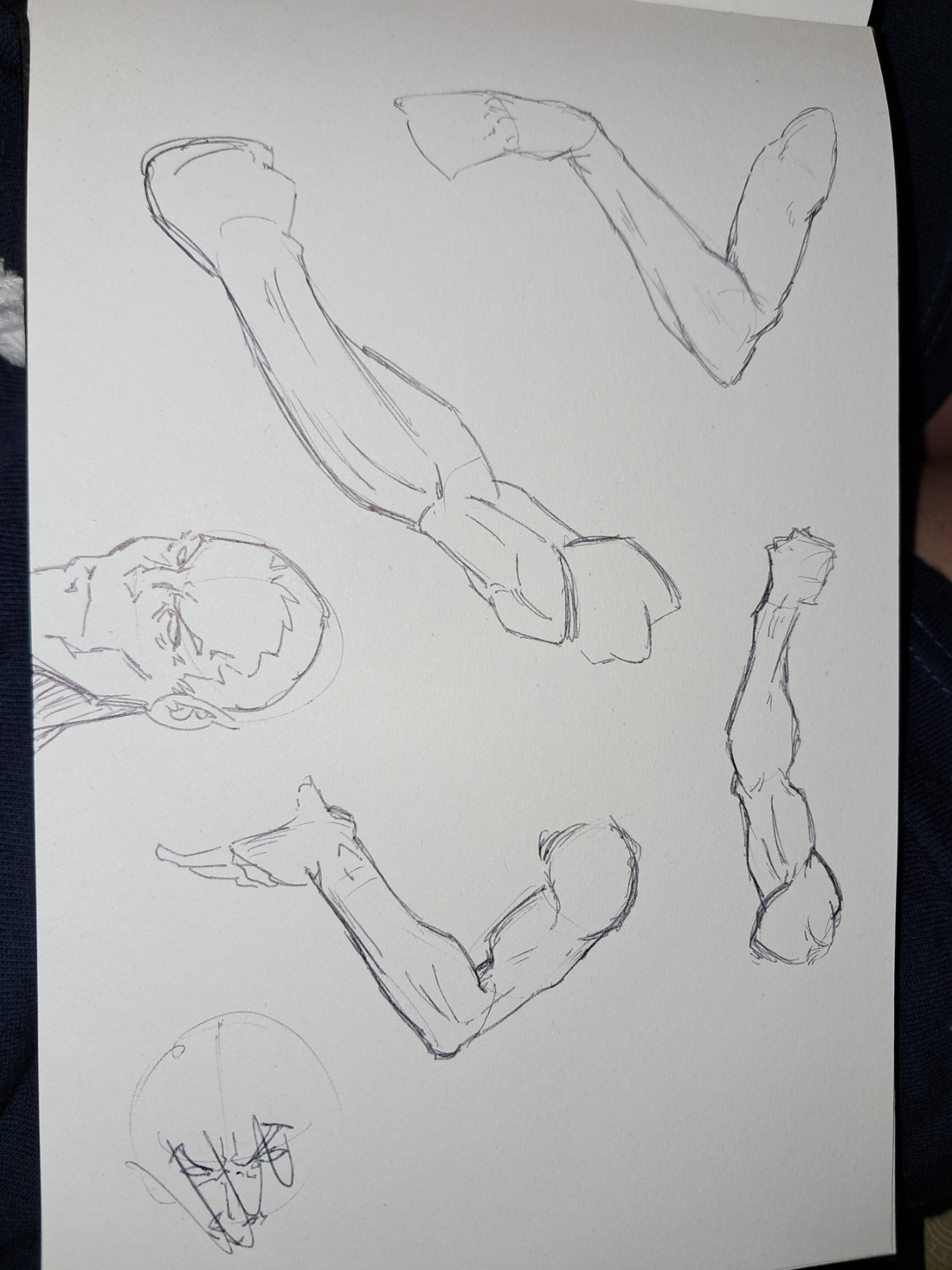
2 sketchbook page
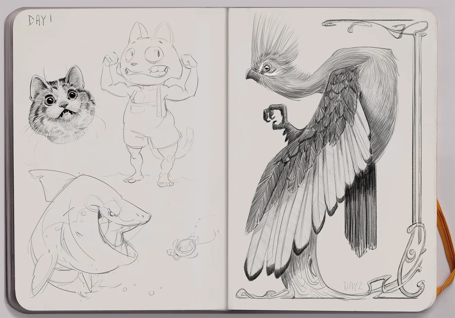
Some arm studys. I wanted to practice the anatomy for the ice arm of the eleven archer character
4 hours ago
View