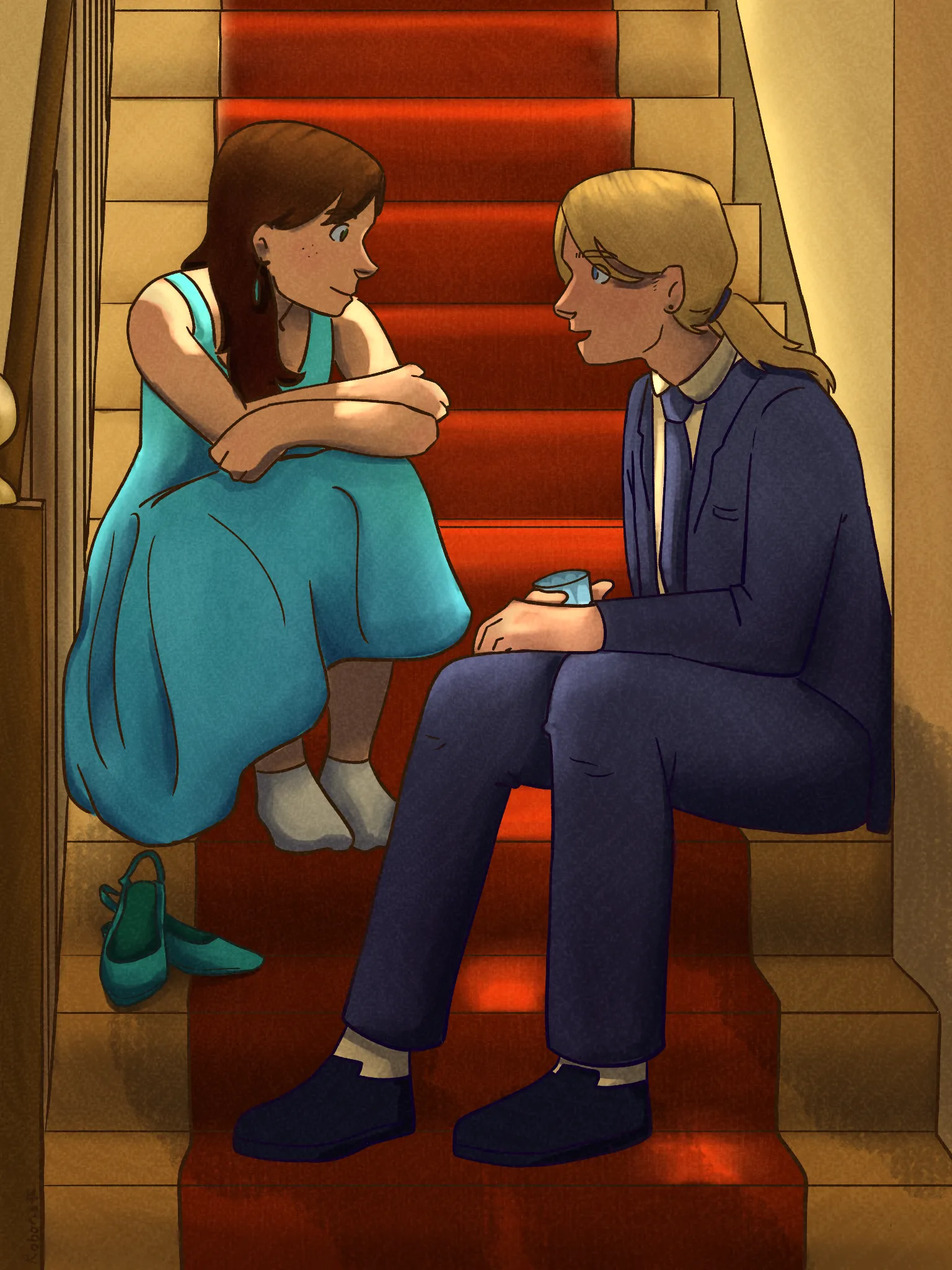
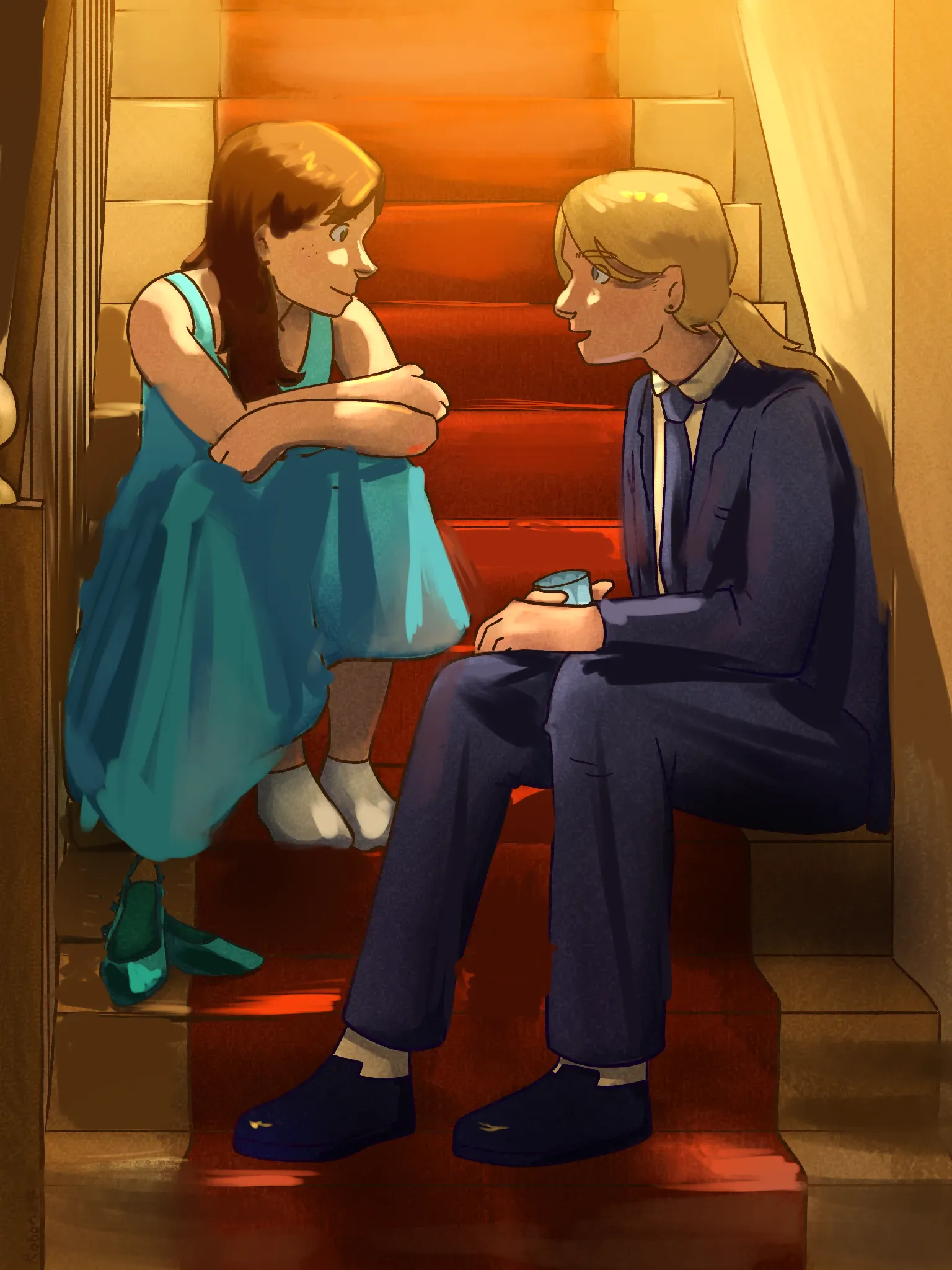

Hi! That is a very wholesome drawing, the colors are fine for the most part. The problem are values and shadows as well as focus. Judging by the shading of her skin the light seem to be coming mostly from above, yet nether of the figures drop enough shadows for it. Try to think in 3D - would this object obstruct incoming light? Another thing that is missing is ambient light. When the light from above hits the surface (w.g. stairs in this case) it take on color of the surface and bounces back and lights up things it lands on (e.g. clothes of the characters). This is a general tip: things you want focus on should have highlights, details and more saturation. Things that are less relevant like BG further away from characters should be more muted (and be less textured!!!). That includes line weight - the further something is away the thinner the lines should be; in this case steps high above should have thin lines and be less saturated. Hope it helps.
Ah, I forgot to add that coloring lineart (brown instead of black for example) could also make a drawing feel less off.