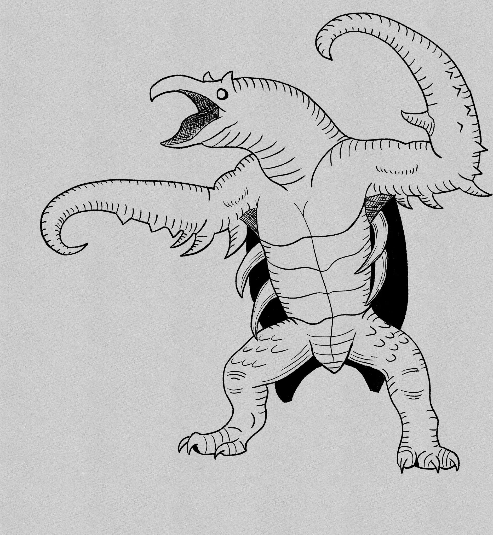
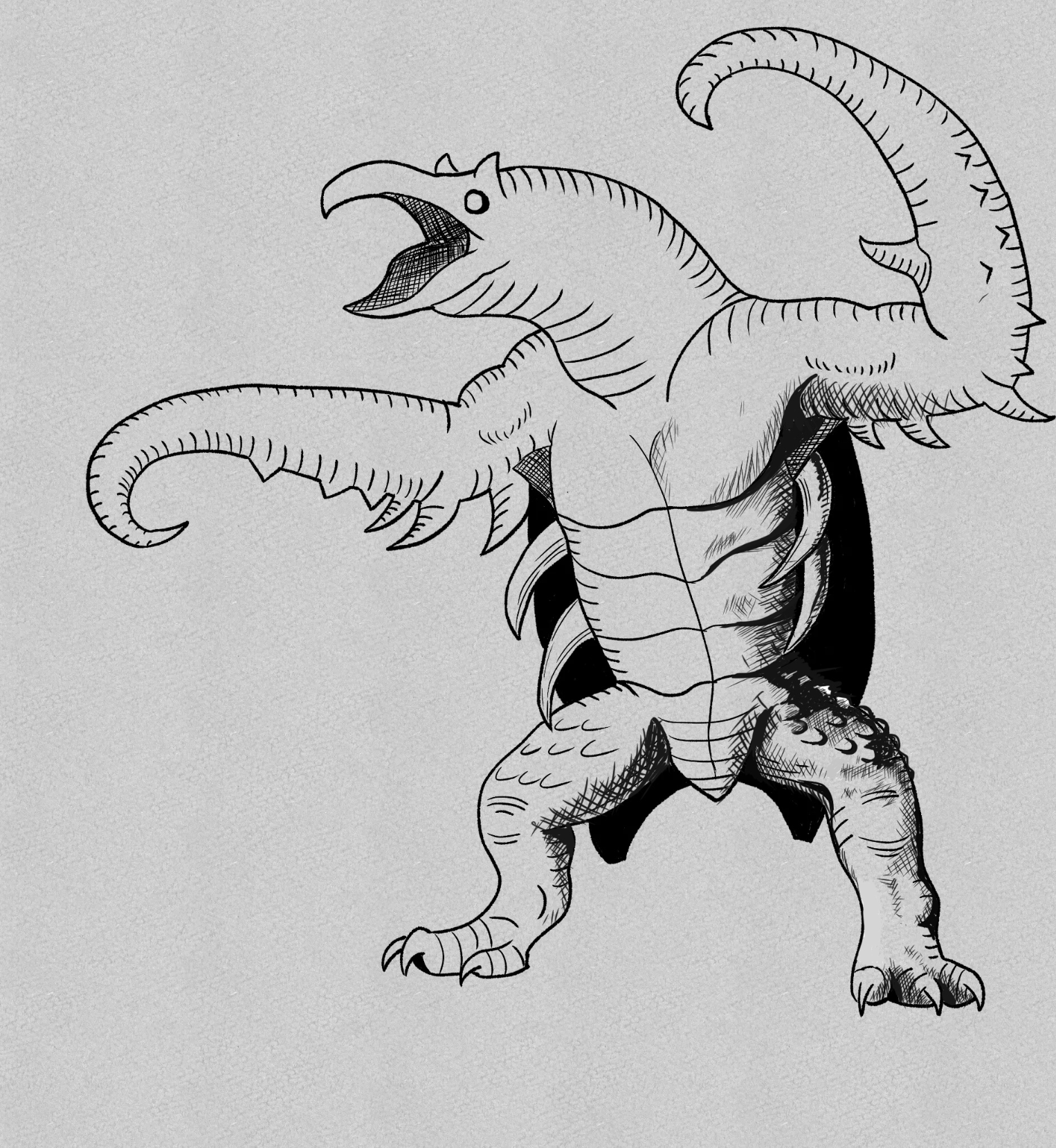

You really have a good base here and you said it yourself, it’s just too clean. The 80’s DND used Line variation and hatching to create depth and texture. I tried to do the right side here a bit to add the thicker shadow lines and some texture. Make sure you break up your silhouette With that texture, like on the legs, those bumps need to extend past the silhouette as well need shadows and texture to give the illusion that the bumps are more prevalent without having to draw them all…. Hopefully this helps. Hatching is just form lines following the shape. Practice using a thicker tipped pen and adding thickness in areas that might be in shadow.
Thanks, it definitely helps with the aesthetic. I've had a lot of problems with trying to vary my lines as I'm quite heavy handed and I've made the pen a bit more resistant on its calibration but still a work-in-progress in trying to give myself flexibility without having to constantly redo overly thick lines.
Excellent. Just keep practicing and don’t be afraid to go back and add more dimension to certain areas. It doesn’t have to be perfect on the first pass. Just keep refining until you get the look you’re after.
So this was all done with a 20px textured pen in Clip Studio Paint, does that sound undersized or oversized at face value? Just trying to rule out if I might just be taking a bad brush size.
Unfortunately, I am 90% traditional and rarely use digital but I’d just say go by looks, if things look all the same line width then you might just go back and use a thicker line in areas. Or if clip studio allows for pressure sensitivity, use that. Then you can practice with different pressure in areas. Either way, start with something and then go back and add dimension, whether that means going over to get a thicker shadow or line or using a thicker brush to get what your after. I’d advise getting a ketch down, then refining with shadows and texture on a second pass…
Yeah there's a sketch layer underneath. Thanks for all the feedback!
Anytime.
I had one more question if that's alright; Take for example the new hatching shading on the arm, is that meant to be in place of the short contour dashes I did or intentionally be put over them? I feel they fight for space a bit but couldn't tell if maybe that was just because you'd used a new layer to draw over it
Yes, I just used your image as a background so I didn’t have to redraw the entire thing. Unless those lines were for another intention, The hatching and darker shadows would be what that style of DND was doing. I would suggest looking at some YouTube’s on hatching. A great one would be Alfonso Dunn - Pen & Ink drawing tutorial. He explains how to use these hatching lines to create form