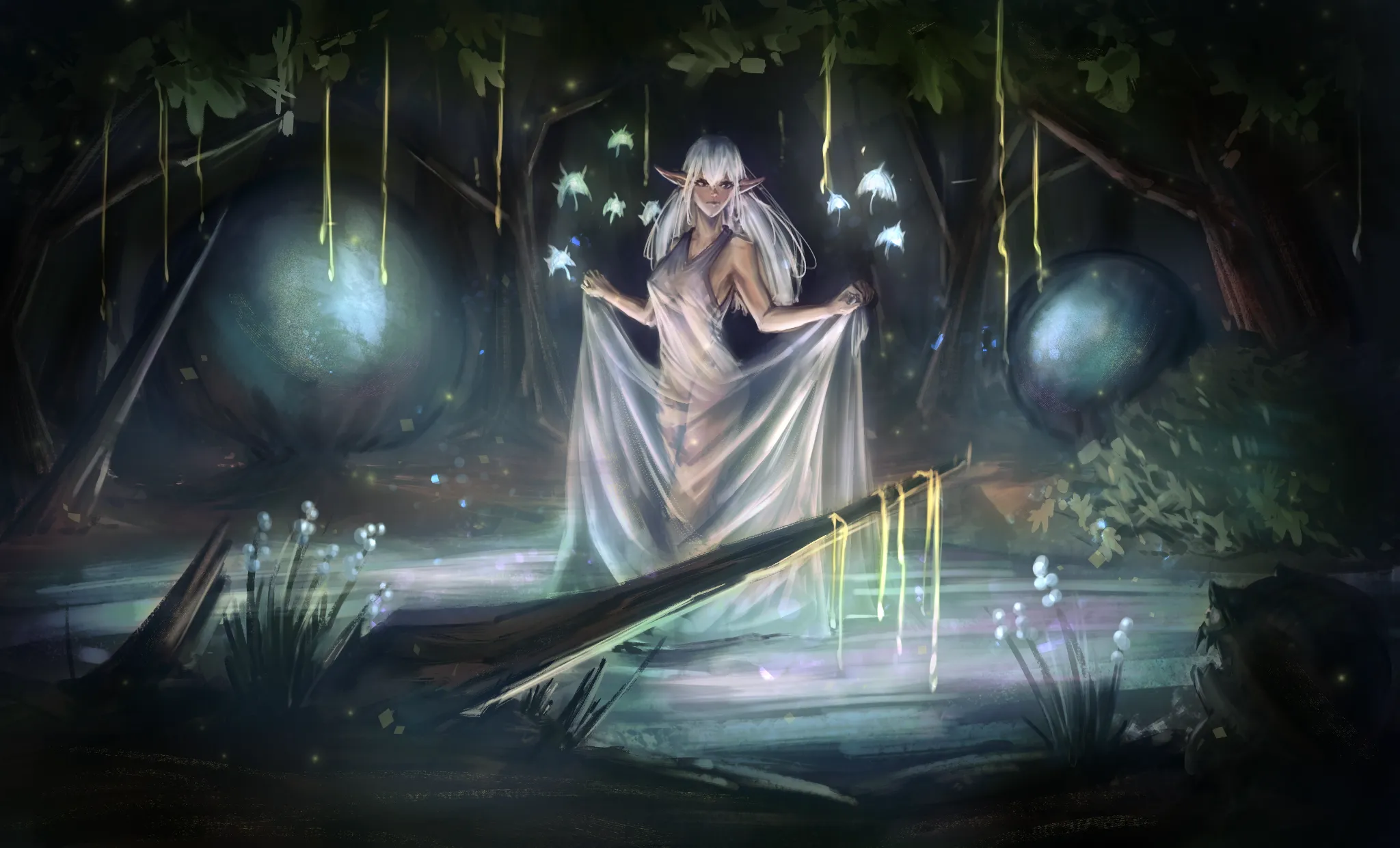
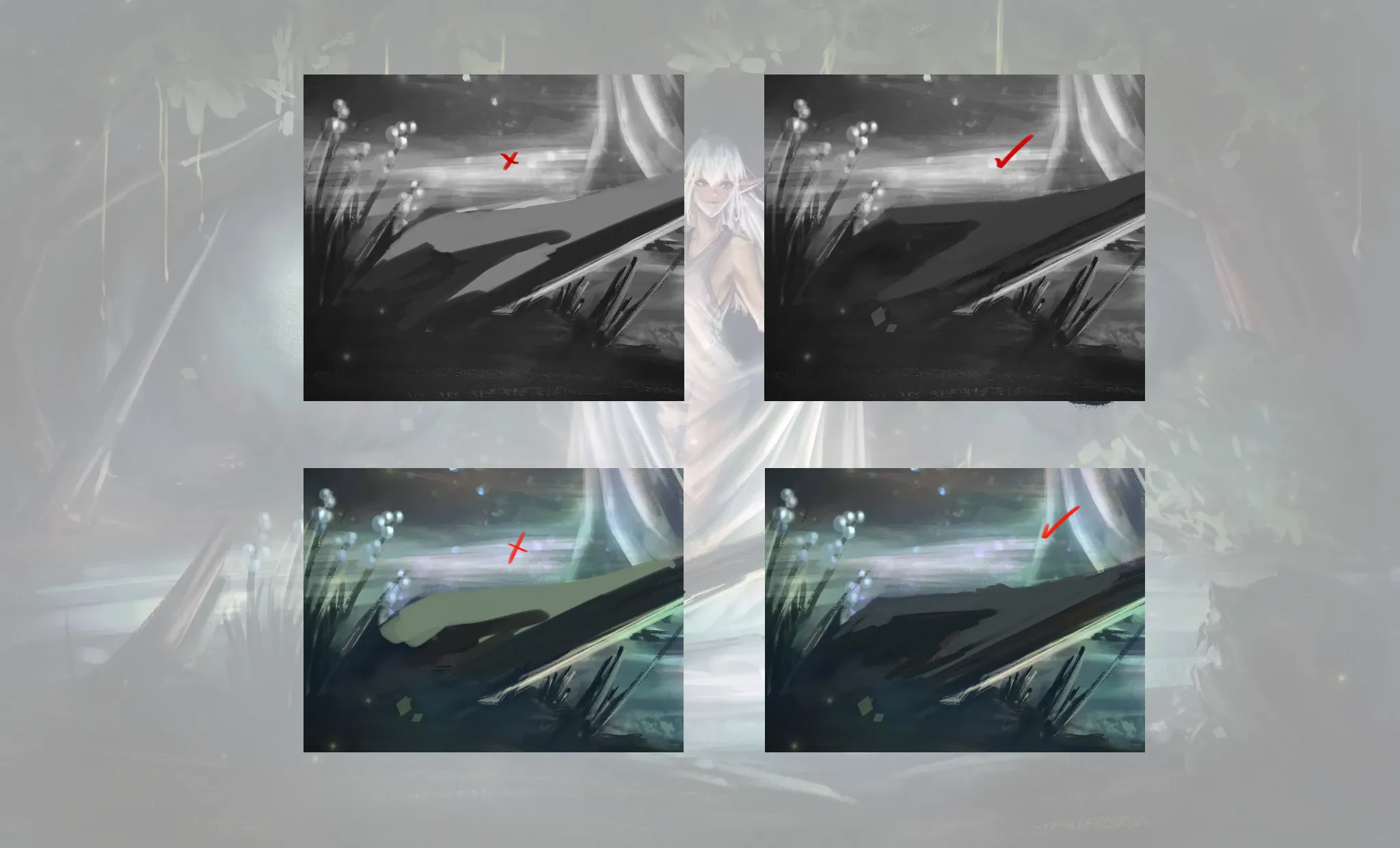


Hey there! It's looking really good! I really like how the illustration is coming together. :D First of all... I'm not entirely sure what the bubbles in the background are, but they're drawing slightly more attention than the character. You could reduce their brightness a bit so they don't compete with the focal point. As for adding details without losing the value structure of your scene, just keep in mind that any details you add should stay within the same value range. Try to avoid introducing very bright colors into areas that are meant to remain dark. It's a simple example, but I hope it gets the idea across. :) Hope this helps!
Anstriche (1)
Enchanted Forest Painting
Künstlernotiz:
I'm unsure of how to render more detail without ruining the values I already have established. In particular, I think the foreground and background are both too empty but I'm afraid of over-rendering objects in them.
Kommentare 2

You may add more textures. This always works fantastic for detailing without changing much.