
Wooooow
Anstriche (1)
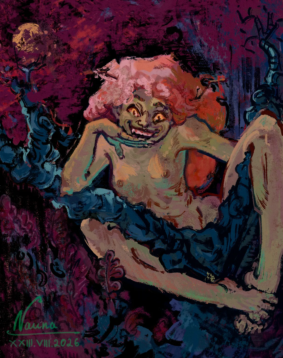
Dubava from Oak woods
Künstlernotiz:
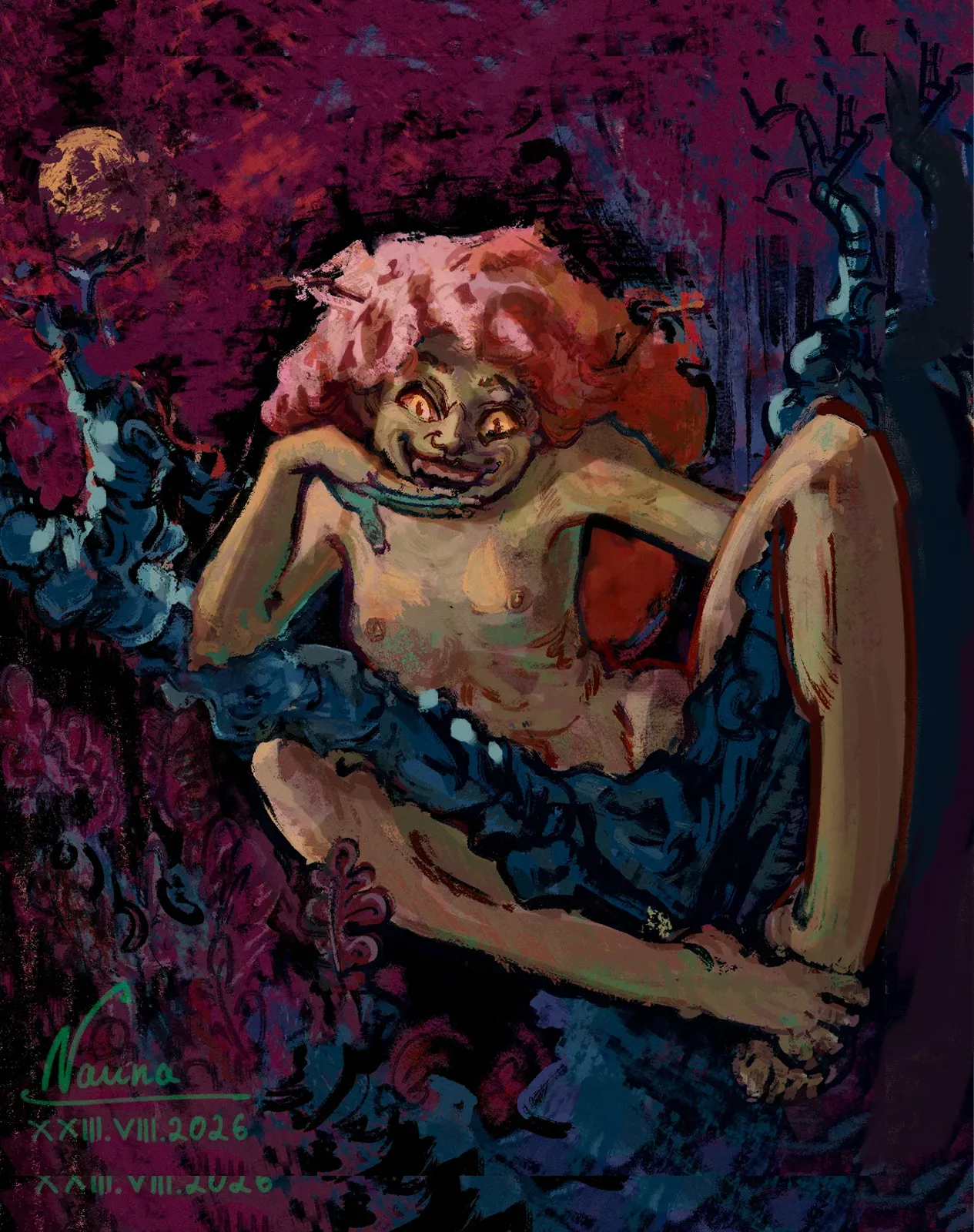
I can't get the lighting on the figure right, especially on the hair. I suppose my struggles are compounded by the anatomy mistakes (at least the wrist) and the fact that I added the light source long after I began rendering. On top of that, I forgot to add the second hand at the beginning, and now I have no idea how to squeeze it into the composition without making it feel too compressed."
Kommentare 2
Hey there! The illustration looks awesome, and I really like the style! :D I honestly like the way you've drawn the body, even though a few areas feel slightly off, such as the right leg. You could make the character just a little smaller so you have enough room to draw the arm without having to squeeze it in. What would help the most here is simply pushing the contrast between the lights and shadows a bit further. :D Try to make that contrast strongest around the focal area, while keeping the rest of the illustration more subdued and in shadow. Hope this helps! :)