
i love this, try using more shadows to the girl
Anstriche (0)
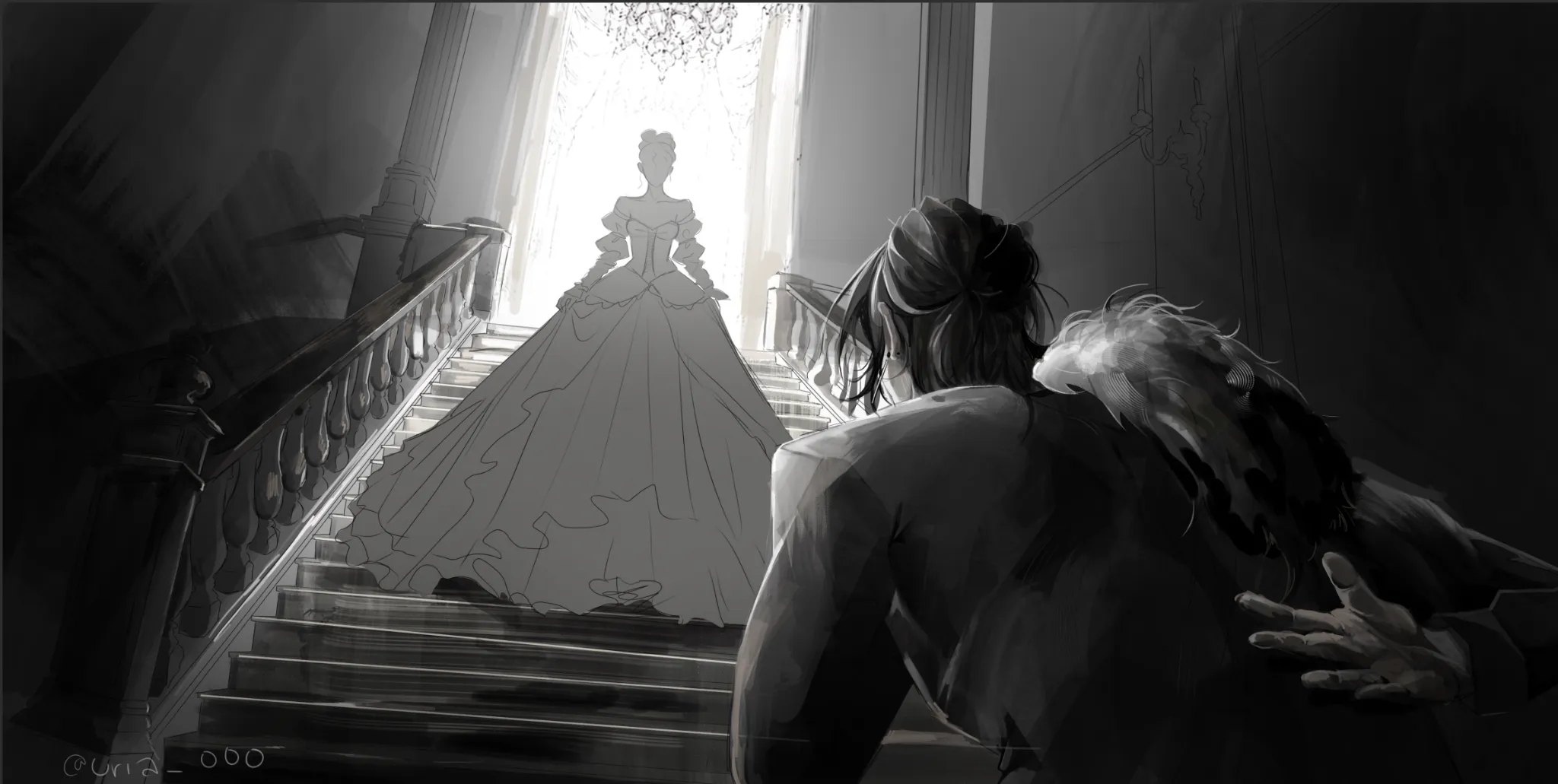
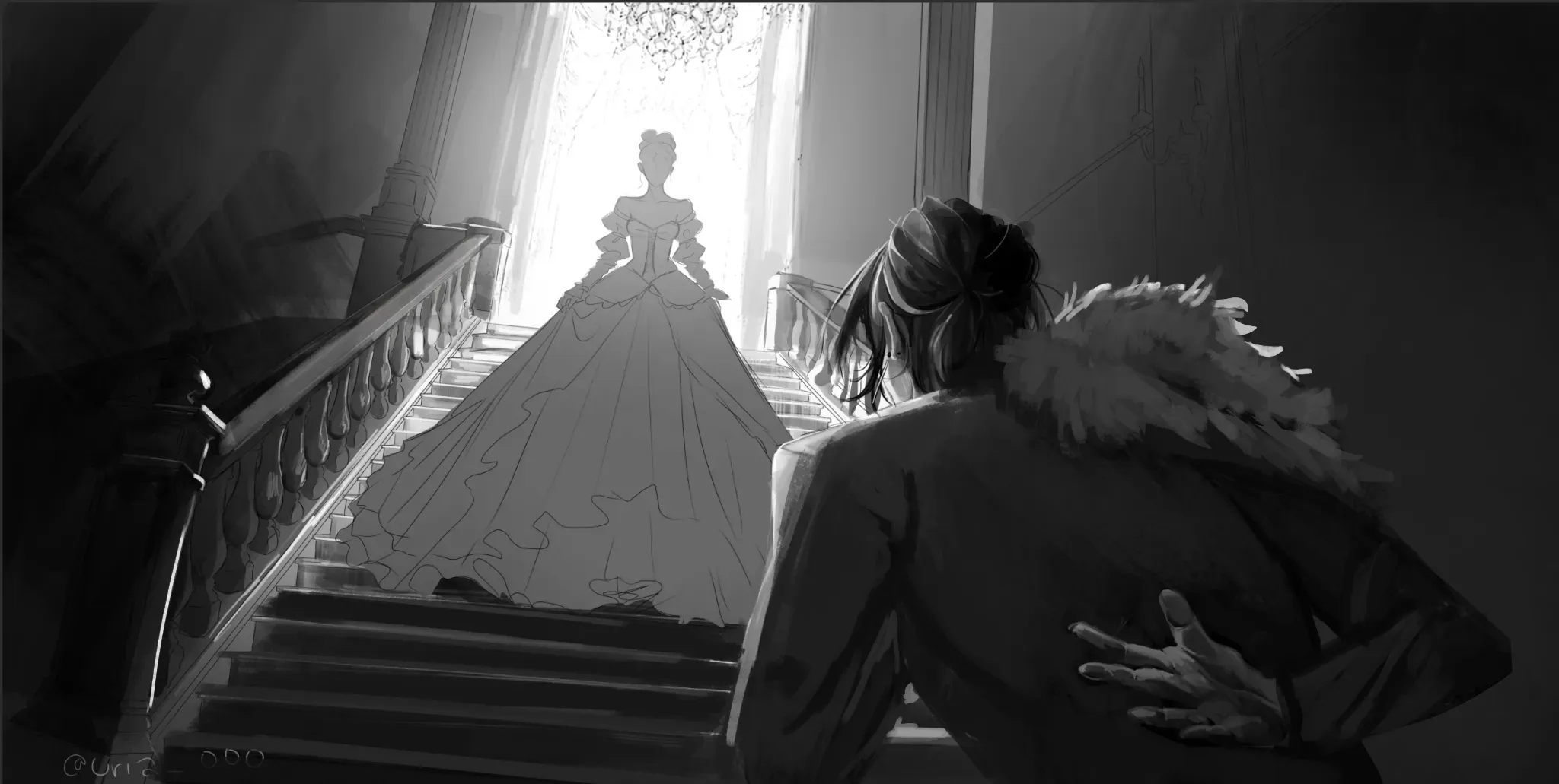
first meeting
Künstlernotiz:
HEY!! first time using this pls dont steal my art work anyways I TRIED A DYNAMIC angle and idk if the values are correct!! or the anatomy idk IT JUST SEEMS OFF TO MEE AND IDK HOW TO RENDER THE FUR ON HIM
Kommentare 2
Hey there! This one looks promising! :D First of all, the arm definitely looked off because it was positioned too far away from the body. You're placing the shoulder right beside the fur, when the fur should actually cover the shoulder and part of the upper arm. The hand should also sit closer to the center of the back. I adjusted it a bit, not perfectly, but enough to give you a better idea. :) I'd recommend taking photos of yourself recreating the pose so you can use them as reference. On top of that, the values are a bit inconsistent. The stairs in front of the woman should be darker because her figure is blocking the light completely, so that bright highlight line shouldn't be there. The ambient light is the one that will make the top plane of the stairs a bit brighter. On the other hand, the railing on the left should be brighter since it's facing the light source. You could also make the wall on the right slightly lighter so the foreground character's silhouette stands out more. As for the foreground character, only the contour should have a light value, like a rim light. The rest of the back should remain dark, staying roughly within a 10–20% value range. With that in mind, the fur behind the head shouldn't be completely white, since the head is also blocking the light. Only the contour should catch that light. Hope this helps! :)