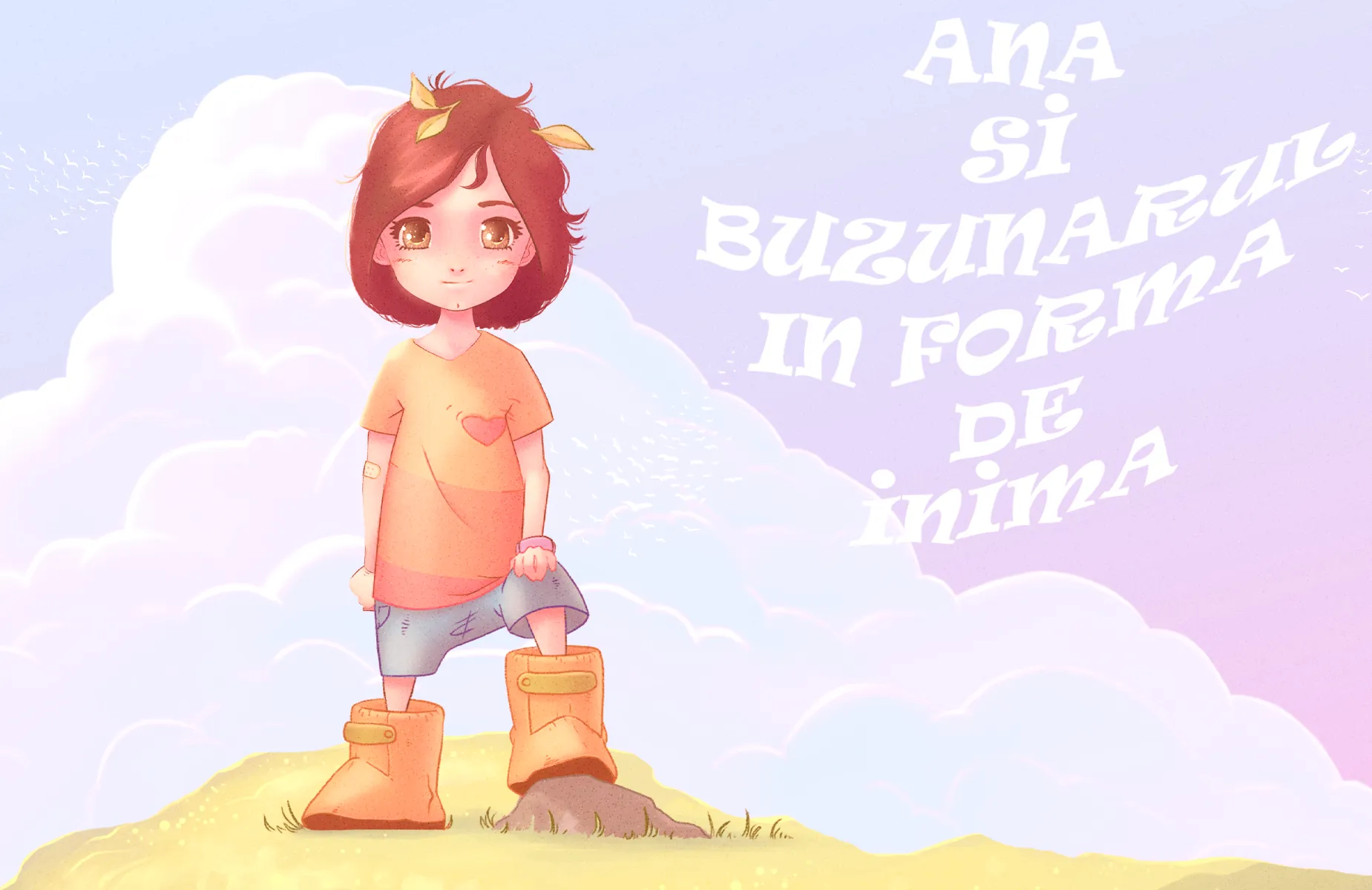
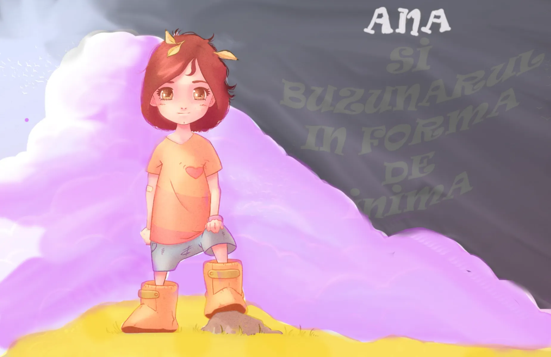

What a cute cover ! My personal opinion is to keep the lines :p. What I would rework might be the values. They are really similar. I tried something to illustrate my point but it is far from good. Also : the title should be highly contrasted to be easily readable.
Thank you for the feedback! :)