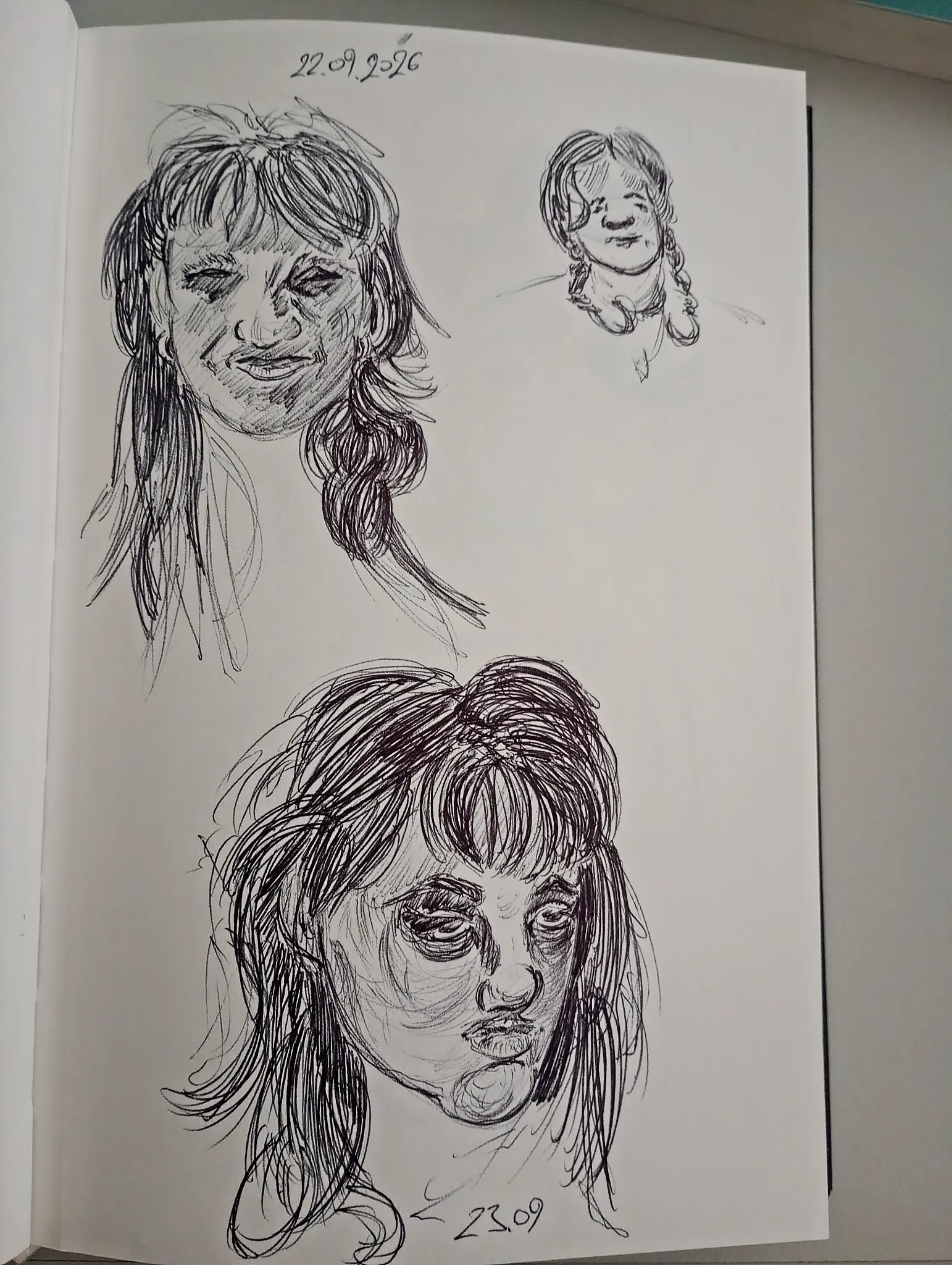
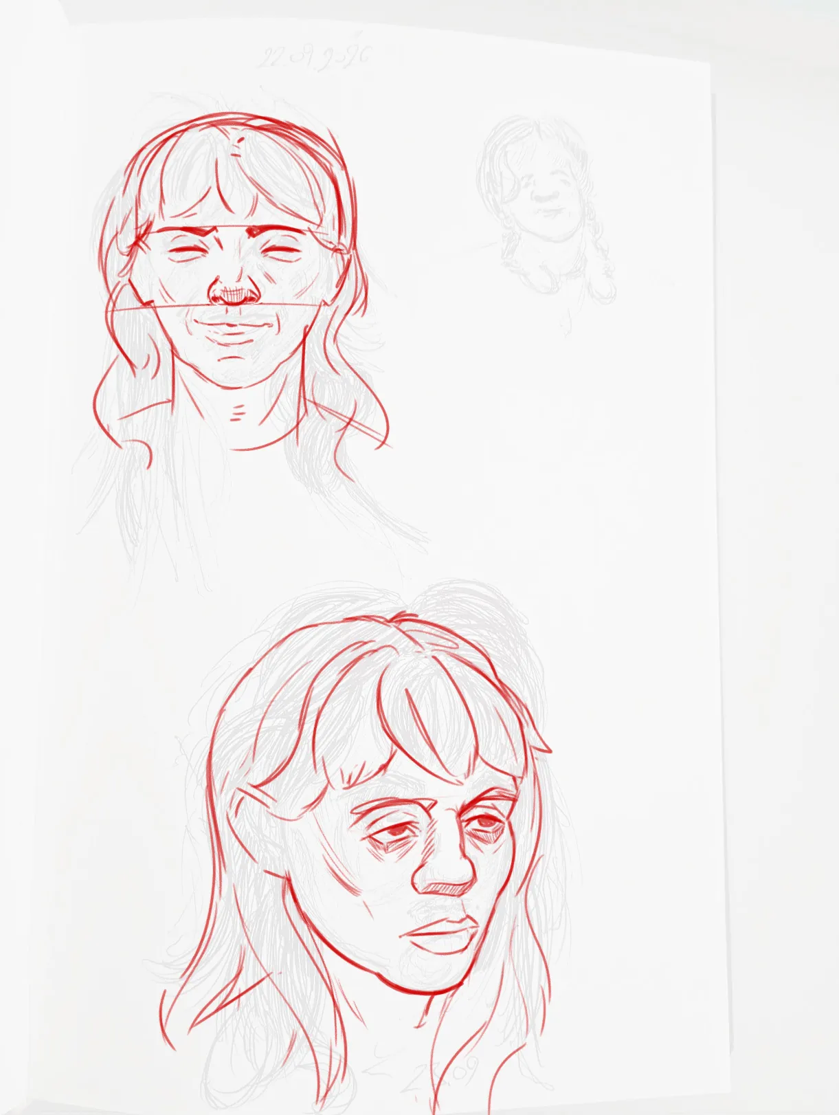

Hey! Cool sketches! In the upper portrait, the right eye is misaligned compared to the left one. The nose also lacks a bit of volume, so ideally, you could shade the underside to suggest its rounded form more clearly. The mouth is also too close to the nose. Ideally, try to leave about one eye-width of space between the nose and the mouth. The lower portrait looks a little flat. The nose lacks volume, as does the side of the face. That area of the face isn’t completely flat, so try to emphasize the cheekbone a bit more. :) Keep the underlying bone structure in mind when defining these forms. Again, the mouth is also a little too close to the nose. Hope this helps!
Anstriche (1)
Portrait
Künstlernotiz:
Whats wrong?