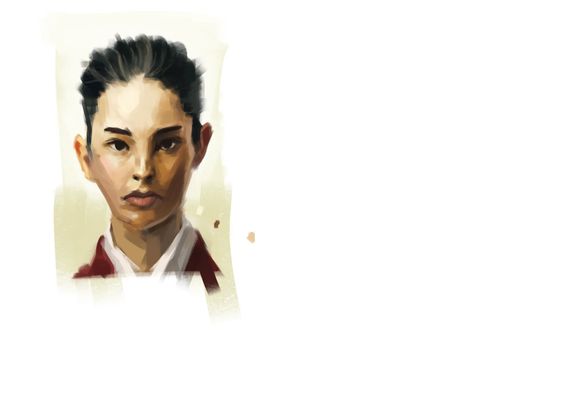
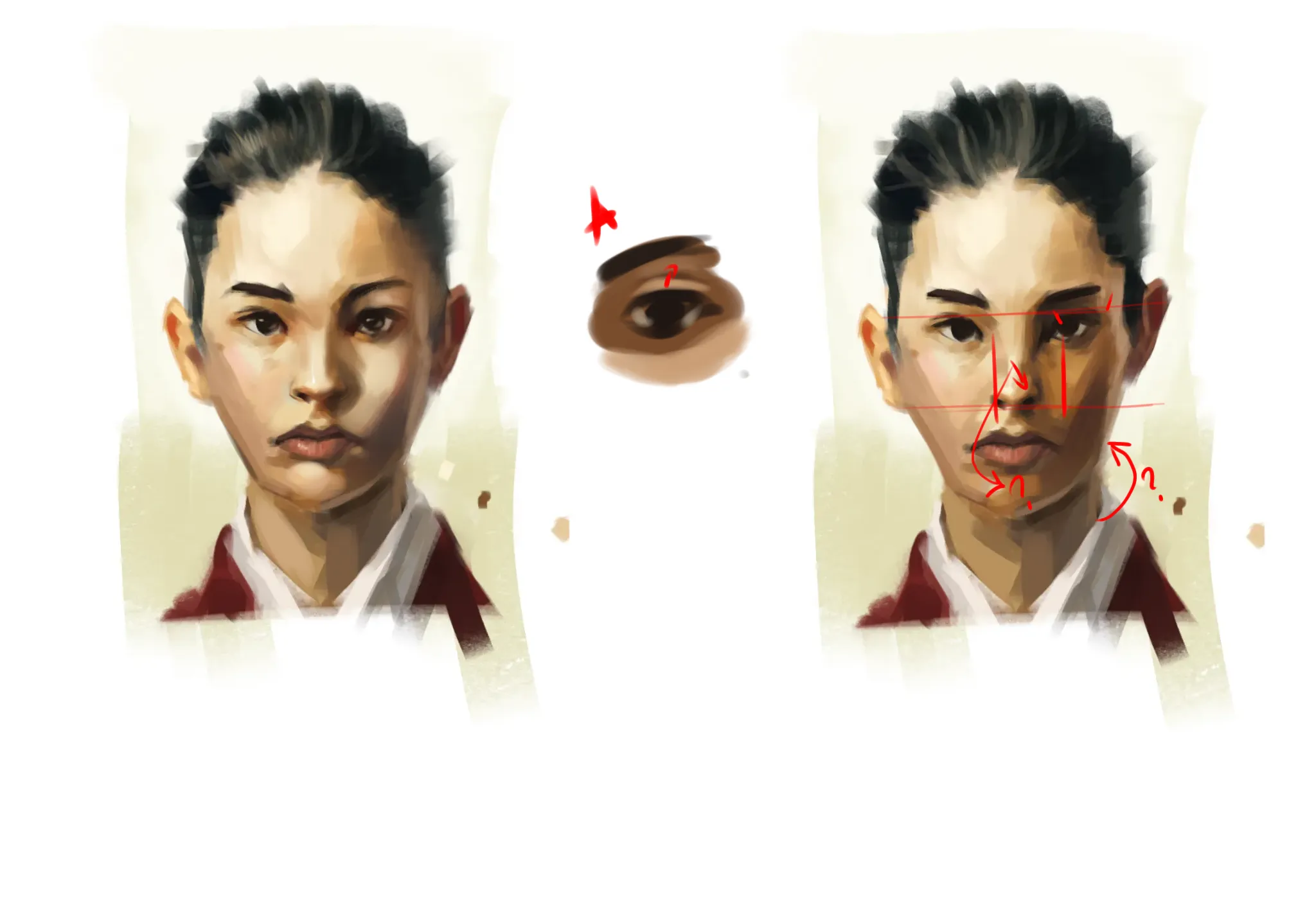

Hi! Cool portrait with nice color palette. You got face/head structure mostly right just need a few tweaks. 1. Idk if it is intended but right ear is placed way too high. 2. Nostrils need to be aligned roughly with inner corners of the eyes. 3. I feel like you couldn't decice on light source. Upper left (our) part of the face is shaded as if light would come from top left but her chin and other half of the face are shaded as if light comes from behind mostly and yet her noses is highlighted as if lught comes from above. Her cheekbones also seem to be of completely different width. 4. When shading darker parts of something remember bounce light(see A). You got it right on the right side of her face but the muscle above her eye and her upper lip are too dark. Color of her neck also suggests some cool light coming from bottom right but it is not present on her right check. All that said, decide on one light source before shading and flip canvas occasionally to check for mistakes. I added some highlights to eyes but they can be kept completely dark as stylistic choice ofc. Hope it helps!
Anstriche (1)
1 hr portrait
Künstlernotiz:
ignore the random paint ill get rid of that but i mainly want general advice to improve