
add more texture to the fruits
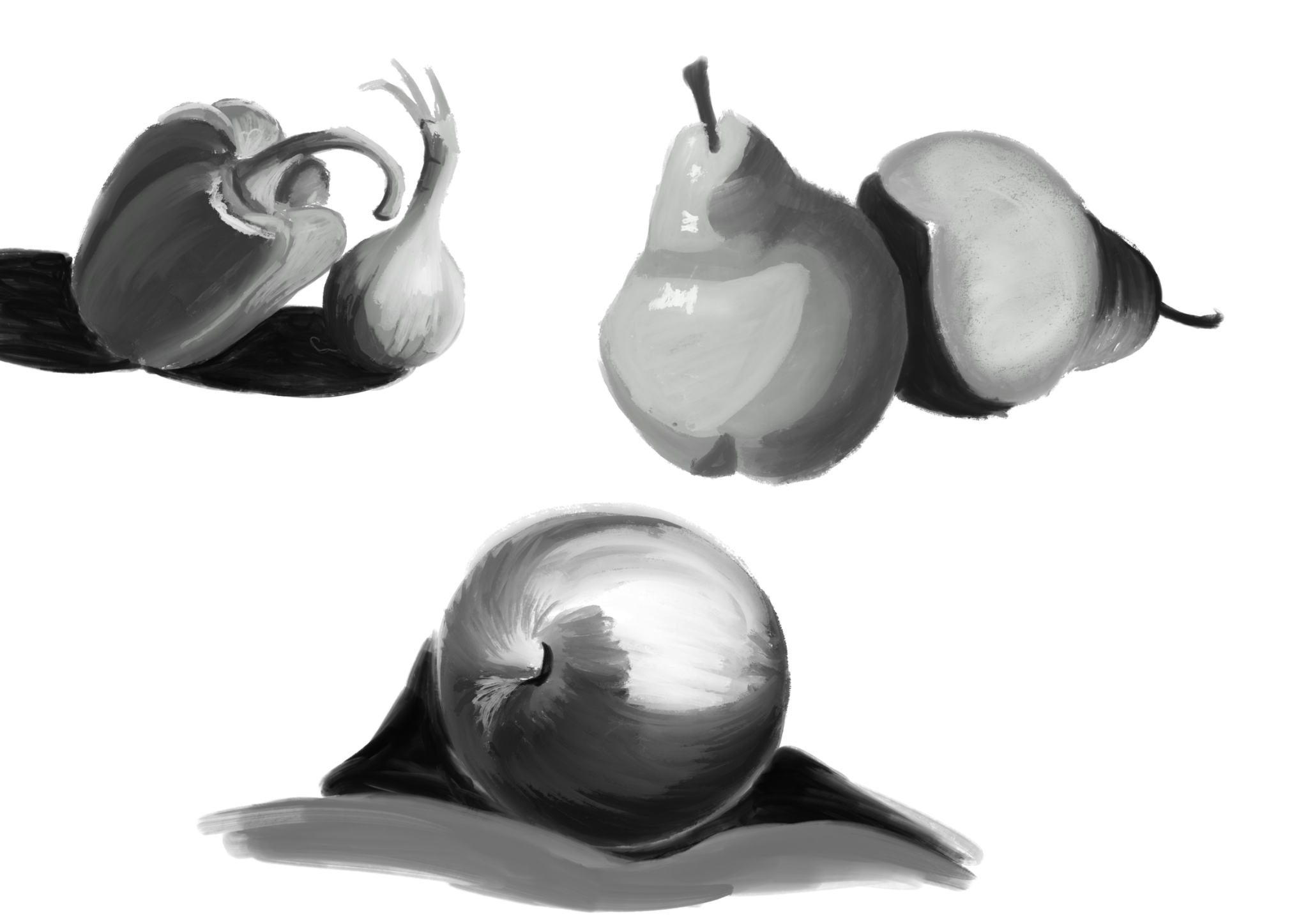
I wanted to focus only on values here but I will try to add texture next time 😊 Thank you for feedback
I know that I have a big problem with values and getting feedback is probably one of the most efficient way to learn so here I am. This is one of my exercises, what do you think? Does it make sense? Any advices?
add more texture to the fruits
I wanted to focus only on values here but I will try to add texture next time 😊 Thank you for feedback
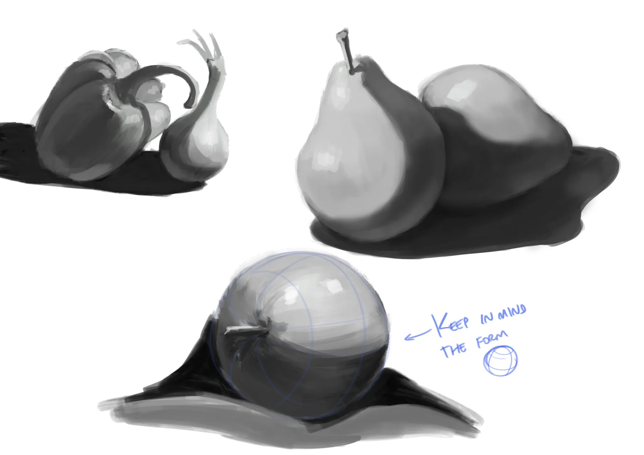
Hey! I made a few corrections regarding the cast shadows and, in general, the way the fruits are painted. First of all... I didn't change the background color, but I'd recommend avoiding painting on a completely white background. For one, a pure white background can be a little harsh on the eyes, and secondly, it can affect your value choices compared to painting on a light gray or more neutral background. The cast shadows on the pears aren't entirely clear because you haven't established a specific light direction; it feels like the light is coming from everywhere. Since both pears are next to each other, ideally they should share the same light source. That's why I painted them assuming the light is coming from the upper left. The cast shadow I painted on the ground isn't completely accurate either; I was kind of guessing the shape, hehe. Ideally, it should be projected more precisely according to the direction of the light and its rays. But anyway, notice how the pear in the back receives the cast shadow from the pear in front of it. I also corrected the shadow shapes on both fruits. Keep other aspects of lighting in mind as well, such as bounce light, ambient occlusion, core shadows, etc. All of these are important if you want to achieve more realistic paintings and give your objects a stronger sense of volume. And speaking of volume, always keep the three-dimensional form of the objects in mind so you can shade them more convincingly. :) Hope this helps!
Thank you very much, I will try to apply your advice next time 😊