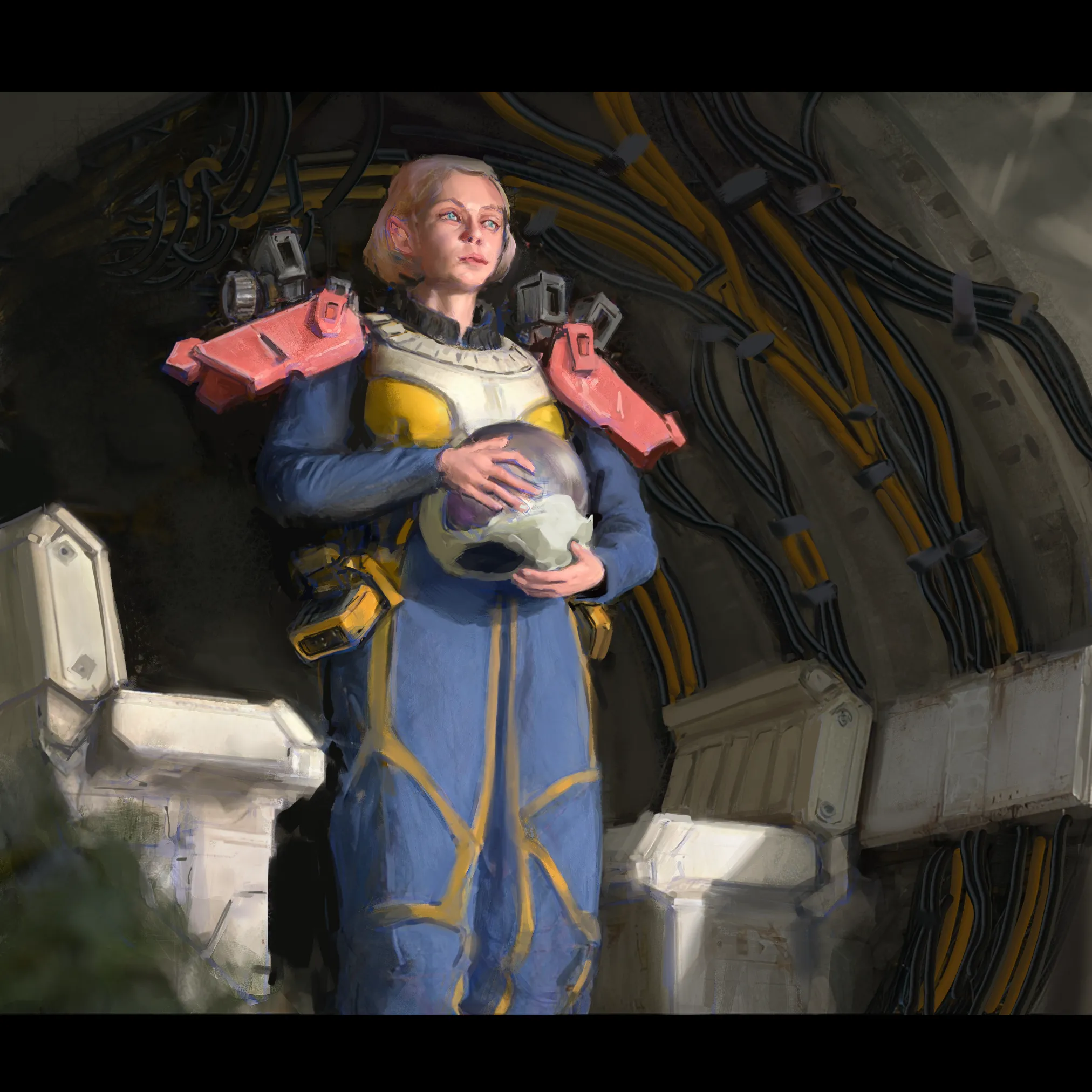
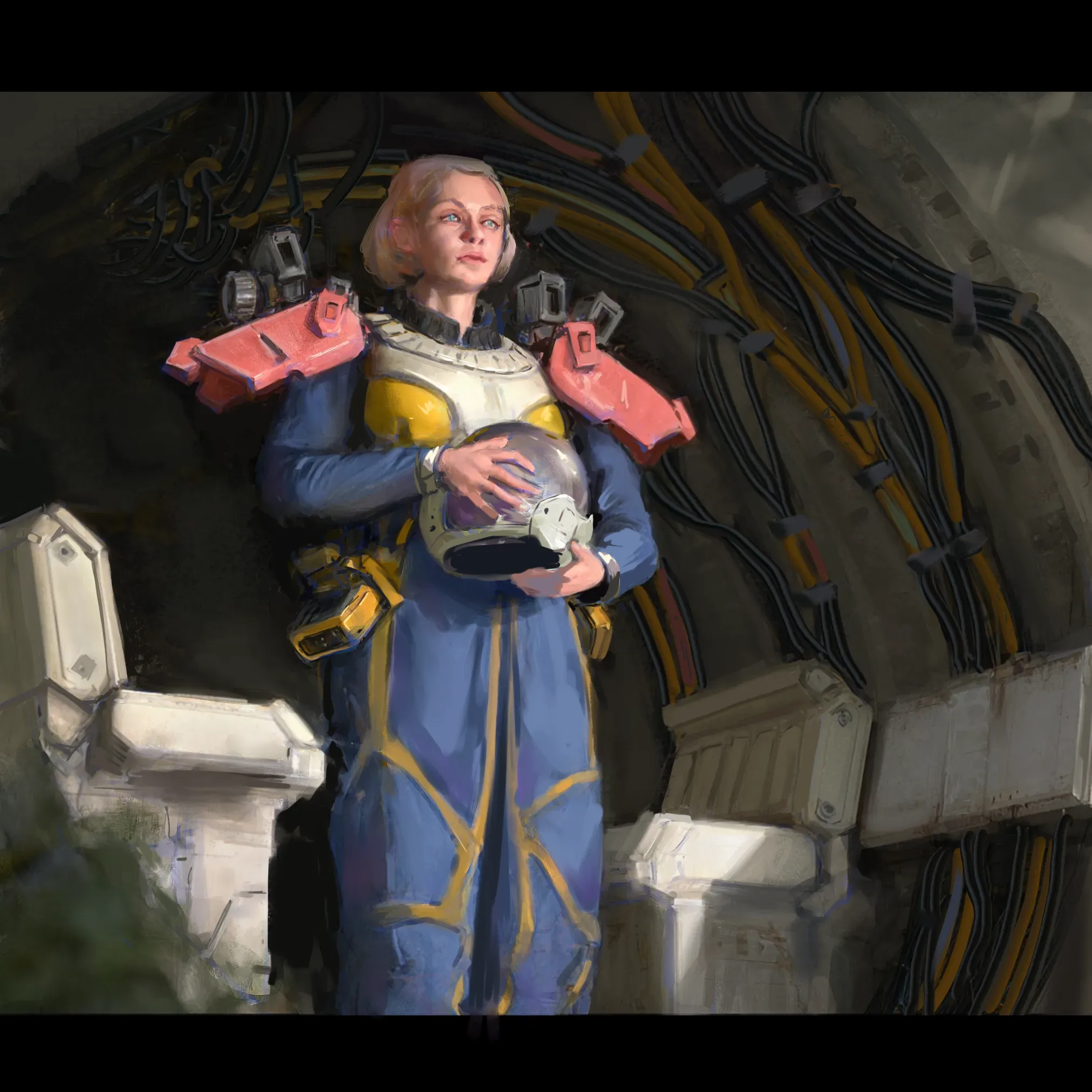
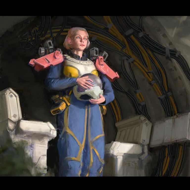
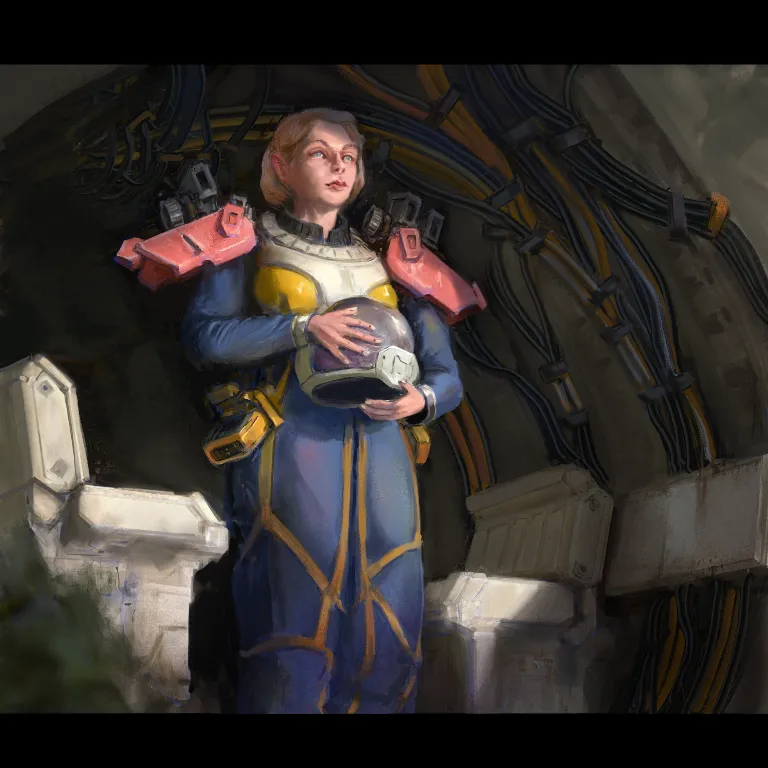

Hey! Love how the lighting and color choice for this one lead the focus to the character nicely. Things to improve: - her face seems to be distorted/squished. Would be a good idea to check the proproportions again (unless intentional) - I would say in such light the ear would be in shadow, same for her hand - the suit could use more texture/folds, also more hue variation - design choice/storytelling: add more details to the illustration to push the idea of space travel, e.g. cables having labels/differentcolors, helmet more technical parts (btw helmet hole should probably be as big as her head). - stylistic choice but the pinky is usually the rebell so I would move it away a bit. - a couple highlights (especially on metalic/glass parts) wouldn't hurt Hope it helps. Cheers!
That is a great feedback, thank you for the points. I can see now that face is distorted, love the way you painted the hands. Thank you! Will go back and apply all the comments asap :)