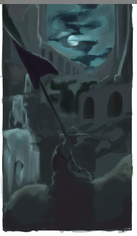
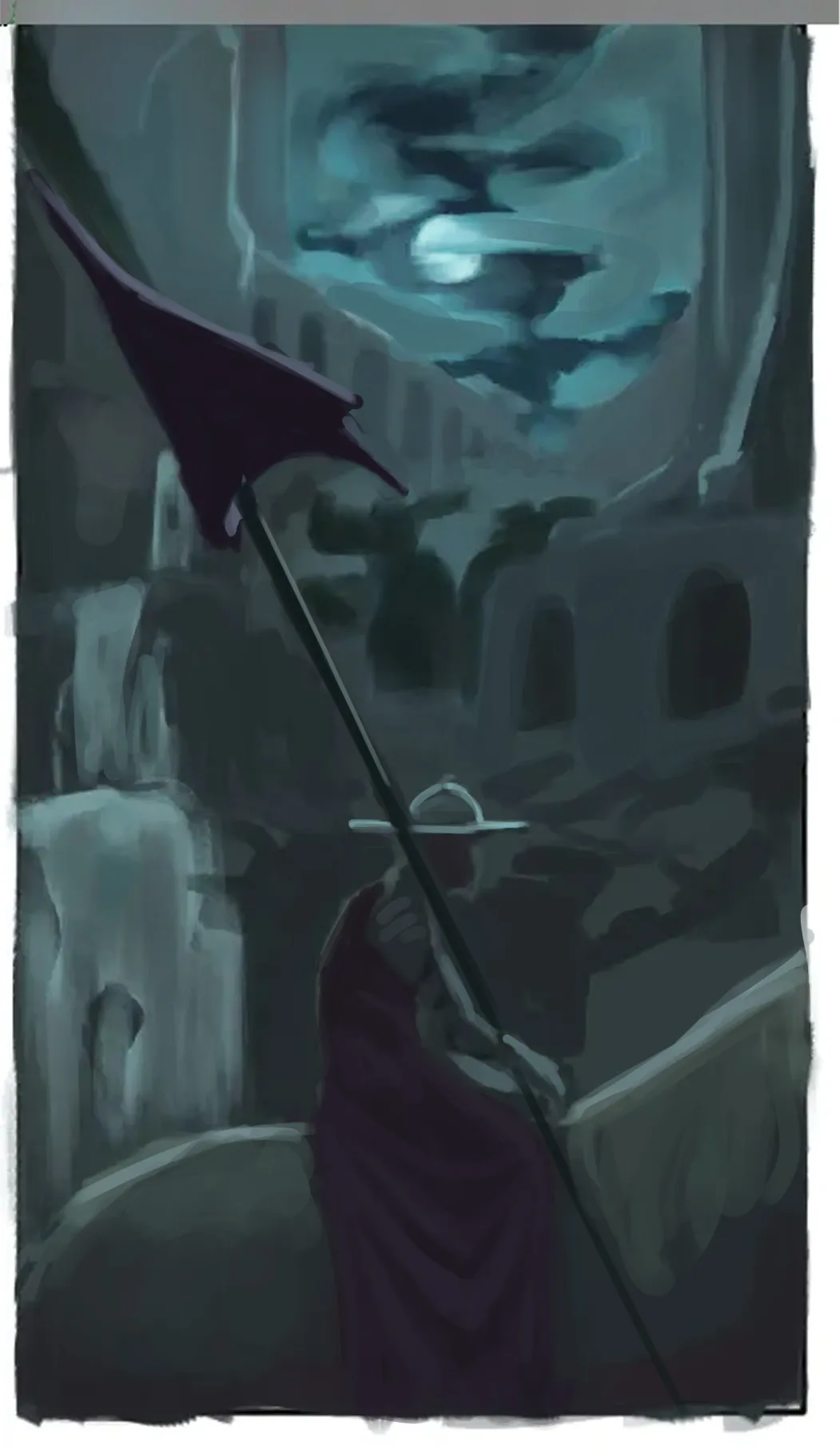

Hey there! Colors are on point! What I could suggest is working a little more on the values. The BG could be lighter to create a stronger sense of atmospheric perspective, while the elements in the FG could be painted slightly darker to create a clearer separation between the BG, MG, and FG. I’m not sure how it looks in the reference, but this could be something worth trying. :) As for the clothing and the forms in general, you need to define them a little more clearly. If doing this directly through painting feels a bit difficult, I’d suggest making a drawing beforehand to indicate the folds of the clothing, the shape of the flag, etc. In many cases, having a solid drawing foundation can save you hours of painting, especially if you’re not completely used to sculpting the forms through paint. :) I’m not sure exactly how the folds work in the clothing, but I assume there’s some kind of diaper fold happening in the lower area. So I defined the folds while keeping them within the value structure of that area to avoid introducing values that are too bright or too accentuated. In this case, the only strongly accentuated values would be the light along the silhouette of the character. Hope this helps!
Anstriche (1)
Somber
Künstlernotiz:
I was trying to do a colour study and this was my attempt, i was wondering how i can improve my colours, especially tje soldoers clothes banner and the horse, im not sure if their respective colours would have a role to play in my decision or if i shouldnt worry about their object colours due to the very dark enviorment (the flag and soldiers clothes are red if it matters)