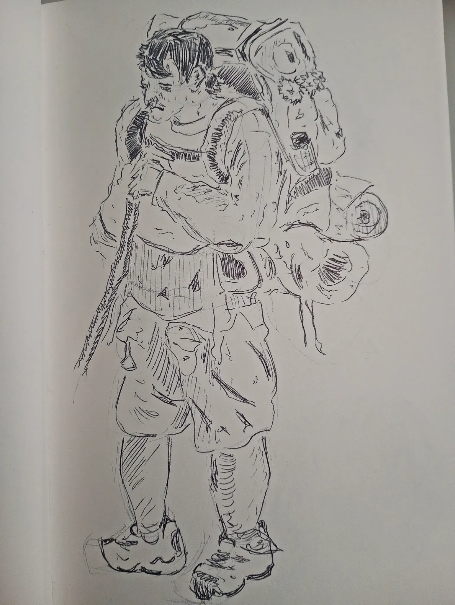
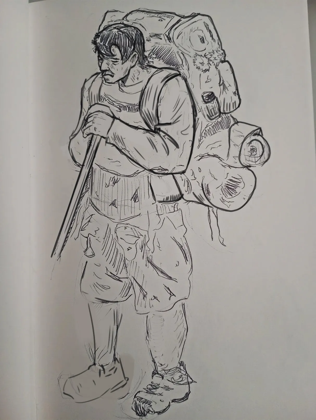

Hello there! Indeed, there are a lot of lines, but the main issue is that there isn’t a clear focal point and, overall, everything looks a bit flat because there’s no clear line hierarchy. I didn’t correct the pose, proportions, or perspective because I actually like these kinds of imperfections in pen drawings. :) However, as I mentioned, you need to improve the line quality to establish a clearer focal point and give the forms more volume. I added some line weight to your drawing, emphasizing the face first (which should be the main focal point), as well as using thicker lines around the silhouette and in some areas where forms overlap, such as the arm. Also, make sure that the internal lines follow the form of the object to reinforce its volume. Otherwise, the forms can easily end up looking flat. Hope this helps!
Anstriche (1)
Charakter
Künstlernotiz:
I think there are just too many lines on one spot. What else can you make out?