Dark Arts of Character Design: Refining Rendering, Lighting, and Color
Character Design: Refining Rendering, Lighting, and Color
There comes a time in any artwork when you need to move to refining your piece.
When the piece is ready to be rendered, some artists can spend hours and hours polishing it (others think it's a real bore). Whether you like rendering or not, you can easily sink a lot of time into the process, but still miss some important details.
Today we're breaking down a submission to the Artwod Community: a Skeleton Knight inspired by the Darksiders to make sure you're not missing anything and your rendering really hits the right spots.
Specifically, we will explore how to make your character respond convincingly to light while keeping the color palette and design visually cohesive.
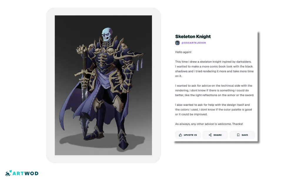
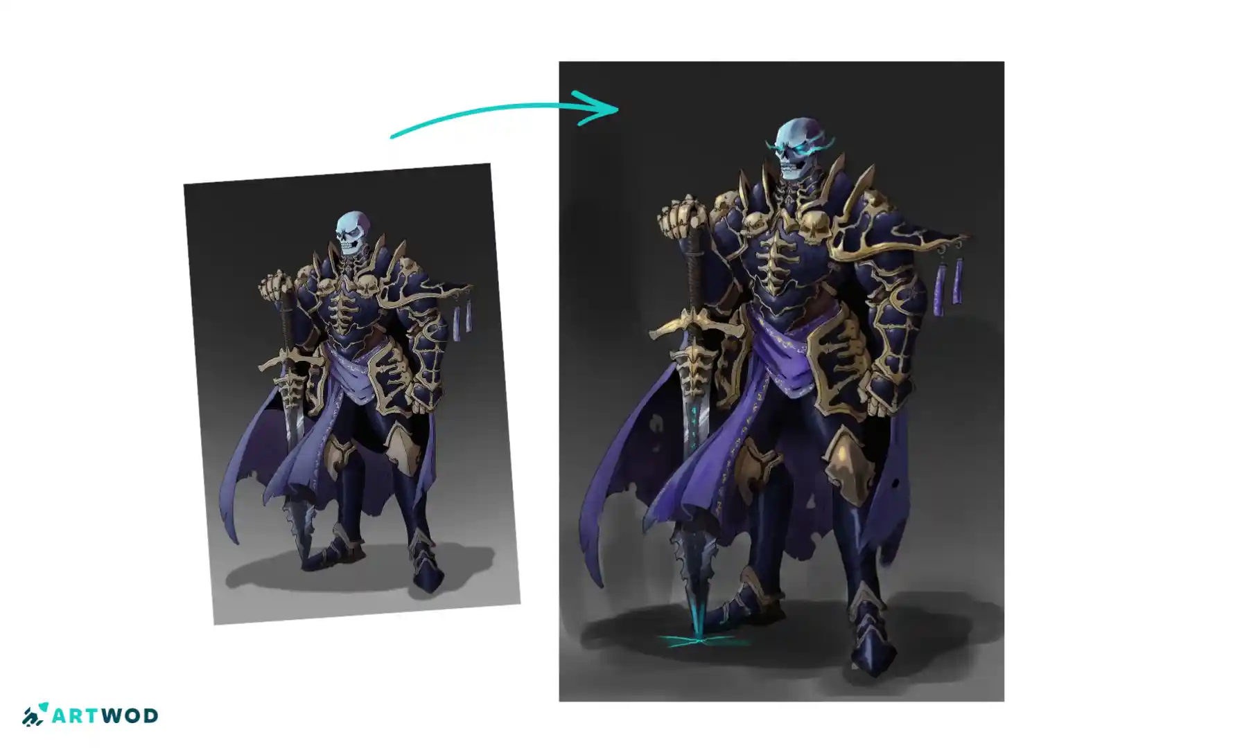
Skeleton Knight artwork inspired by Darksiders with black shadows, rendered armor, sword, and a dark color palette
The Artwork and the Problem
The artwork is titled “Skeleton Knight” and was submitted by @oscartejedor to our Community. The piece is inspired by Darksiders, a famous action videogame. Artists like Joe Madureira and Christian Lichtner have worked on this game and created a beautiful universe with uniquely dark ambient. As you can see, rendering metal in this particular style can be quite hard.
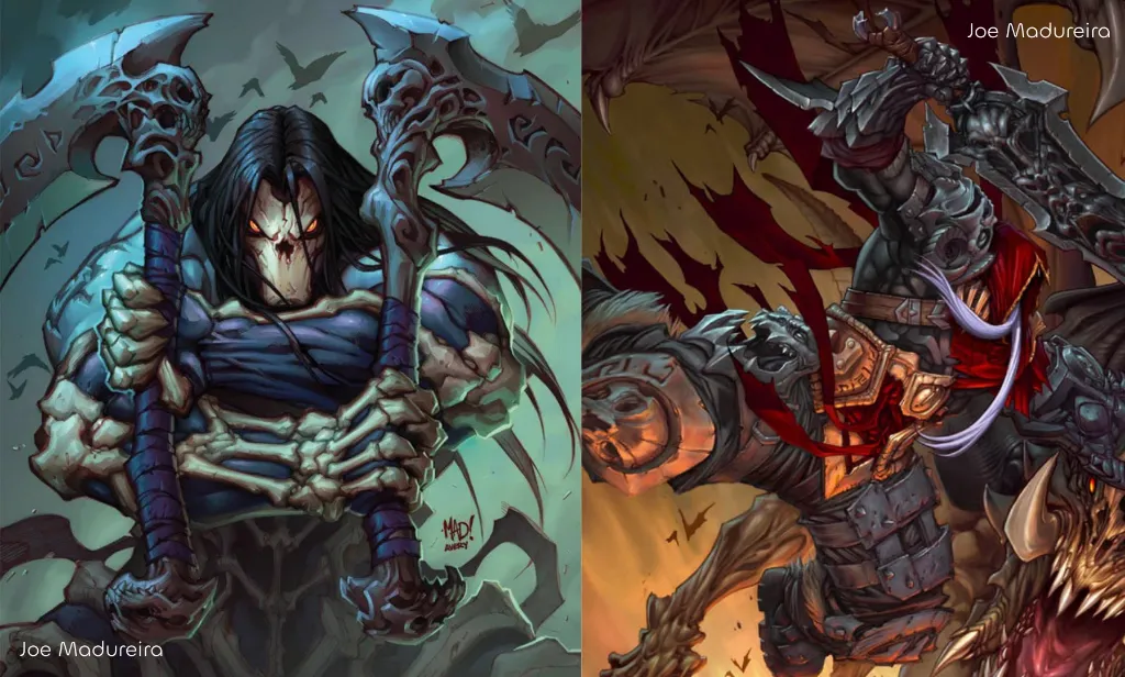
And in fact, the artist specifically wanted advice on the technical rendering side, particularly the light reflections on the armor and sword. They also questioned whether the design and color palette could be improved.
Rendering problems are always unique, and this one is particularly interesting: reflective materials can easily become visually noisy, while a dark comic-book style requires strong control over where the darkest values actually belong.
The goal is not simply to add more reflections or more colors. It is to make every lighting decision support the form and the overall visual style.
Start With the Light Source Before Rendering Reflections
Reflective armor is easier to render when the light source is established first.
Before adding highlights, determine:
Where the main light comes from.
Which surfaces face the light.
Which planes turn away from it.
Where the strongest reflections should appear.
Which areas should remain predominantly dark.
This prevents highlights from becoming decorative marks that do not correspond to the object's form.
For hard surfaces such as armor, the relationship between planes is particularly important. A change in surface direction can produce a noticeable change in value or reflection.
Instead of thinking, Where should I put a shiny highlight?, ask:
What is this surface reflecting, and why would the viewer see that reflection here?
That question will bring much more convincing results.
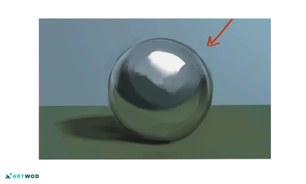
Simple metal rendering example: rendering a metal sphere. First, establish a light source.
How to Render Armor Without Losing the Form, step-by-step breakdown
Armor can look flat when every surface receives similar values. It can also become overly glossy when every edge receives a bright highlight.
A better approach is to establish the major planes first.
Step 1: Identify the Armor PlanesBreak the armor into large surfaces rather than treating it as one continuous object. Look for:
outward-facing planes
inward-facing planes
curved transitions
edges
recessed areas
Each plane should respond to the light differently according to its orientation.
Step 2: Establish the Large Value PatternBefore adding small reflections, decide which parts are light, middle value, and shadow.
This is especially important for a dark rendering style. Strong black shadows work best when they contrast with deliberately controlled lighter areas.
Step 3: Add Selective ReflectionsPlacing as many highlights as possible is a common mistake beginner artists make. Reflective surfaces do not need highlights everywhere. Reserve the strongest reflections for areas where they communicate the material, form, or focal point.
A few deliberate highlights can make armor feel more metallic than dozens of random bright marks. But too many highlights will make your image scattered and the viewer will lose focus.
Step 4: Check the SilhouetteZoom out and look at the character as a whole.
If the brightest reflections are scattered equally across the entire figure, they can compete with the silhouette and make the character harder to read.
The rendering should support the character design rather than overpower it.
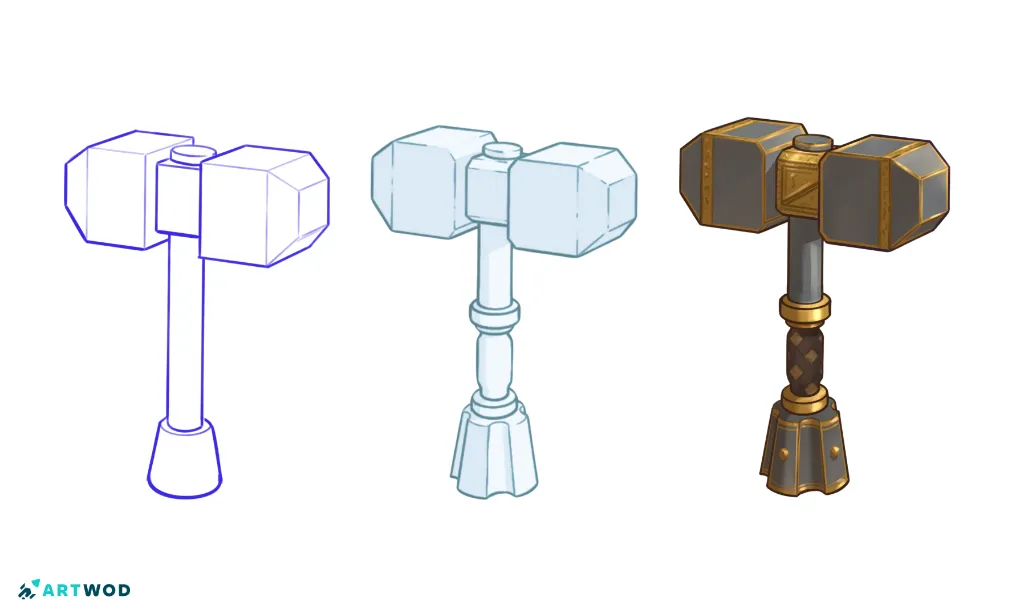
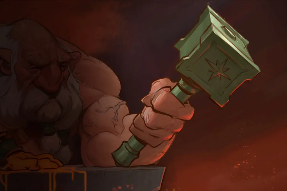
Metal hammer drawing, step-by-step breakdown
The Sword Needs Its Own Lighting Logic
The sword presents a similar challenge.
A blade is a reflective surface, but its appearance depends heavily on its orientation relative to the light and viewer.
Instead of filling the blade with a uniform bright gradient, think about the blade's planes and edges.
A useful approach is to establish:
The overall blade value.
The direction of the primary light.
The brightest reflective edge or plane.
Darker areas that separate the blade from surrounding forms.
Any reflected colors that help connect the sword to the environment.
The strongest highlight should have a reason to exist.
If everything on the sword is equally bright, the material becomes less convincing because there is no hierarchy between its surfaces.
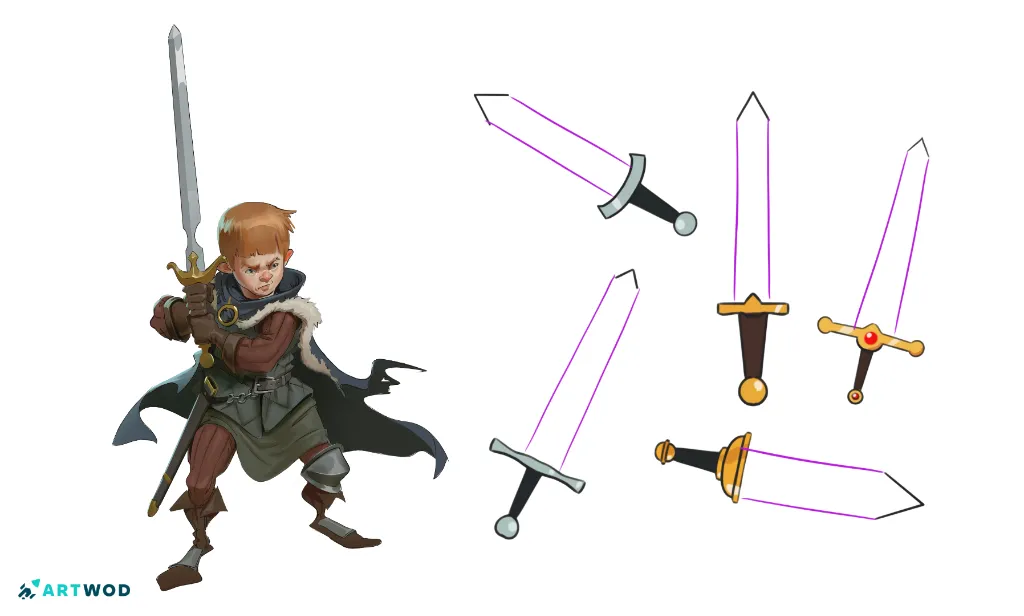
Try drawing these swords!
Making Black Shadows Work in a Comic-Book Style
The artist deliberately wanted strong black shadows to create a comic-book look.
That can be effective, but deep shadows need structure. Black should not simply mean “the areas I haven't rendered yet.” Instead, use the darkest values deliberately to describe:
Occlusion
Deep form turns
Areas facing away from the light
Separation between overlapping forms
Remember, that shadows are not only describing the form, they are also a visual element in your drawing and thus need to be aesthetically pleasing. Work on the shapes of your shadows deliberately, make them a part of your composition.
Combining form description with pleasing graphical shapes is not an easy artistic challenge. It can easily frustrate you and make you lose a lot of time. Don’t be shy and submit your work to the Artwod Community, where real artists can take a look at your work and give you useful tips and draw overs!
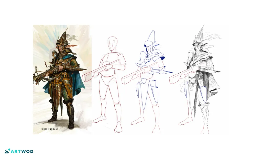
Character design by Filipe Pagliuso, breakdown
Color Should Support the Lighting
The artist also questioned whether the color palette could be improved.
Before changing individual colors, consider the palette as a relationship.
Ask:
Which color dominates?
Which color supports the main subject?
Where is the strongest saturation?
Do the colors separate the character from the background?
Do the colors reinforce the intended dark atmosphere?
A limited palette can work particularly well for a stylized character like this because it allows the values and material differences to carry more of the visual information.
You do not necessarily need more colors. You need clearer roles for the colors you already have.
A Better Rendering Workflow
For a similar Skeleton Knight or dark fantasy character, try this sequence:
Design: Establish the character's major shapes and silhouette. If you have troubles with this step, make sure to check our figure drawing road.
Composition: Make sure the character silhouette reads clearly before detailed rendering.
Light source: Decide the primary direction and quality of the light.
Large values: Establish the main light and shadow pattern.
Material separation: Decide how armor, bone, cloth, and the sword respond differently to light.
Form rendering: Describe the major planes and volumes with simple strokes.
Color: Adjust the palette so colors support the value structure and mood.
Details: Add small edges, textures, and accents only after the larger relationships work.
Reflections: Add selective highlights according to the light source and surface orientation.
This order helps prevent detailed rendering from becoming a substitute for solving the underlying lighting structure.
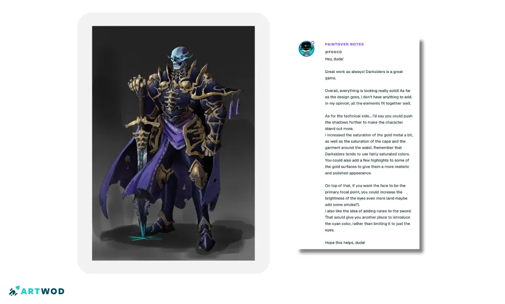
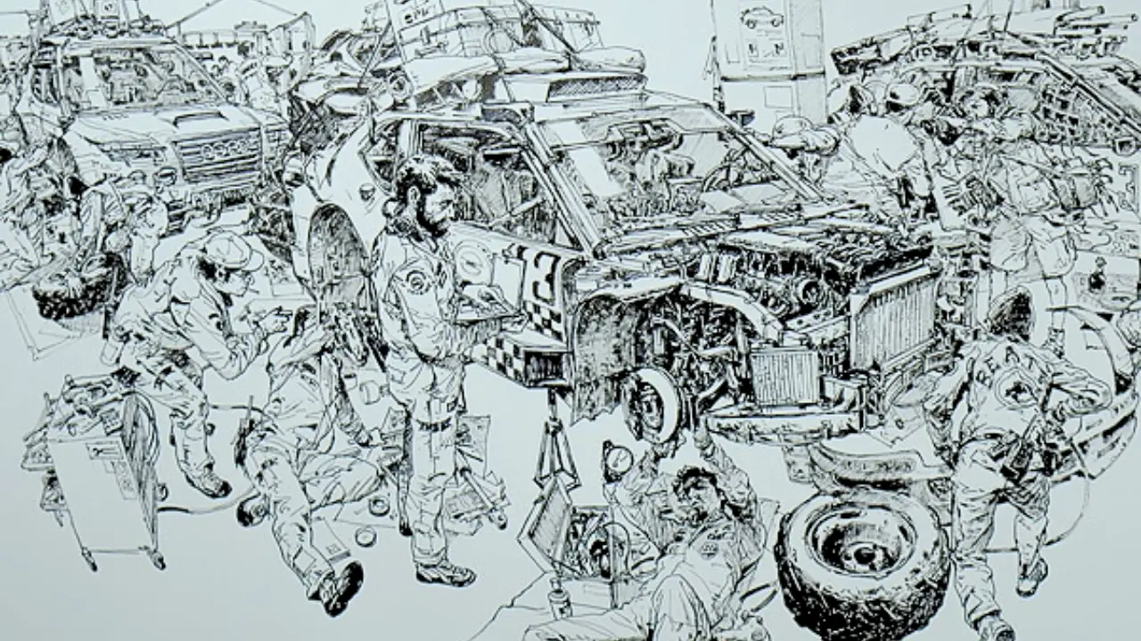
Drawover and tips by Fosco
Common Rendering Mistakes
Adding highlights without a defined light source: you will lose the form.
Making every armor edge bright: This reduces the impact of the most important highlights.
Using black everywhere: Deep values lose their graphic impact when they are not selective.
Treating every material the same: Metal, bone, cloth, and other surfaces should respond differently to light.
Changing colors without checking values: A new palette will not solve a value-structure problem.
Rendering before solving the silhouette: Detail cannot compensate for an unclear overall shape.
The broader lesson is simple: rendering quality comes from controlled decisions, not from adding more detail.
Practice Exercise: Render the Same Armor Three Ways
A useful exercise for this type of artwork is to create three small lighting studies of the same armor design.
Keep the character and pose unchanged.
Choose a different primary light direction for each study.
Block each version into large light and shadow shapes.
Add only a few reflective highlights.
Keep the color palette limited.
Compare how the armor changes under each lighting setup.
Choose the lighting arrangement that best supports the character's intended mood.
The objective is not to create three finished illustrations. It is to train your eye to understand how lighting changes the appearance of reflective materials.
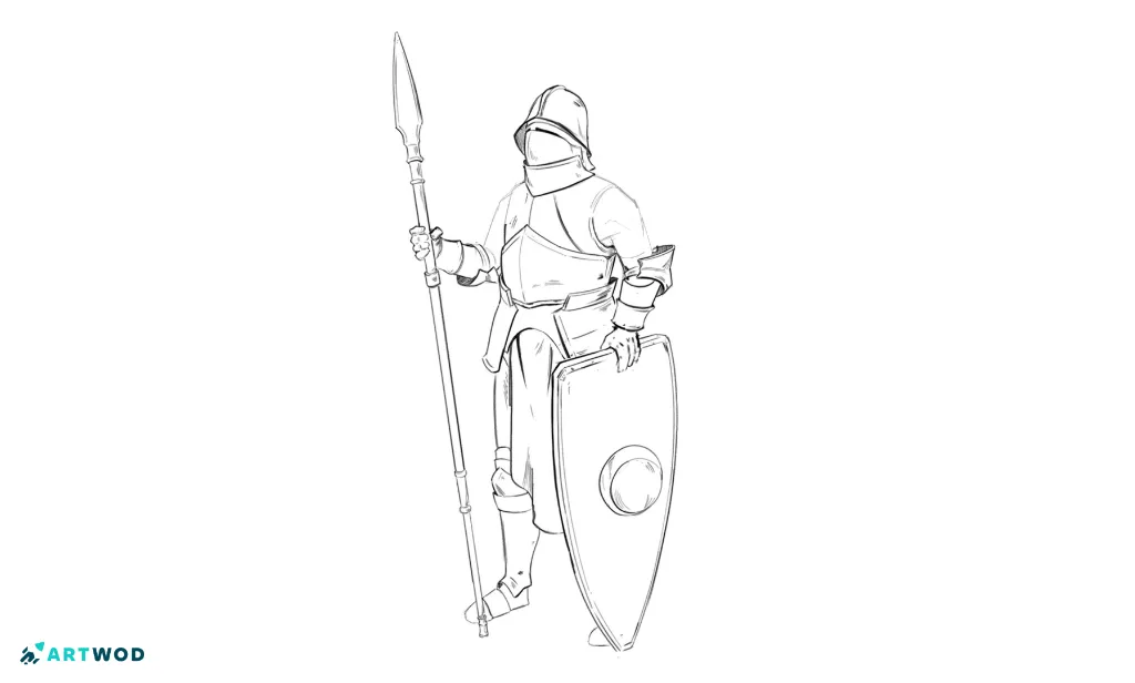
Use this template to render the armor 3 times!
Getting Feedback on Rendering Problems
When sharing your own artwork with the Artwod Community, asking a focused question can make the feedback more useful. Instead of simply asking whether the rendering looks good, you could ask whether the armor reflections read as metallic, whether the light direction is consistent, or whether the color palette supports the intended mood.
A specific question gives other artists something concrete to analyze and gives you a clearer direction for your next revision.
FAQ
Start with the light source and major armor planes before adding reflections. Use selective highlights to describe the material and form rather than placing bright edges everywhere. If you’re not sure where to use the highlights, check out our painting road!
How do I make metal look reflective?Metal usually benefits from strong value changes and controlled reflections. Establish the surrounding lighting first, then place highlights according to the surface orientation and reflected environment.
How do I use black shadows in comic-book art?Use deep shadows deliberately to describe form, separation, and graphic shapes. Avoid making every dark area equally black, or the shadow structure can lose its hierarchy. And if you struggle, don’t be shy and submit your work to our Community to get help from real artists of all levels!
How can I improve the color palette of character art?Start by identifying the dominant color, supporting colors, saturation, and value relationships. A smaller, more controlled palette can often create stronger visual unity than simply adding more colors.
Why do my reflections look random?Random-looking reflections often come from adding highlights without first establishing a consistent light source. Decide what the surface is reflecting and how its orientation affects what the viewer sees.
How can I improve rendering without overworking my artwork?Solve the large value and lighting relationships first, then add only the details that reinforce them. If the rendering works at a small size, additional details become much more purposeful.
Related Posts