Quer guardar seu feedback?
Registre seus comentários em um só lugar na sua conta. Seu feedback será privado e não público.
Pintar
Pinte sobre notas
Escolha uma tinta
Escolha um avatar para ver suas anotações e discuti-las.
Também ajuda com ambientes?
Melhore o layout e a perspectiva, a 3 min
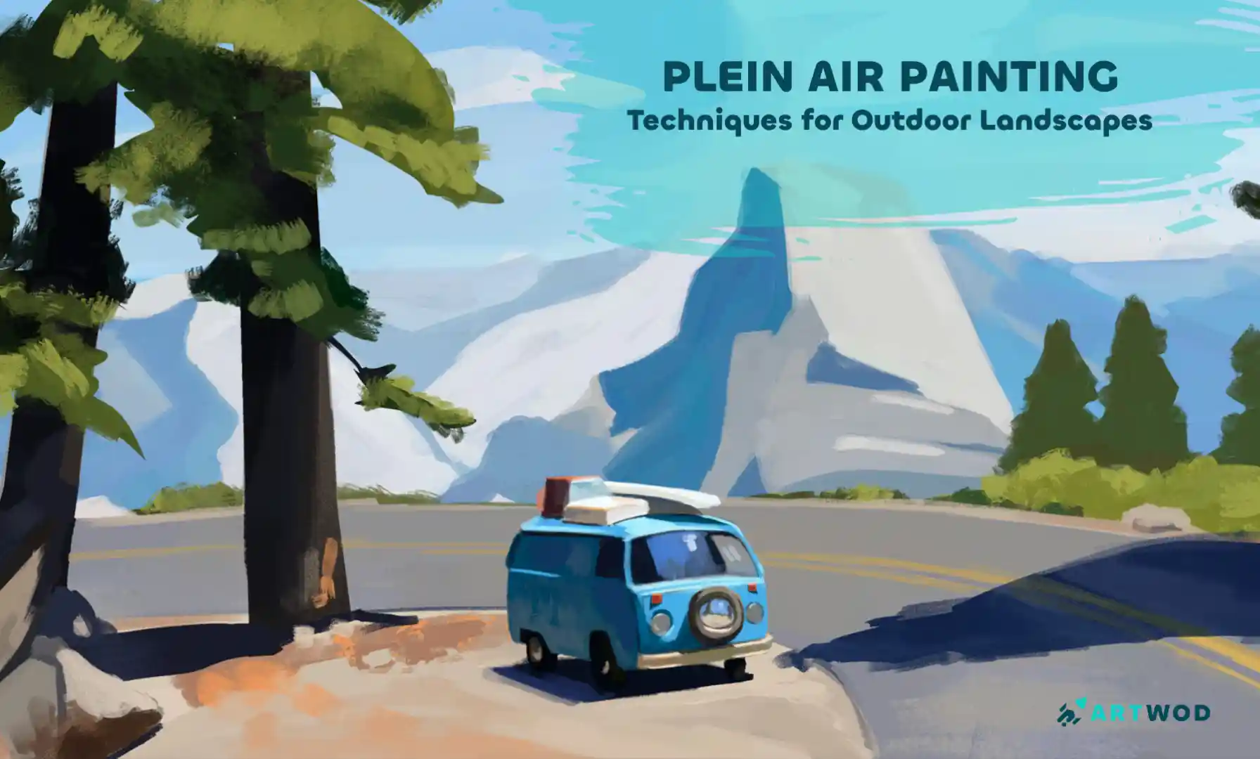
Plein Air Painting: Outdoor Techniques for Landscapes and Nature Scenes
Master plein air painting by analyzing compositions, sketching real environments, building value structures, and layering color to create immersive landscapes.
Environment
Quer ajudar alguém que ainda está esperando?
June 30 Sketchbook Pages Challenge
Ainda sem resposta
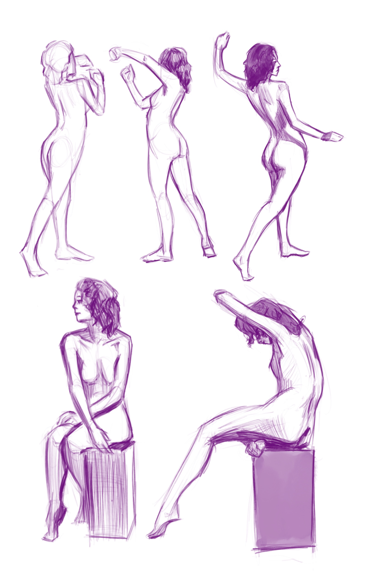
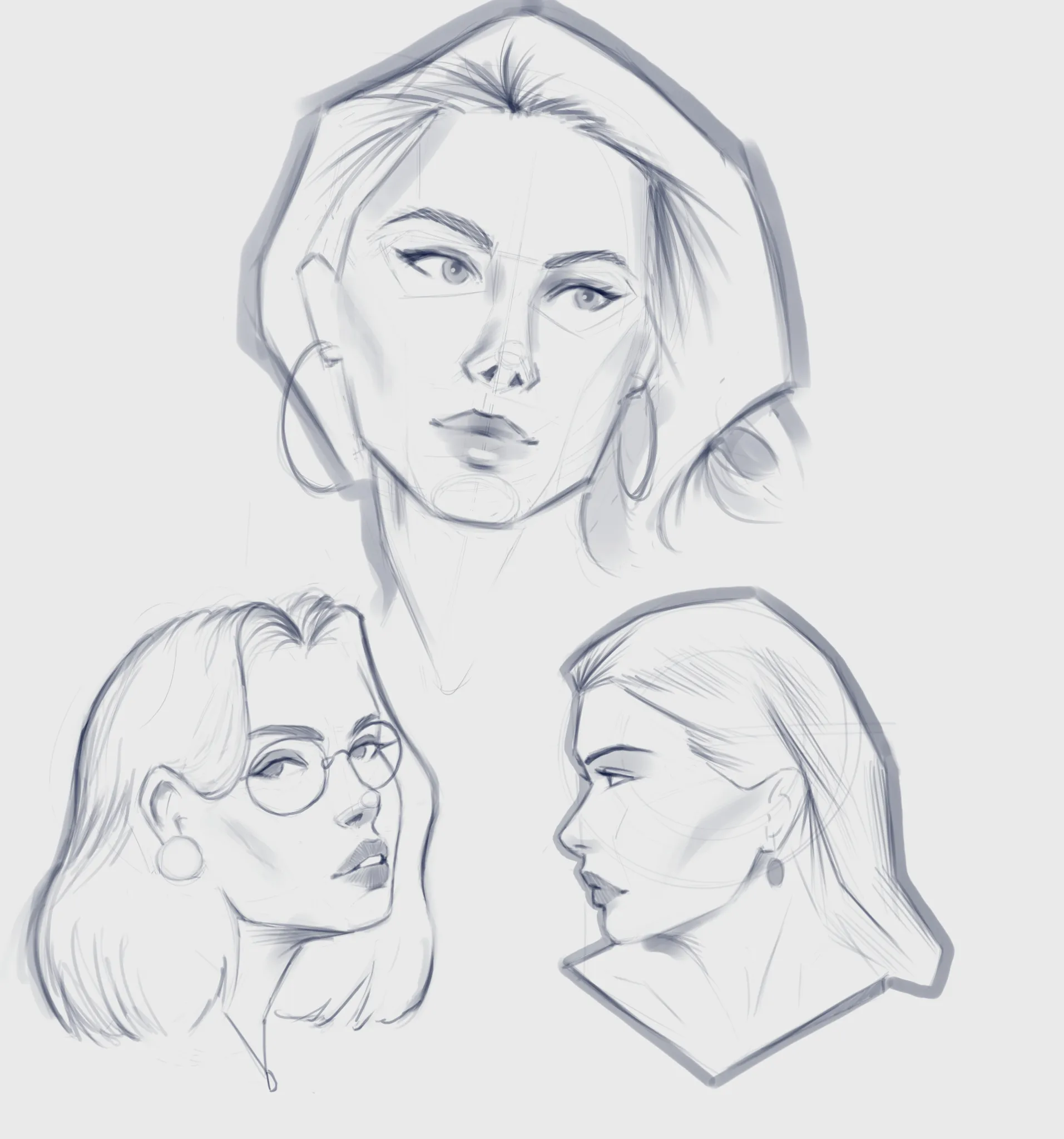
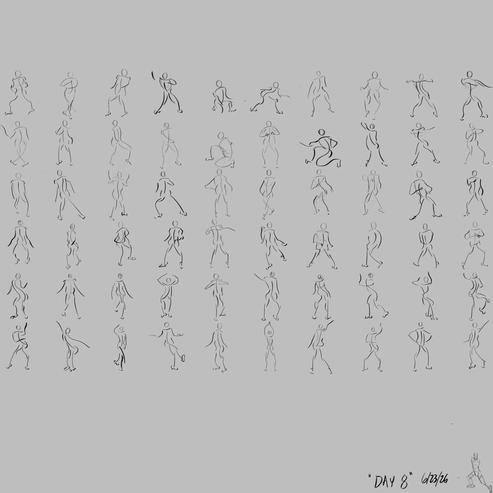
Daily gestures 2
Another daily figures, trying to push myself to add more details and form. The top row is roughly 5mins, bottom two are more 15mins. Looking for feedback on improving forms for these time ranges.
há 2
Ver
June 30 Sketchbook Pages Challenge
Ainda sem resposta
24th June submission
Made one from imagination and 2 from reference. I for sure struggle with same face syndrome when drawing from imagination.
há 7
Ver
June 30 Sketchbook Pages Challenge
Ainda sem resposta
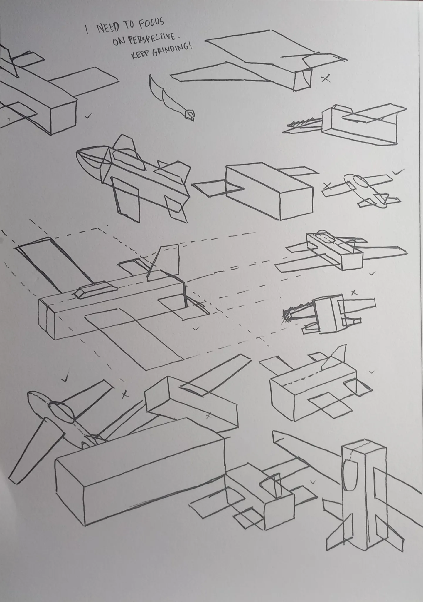
June Sketch Day 24
Back at it again, with all these blocky planes xD. I'm having fun with this since i know the form of each block, i kinda went all out with different angles. I found my go-to practice, thanks to Fosco, Marco and Christopher. I will keep hammering at this practice until i'm comfortable to draw planes without guiding lines. From their feedback, i thought that i needed to work more on perspective, and proportion. Hence, why i made all these blocky shapes, to ease my understanding with planes but in simple forms. For the two real planes, I also worked on proportion by following the corresponding line from the front tube to the back of the mainframe/rudder. It's still messy, but i hope it'll get better if i keep practicing. Shoutout to Fosco, Marco, and Christopher, you guys are awesome.
há 7
Ver
Figure
Ainda sem resposta
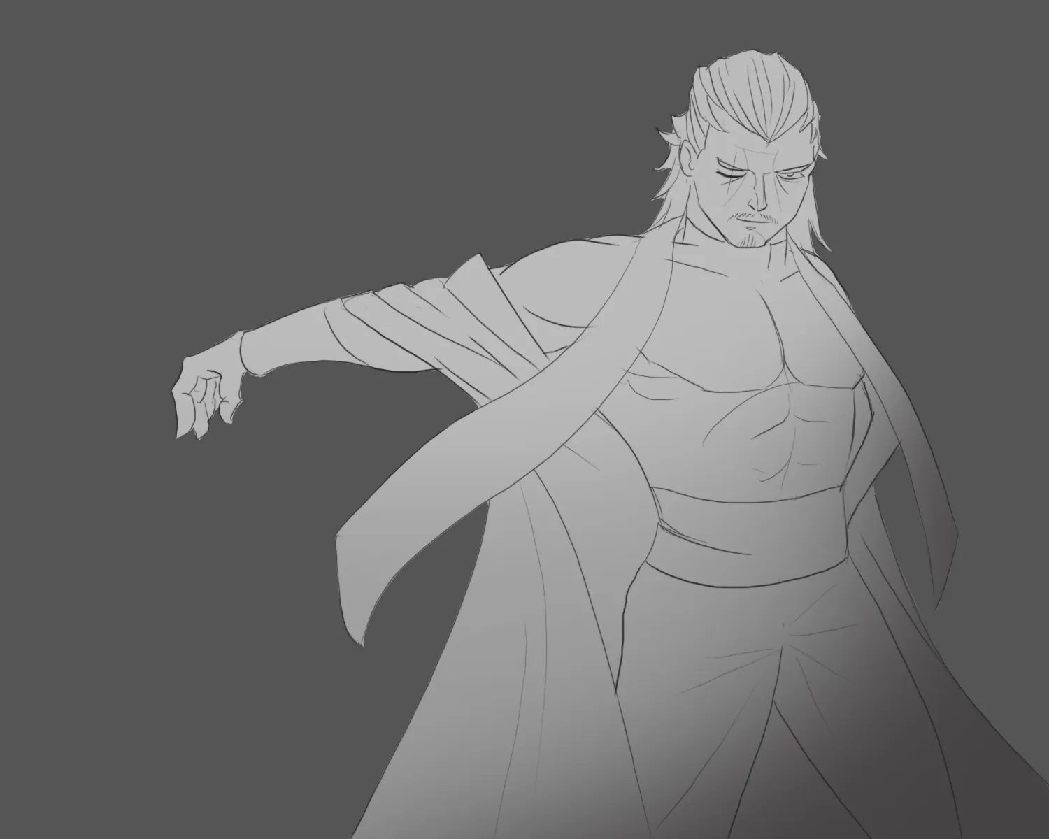
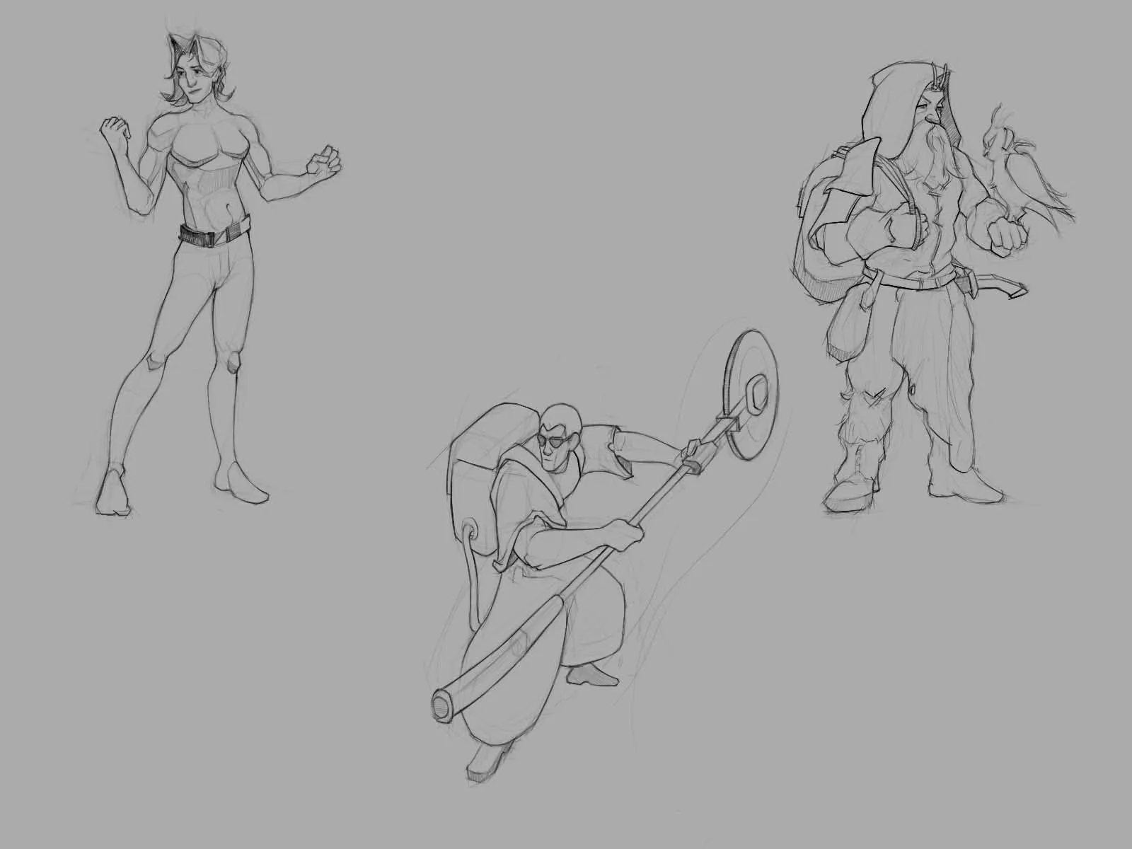
Need help checking proportion
Hi guys, I feel something off about arm and torso proportion. Pls help me check, I draw alone for 4 months with no feedback and I'm craving it a lot. If you have suggestion for other parts, feel free to correct me. I need it a lot. Thank you so much.
há 7
Ver
Rendering
Ainda sem resposta
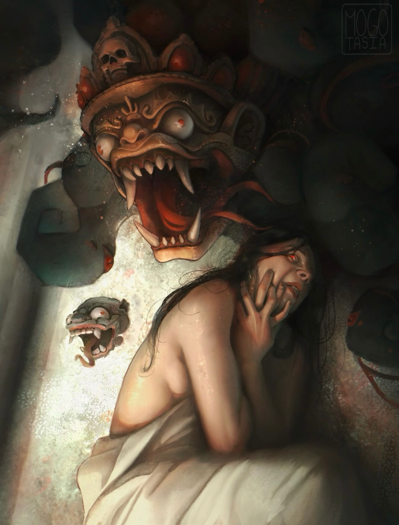
Personal Illustration
Hi! It’s my first time posting here! I’m looking for some feedback regarding my values / shading. I feel like I keep going too dark with the shadows and lose a lot of the form, but when I add bounce light I feel like my shadows start getting too contrasted (as in there is no clear shadow vs light shapes). I’m wondering if this is an issue of the core shadow not being dark enough, thus making the bounce light too light in comparison. I also feel like I am struggling showing that the mask is more in the forefront compared to the girl, and am also struggling showing that all these elements are in the same environment (as in, should I have some color from the mask bounce on her skin or the smoke to make it more believable?) I feel like I also struggle with over rendering a lot, so I’m thinking if I’m able to nail down the forms and showing them turning in space more easily, maybe that can fix that problem. I did struggle a bit with this illustration, as I kept moving a lot of elements around. Any feedback is appreciated, thanks!
há 7
Ver
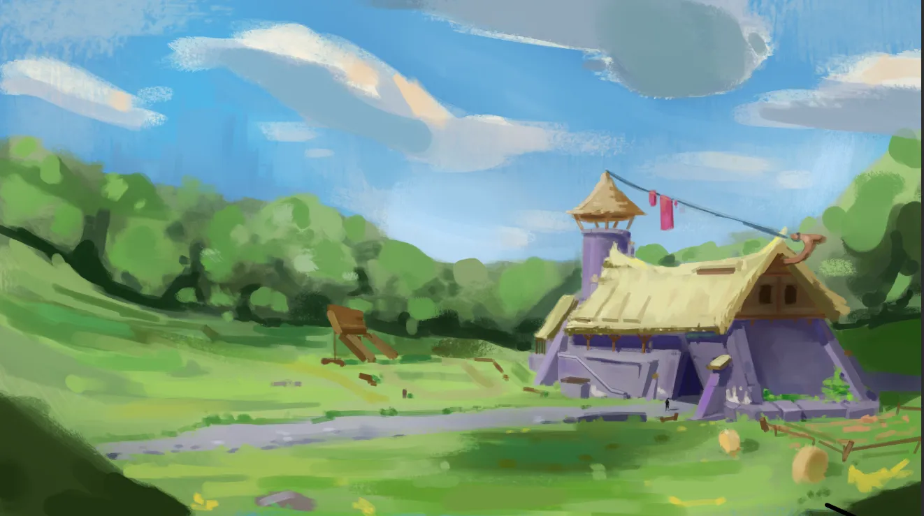
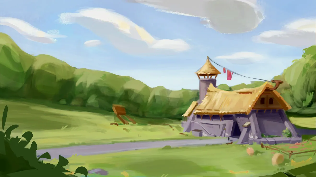
Environment
Ainda sem resposta
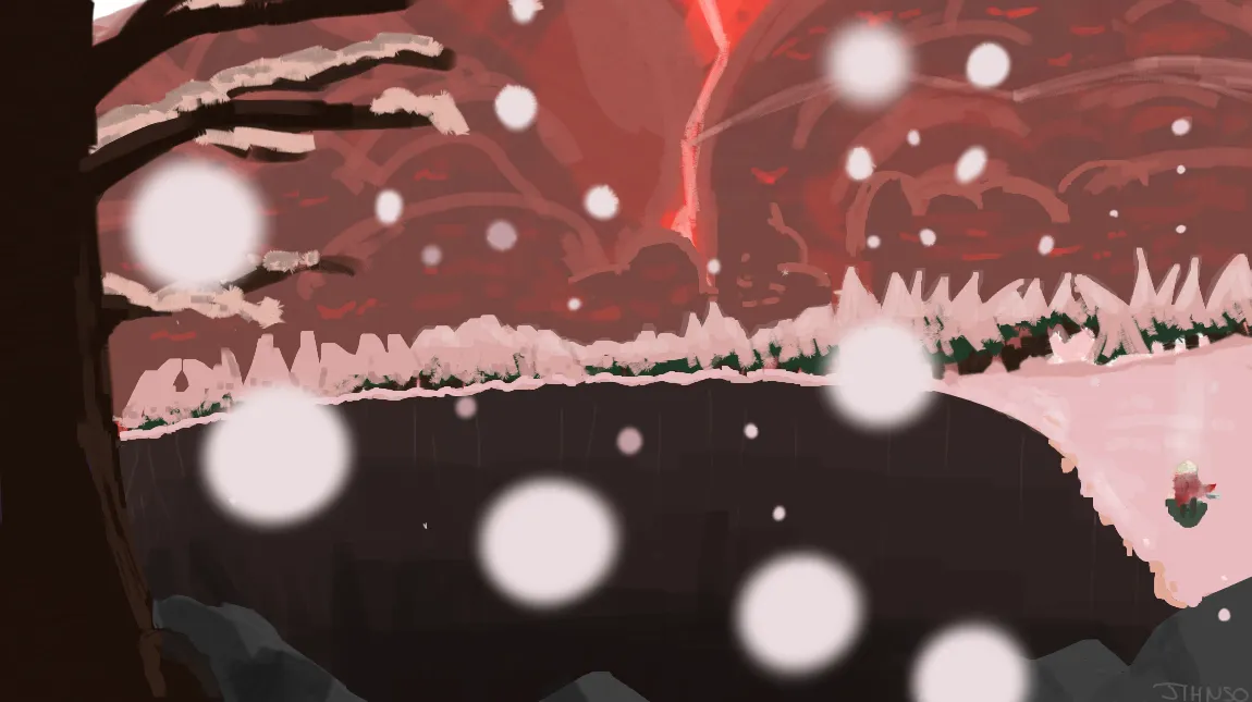
End Times
Would love to have critics, especially on the composition and the perspectives, i feel like i could have done better on those. Also i don't know how to make it seems like the holes is massive and that the earth have been lauched from below.
há 8
Ver
June 30 Sketchbook Pages Challenge
Ainda sem resposta
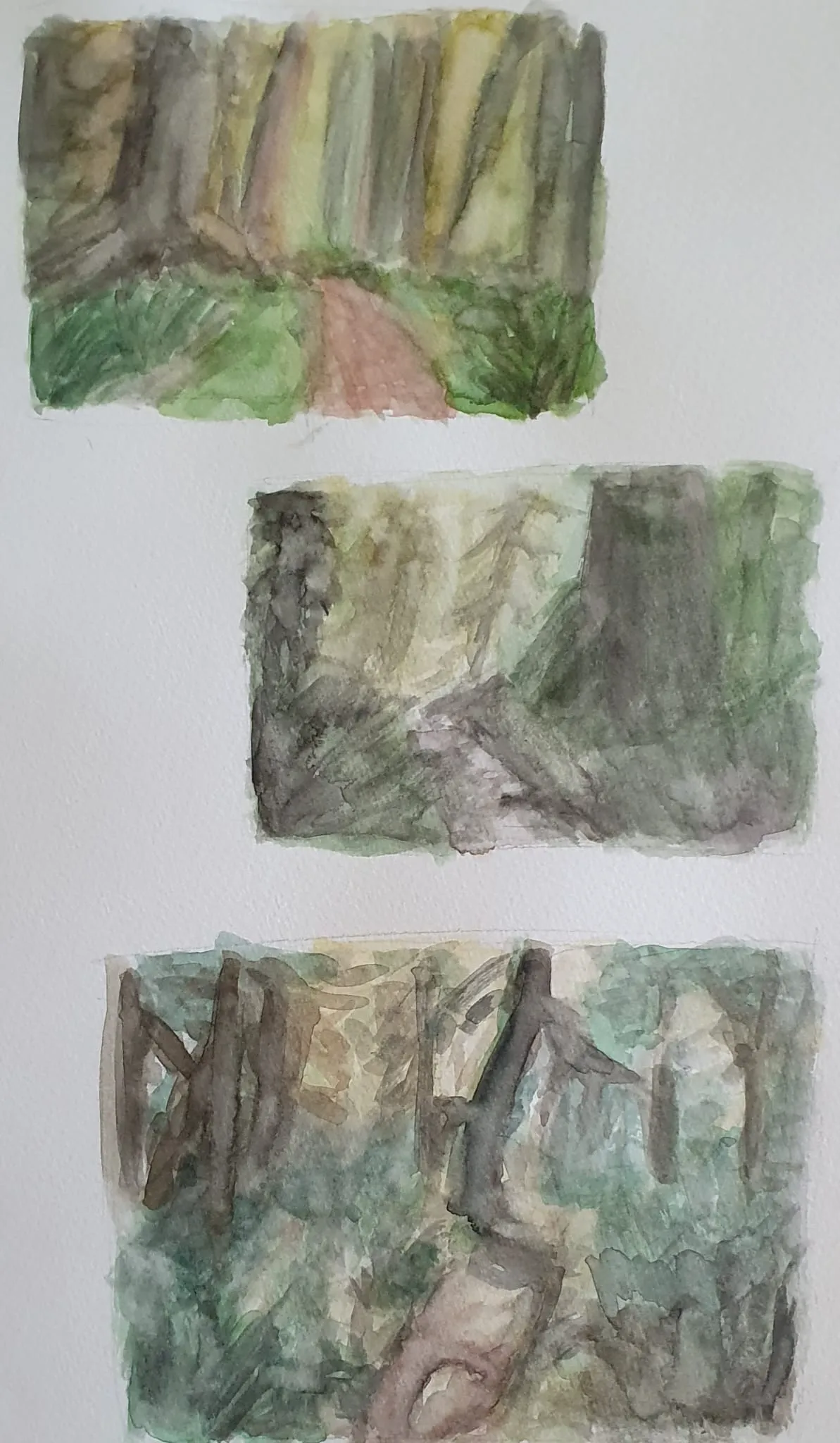
Watercolor forest scene
Some quick watercolor forests. I wanted to do it because I liked the lighting and composition. But it's a bit too sketchy. Still need to improve watercolors.
há 8
Ver
Figure
Ainda sem resposta
Gesture Practice
My first week of gestures have been an attempt at establishing a daily practice in building familiarity with the flow of a figure in dynamic poses. I am still trying to figure out what method works for me or what is comfortable when it comes to this practice. My next goal is to begin applying a little more construction - better indicating directionality (twists) of elements like the torso and hips without while understanding how to keep my flow intact. Helpful feedback: (1) Moving from "Implied torso/hips" to "Intentional" (2) Anchoring/giving weight to the pose through legs and feet (3) Overall clarity
há 10
Ver
Figure
Ainda sem resposta
Sketches
Line quality, shape language, flow
há 10
Ver