British illustrator & graphic designer. I love to help :)
#5
Rang
12
Upvotes
10
Feedback donné
100%
Utile
“This is a really good first attempt! Values are difficult, for future studies I would start out black and white, then greyscale, then colour. That’ll help you avoid making everything too pale. Darker ”
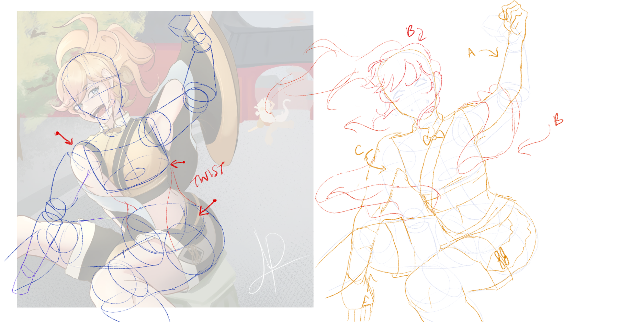
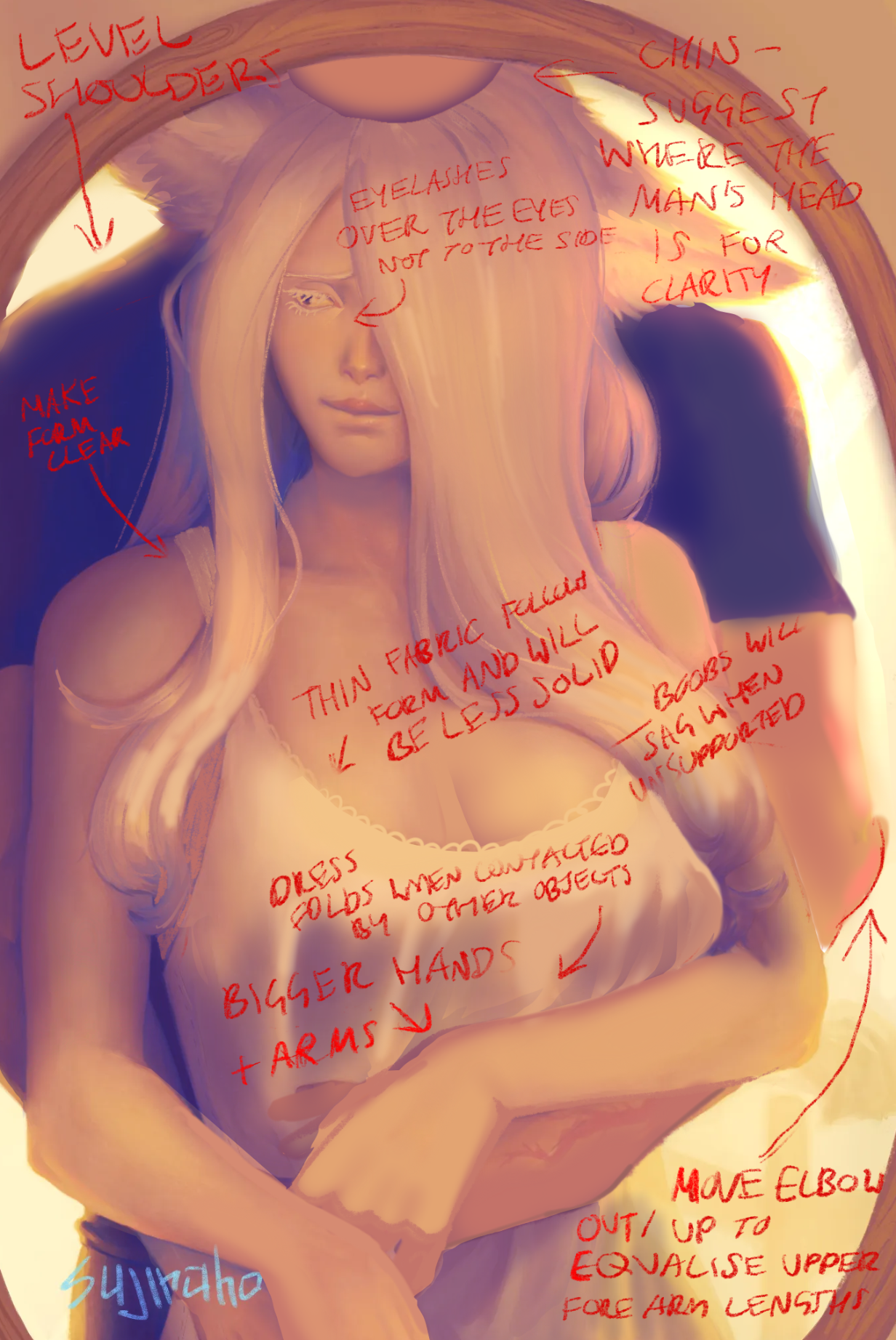
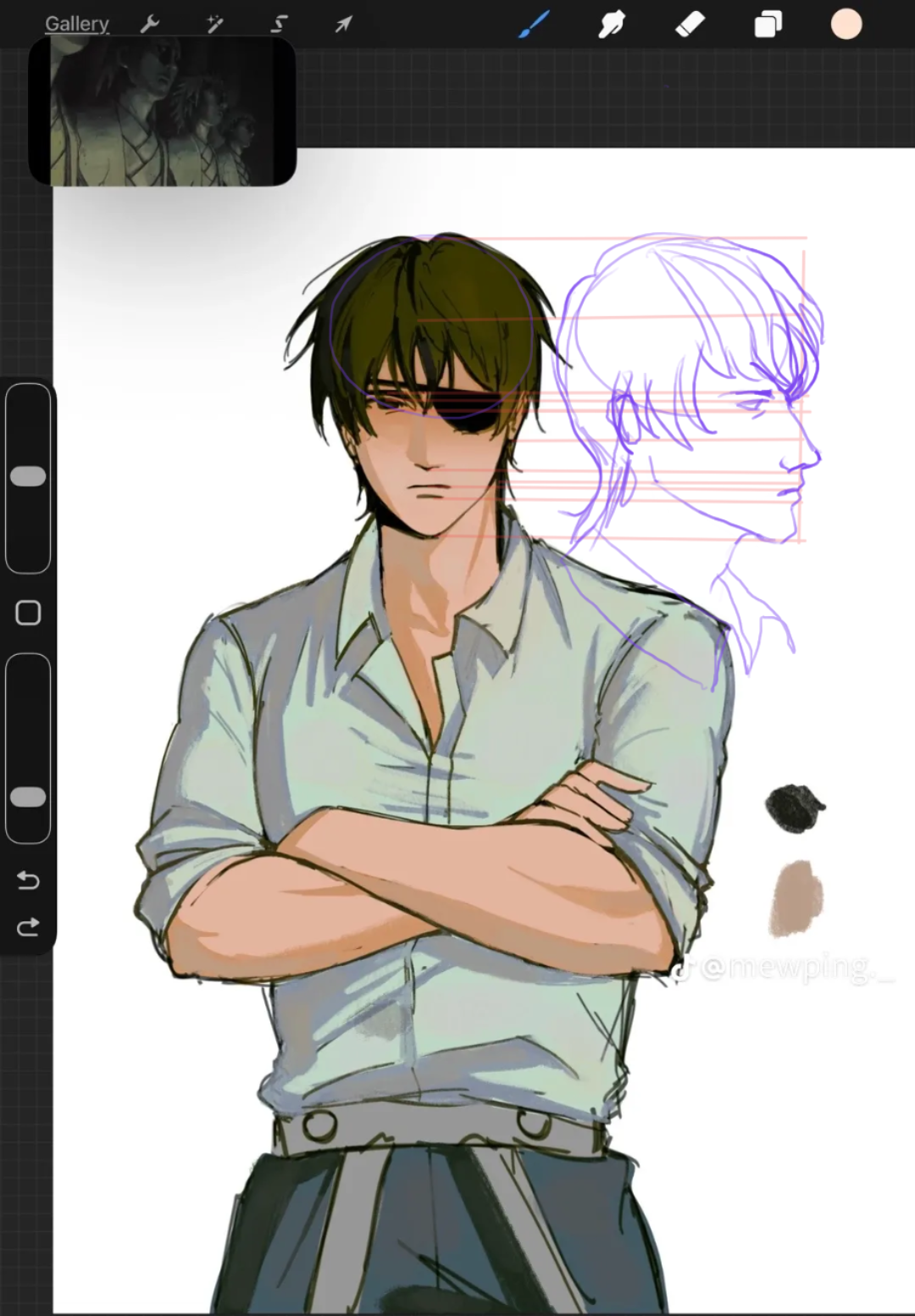
“Hi! I think your main problem is the position. Her left arm is stretched out uncomfortably behind her, while her right shoulder is pushed uncomfortably forward. The joint of the shoulder doesn’t move ”
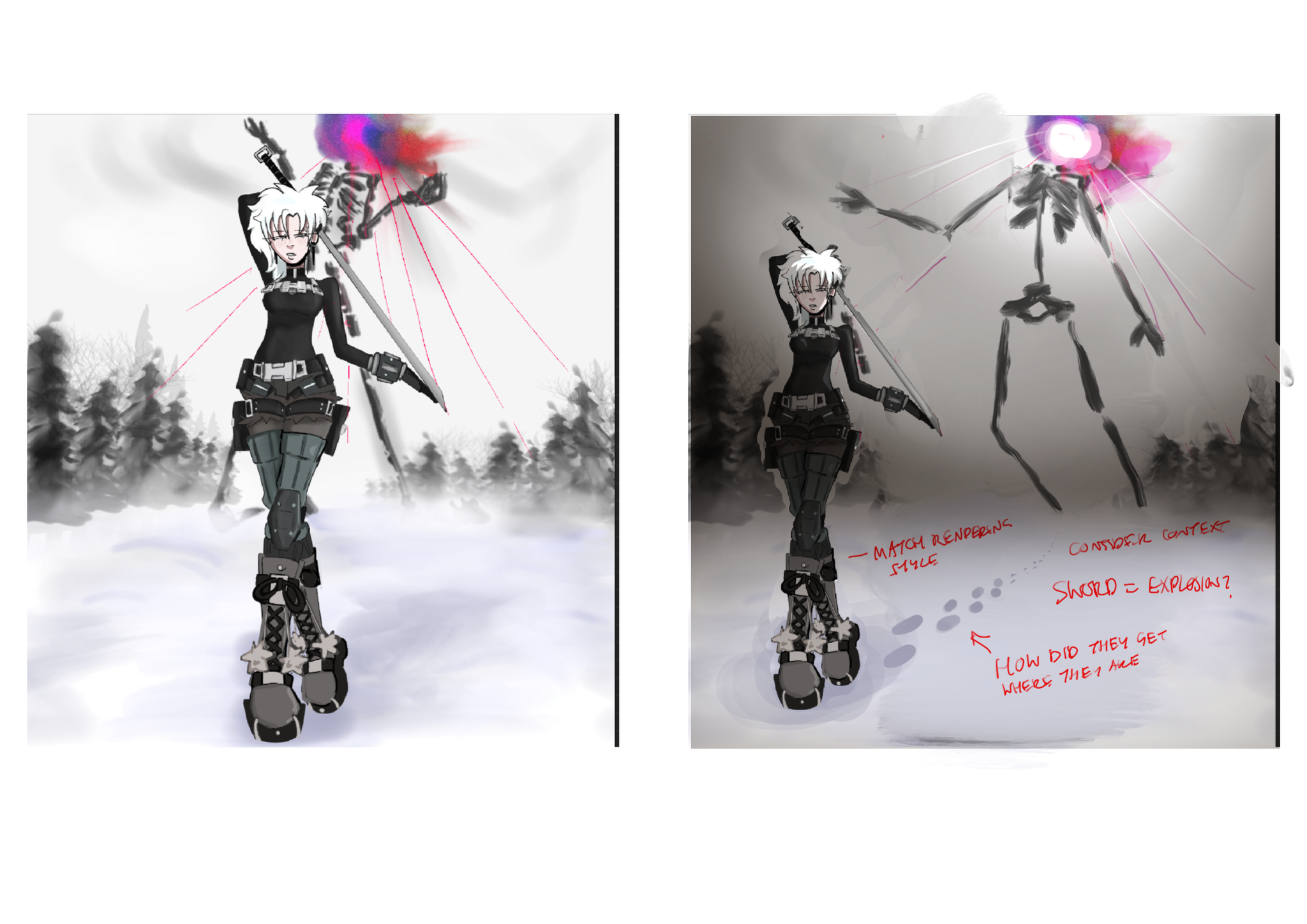
“I would move the character so the monster is clearly in view and the story is more clear. The ‘dullness’ is just a lack of contrast which can be fixed with some stronger lighting! The lines from the ”
“I really love the drawing! You can give dimension to your drawings by using contrast to showcase the forms even with soft lighting. For example the light is brightest on the parts nearest the mirror (”
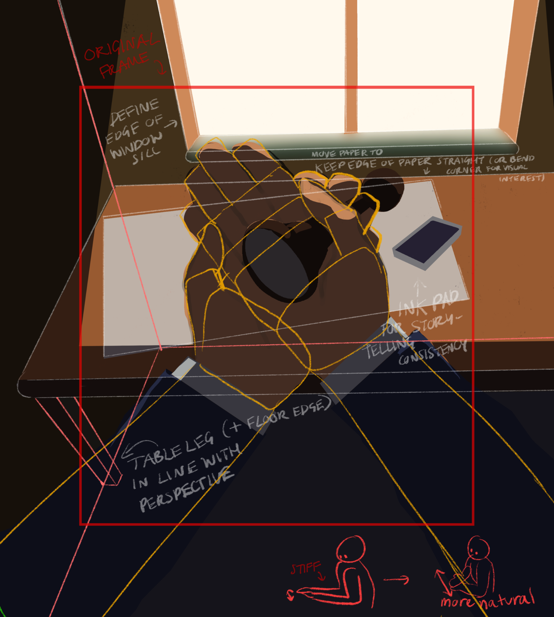
“I think the perspective is really interesting, the elbows are quite close together so spreading them out will make them look more natural. I’ve attached a paintover for what I would change, alongside ”
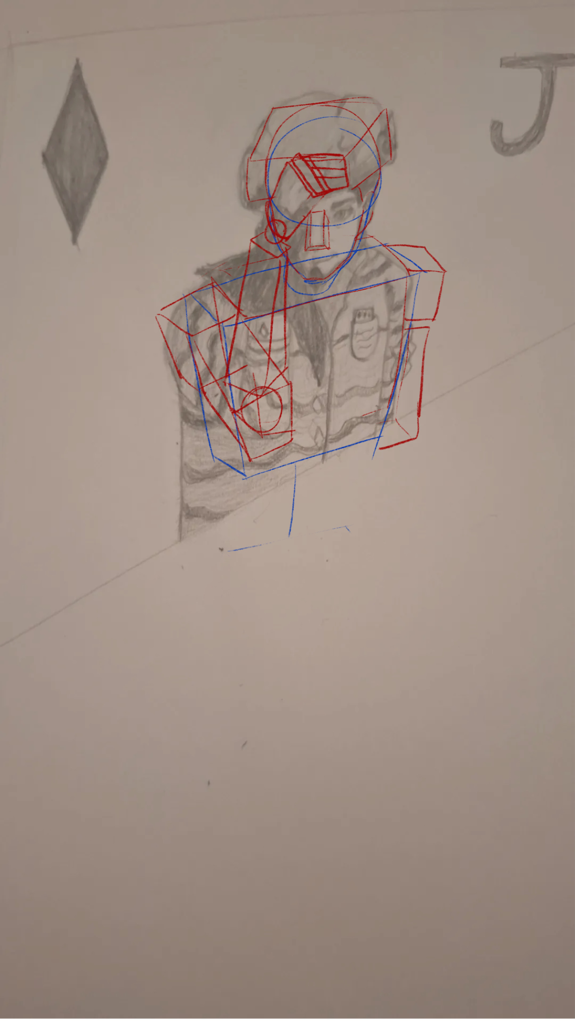
“It’s a great idea to use the box as a starting point, in my version I’ve shown how I like to use boxes. The body is a little more complex than just one box for the whole upper body. I’d suggest using”
“It’s unclear what kind of feedback you’re looking for, I think the face looks cool and stylised, definitely not bad proportionally. That being said if you can draw them from the side, just use parall”
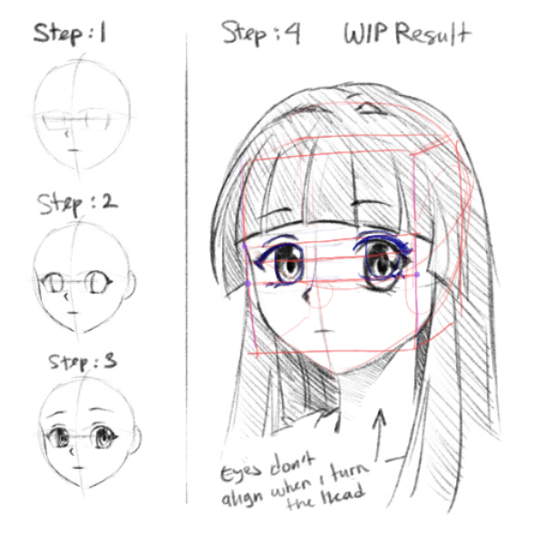
“This is an easy fix! You’re just forgetting to use your guidelines. The eyes need to be pretty much the same height and width in the perspective you’re using here. Just use construction lines from on”
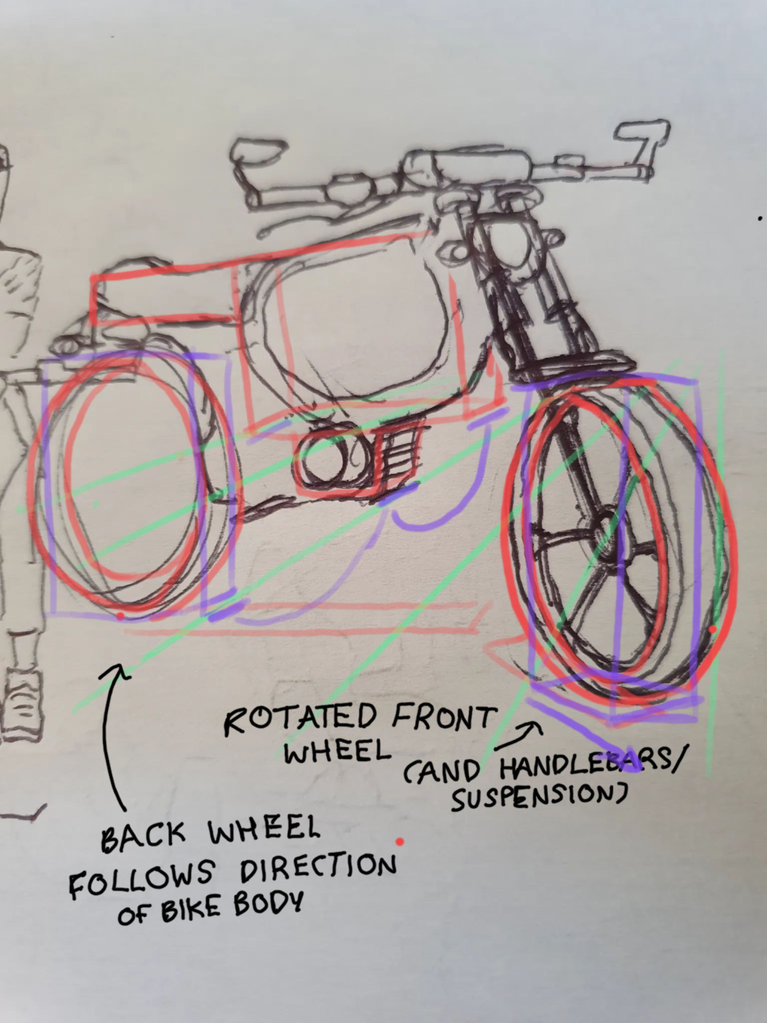
“I’ll deconstruct it for you! The front wheel and its attachments are turned in a separate direction from the bike, so the wheel is turned towards the viewer. This means the plane of the tracks is more”