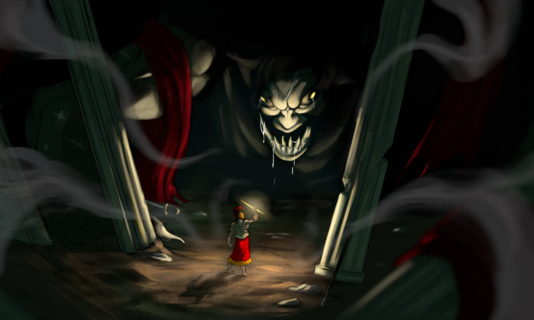
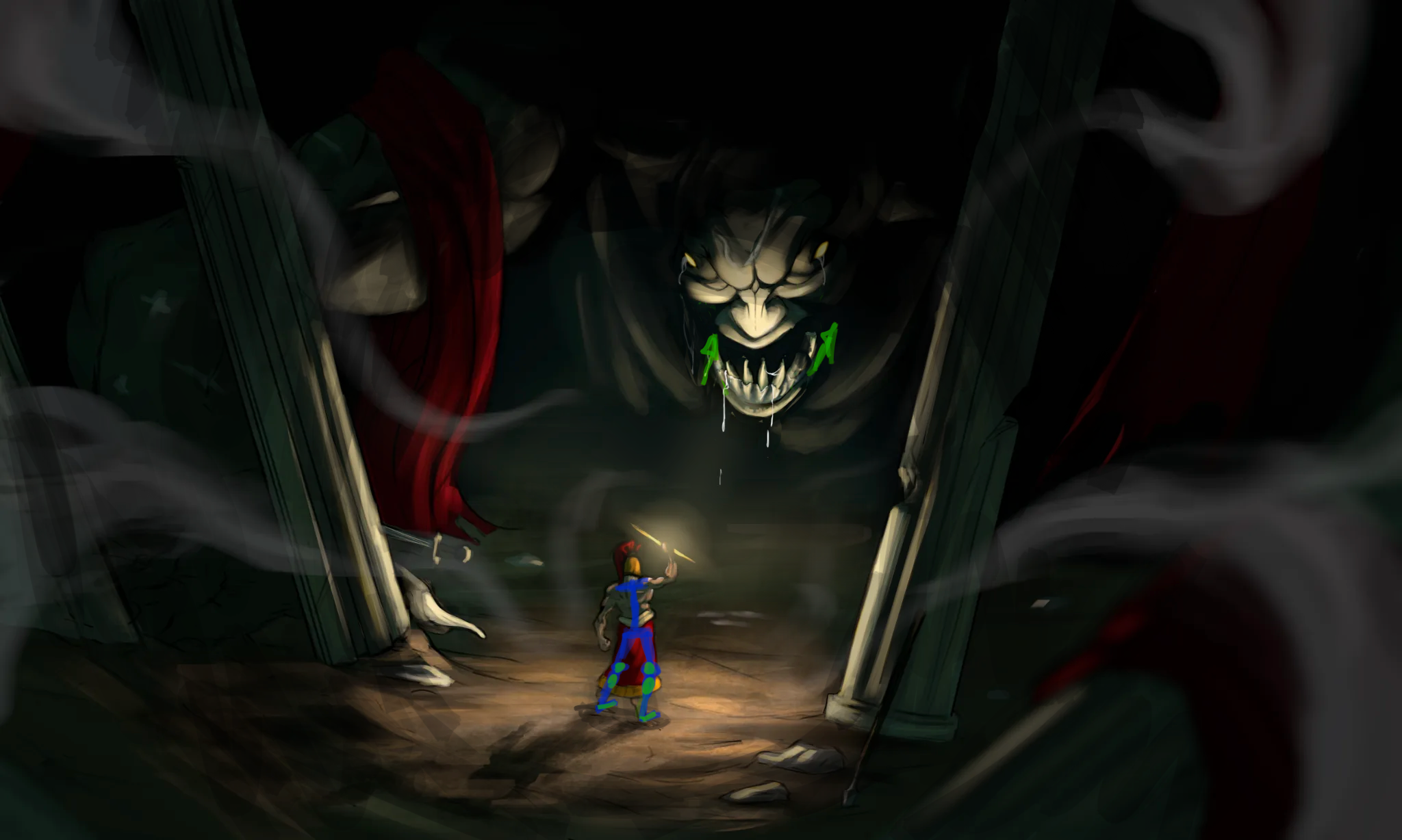

I’m quite a fan of your picture and its composition. At first I also couldn’t figure out what might improve it, but I think it’s the lighting / main focus of it. I reduced the overall brightness of the light source in order to steer the attention more to the centre. I also moved the jaw a bit more backwards because I had the impression that it’s too far in the front. The last thing I would adjust are the calves of your hero. They are way too low. The green dots are the knee joints and the expected calve position. So either shorten the skirt or remove them entirely. I hope it helps!
Peintres (0)
Defiled King
Notes d'artiste :
I'm trying to figure out what might be holding this picture back, I'm fine with the composition but something is just wrong or off that keeps me from getting that feeling of life I get from other concept artist's work.