Tu veux enregistrer ton avis ?
Enregistrez tous vos commentaires au même endroit sur votre compte. Vos commentaires seront privés et non publics.
Peintres
Paintoover Notes
Choisir un vernis
Choisissez un avatar pour voir ses notes et en discuter.
Tu as aussi besoin d'aide avecle rendu ?
Améliore tes valeurs et tes mélanges, 3 min de lecture
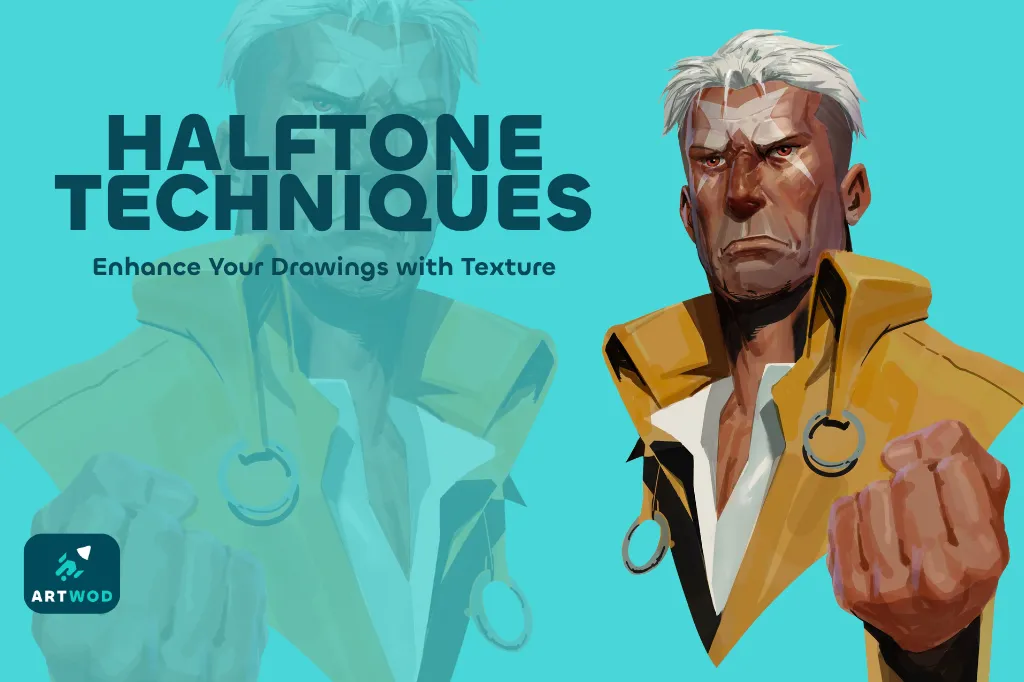
Halftone Techniques: Adding Texture and Depth to Your Artwork
Master halftones by establishing shapes, volumes, and shadows first, then practicing on beans, noses, portraits, and posters to add texture and depth to your artwork.
Rendering
Tu aimerais aider quelqu’un qui attend encore ?
Rendering
Pas encore de réponse
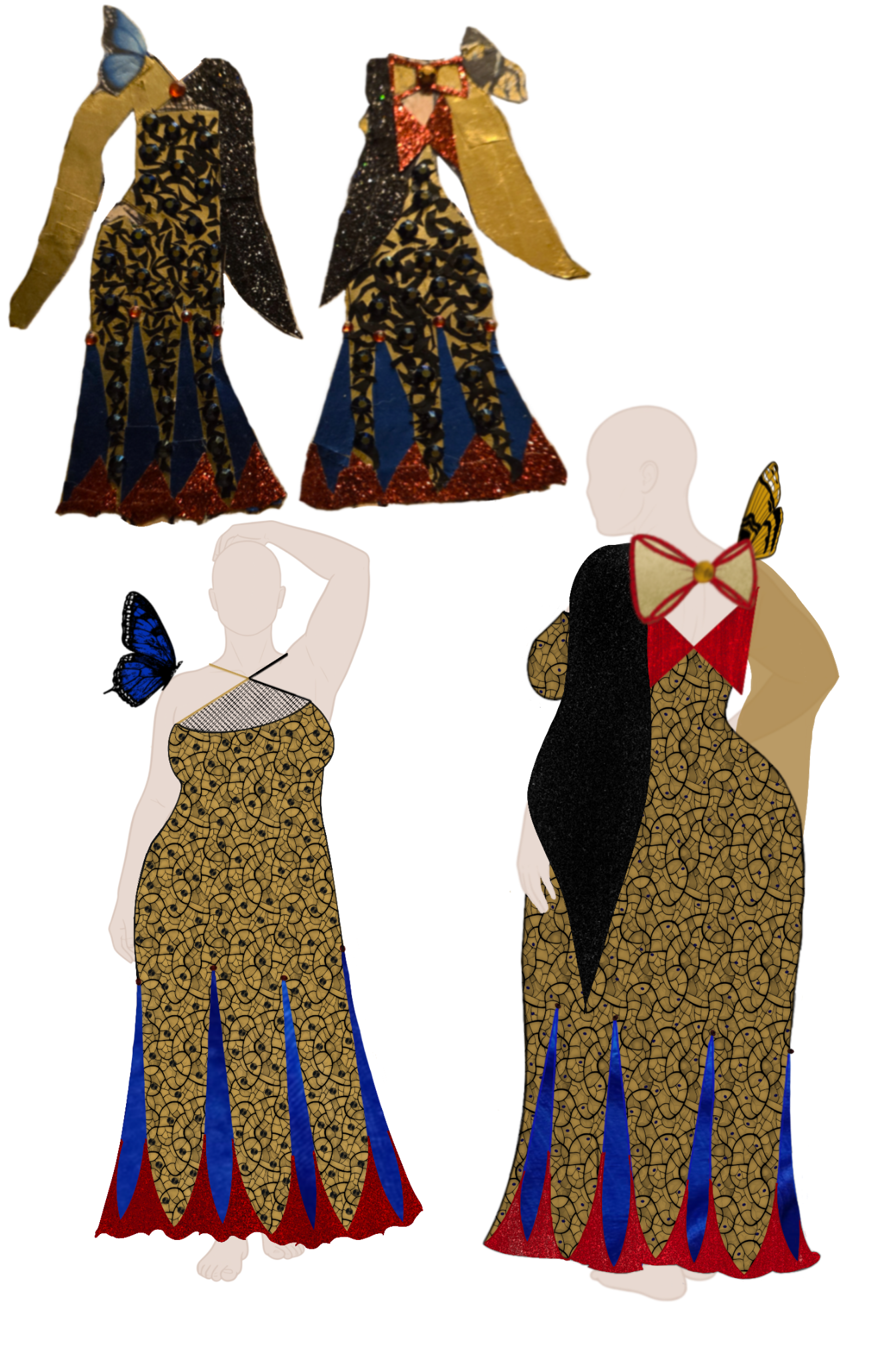
Crimson Peak couture design
I have the absolute hardest time figuring out fabric folds and shading. This was drawn using the Procreate app, with the reference being the previous attempt using washi tape, paper, and pencil. I’m working on digitizing all my designs but I keep getting stuck on shading
Il y a 32 minutes
Vue
Rendering
Pas encore de réponse
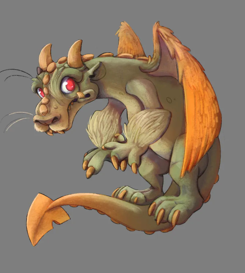
Silly dragon
I'm at that awkward moment of my art journey where I feel like I've been stuck on the same level for years. I'm still struggling with a) making my pieces feel less flat despite shadows and light/color, and b) there's always something about my shapes that makes characters look... awkwardly stiff even though their pose is dynamic in theory? I wish I could draw my characters' proportions and shapes more freely (thinking: Nicholas Kole or Nicola Saviori type of energy); color work needs improvement too, but also holy moly I really need some tips on what to do to move from that dead zone of skill because I've been trying to move on for 2+ years now and it's harder to not get irritated with every single day.
Il y a 37 minutes
Vue
Portraits
Pas encore de réponse
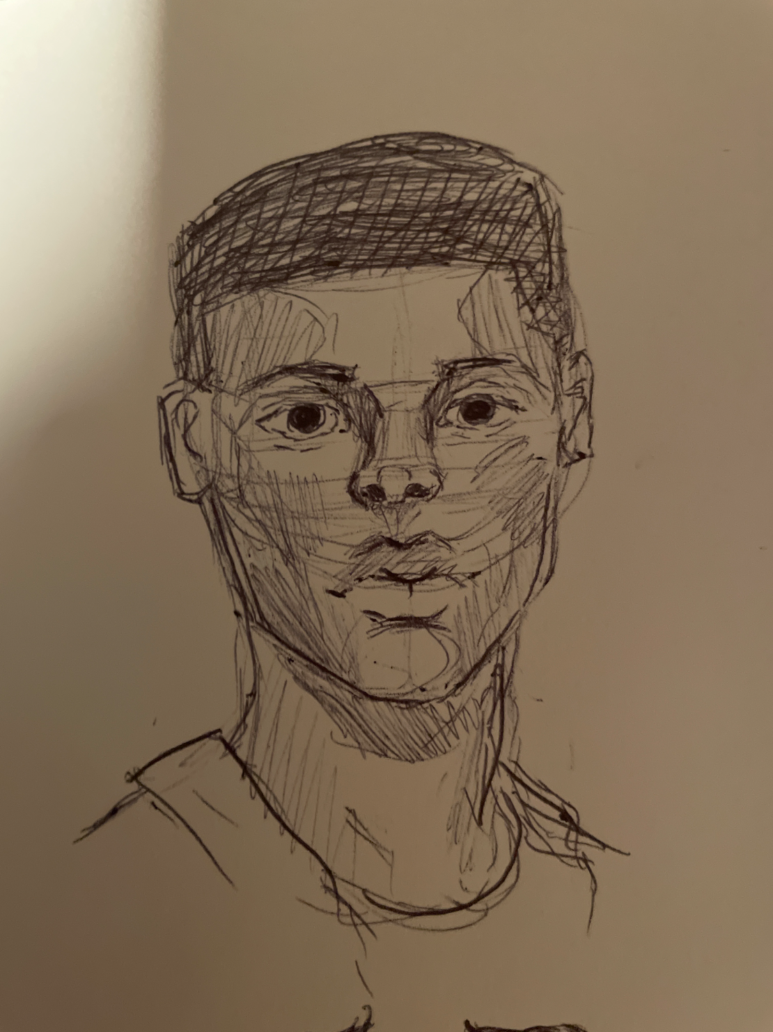
Portrait in pen
I’m struggling with making features and proportions natural
Il y a 38 minutes
Vue
July Before & After Art Challenge
Pas encore de réponse
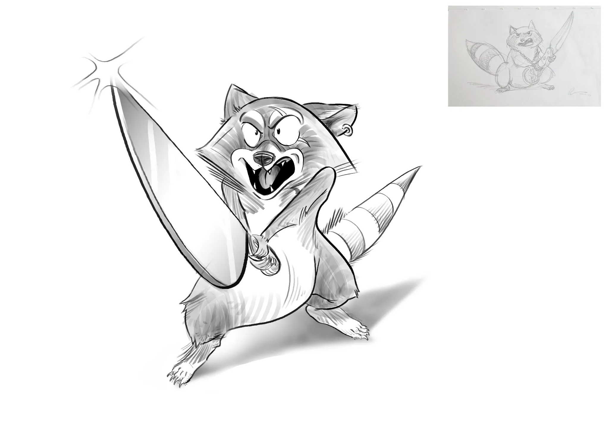
Your Paddle & your Canoe !
Just a bit of cleaning and texturing. Tried to keep the process as simple as I could.
Il y a 42 minutes
Vue
Portraits
Pas encore de réponse
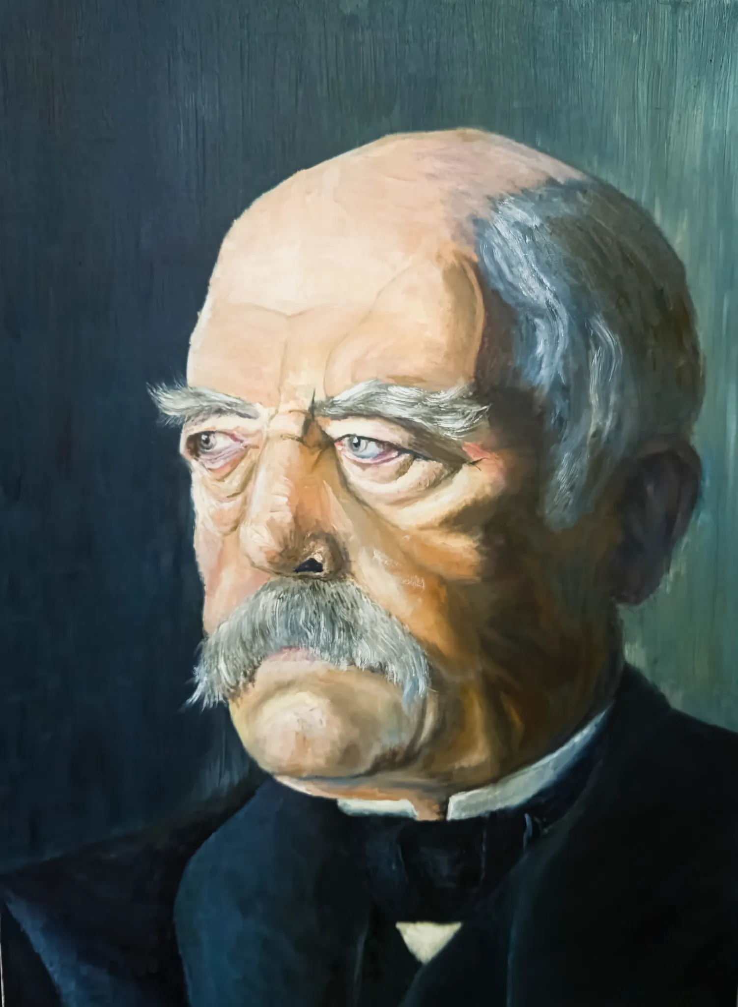
Otto Eduard Leopold von Bismarck
General comments welcome
Il y a 58 minutes
Vue
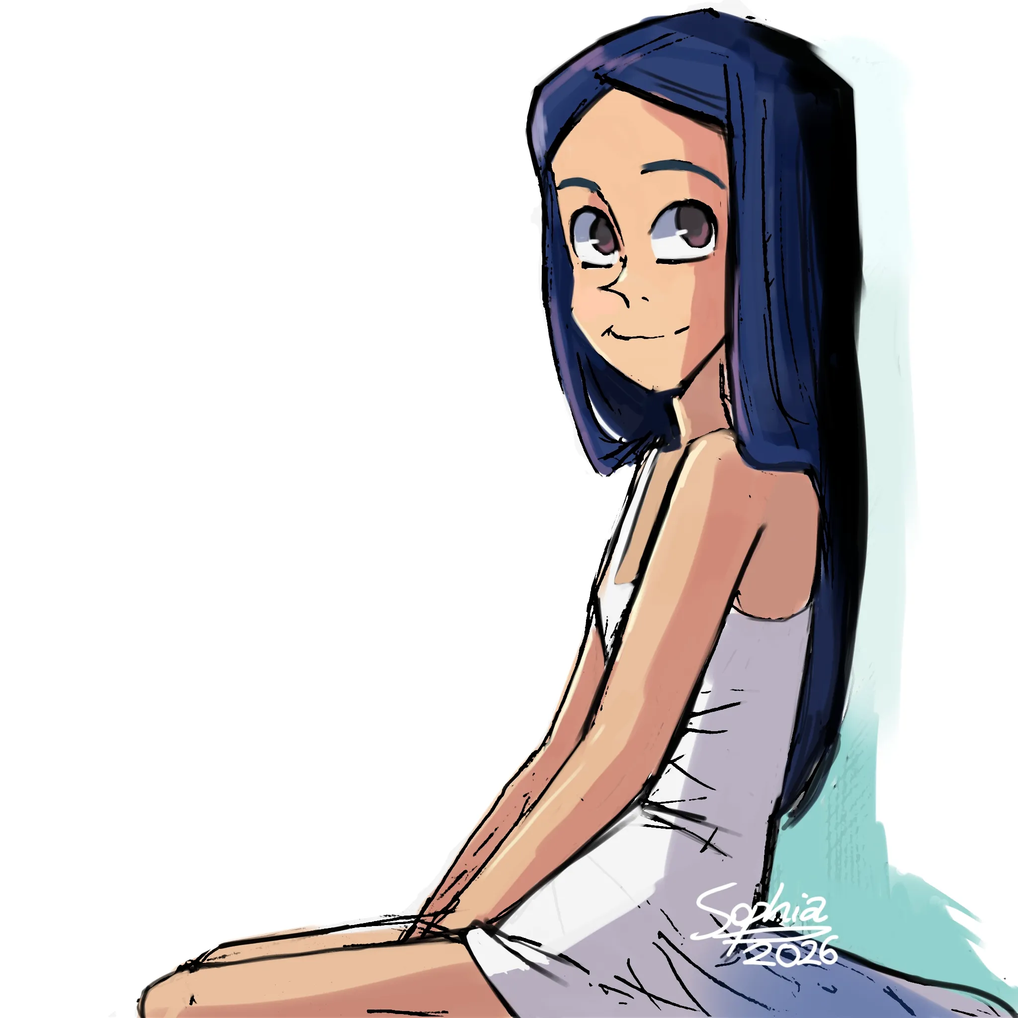
July Before & After Art Challenge
Pas encore de réponse
A pretty girl
This is how I draw it now. If you see any mistakes, please feel free to edit them. I'll definitely appreciate it.
Il y a 1 heure
Vue
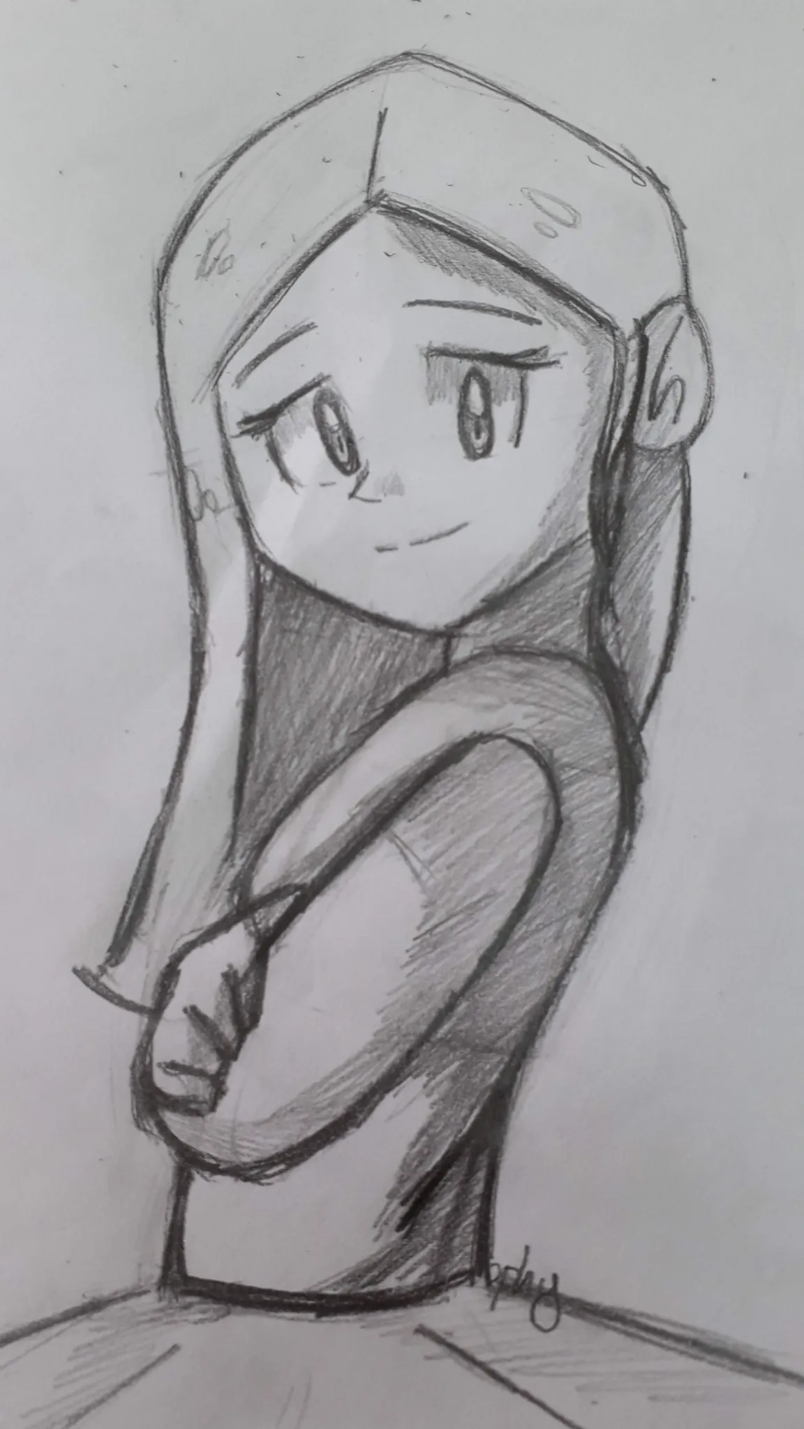
July Before & After Art Challenge
Pas encore de réponse
A pretty girl
This pencil drawing was done in 2020. At the time, I was in high school and couldn't draw as well as I do now. I've always been self-taught, but I still struggle with some things. A clear example is the difficulty of drawing clean lines and slightly more three-dimensional shapes. However, I'm learning gradually.
Il y a 1 heure
Vue
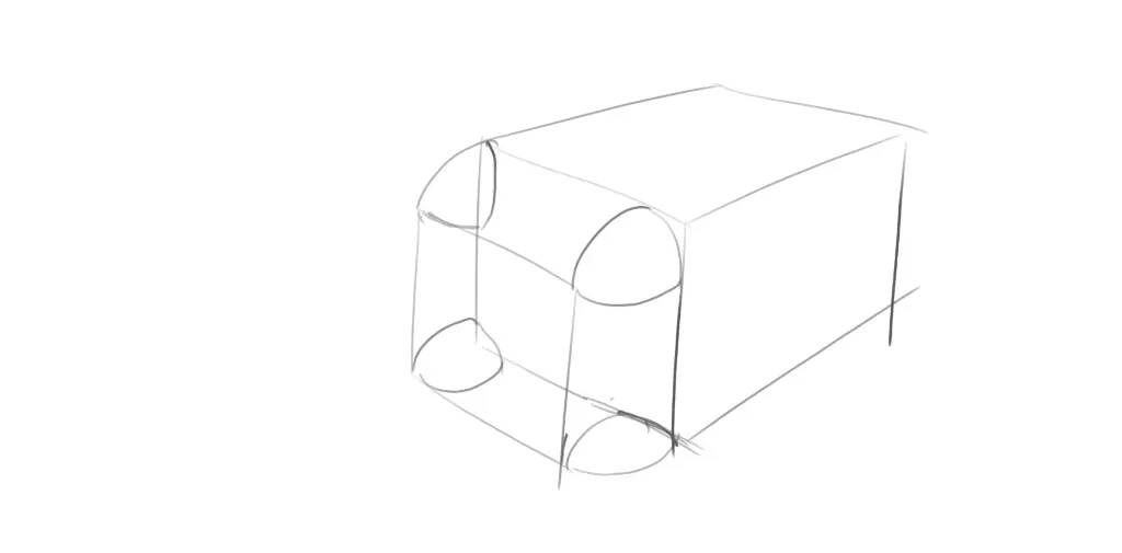
Perspective and Form
Pas encore de réponse
Multiple Rounding using the Projection Technique
I have practiced single rounding and multiple rounding for some time now, but I can't figure out how to use the projection technique on multiple rounding. When the rounding part using the projection technique comes, I get completely confused. I don't know if I am allowed to ask for feedback on exercises besides artwork, but I have been really struggling with this for quite some time now.
Il y a 1 heure
Vue
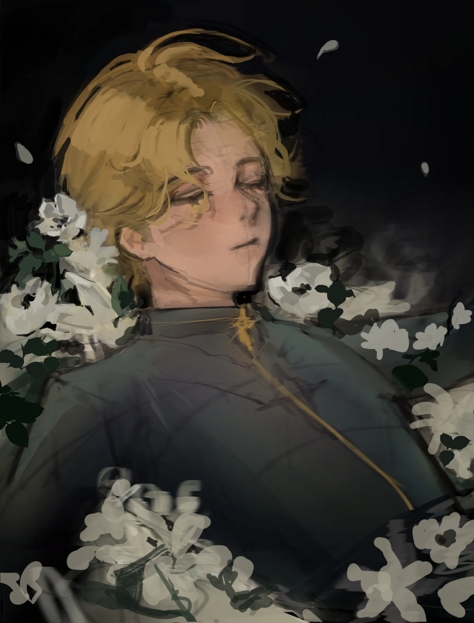
Rendering
Pas encore de réponse
oc
I need help with how to make the drawing interesting..I haven't finished drawing the flowers yet 🥲 crits on anatomy is welcomed too!!
Il y a 1 heure
Vue