borbetIl y a 1 semaine
I feel like the left arm specifically on the lower part should have more shadow, it should be as dar as the left side of the torso right?
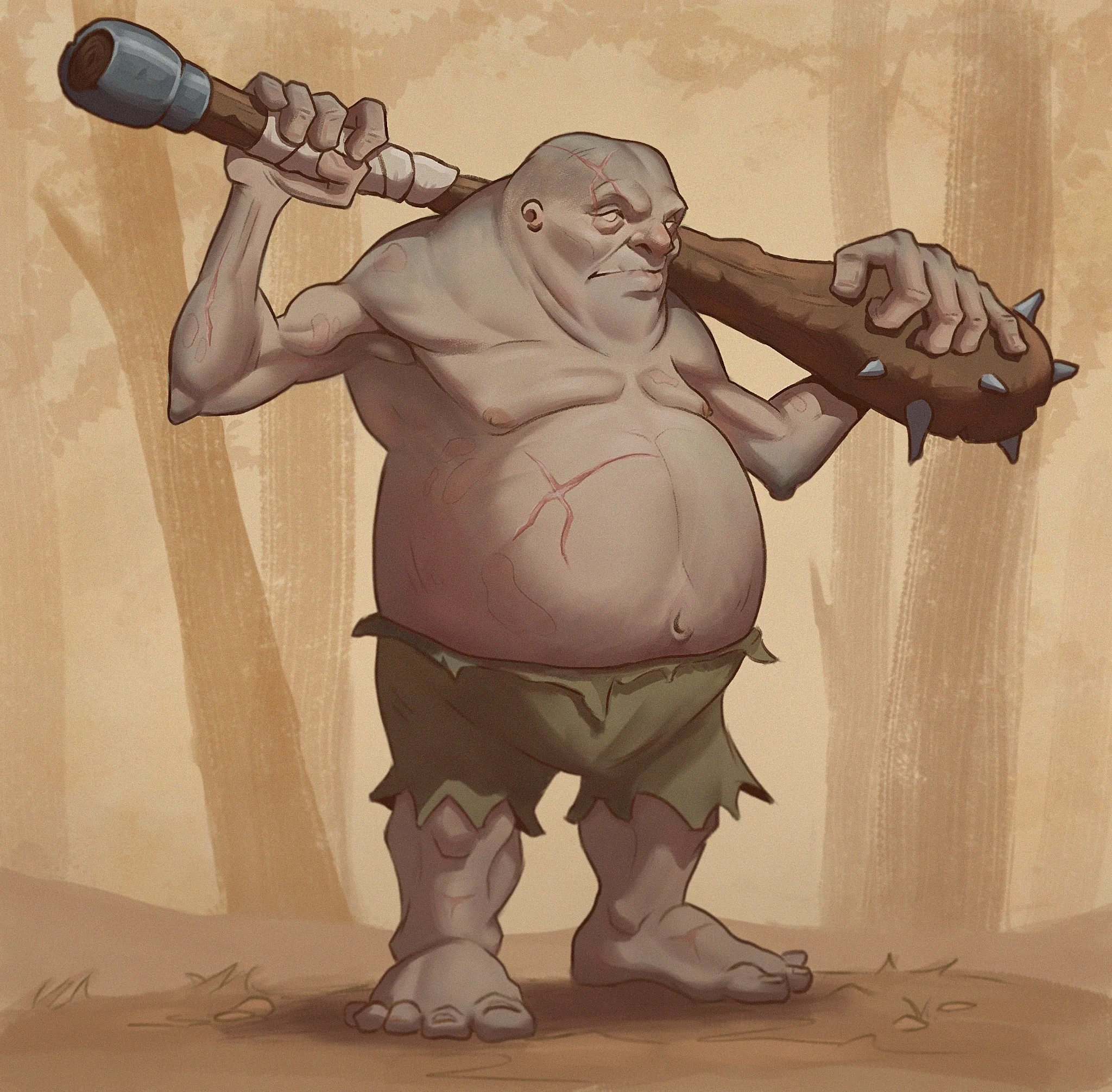
I could use some fresh eyes on this guy. I've received a lot of helpful feedback here in the past, so I thought I'd try again. I tried to apply the small, medium, and large shape principle throughout the design, although I'm wondering if I should have pushed it further. I also made a conscious effort to improve the lighting, since that's been one of my weaker areas. Any feedback would be greatly appreciated, whether it's on the composition, design, lighting, perspective, rendering, or anything else that stands out. I'm ready to move on from this piece, but I'd love feedback from a fresh perspective before I do.
I feel like the left arm specifically on the lower part should have more shadow, it should be as dar as the left side of the torso right?
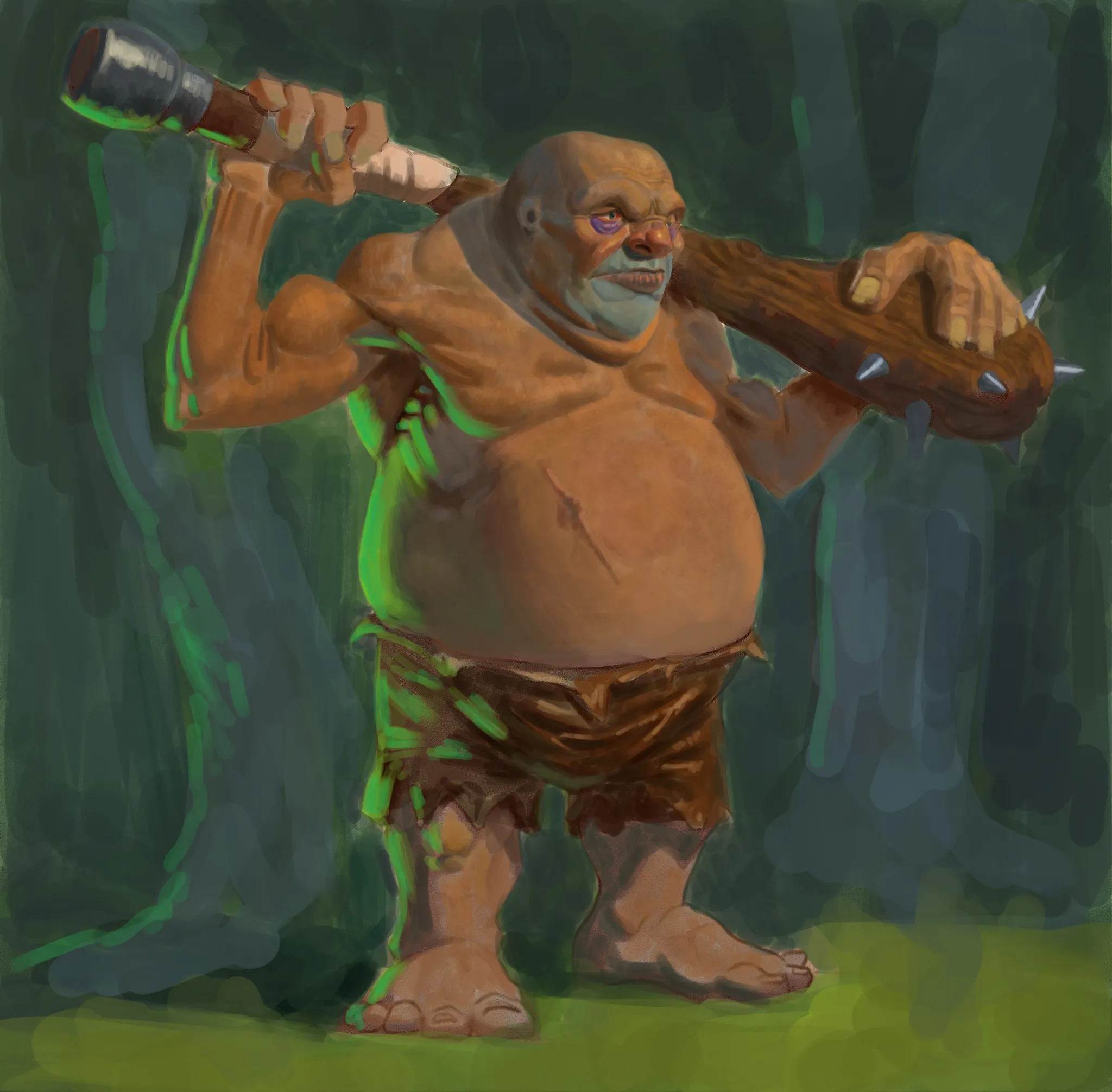
I’m not sure if this will help, but this is what I would have done. Of course, there are plenty of other directions you could take it, but this was my first quick interpretation. It’s a really cool character with some great shapes, so it made me want to throw in my own take on it. Hopefully there’s something useful in here!
Thanks! This is great, lot of good stuff here to consider. Color composition of the whole piece is way better. Also the hands work better in your version, I might need to steal them. The green rimlight is cool, I like it but I couldnt do it myself if I dont explain where its coming from in this forest scene. Still cool though! Thanks again, great stuff!